The signage decisions that make or break a skilled nursing rebrand
Most healthcare rebrands stop at the front sign. The wayfinding, door signage, and interior environmental graphics get value-engineered out — and the rebrand quietly fails. Here's how we approached signage on Village Place, from the curb to the bedside.
Most healthcare rebrands stop at the front sign.
The exterior monolith gets replaced. The new wordmark goes up. The marketing director takes a photo for social media. The rebrand looks complete from the parking lot.
Then the family member who came for a tour walks inside, sees the same dated wayfinding signage from 2008 pointing toward “Physical Therapy / Cafeteria / Nurses Station,” and the rebrand quietly stops working.
Signage is where most healthcare rebrands die. Not because the design is wrong, but because the scope gets value-engineered down to the cheapest visible piece. The exterior gets the budget. The interior gets whatever’s left over, which is usually nothing.
This is what coordinated signage actually looks like in a skilled nursing facility, why every category matters, and what we did at Village Place — where the system extended from Harbor Boulevard all the way to the resident’s bedside.
The four categories of signage that matter
A complete skilled nursing signage system has four distinct surfaces, each with a different audience and a different job:
1. Exterior identification
The signs visible from the road, the parking lot, and the building’s approach. These do market-level work — they tell drivers, neighbors, referral sources, and prospective hires what kind of operation lives in the building.
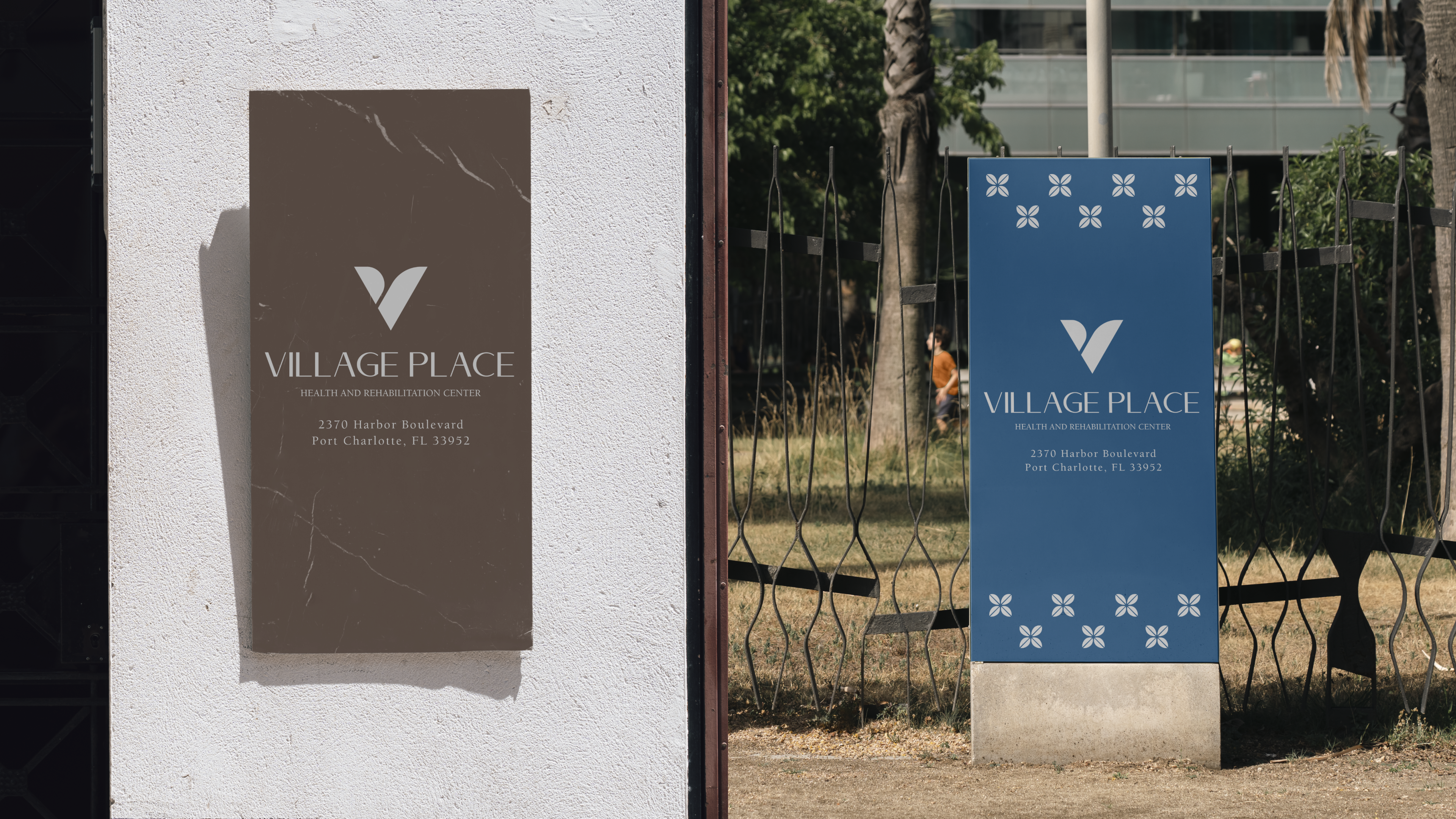
For Village Place, the exterior system included:
- A wall-mounted monolith on the side of the building
- A tall freestanding marker at the property entrance with the address and wordmark
- Pattern-printed environmental detail using the brand’s secondary mark
The exterior signage gets the most attention from leadership because it’s the most visible. It’s also, paradoxically, the lowest-leverage surface. The driver who passes the building once a week isn’t the person who decides whether your facility gets the next admission. The hospital case manager and the family member touring the building are. The exterior tells you the operation cares about how it presents. The interior is where they decide whether they trust it.
2. Interior wayfinding
The directional signage inside the building. This is where most skilled nursing rebrands break down, because wayfinding gets treated as a building maintenance issue rather than a brand expression.
A confused visitor in your hallway is a lost referral. A family member walking a wing for the first time, looking for their parent’s room, scanning a sign that points toward “PT / Caf / Nurse Stn” in three different fonts on three different signs from three different decades — that family member is forming an opinion about how the facility runs.
Coordinated wayfinding looks like what we shipped at Village Place. Single typeface. Single color system. Clear directional arrows. Plain-language labels — “Physical Therapy” and “Cafe & Lounge” and “Boardroom” rather than abbreviations. Symbols where they help (an accessibility icon next to the restroom). And consistency across every wing of the building.
The interior wayfinding system is the second-highest-leverage surface in the entire signage scope, after the door signage.
3. Door signage
The signs on individual room doors and wing entrances. This is the surface that does the most work and gets the least attention.
A family member walking down a wing for the first time should never wonder if they’re in the right place. Door signage that’s clear, consistent, and brand-aligned solves the wayfinding problem at the smallest scale and signals operational care at the largest one.
For Village Place, every door got:
- A consistent room number, sized and positioned the same on every door
- Wing identifiers (“Rooms 101-103” with directional arrows)
- “You are welcome, come on in” door hangers for new admissions, in the brand’s secondary blue
- Clear signage for shared rooms (boardroom, cafe, therapy gym, restrooms)
The door signage is also the most photographed surface in any rebrand. Family members take pictures of their parent’s room number to send to siblings. Those photos circulate on family group chats for years. A well-designed door number is a brand asset that does free work for the facility every time it shows up in a family photo.
4. Environmental graphics
The non-directional signage and graphic elements that live throughout the building. Welcome panels in the lobby. Identifying signage on therapy equipment. Recognition walls for staff. Mission statements in shared spaces. Departmental signage at the nurses’ station.
This category gets value-engineered out the most. It’s also where a building feels designed rather than just decorated. The presence of considered environmental graphics is what separates a facility that looks newly rebuilt from a facility that looks like it was renovated 20 years ago.
What gets value-engineered out (and why it matters)
When a healthcare signage budget gets cut, here’s the order things tend to disappear:
- Environmental graphics go first. They’re seen as decorative, so they’re treated as optional.
- Door hangers and welcome signage go second. They’re operational items that aren’t perceived as marketing.
- Interior wayfinding gets minimized. Existing signs get kept “for now,” with a plan to update them later (later never comes).
- Door signage gets standardized to the cheapest possible option (vinyl numbers on existing doors).
After all these cuts, what’s left is the exterior monolith. The rebrand looks complete from the parking lot and falls apart inside the building.
The economics are the inverse of how budgets get allocated. The exterior is high-cost, low-leverage. The interior is lower-cost, high-leverage. Cutting the interior to fund the exterior is exactly backwards.
What coordinated signage actually costs
A complete skilled nursing signage system — exterior, interior wayfinding, door signage, and environmental graphics — typically runs $30,000-$80,000 for a single-facility rebrand depending on building size, signage types, and quality of materials.
A new facility filling 104 beds at $10,000 per bed per month generates over $1 million per month at full census. Coordinated signage that closes one referral per quarter pays for itself many times over inside the first year.
The signage budget is one of the highest-ROI line items in a healthcare rebrand. It’s also the one most consistently underfunded.
What we did at Village Place
The Village Place signage system extended across all four categories, designed as one coordinated effort:
Exterior — A brown-stone wall monolith on the building’s side, a tall blue freestanding marker at the property entrance, both carrying the wordmark and the address.
Interior wayfinding — A single typeface, a single navigation system, plain-language labels, and consistent placement throughout every wing. The signage anchored the brand in every corridor.
Door signage — Room numbers in the brand’s blue, wing identifiers with directional arrows, “You are welcome, come on in” door hangers in the brand’s secondary blue.
Environmental graphics — Brand-aligned wall panels, lobby identification, and the facility’s wordmark integrated into the architectural details where appropriate.
You can see the photography of the full system on the Village Place case study. The signage section shows the exterior monoliths, the corridor wayfinding, and the door signage as one connected language.
How to think about your signage scope
A few questions worth asking before signing off on a healthcare signage budget:
- Is the interior wayfinding included or is it “phase two”? If it’s phase two, plan for the rebrand to feel half-done for years. Phase two never happens.
- Are the door numbers being replaced or kept? Vinyl numbers on existing doors will undermine the rest of the work. Plan for new plates.
- Is the welcome signage for admissions included? The “you are welcome” door hanger is one of the cheapest pieces and one of the most-photographed. Don’t skip it.
- Is environmental graphics in scope or out? If out, the building will feel sparse compared to the rebrand. Bring at least the lobby and shared spaces in.
- Who’s installing? Coordination between the design team and the install vendor is where signage projects most often go sideways. Plan for the install management explicitly.
A skilled nursing rebrand is judged by the surface a family member sees last, not the one they see first. The front sign matters. The door signage on the room their parent is moving into matters more.
If you’re scoping signage for a relaunch, a new facility opening, or a portfolio rebrand and you want to think through which categories actually move the needle, we should talk.
Frequently asked questions
- What does a complete skilled nursing signage system include?
- Four distinct categories: exterior identification (monoliths, freestanding markers), interior wayfinding (directional signs through corridors), door signage (room numbers, wing identifiers, welcome hangers), and environmental graphics (lobby panels, departmental signage, recognition walls). Most rebrands cut the interior categories to fund the exterior — which is the inverse of where the leverage actually sits.
- How much does signage cost for a skilled nursing facility rebrand?
- A complete signage system runs $30,000-$80,000 for a single facility depending on building size, signage types, and quality of materials. The investment pays back inside the first census cycle when it closes referrals and family decisions. It's one of the highest-ROI line items in a healthcare rebrand and one of the most consistently underfunded.
- Should I keep my existing wayfinding signage during a rebrand?
- No. Keeping existing wayfinding 'for now' is one of the most common ways healthcare rebrands quietly fail. The exterior gets replaced, the front sign looks new, and then a family member walks inside and sees dated signage from a previous era. The interior wayfinding is one of the highest-leverage surfaces in the entire rebrand. Phase two never happens.
- What's the most underrated signage category?
- Door signage. The signs on individual room doors are what family members read most closely on day one and photograph for siblings. A consistent, brand-aligned door number system signals operational care at the smallest scale, and 'You are welcome' door hangers for new admissions are one of the cheapest pieces in the system and one of the most-photographed.