Excellence
A standard of clinical care that defines the network and is felt at every facility.
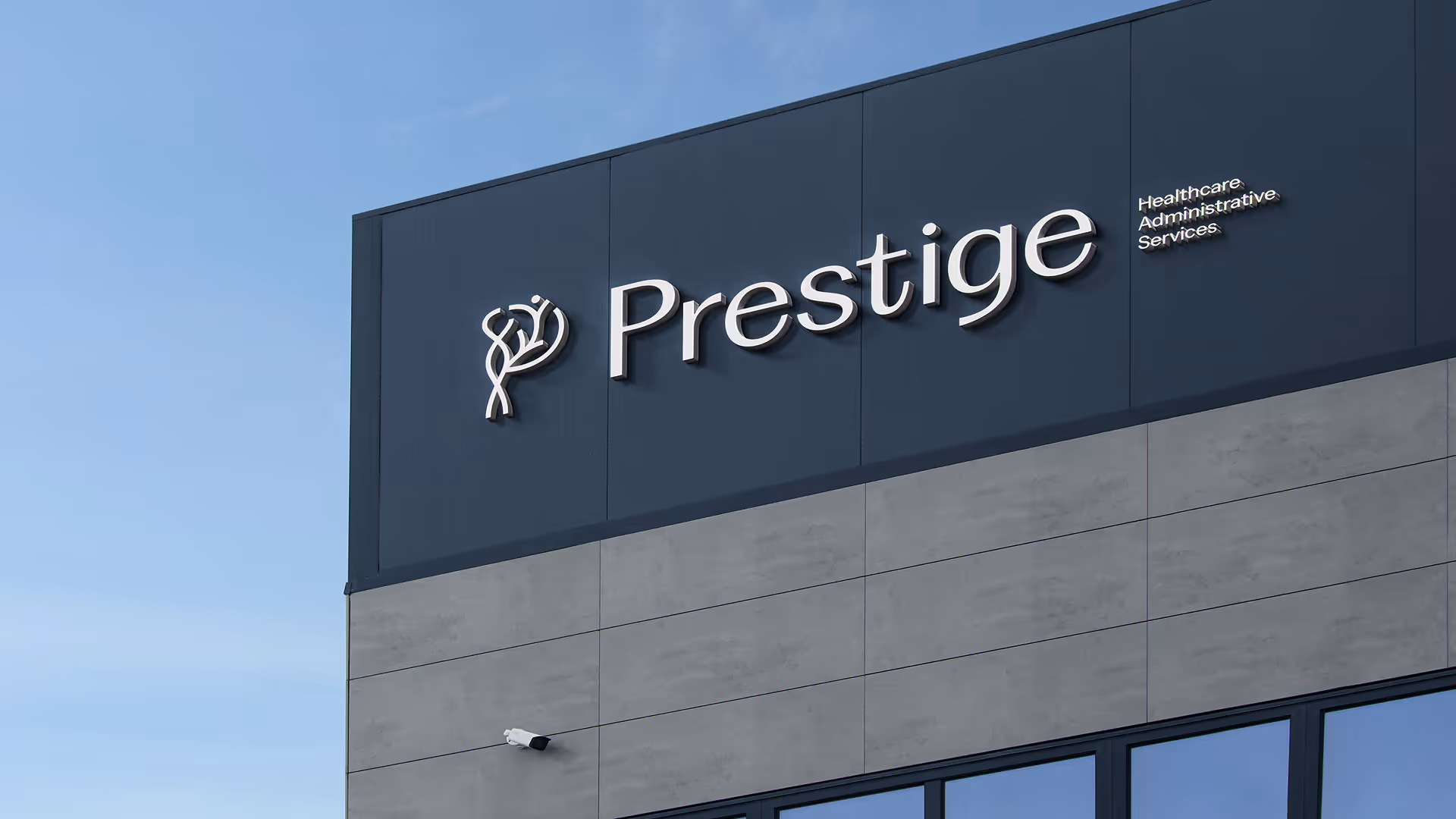
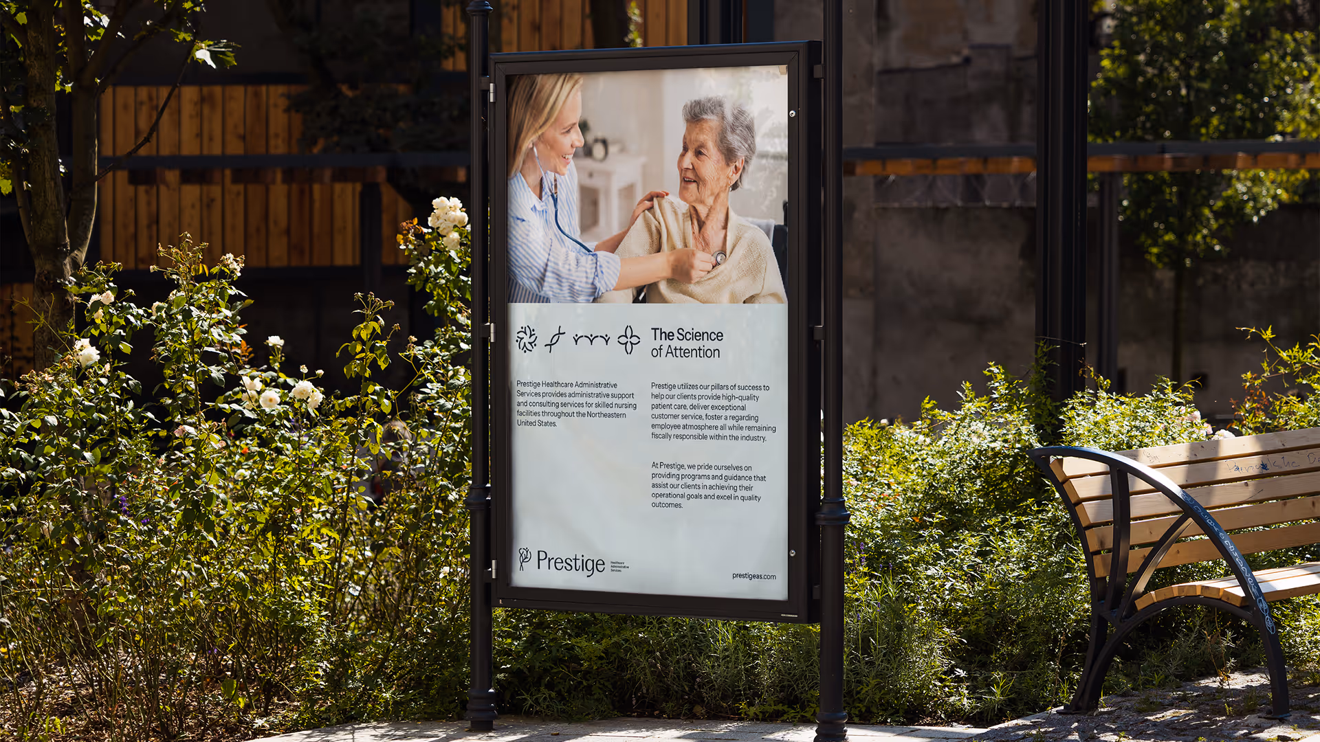
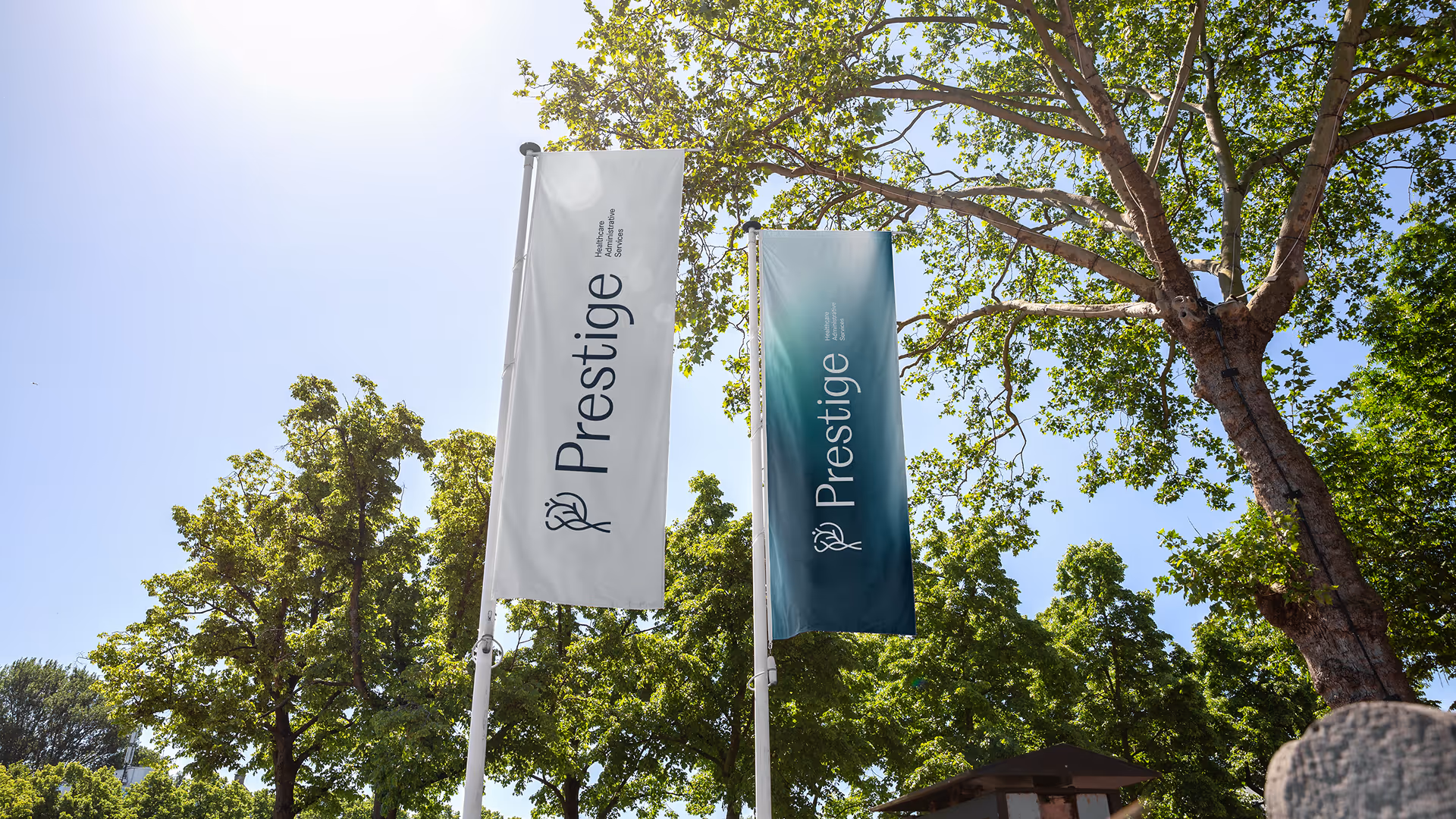
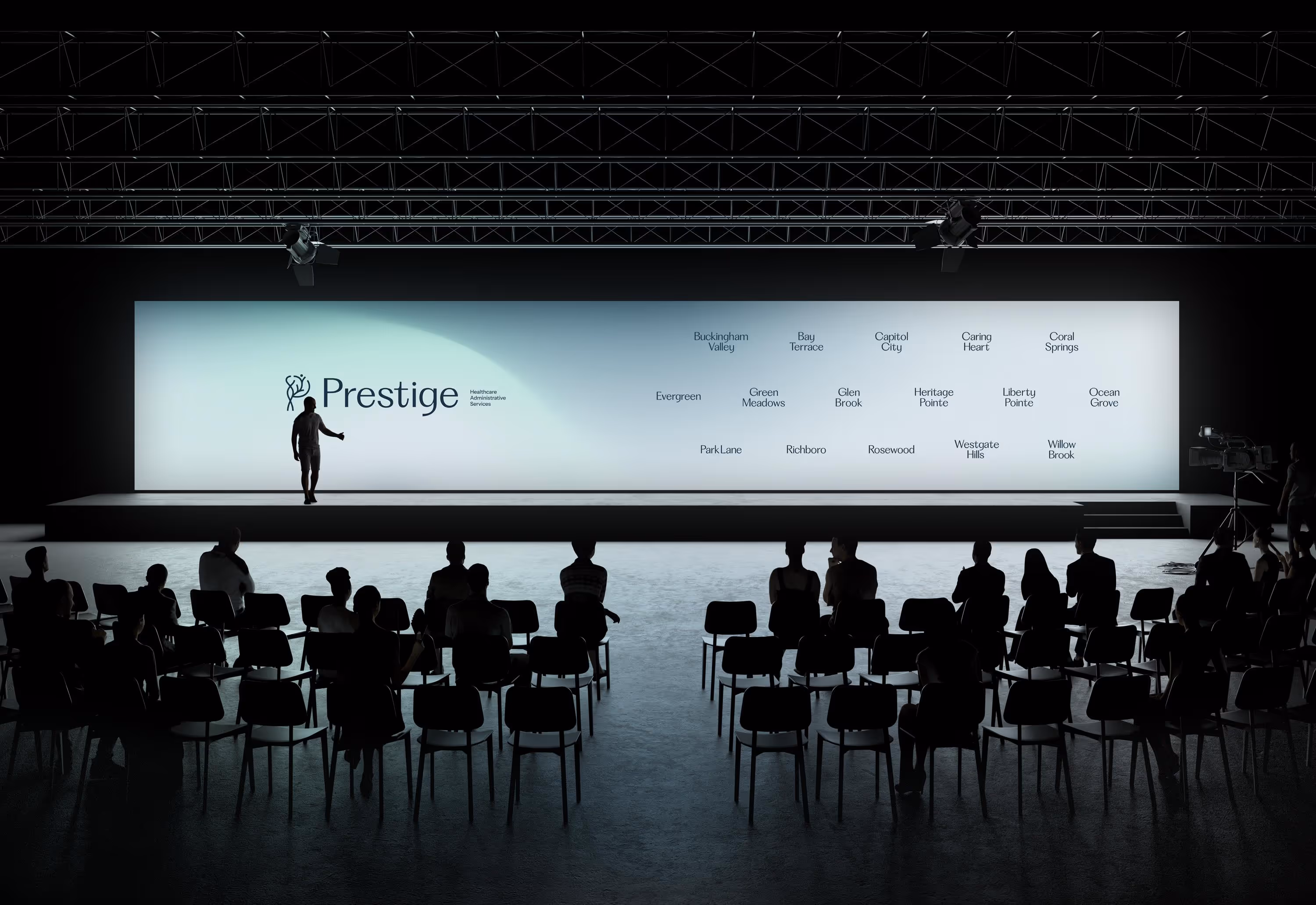
Sixteen facilities. One identity. A complete rebrand for Prestige Healthcare Administrative Services. Strategy through execution, anchored in a single idea: the science of attention.
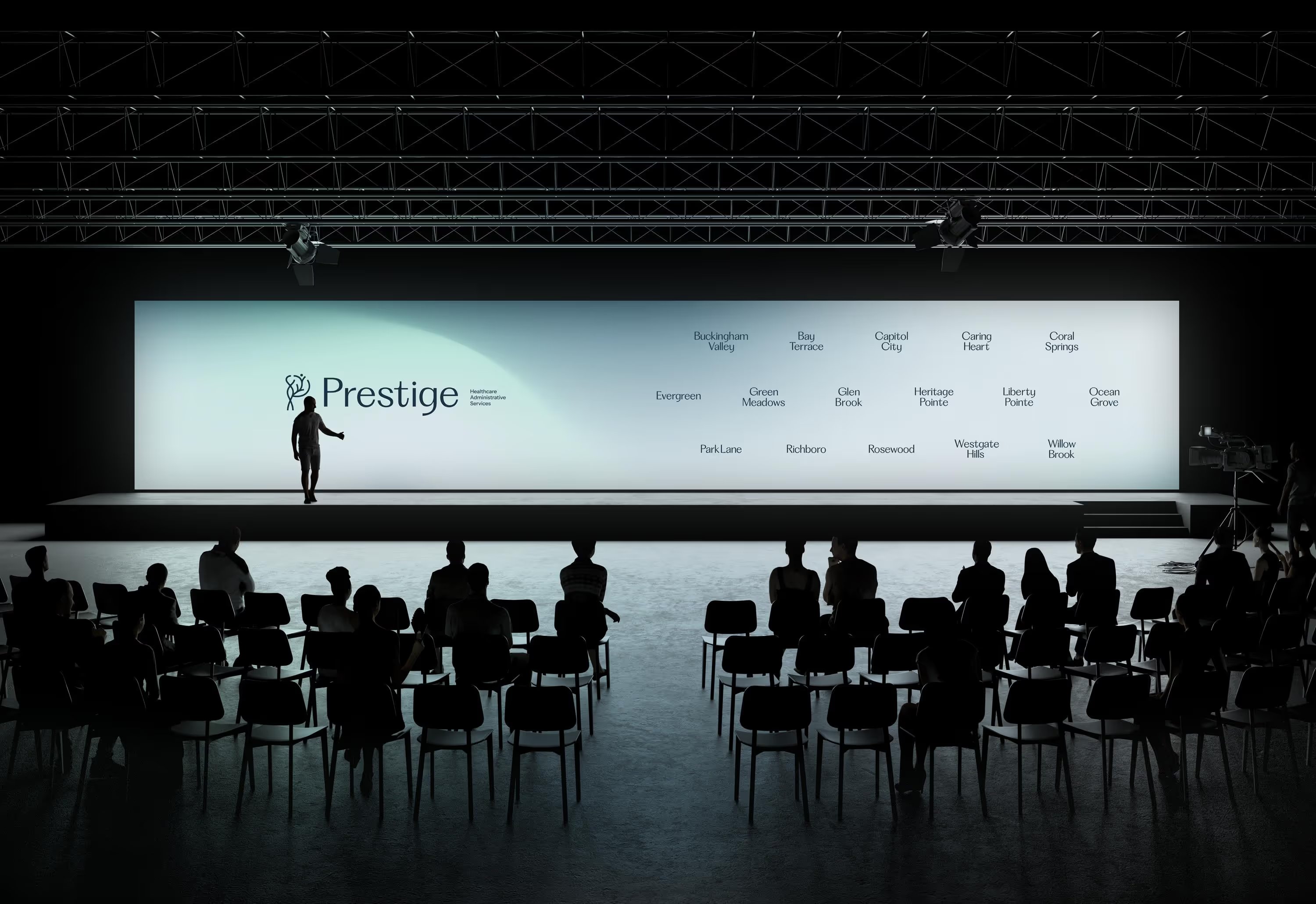
Prestige Healthcare Administrative Services operates sixteen skilled nursing and rehabilitation centers across the East Coast. Known for clinical excellence and a culture of compassion, the network reached a moment when its identity no longer reflected the standard of care it actually delivered.
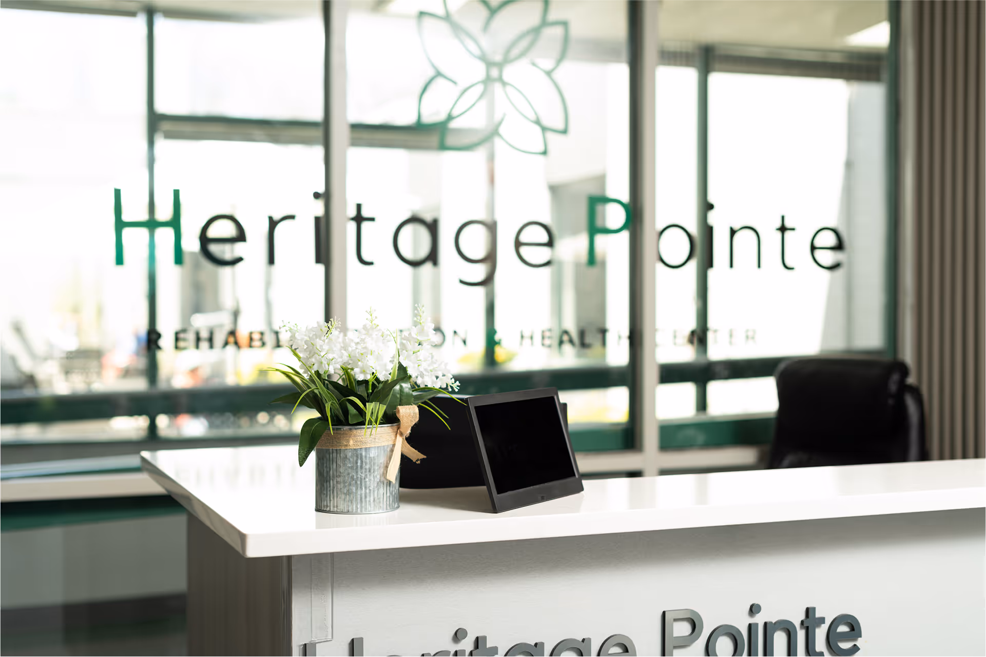
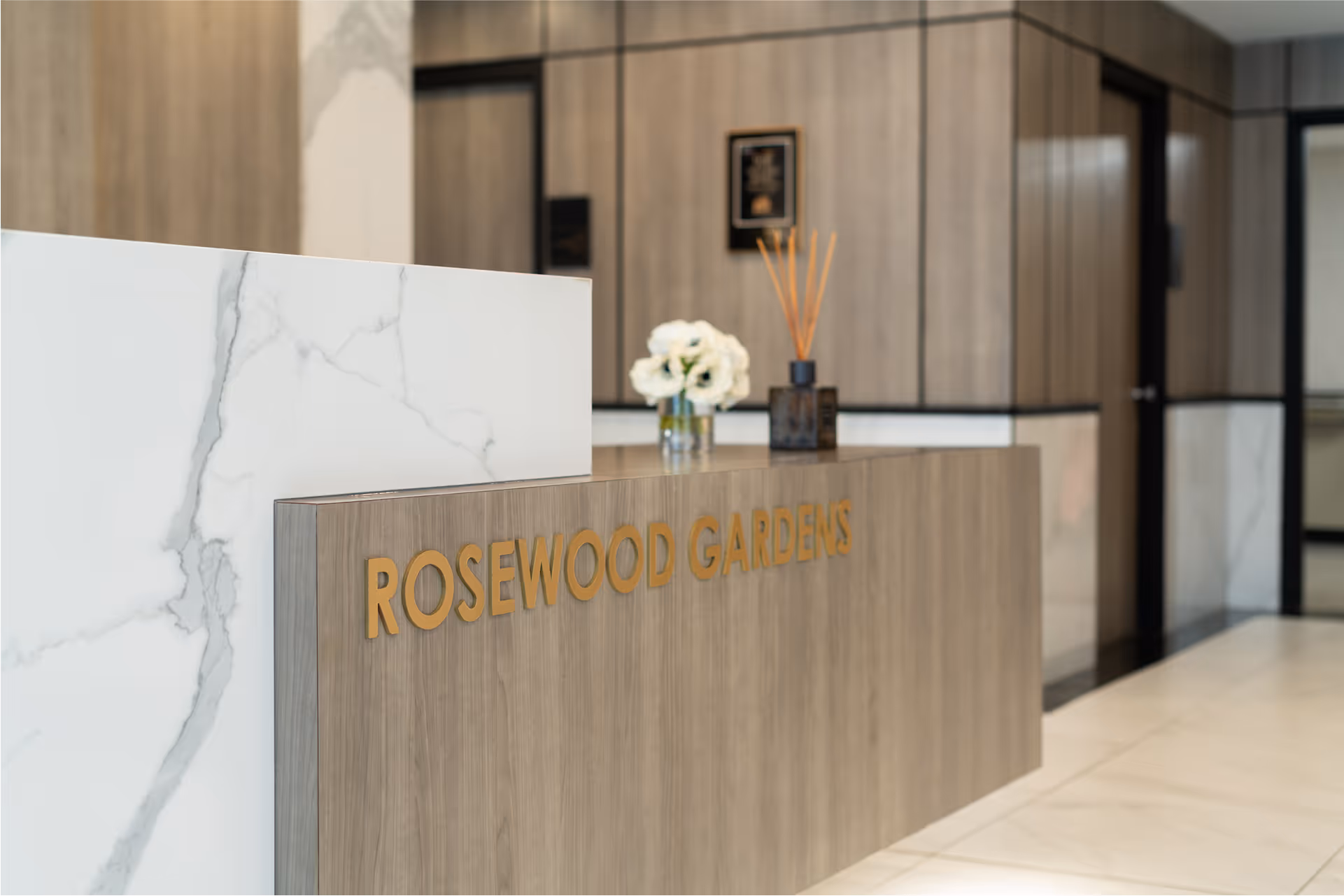
Each facility had drifted into its own visual language. Outdated marks. Mismatched signage. Fragmented digital presence. The reality was a unified, premium operation. The perception lagged years behind.
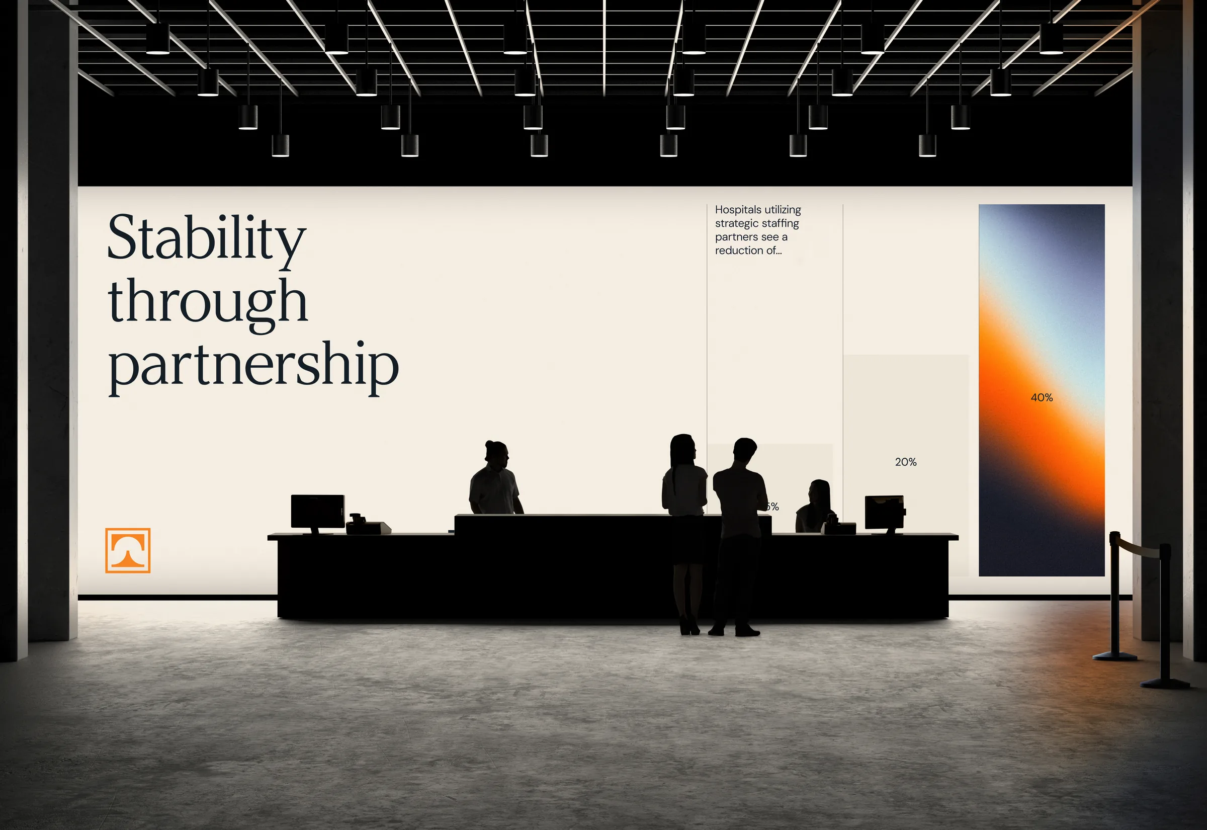
Build an identity system that could carry the weight of sixteen facilities, scale into more, and feel personal at every front door. It had to do four things at once:
A standard of clinical care that defines the network and is felt at every facility.
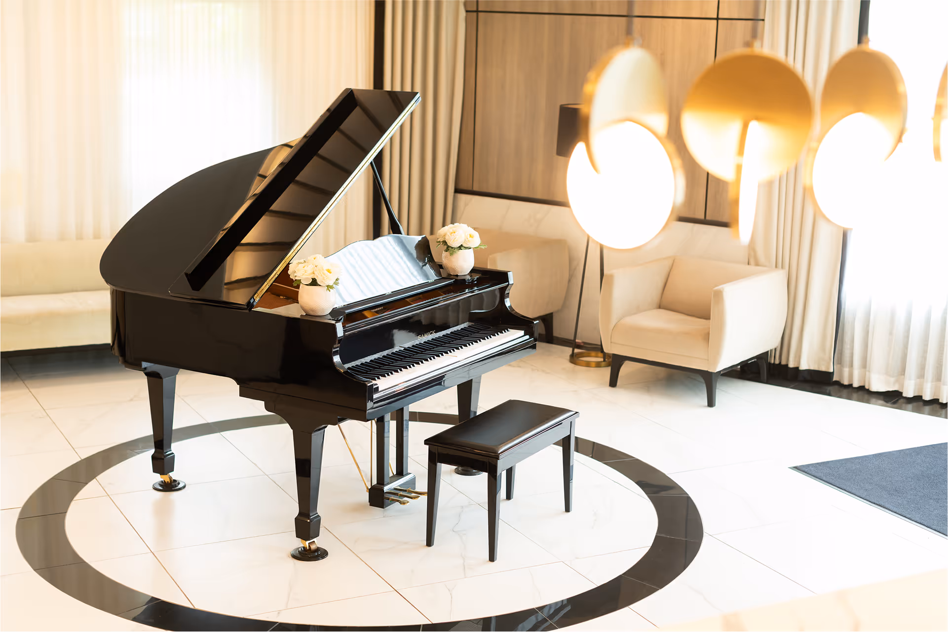
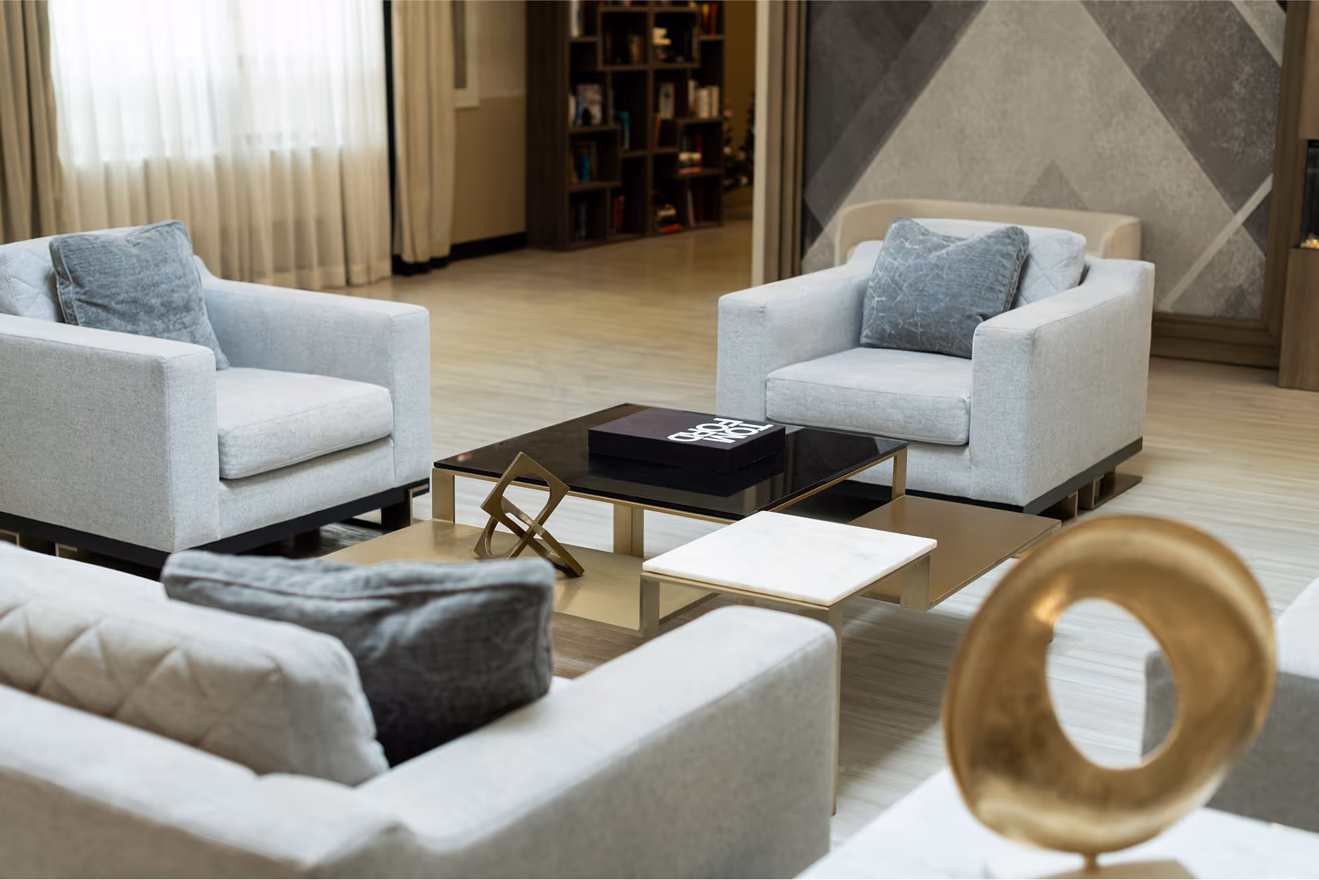
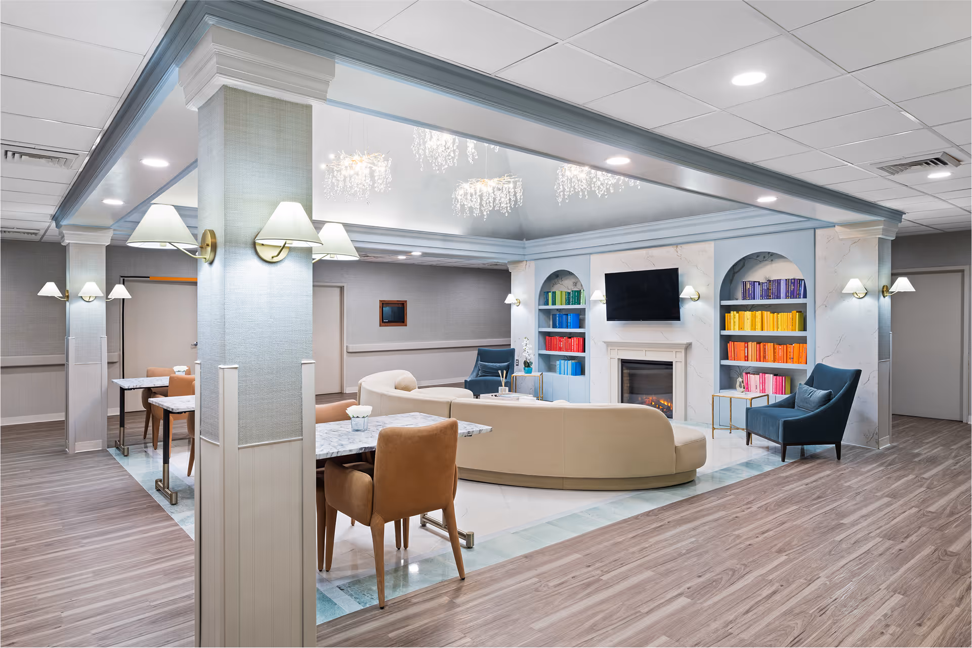
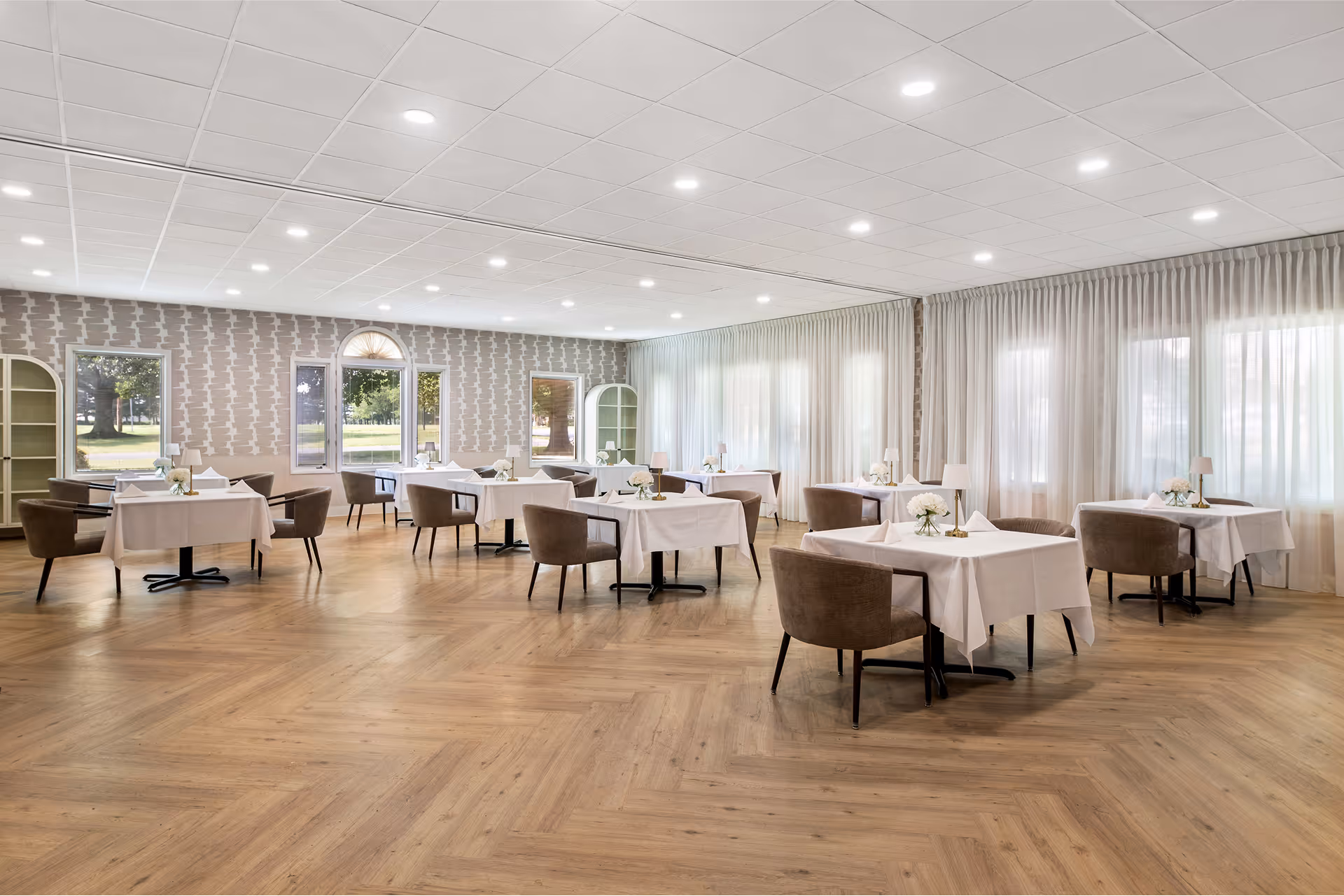
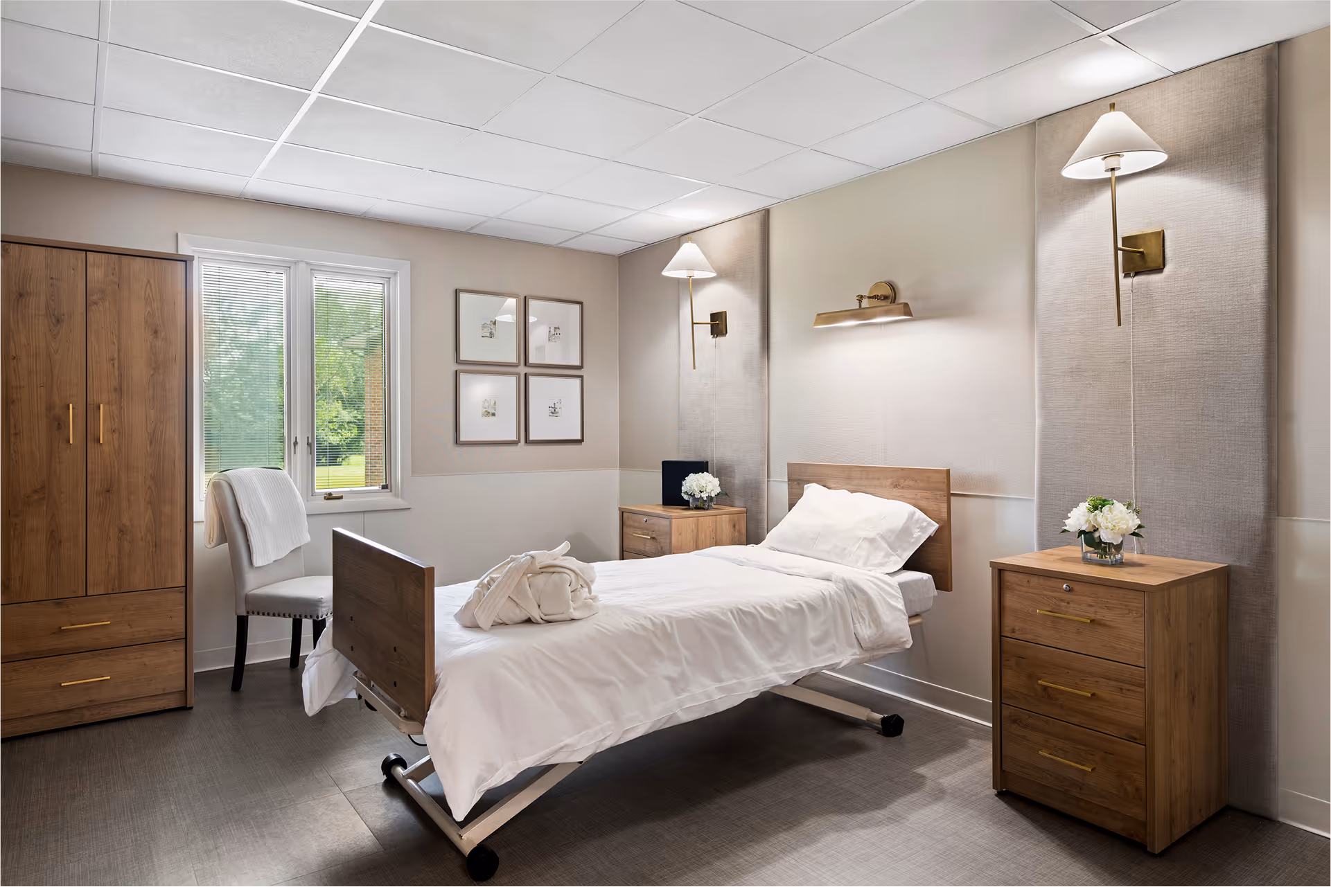
Hotel-grade comfort built into every interaction, from arrival through discharge.
Warmth as protocol. Families and residents are received with the care of guests at a fine hotel.
Operations engineered so attention can stay where it matters: the bedside.
The throughline beneath every decision. Care that is given as well as delivered.
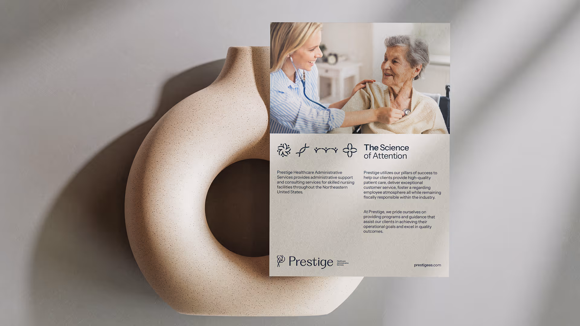
The whole brand turns on a single idea. Healthcare is, at its core, the practice of paying attention. Clinical excellence and human connection are the same act, performed at scale.
From that idea, every system flows: a four-element mark, a typographic system that speaks both clearly and warmly, an ocean palette that signals calm and trust, and a design language built to carry a network without flattening any of its facilities.
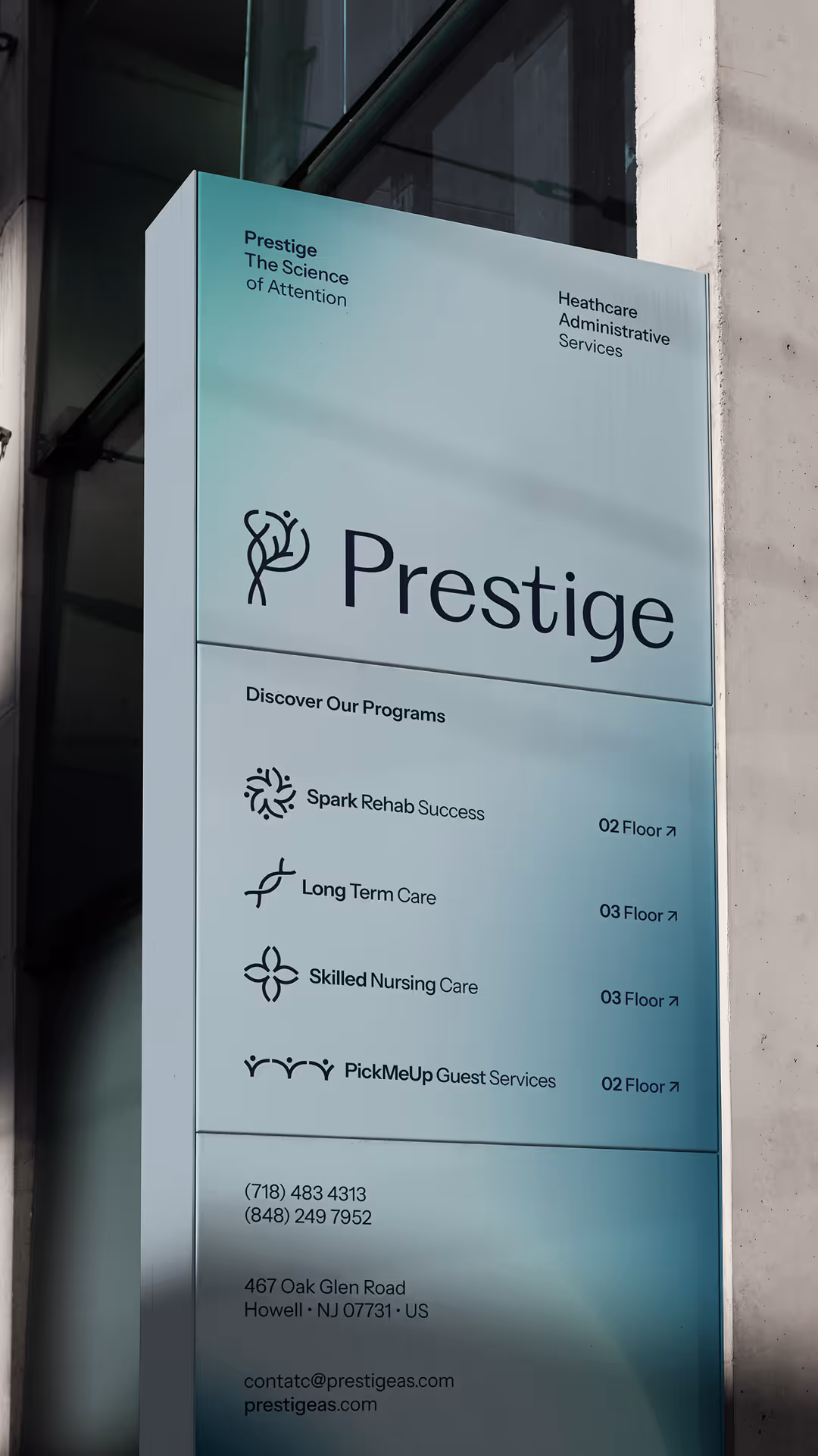
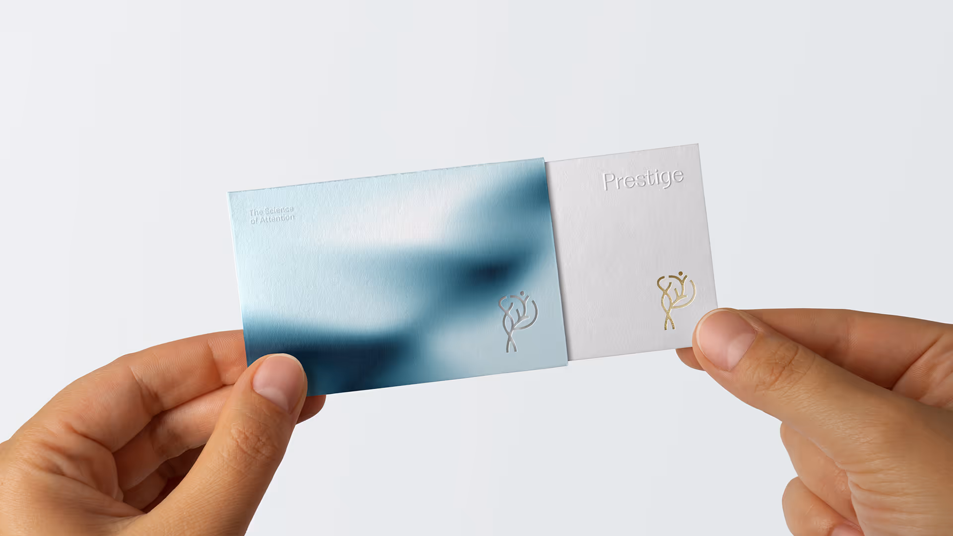
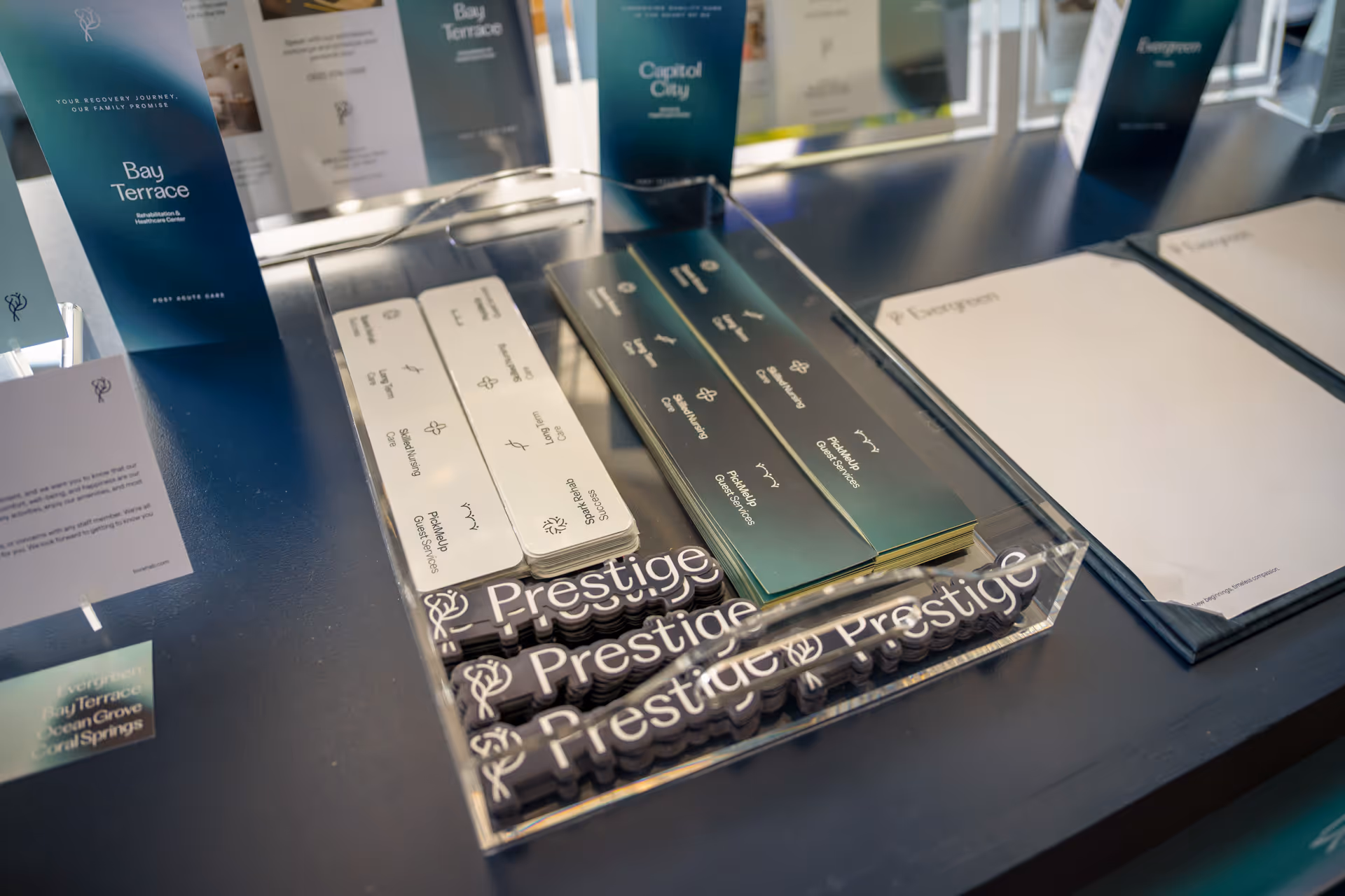
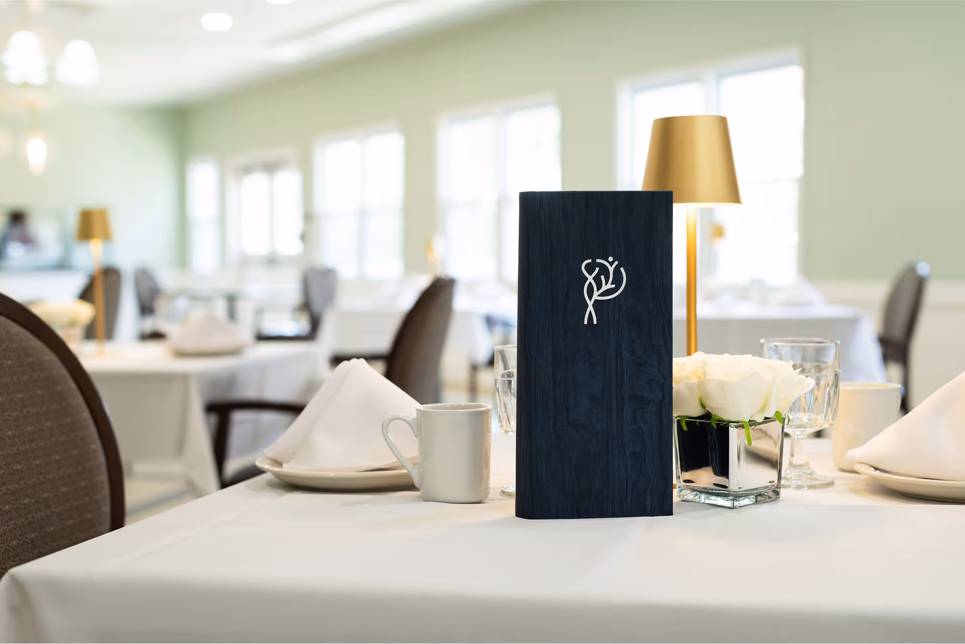
The Prestige "P" is built from four ideas that define the network. Read together they form the wordmark; read individually they become a system of icons used throughout signage, applications, and program identification.
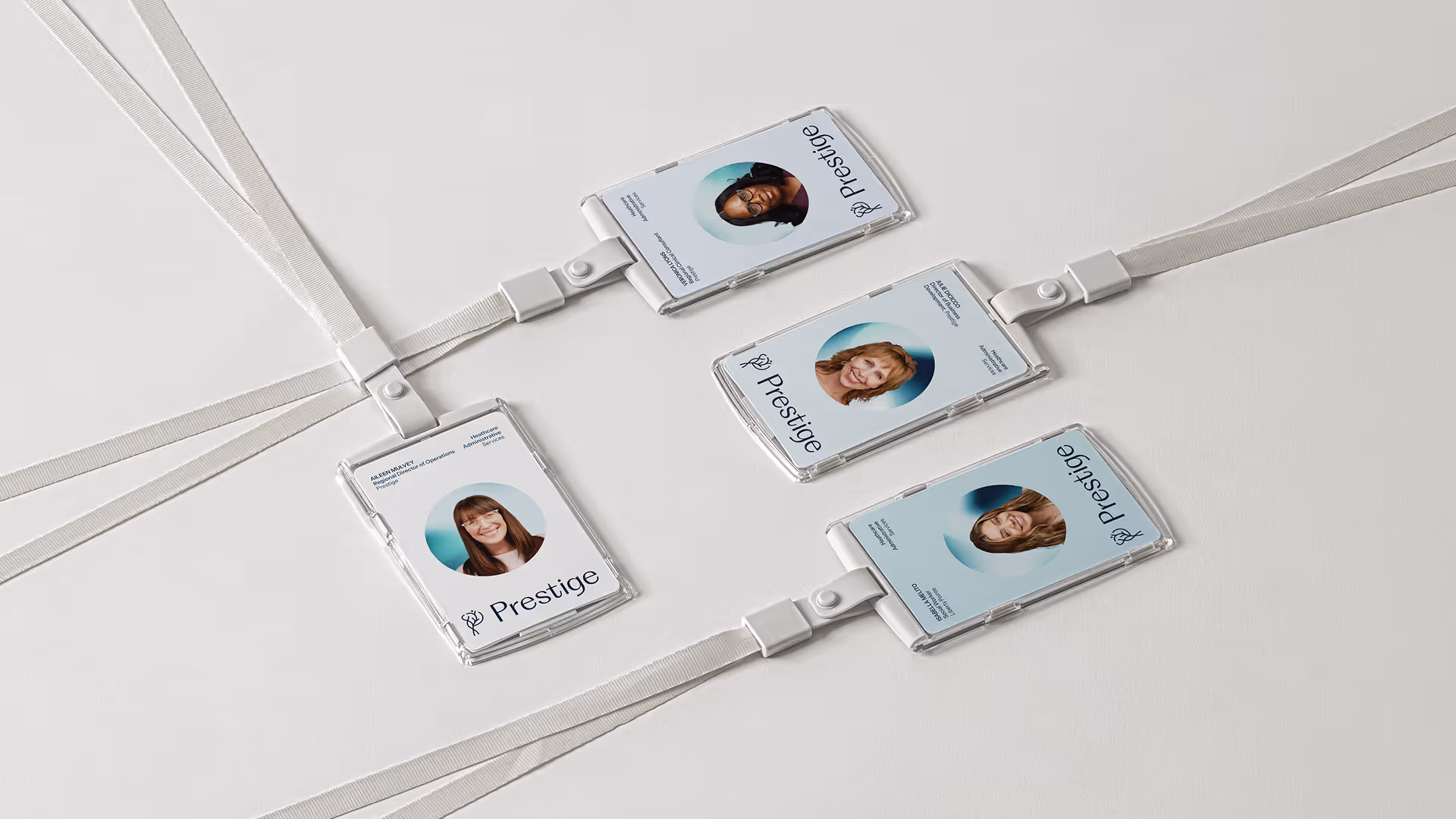
A network bound by shared standards across every facility.
The emotional center of the brand, given visual form.
The patient, the family, the staff member, always the subject.
A network that scales without losing what made it human.
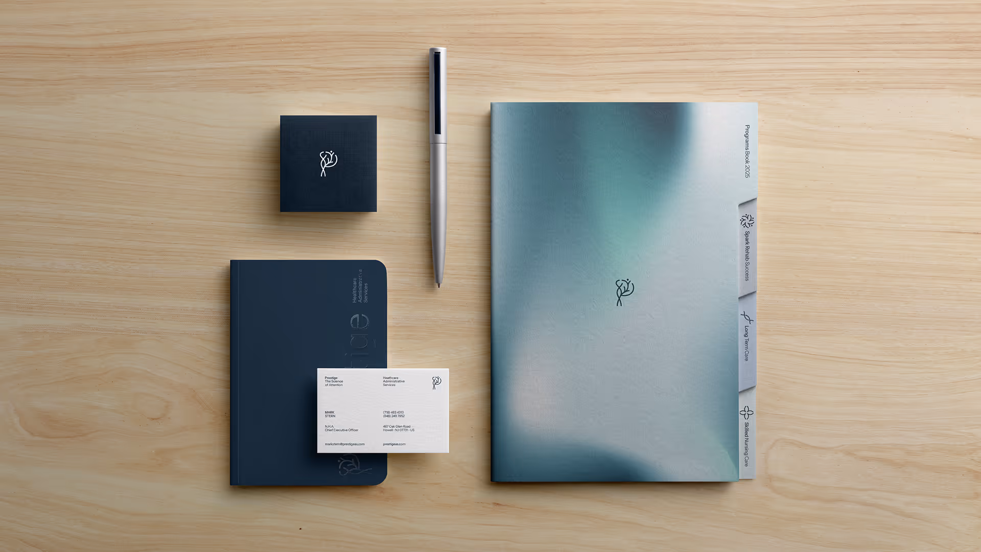
A modern serif for the wordmark and editorial presence. A precise sans for clarity. Together, they let the brand sound clinical without going cold, and warm without going soft.
A B C D E F G H I J K L M N O P Q R S T U V W X Y Z
a b c d e f g h i j k l m n o p q r s t u v w x y z
Sharp serifs, generous curves. Classical proportions with a contemporary edge.
A B C D E F G H I J K L M N O P Q R S T U V W X Y Z
a b c d e f g h i j k l m n o p q r s t u v w x y z
Geometric, balanced, highly legible. Body text, callouts, and interface across digital and print.
A deep navy anchors the system and carries authority. A spectrum of mist and sky tones opens it back up. Clarity, openness, breathing room. The two together feel modern, steady, and assured.
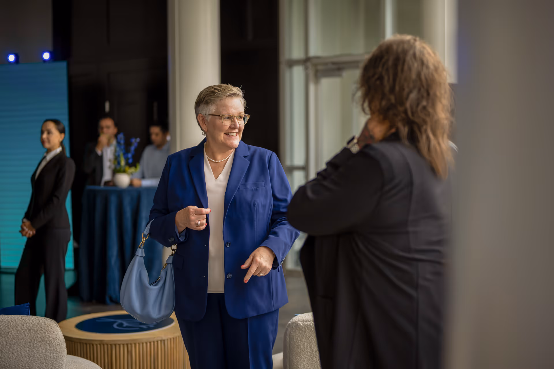
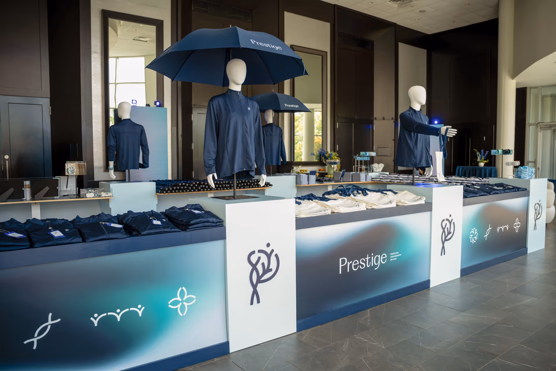
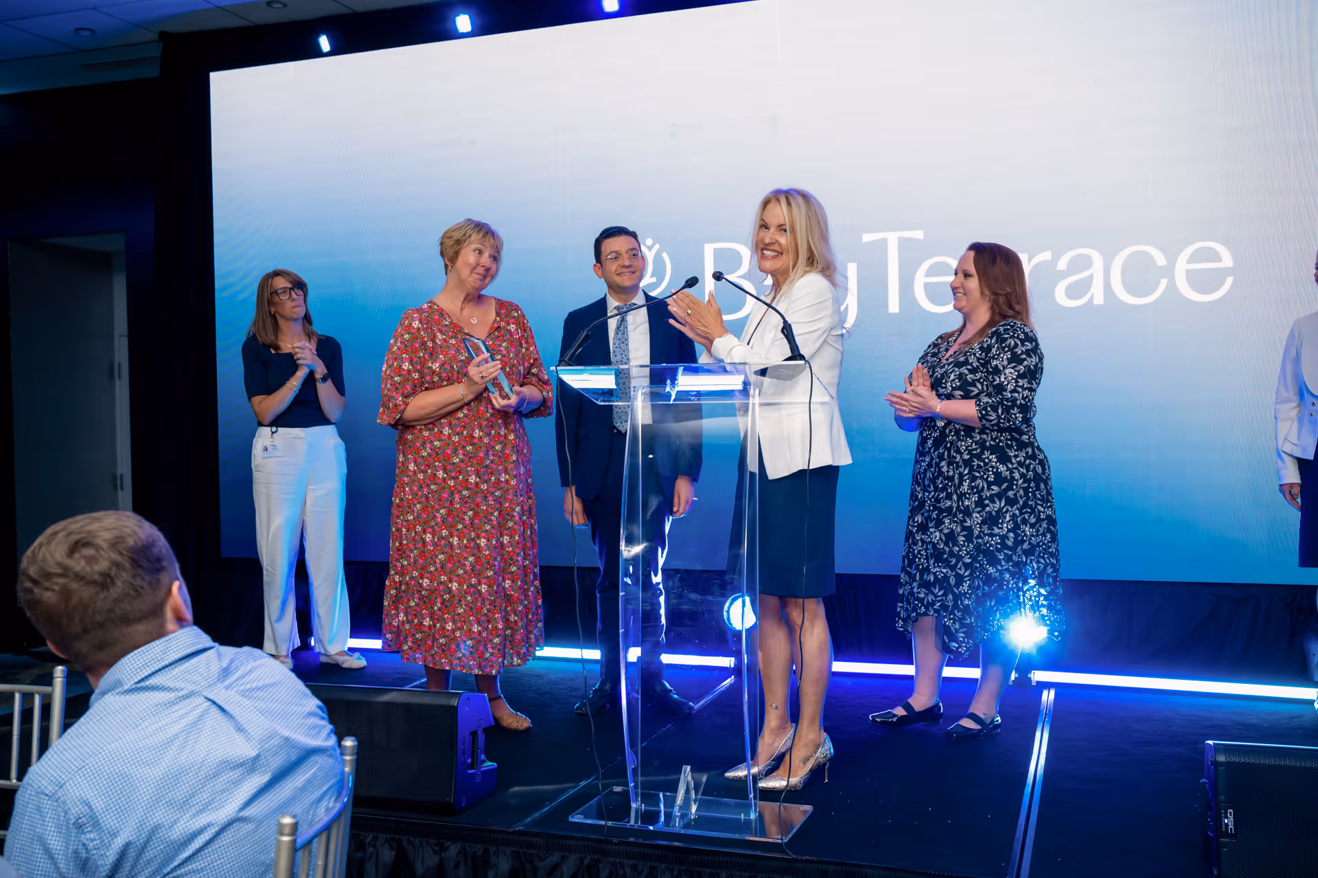
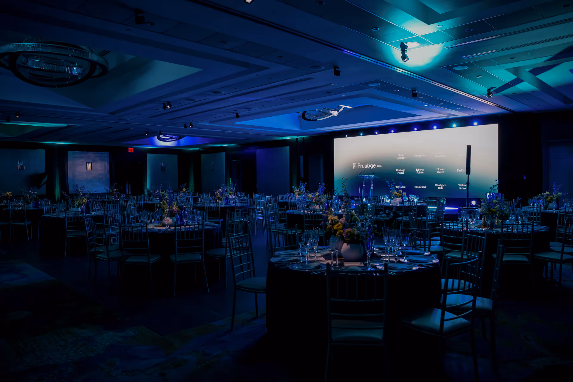
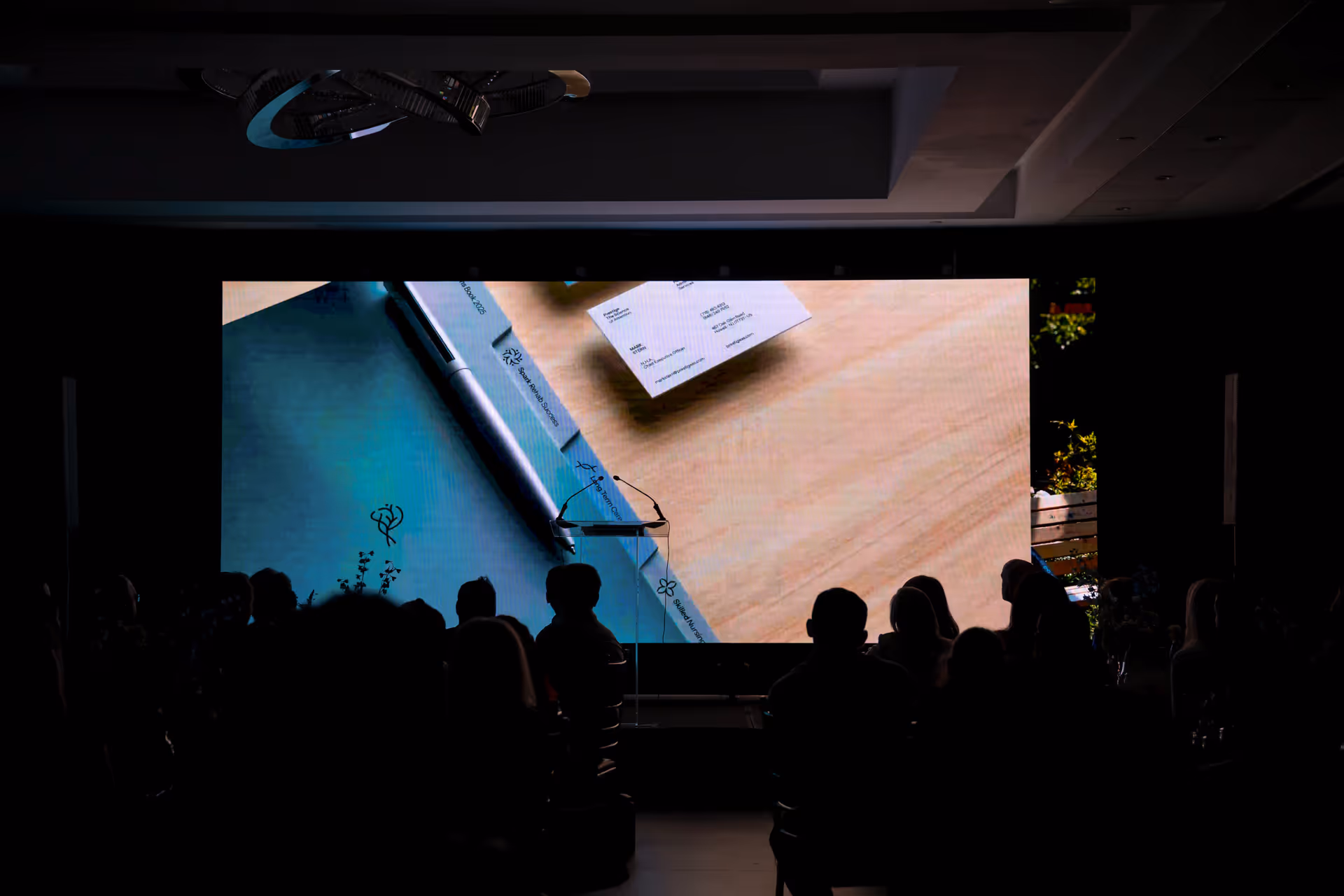
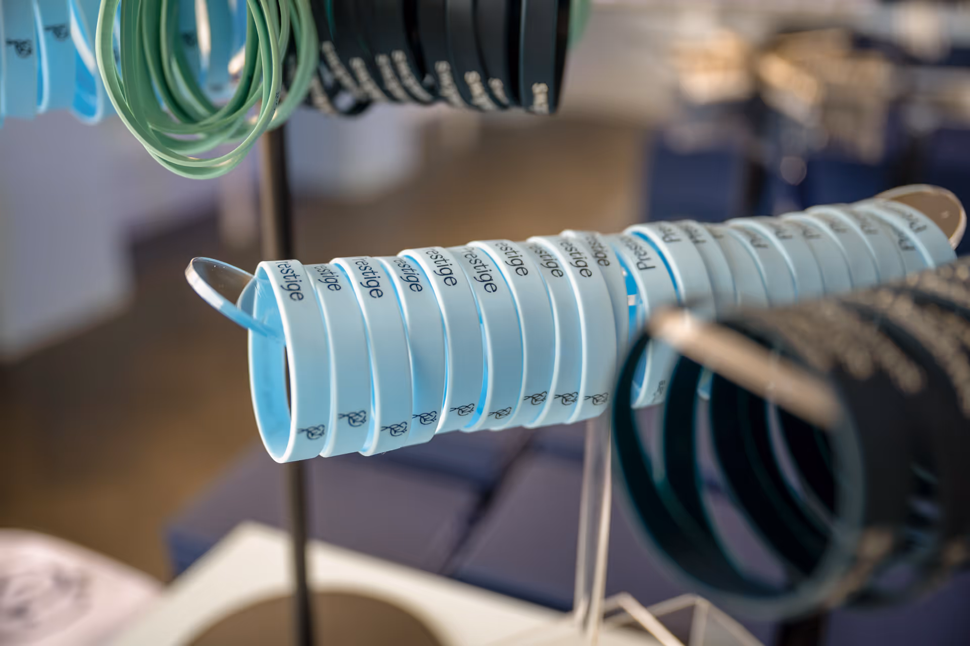
The new brand was introduced to the people who carry it every day. Administrators, leadership, and teams from each of the sixteen facilities gathered for a single evening built around the people, not the design system. Custom awards were presented. A keynote on the science of attention was delivered. The Brand Reveal Film premiered. Branded merchandise was distributed: jackets, paddles, pens, pieces designed to carry the new identity into daily work.
The night was less a rollout and more a chapter break. The brand was no longer something we'd built in a studio; it was something the network now owned.
The Brand Reveal Film as the centerpiece. A motion piece that puts the identity in motion. An event recap that captured the room as it watched. And the keynote, by Charlie Harary. The science of attention, in his words.
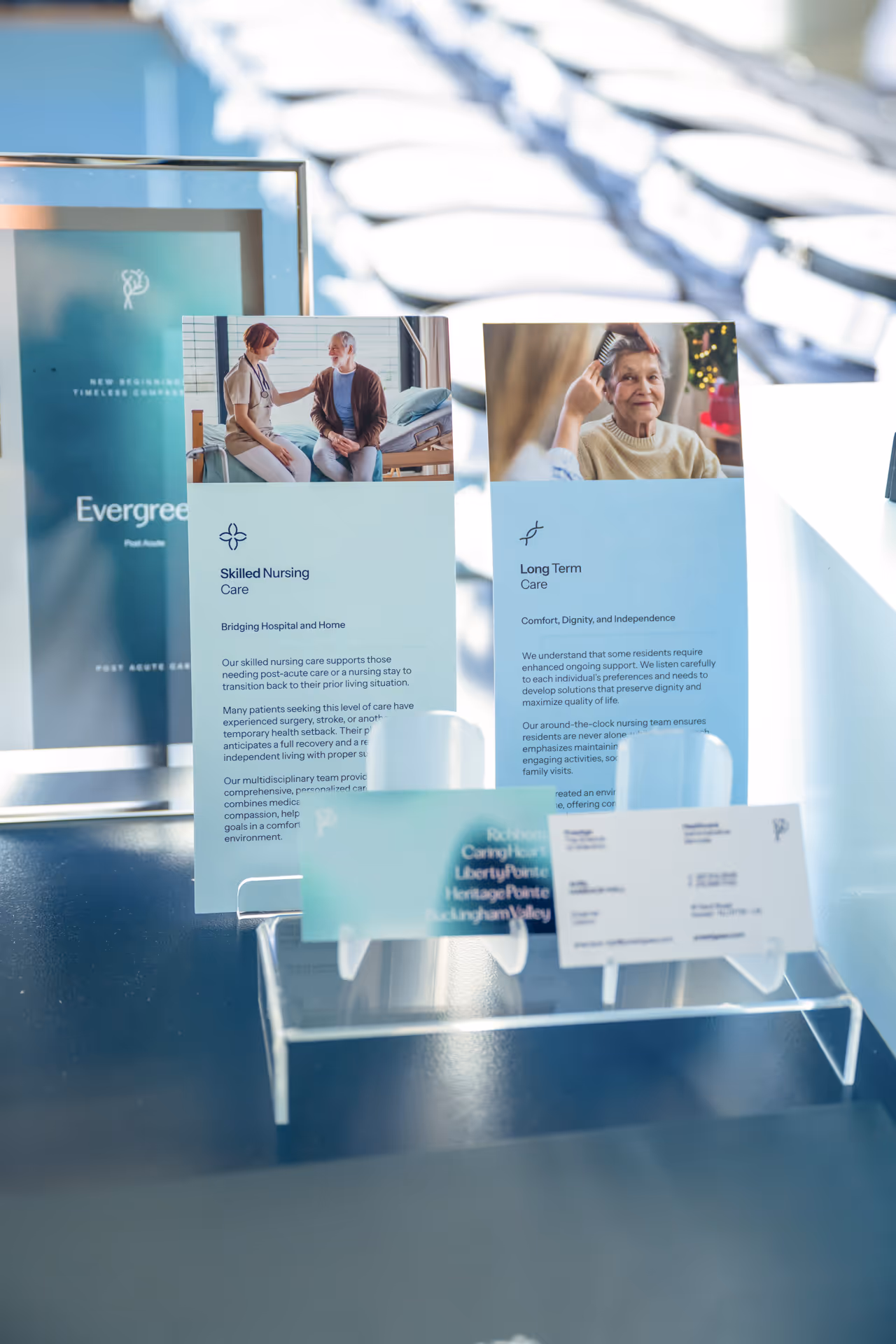
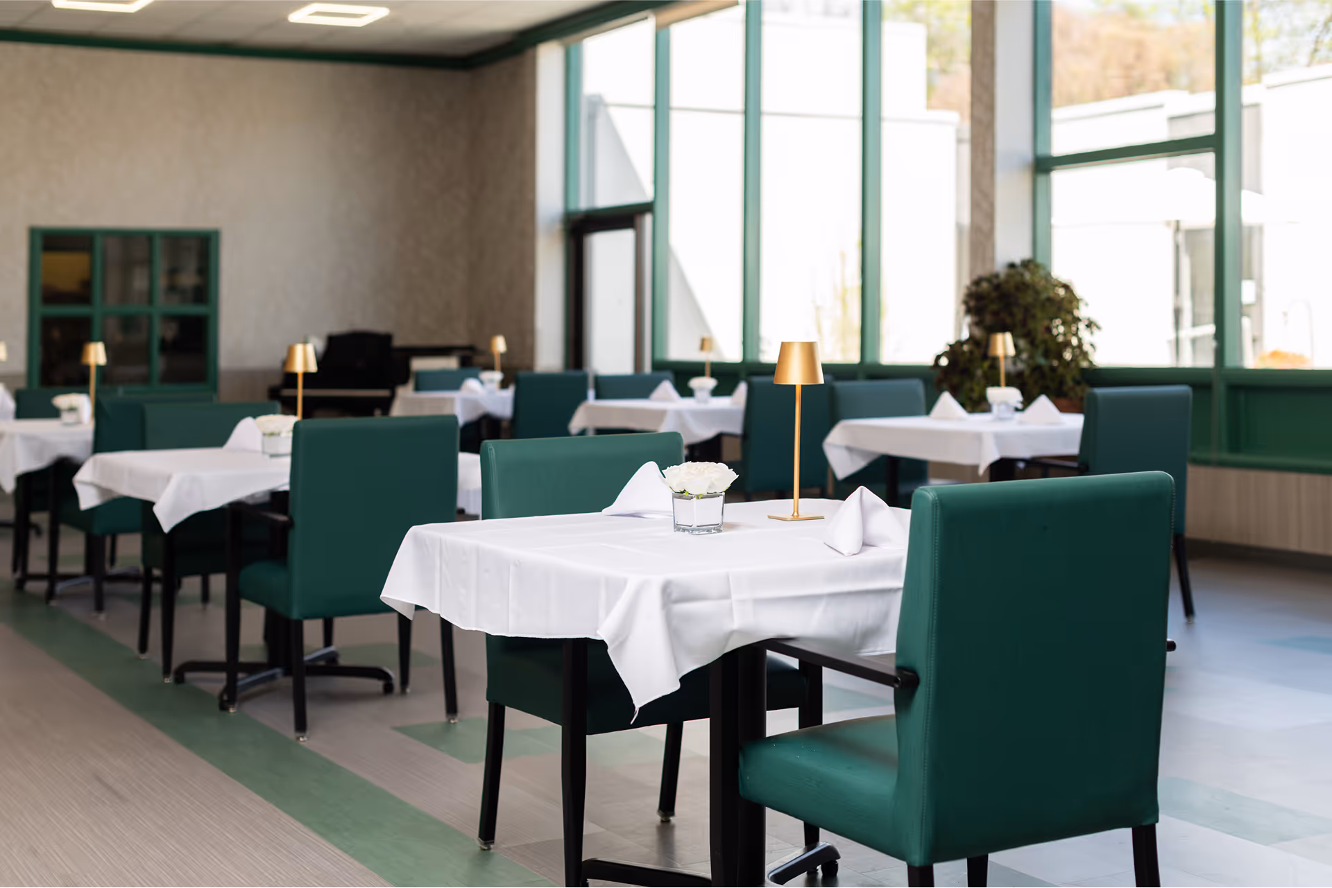
We organized and directed photoshoots at every Prestige facility. Staff. Residents. Hallways and dining rooms. The result is a unified visual library the network now uses across websites, marketing, and community outreach. Original imagery for every location, never stock.
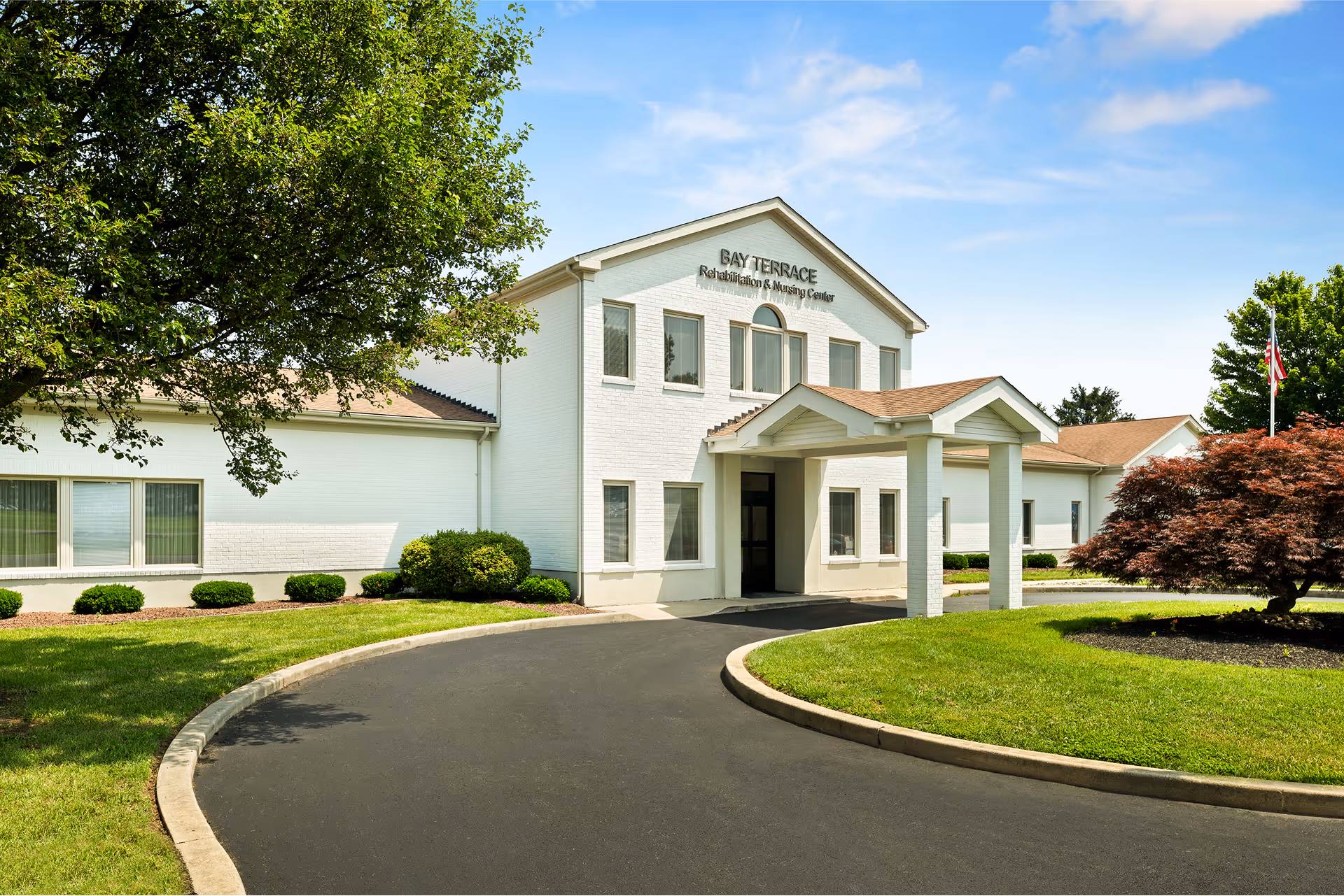
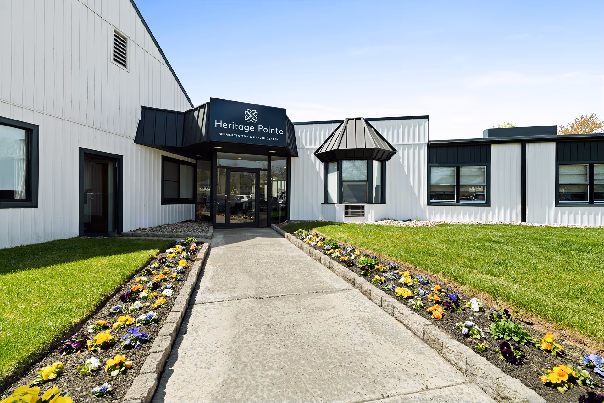
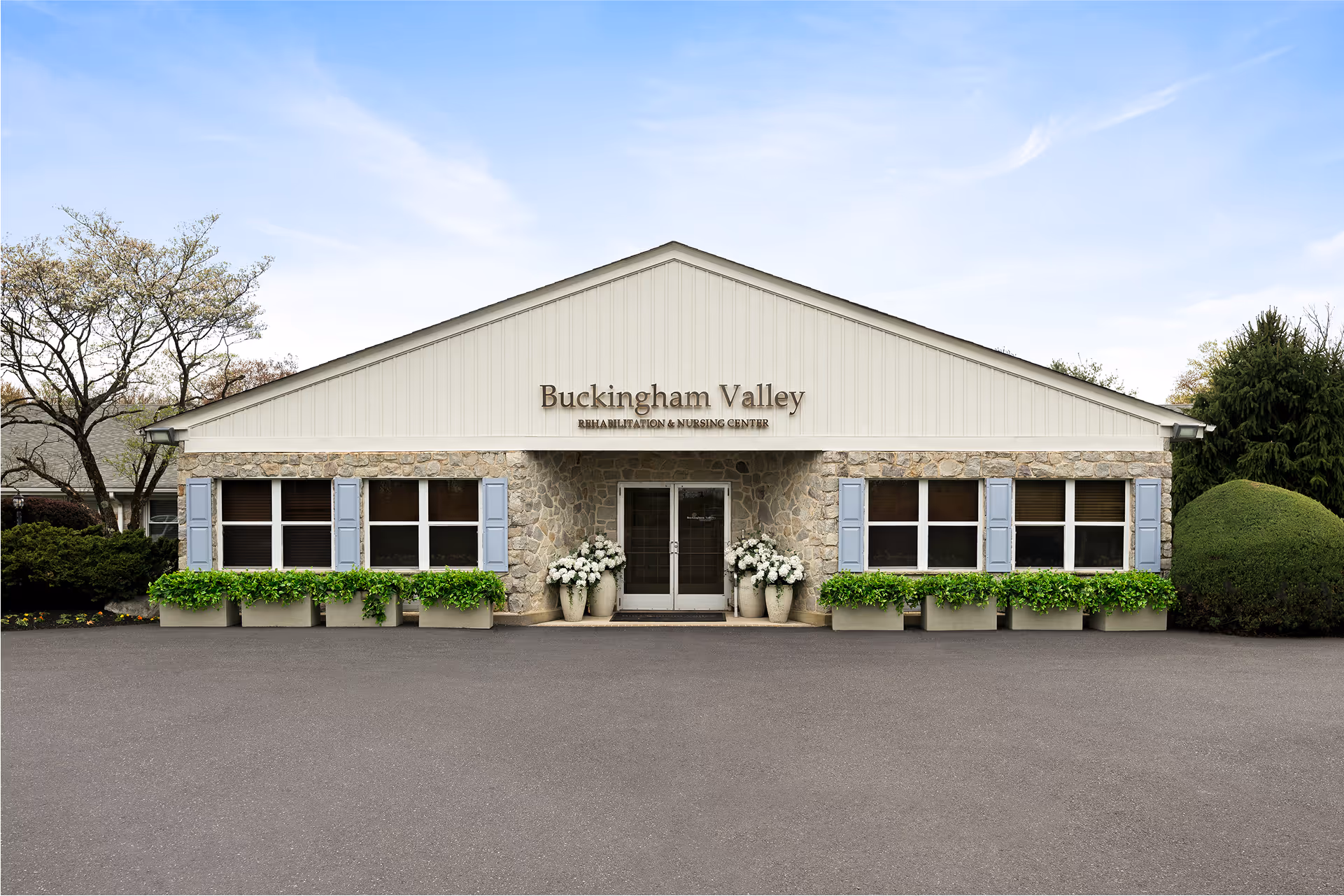
Every Prestige facility now lives on a unified digital platform. Same brand framework, same patterns, same standard of clarity for patients and families. Each site keeps the warmth of its local community while drawing on a shared template that scales with the network.
The reveal was more than a design rollout. It was the moment the network stepped forward as one organization, clinically excellent, warmly human, ready for the next chapter.