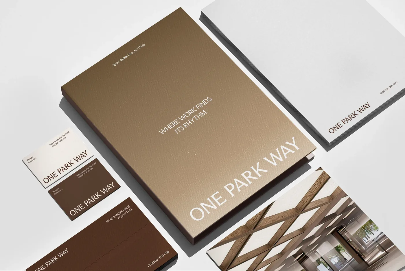
One system,
six identities.
Six healthcare facilities. Six neighborhoods, six staff cultures, six sets of residents. We built a brand architecture that ties them together without erasing what makes each one its own place.
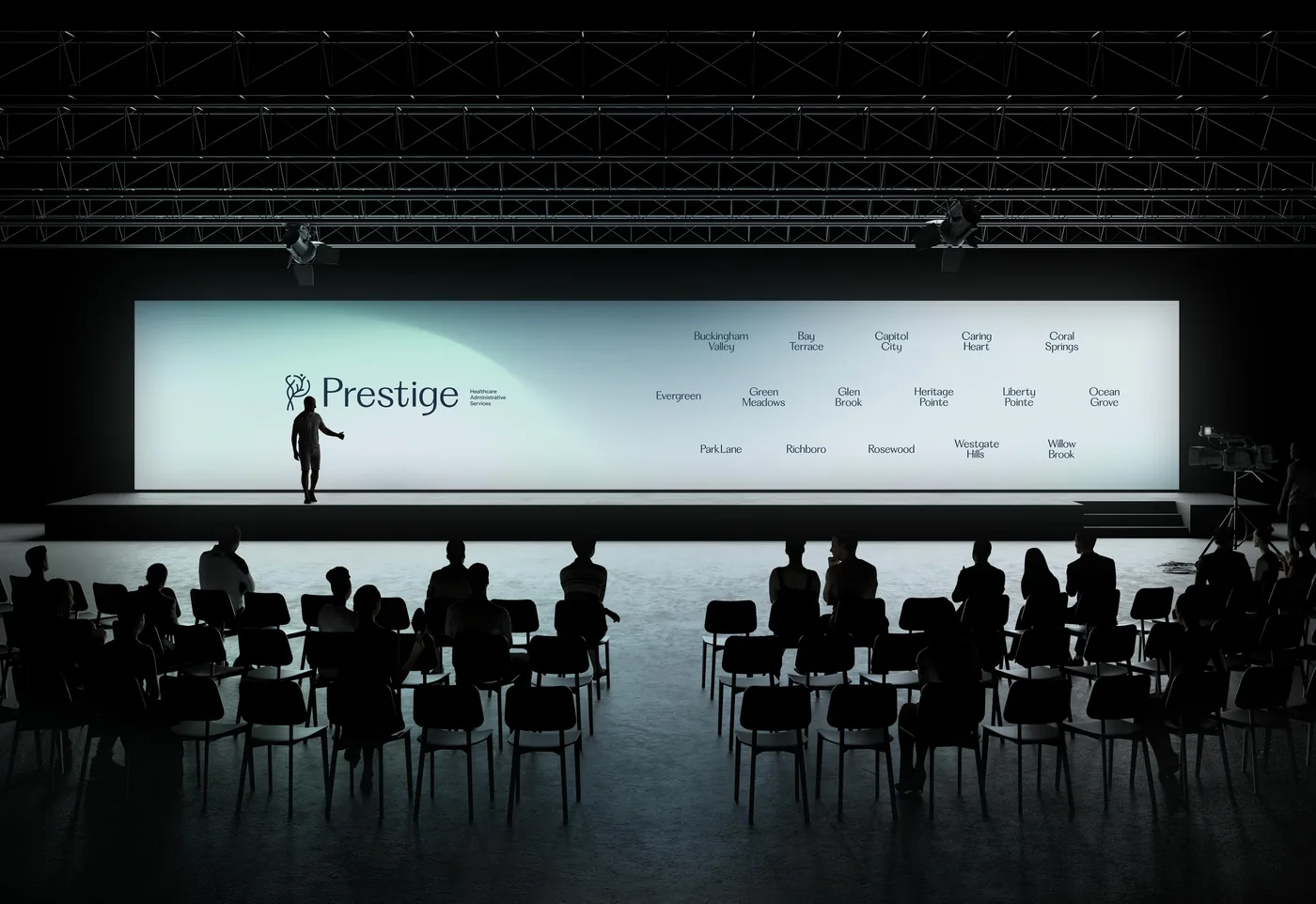
Six independent healthcare facilities, each with its own name, its own neighborhood, and its own history. Each had been built piecemeal over the years: a logo here, a brochure there, signage from whoever was around. The names were good. The places were good. The packaging just didn't say so. That's the multi-location brand problem in its purest form. We were asked to design a system the six could share, and that the next one could join.
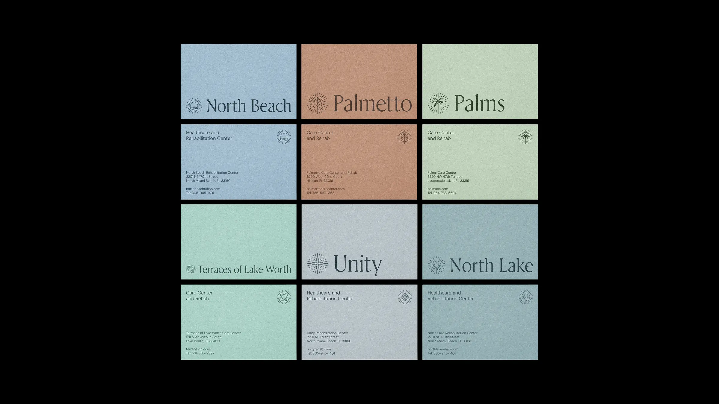
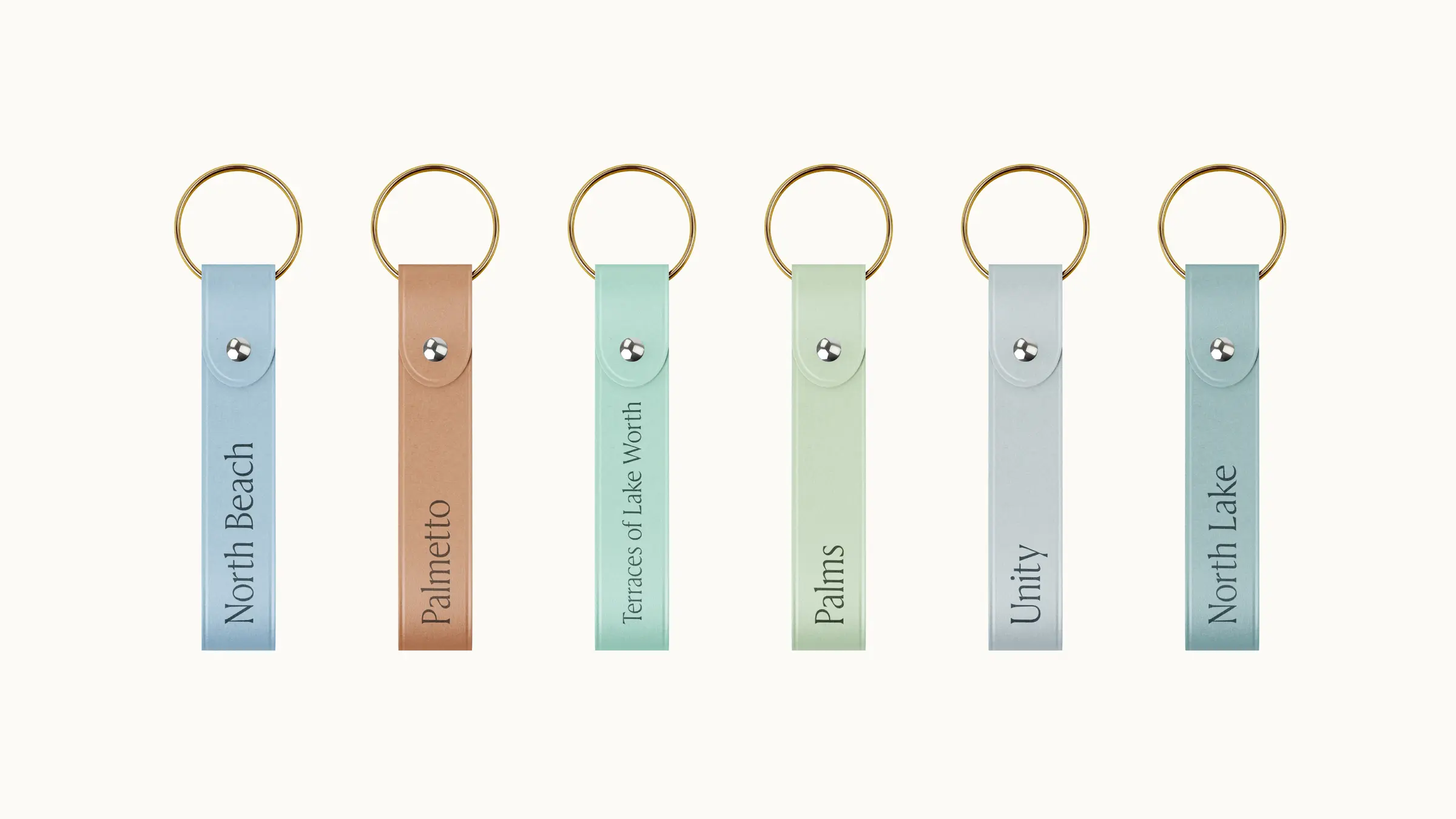
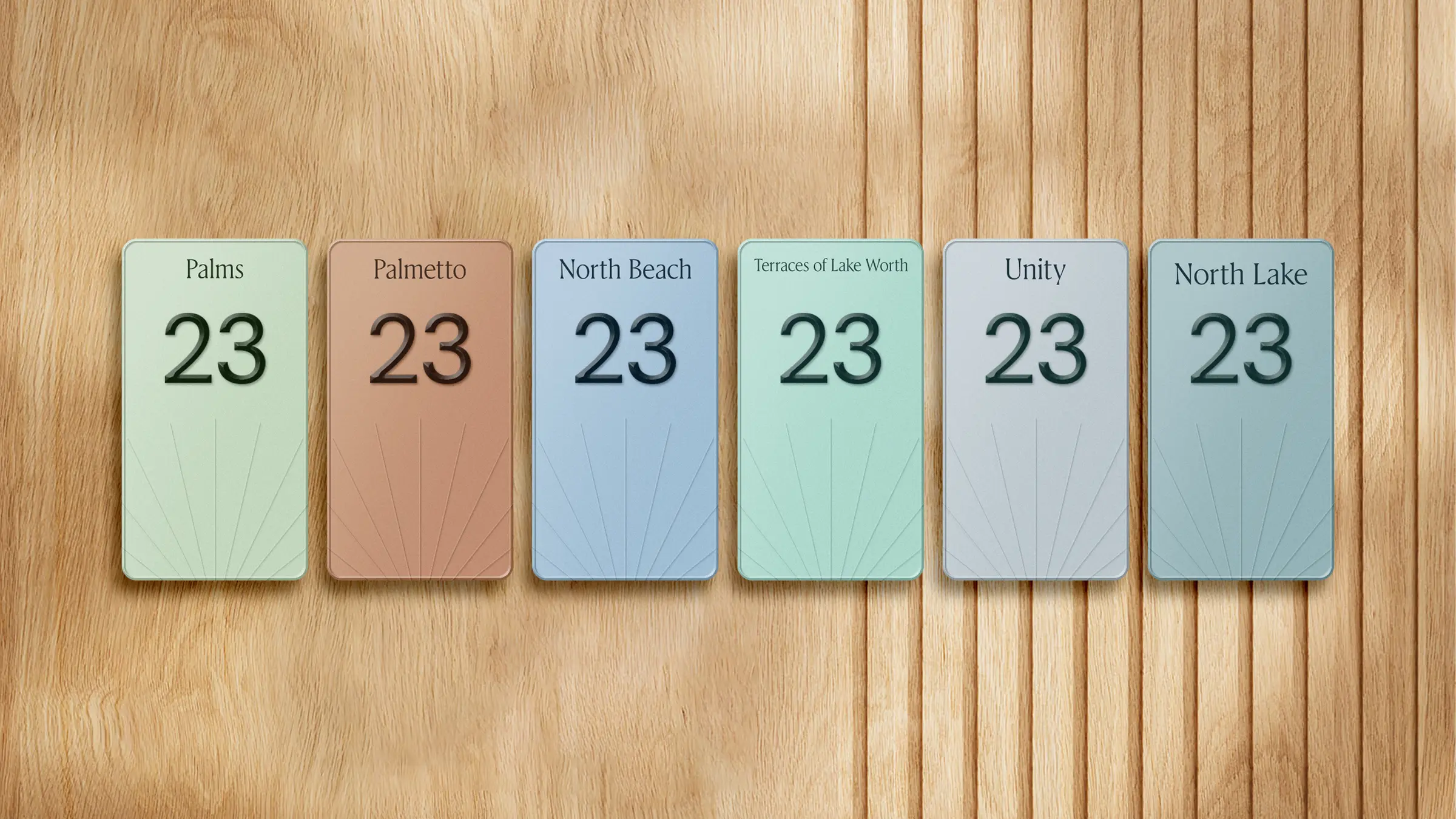
North Beach. Palmetto. Palms.
Terraces. Unity. North Lake.
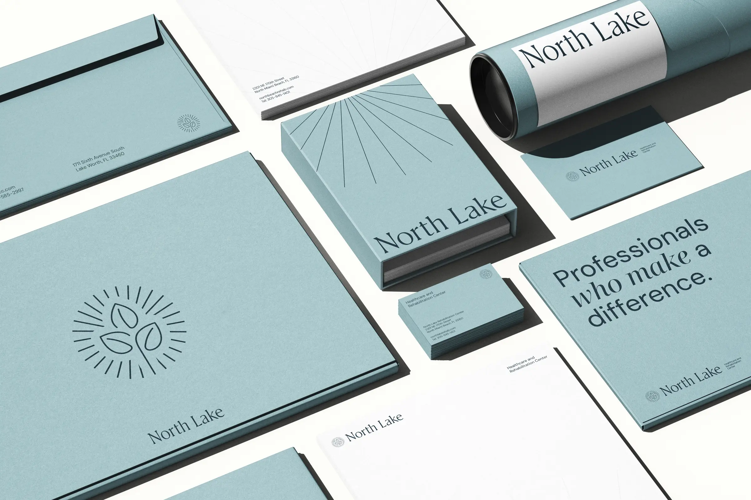
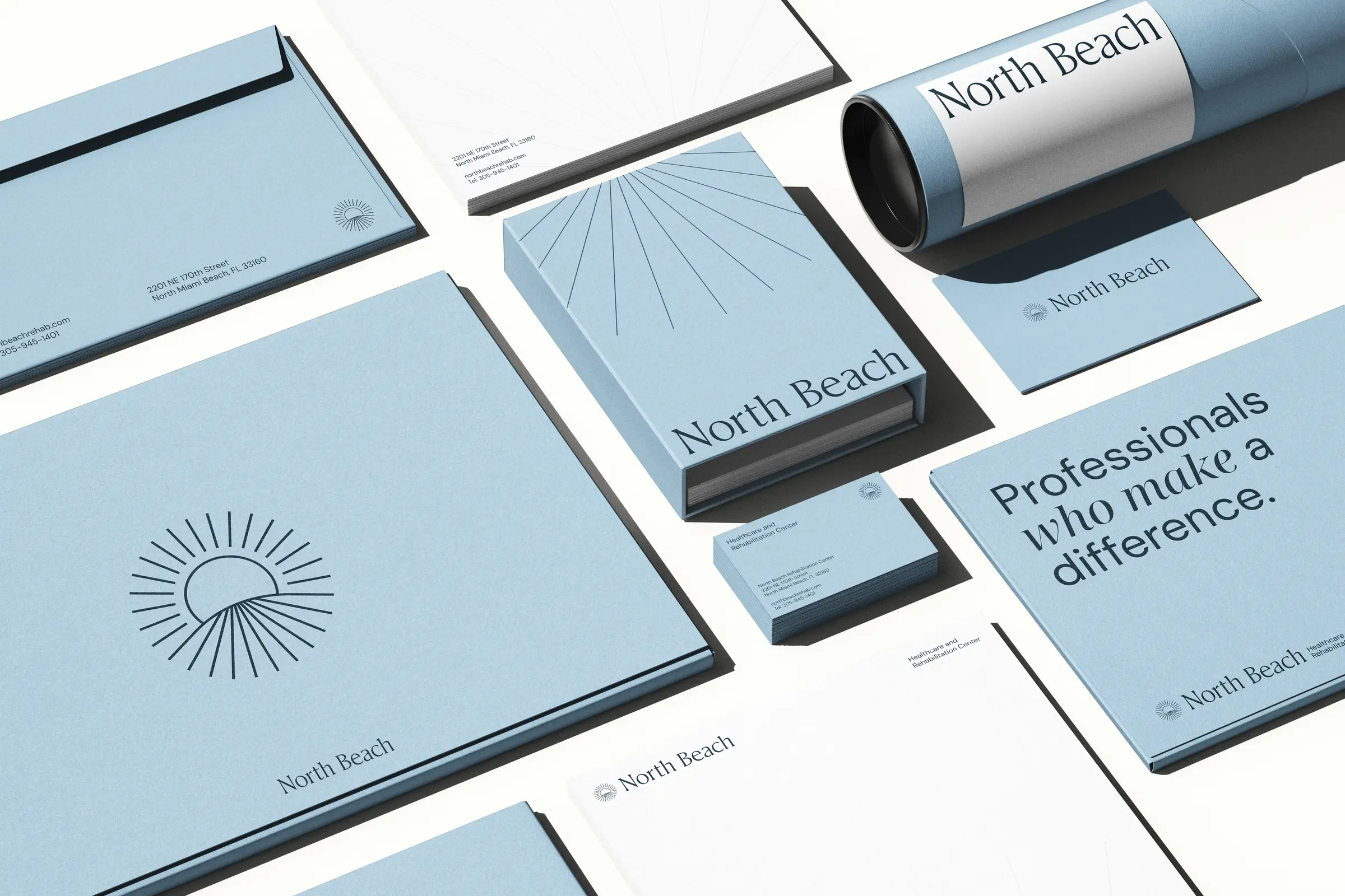
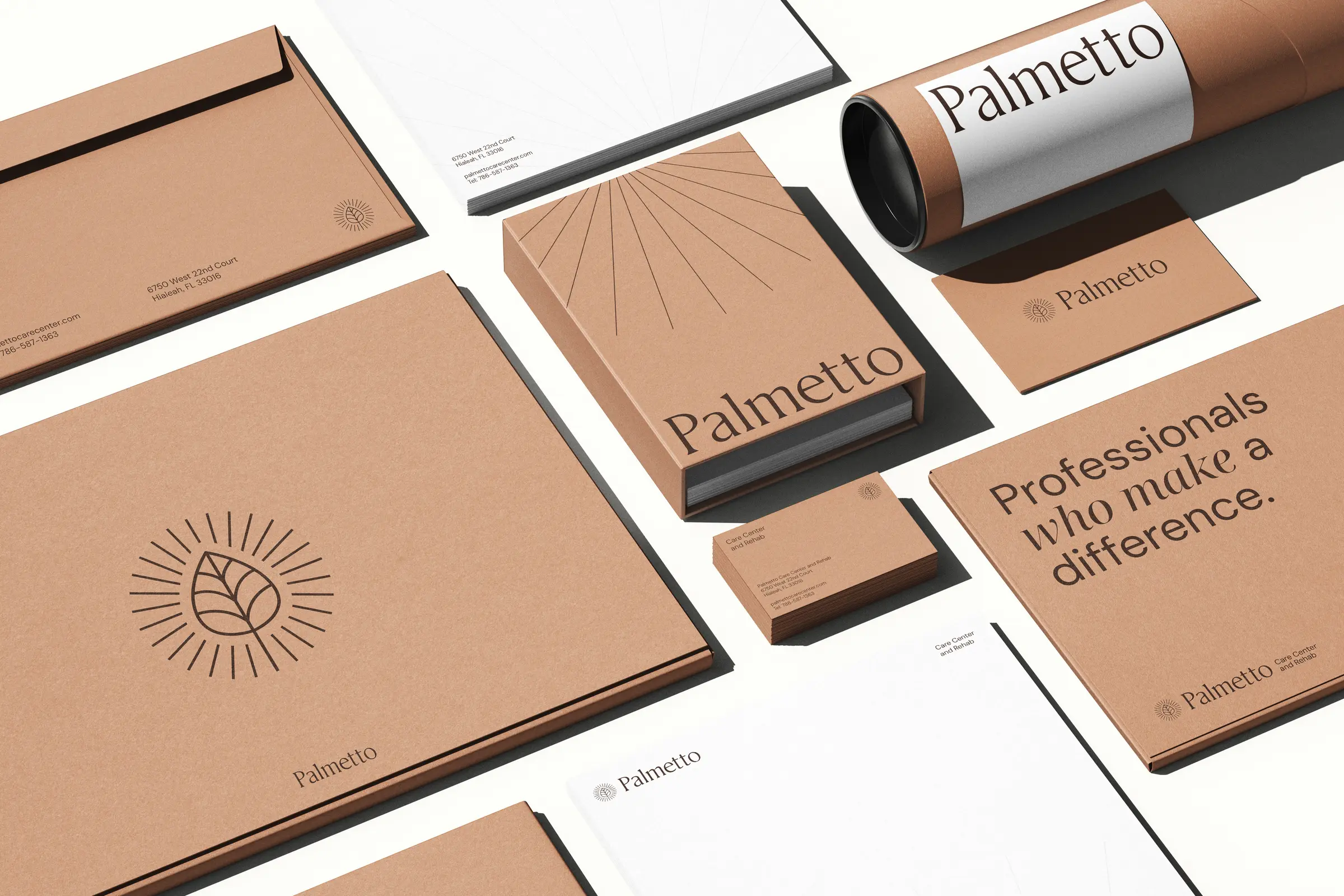
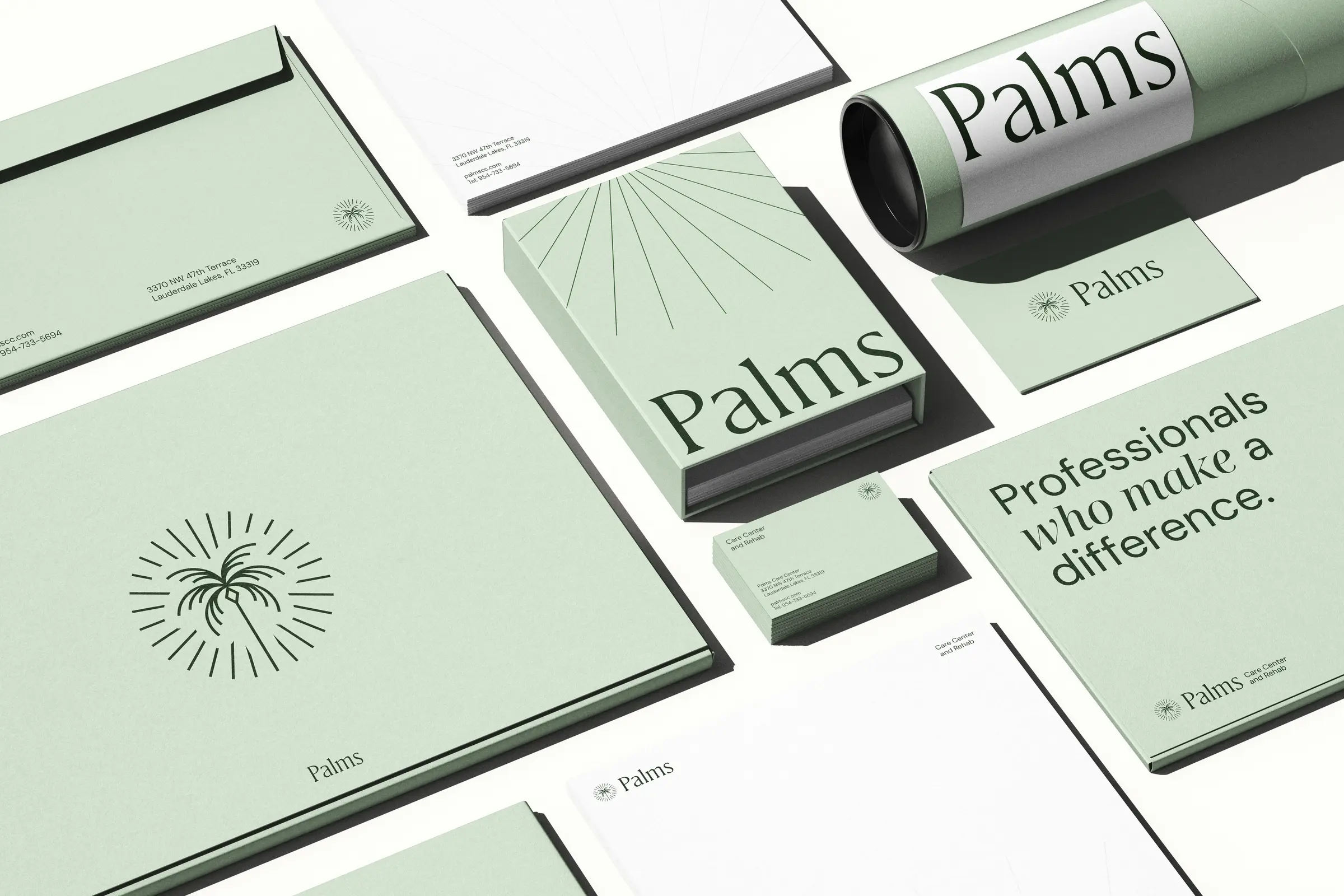
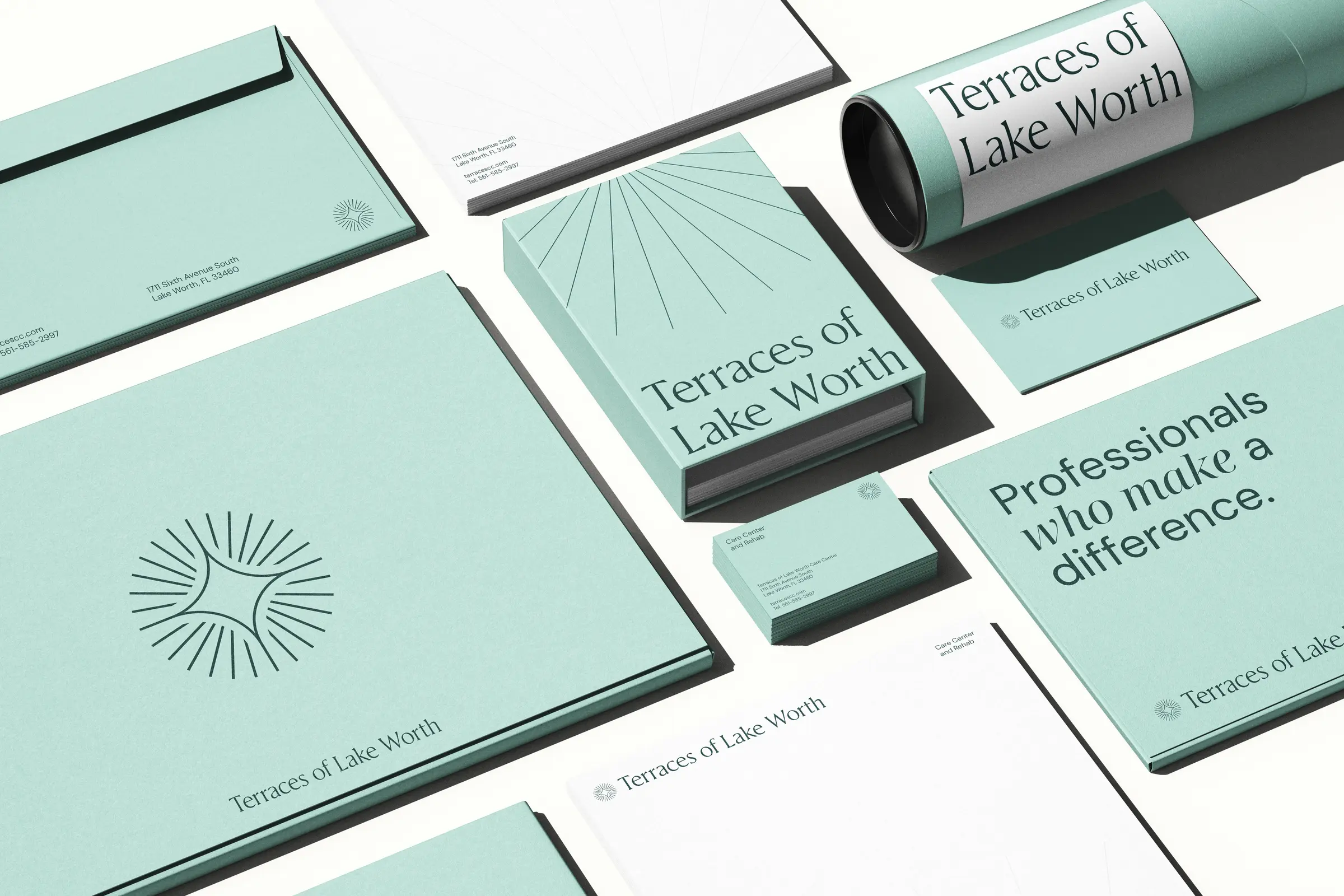
Each facility holds its own color, its own custom symbol, and its own neighborhood. The serif wordmark is shared. The sunrise motif is shared. Everything else flexes.
A motif that
holds the whole.
The sunrise is the through-line. Every facility carries its own variation, framed in rays. North Beach gets the literal sun on the water. Palmetto, a leaf. Palms, a tree. Terraces, a star. Unity, a bloom. North Lake, a sprout. Same posture, different subject.
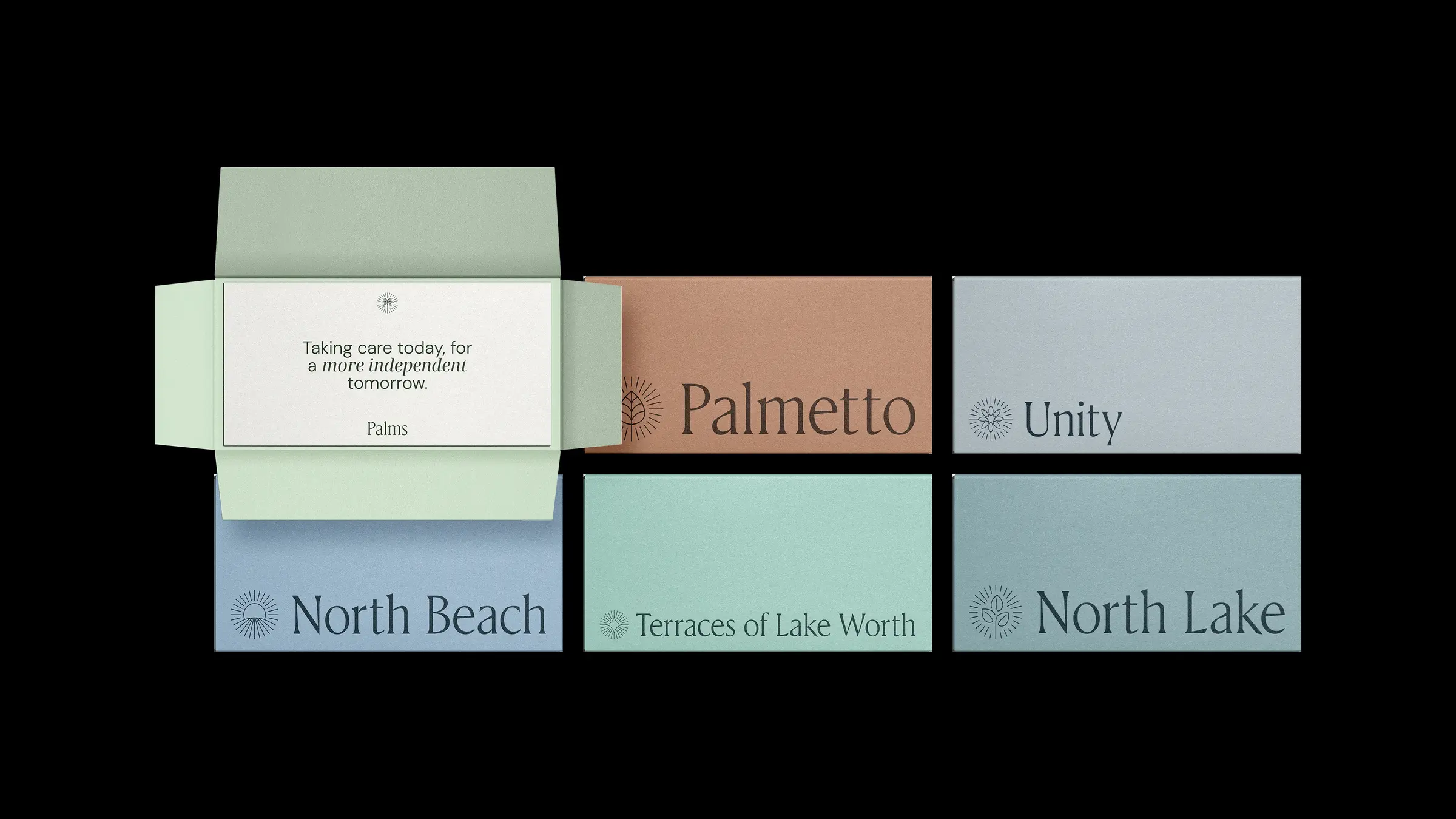
Six full kits.
One quiet rulebook.
Letterhead, envelopes, business cards, tubes, folders. Each facility ships with a complete suite in its own palette. The grid behind every layout is identical. The light behind every cover is the same sunrise.
Down to
the room number.
The system has to hold when you see it from the hallway, not the brand book. Room markers carry the facility color, the facility mark, and the same serif numeral. A resident walking back to room 23 sees the brand at eye level, every time.
A real brand architecture isn't a logo lockup. It's the rule that lets a seventh facility join next year and look like it always belonged.