The wings
Two strokes rise like wings mid-flight. Caring Higher, drawn as a shape before it is read as words.
Vivo Healthcare runs 18 skilled nursing and rehabilitation centers across Florida. We built the new brand around one mission, Caring Higher, and carried it through the mark, 18 center logotypes, print, signage, merch, social, the website, and the film that introduced it.
Vivo Healthcare operates 18 skilled nursing and rehabilitation centers across Florida, from Jacksonville down through Tampa Bay to the Treasure Coast. Long-term care, short-term rehab, secured memory care, hospice and respite, under one name.
The group was also opening Taylor, its first premium-tier community, in Jacksonville. A new tier of building needed a parent brand that could stand next to it.
Give 18 centers one identity that reads as a family without erasing the town on each front door. And do it around something truer than a color change. The brief came down to a few requirements:
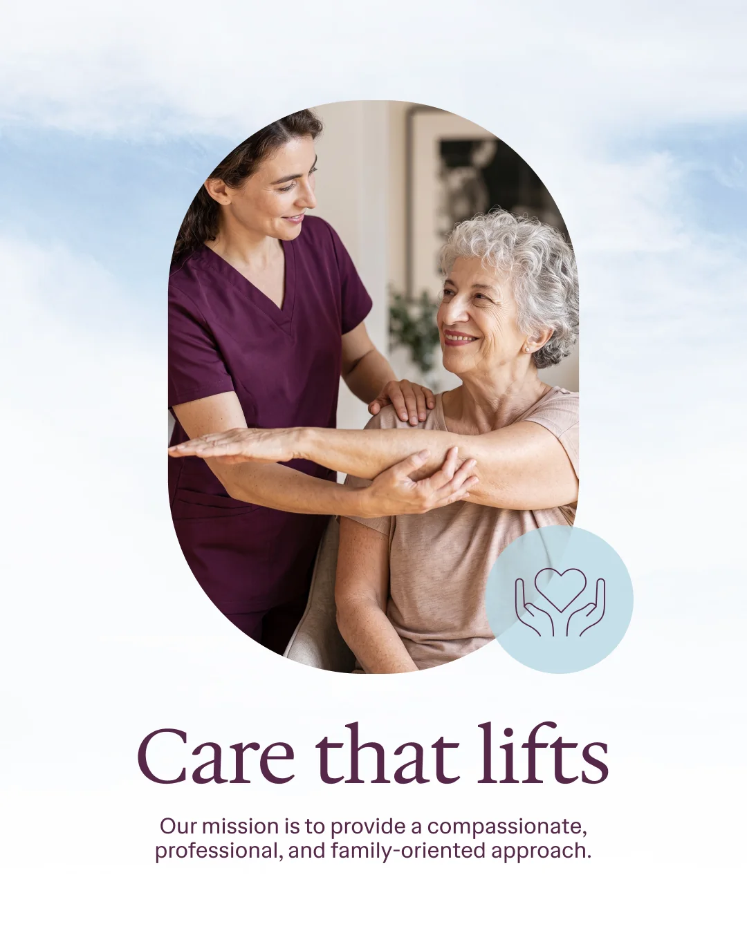
Two words, and the whole brand hangs on them. Care in a skilled nursing setting is physical. Someone is lifted out of a bed, steadied on a walker, helped back up to standing. The brand takes that literal lift and makes it the promise.
Every piece that follows, from the mark to the door tags to the film, is built to point up.

The tagline explains the logo. Two wings lift a figure upward, and a ring of people closes around them. It holds in one color, reversed, at building scale, and down at the size of a pen clip.

Two strokes rise like wings mid-flight. Caring Higher, drawn as a shape before it is read as words.
Between the wings, a person carried upward. The resident sits at the center of the mark, the way they sit at the center of the work.
The circle around them is the team. Nursing, therapy, operations, and family, closing ranks around one person.

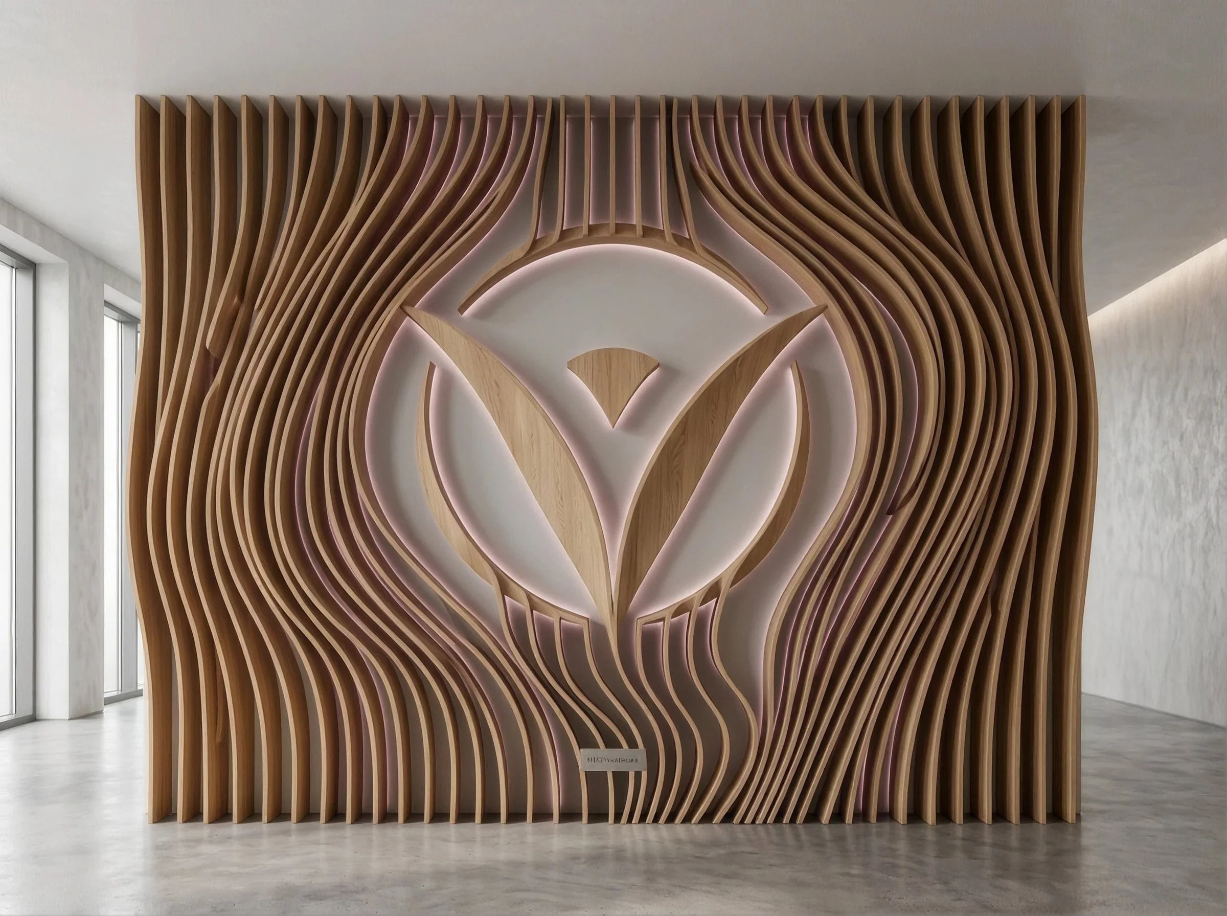
Each center leads with its own name, set in the brand serif, with the Vivo symbol in front and the parent wordmark tucked behind. A family in Sebring sees Sebring. A discharge planner in Tampa sees Vivo. Both are right.


Two purples carry the weight: one close to black for the anchor, one warmer for the voice. Around them, a wash of soft blue, beige, and white. Purple is rare in this category, which is the point. Nobody mistakes a Vivo brochure for the one next to it.
Hedvig Letters Serif for headlines and center names, Hedvig Letters Sans for everything a family has to read quickly. Same designer, same skeleton, so a brochure cover and a medication card feel like they came from the same building.
A B C D E F G H I J K L M N O P Q R S T U V W X Y Z
a b c d e f g h i j k l m n o p q r s t u v w x y z
A quiet, bookish serif. It gives Caring Higher and the 18 center names a settled, trustworthy weight.
A B C D E F G H I J K L M N O P Q R S T U V W X Y Z
a b c d e f g h i j k l m n o p q r s t u v w x y z
Open and even. Service lists, wayfinding, contact details, and the website all set in it.
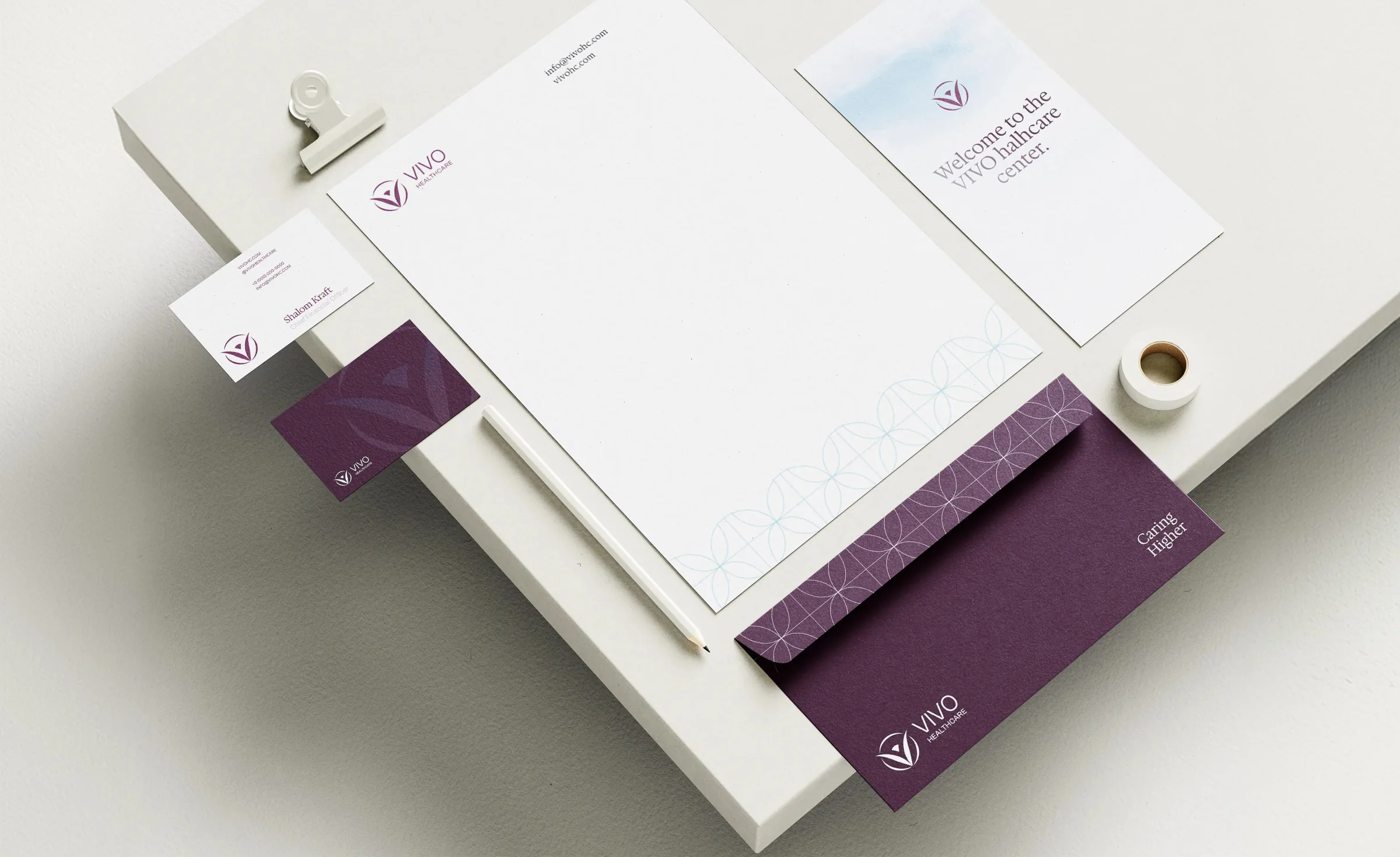
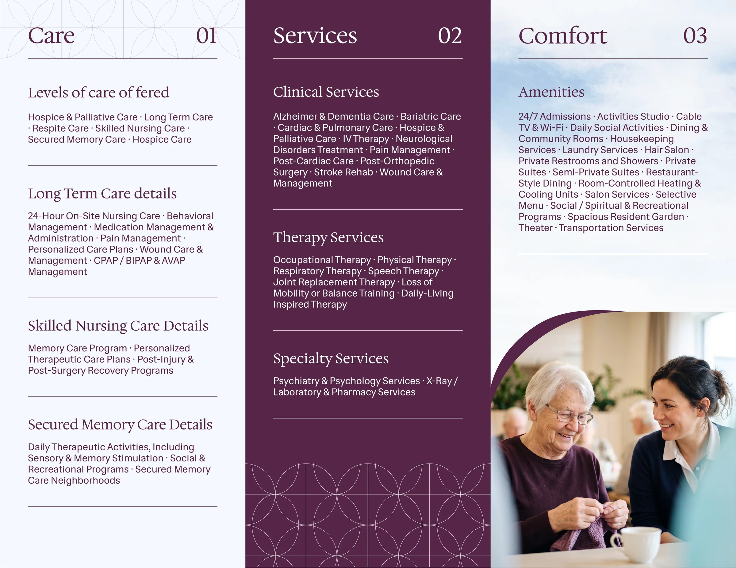
Business cards, letterhead, envelopes, admissions folders, and a trifold brochure for every center. Each trifold carries the same three panels, Care, Services, Comfort, with the center's own address, phone, and QR code. The lattice pattern, drawn from the ring of the mark, runs under all of it.
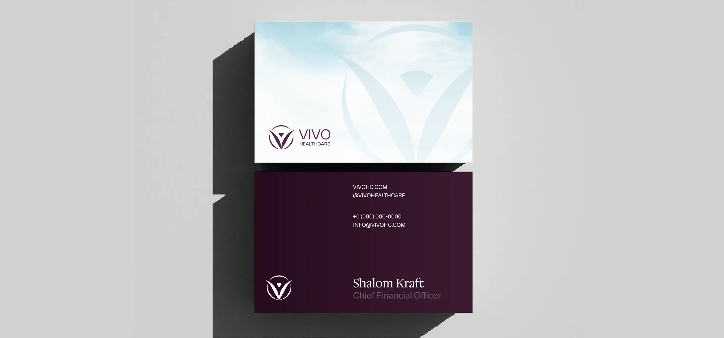
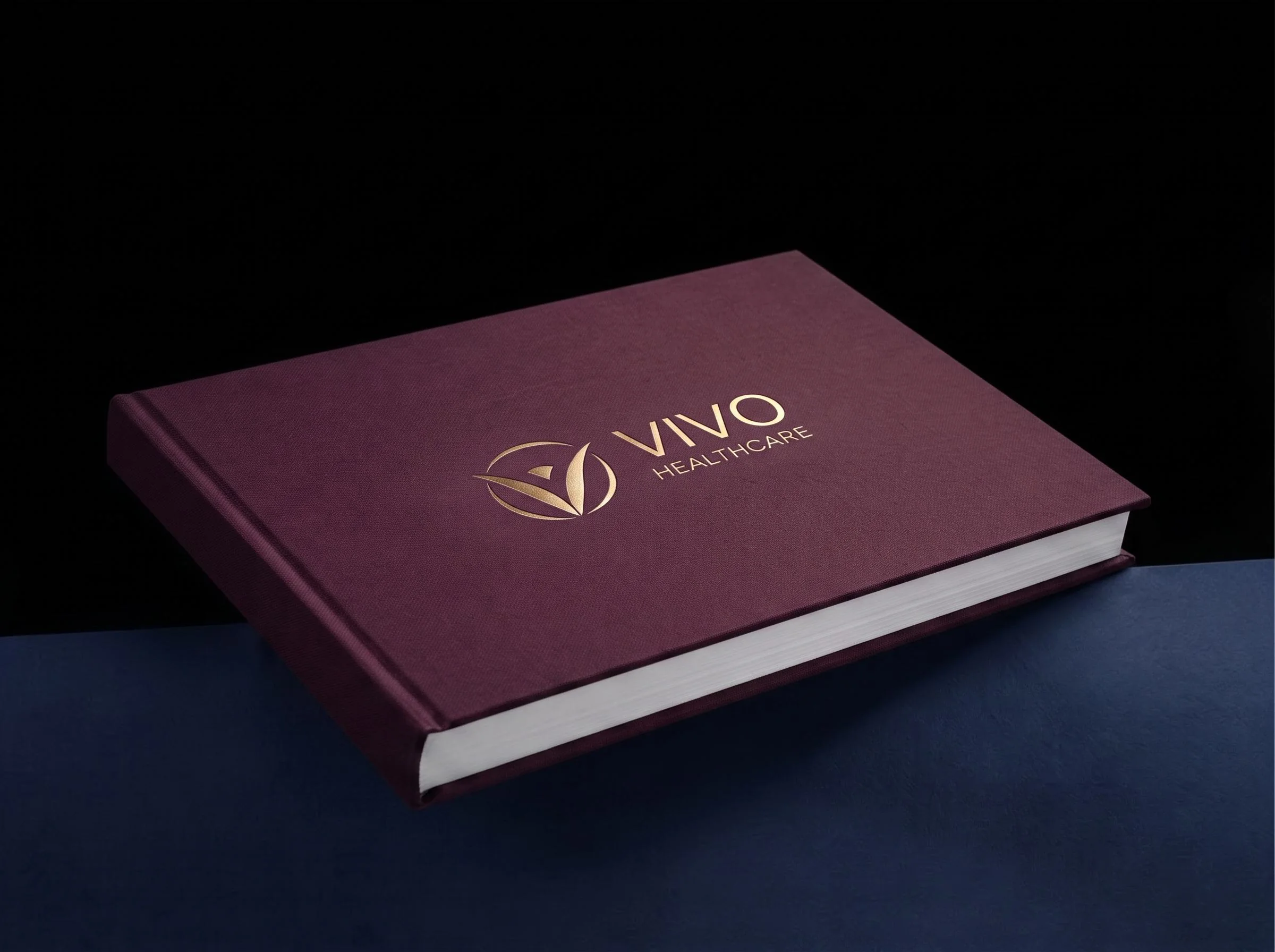
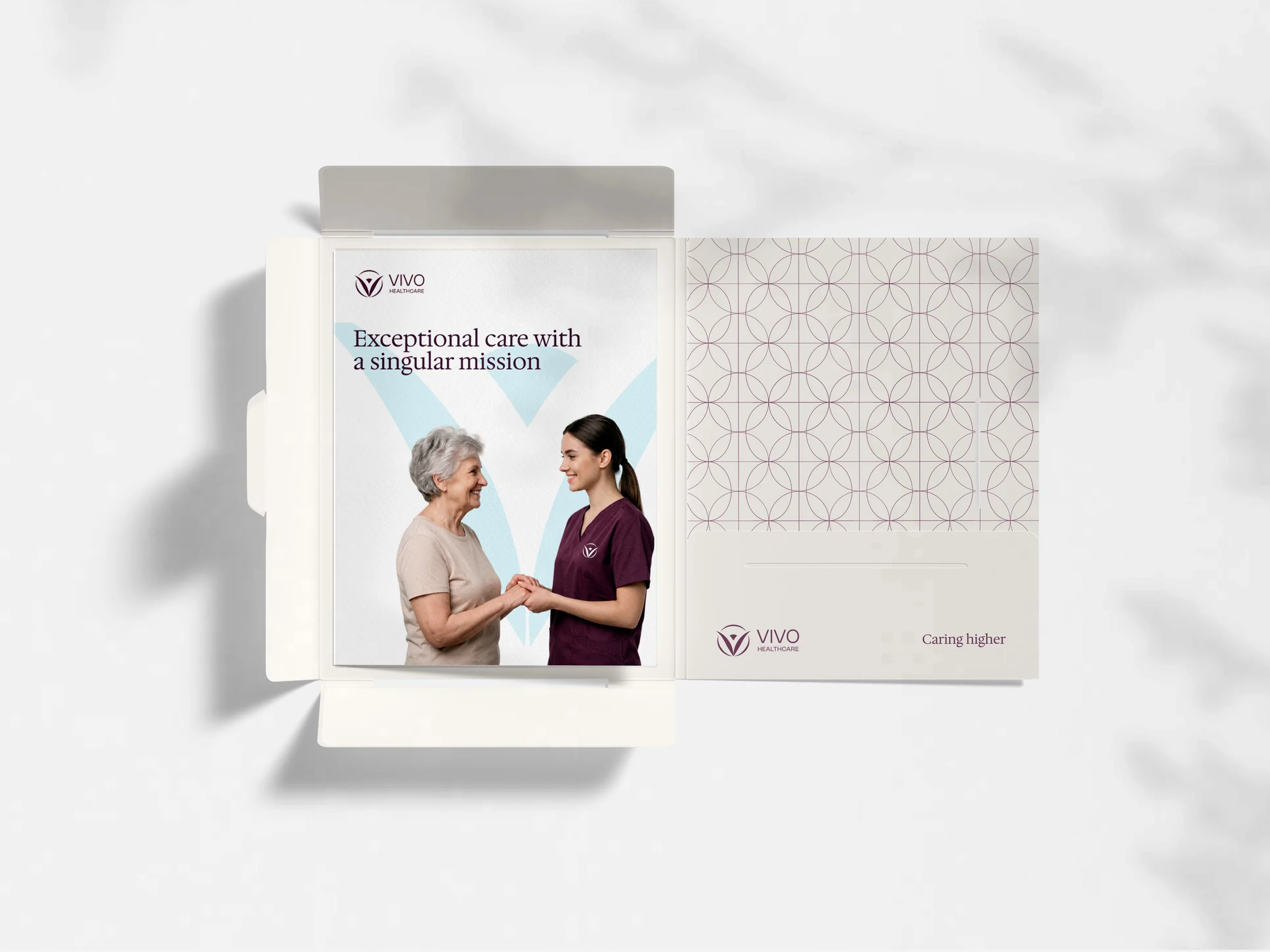
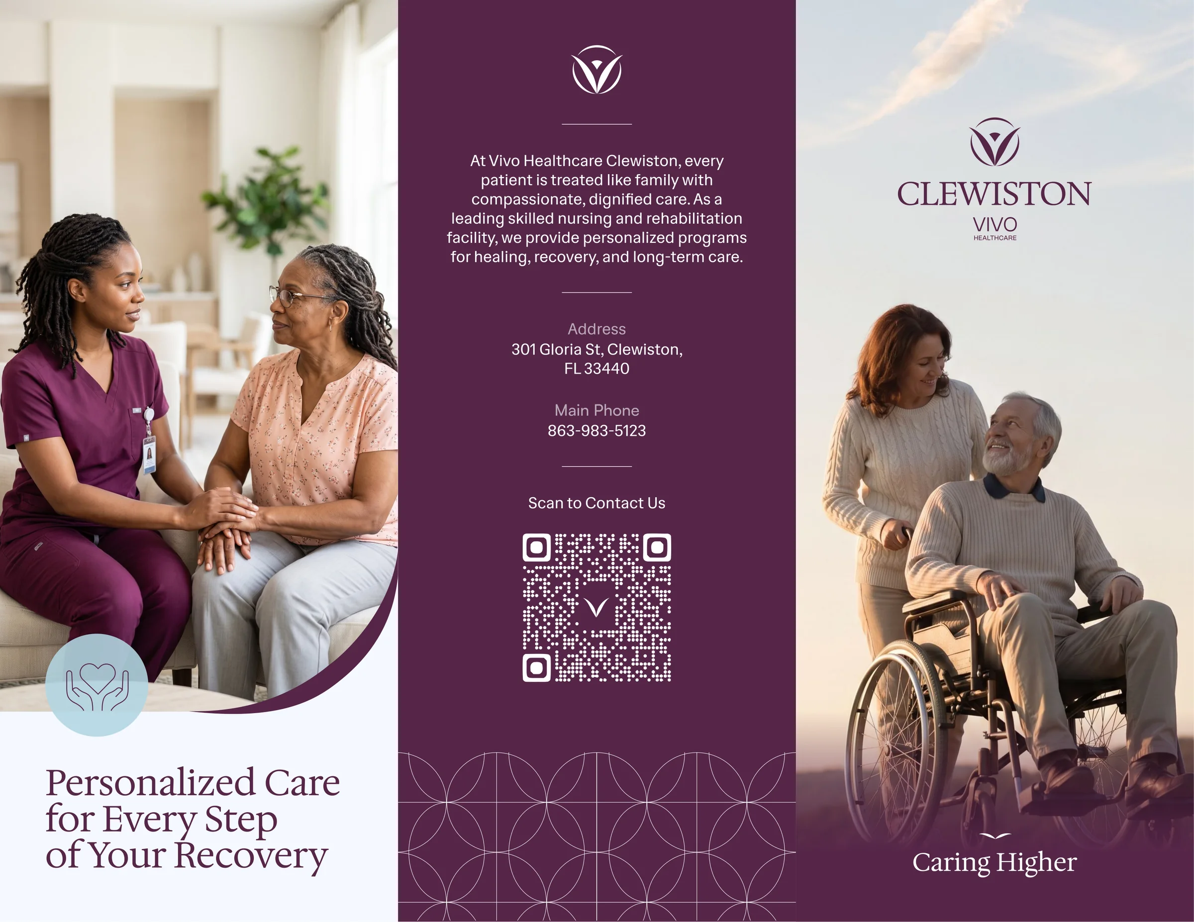
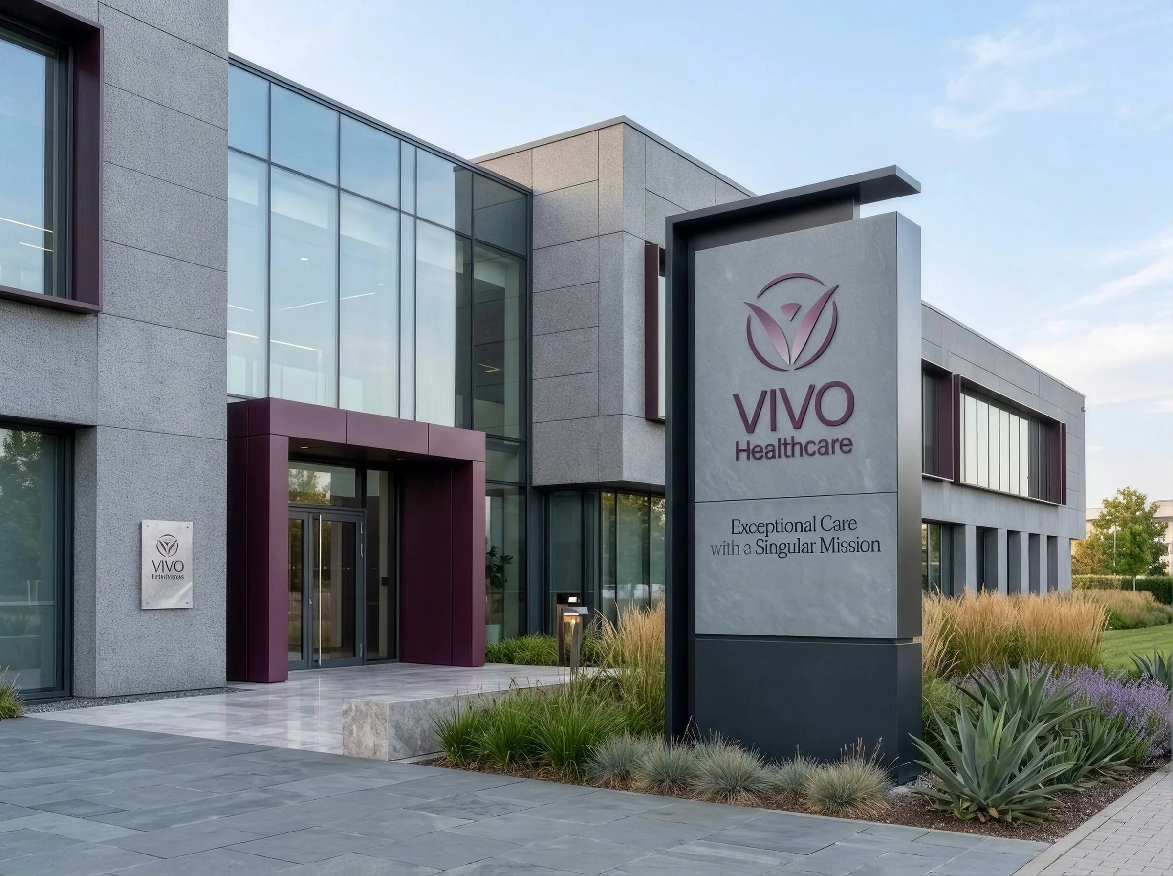
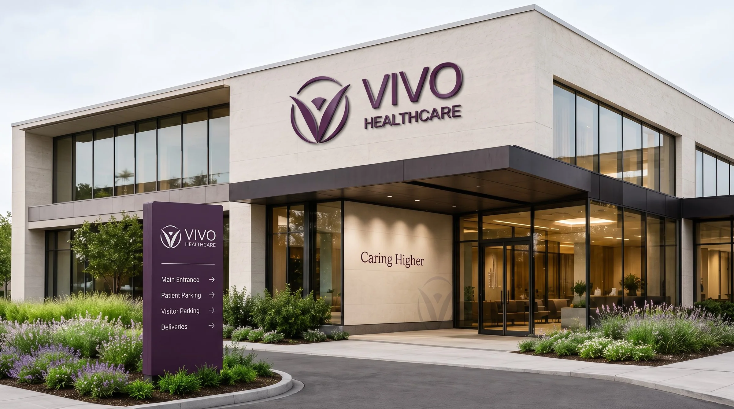
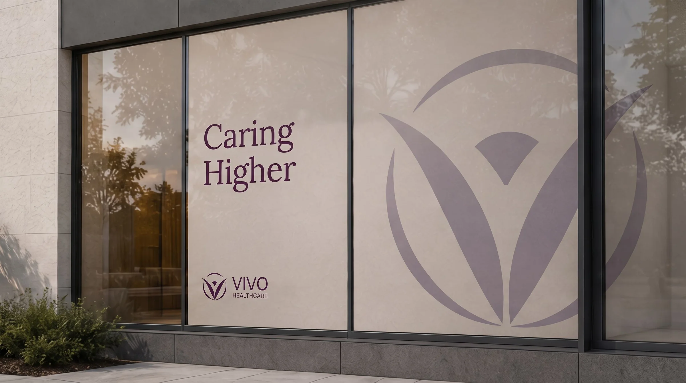
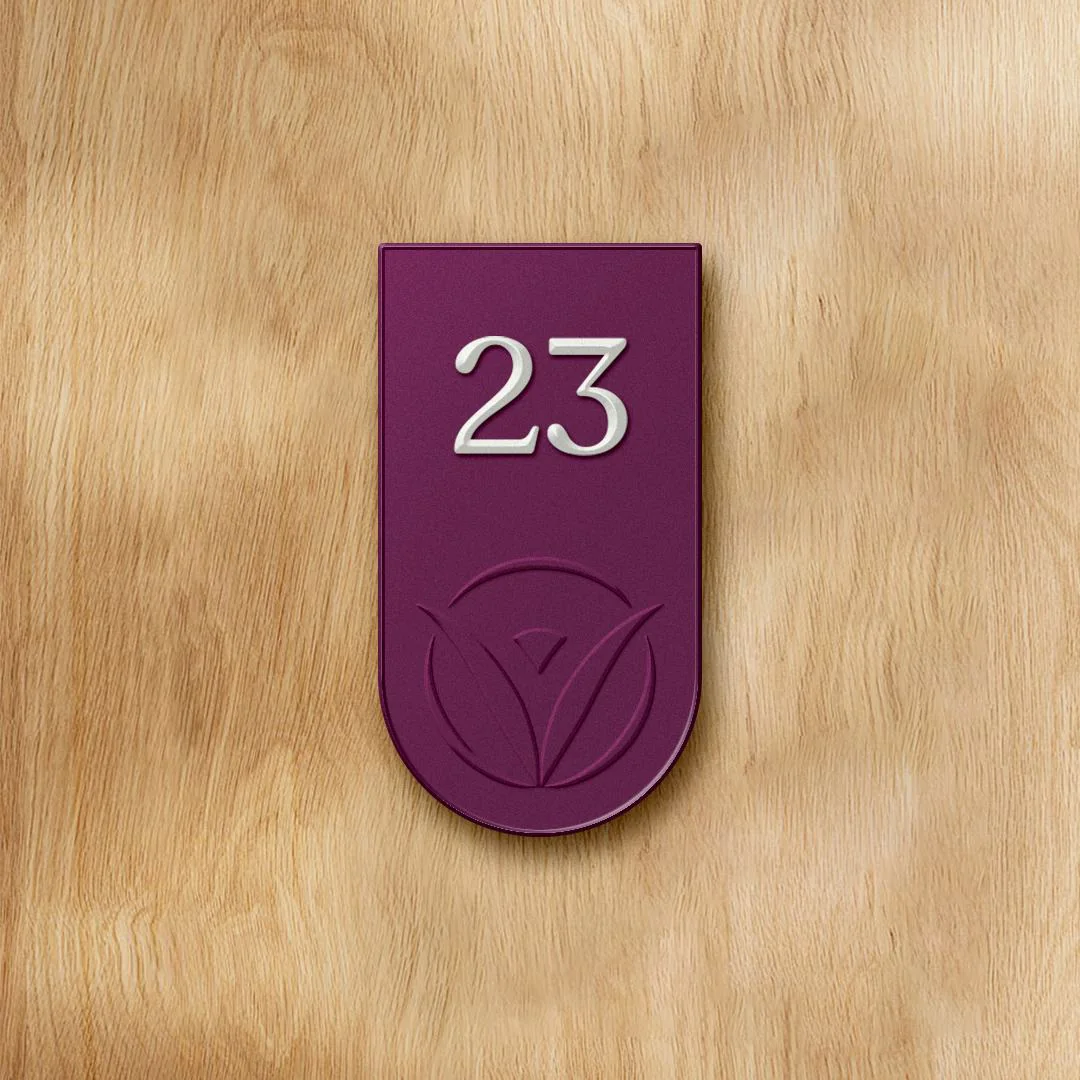
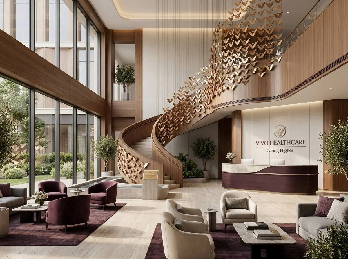
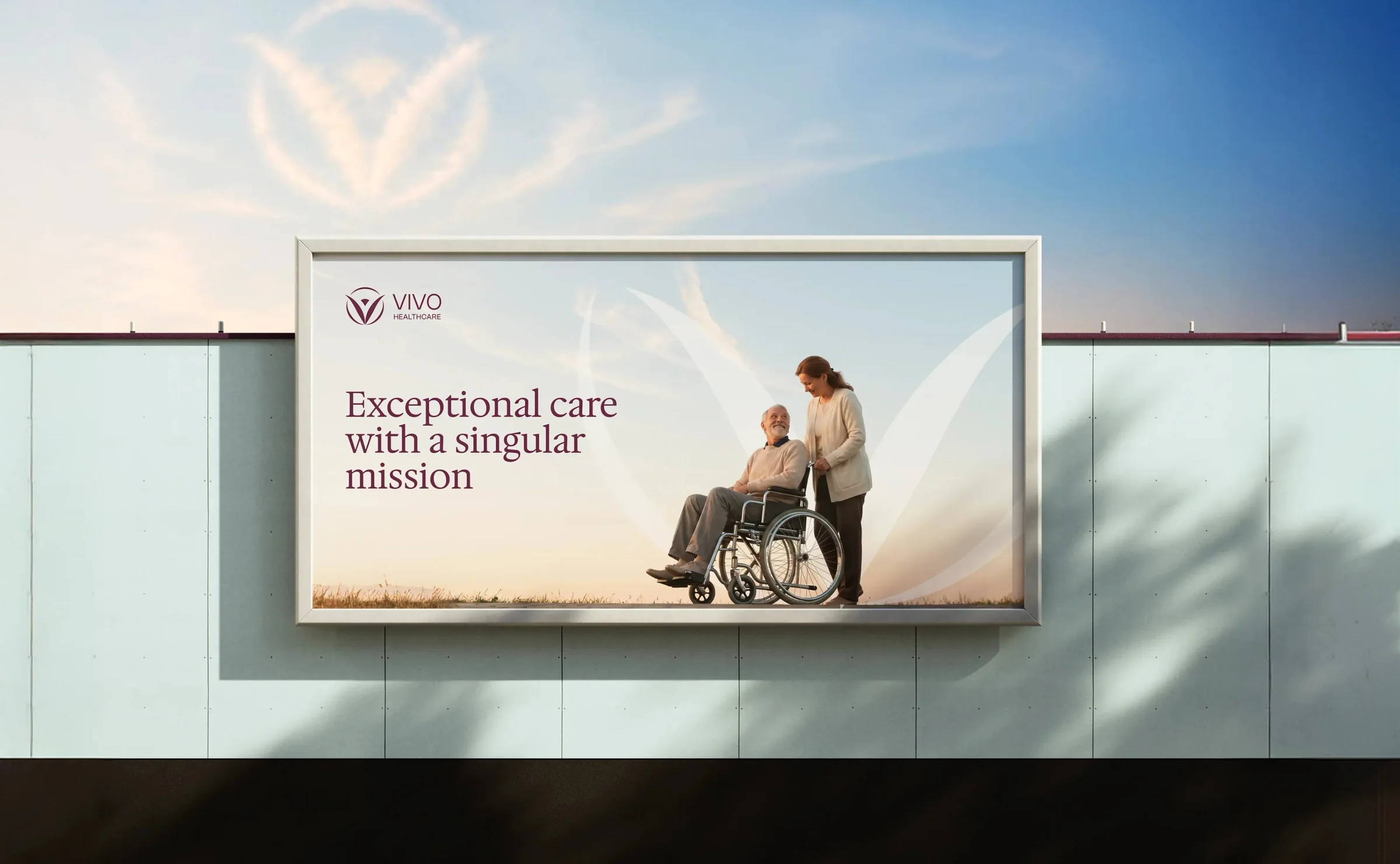
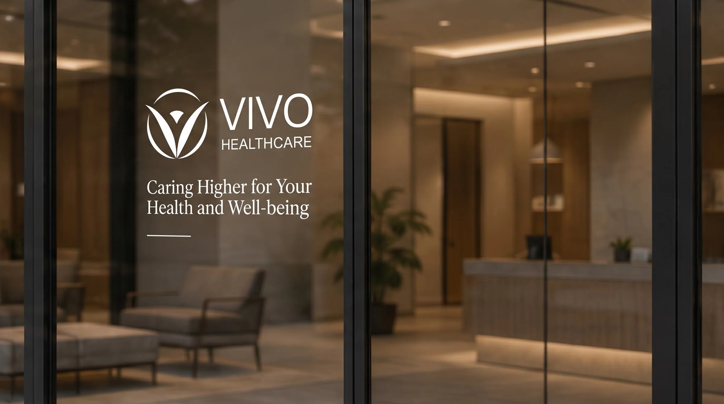
Building letters, a monument at the entry, Caring Higher etched on the glass, and a purple door tag on every suite. The mark has to land from across a parking lot and still feel gentle at a bedside door.
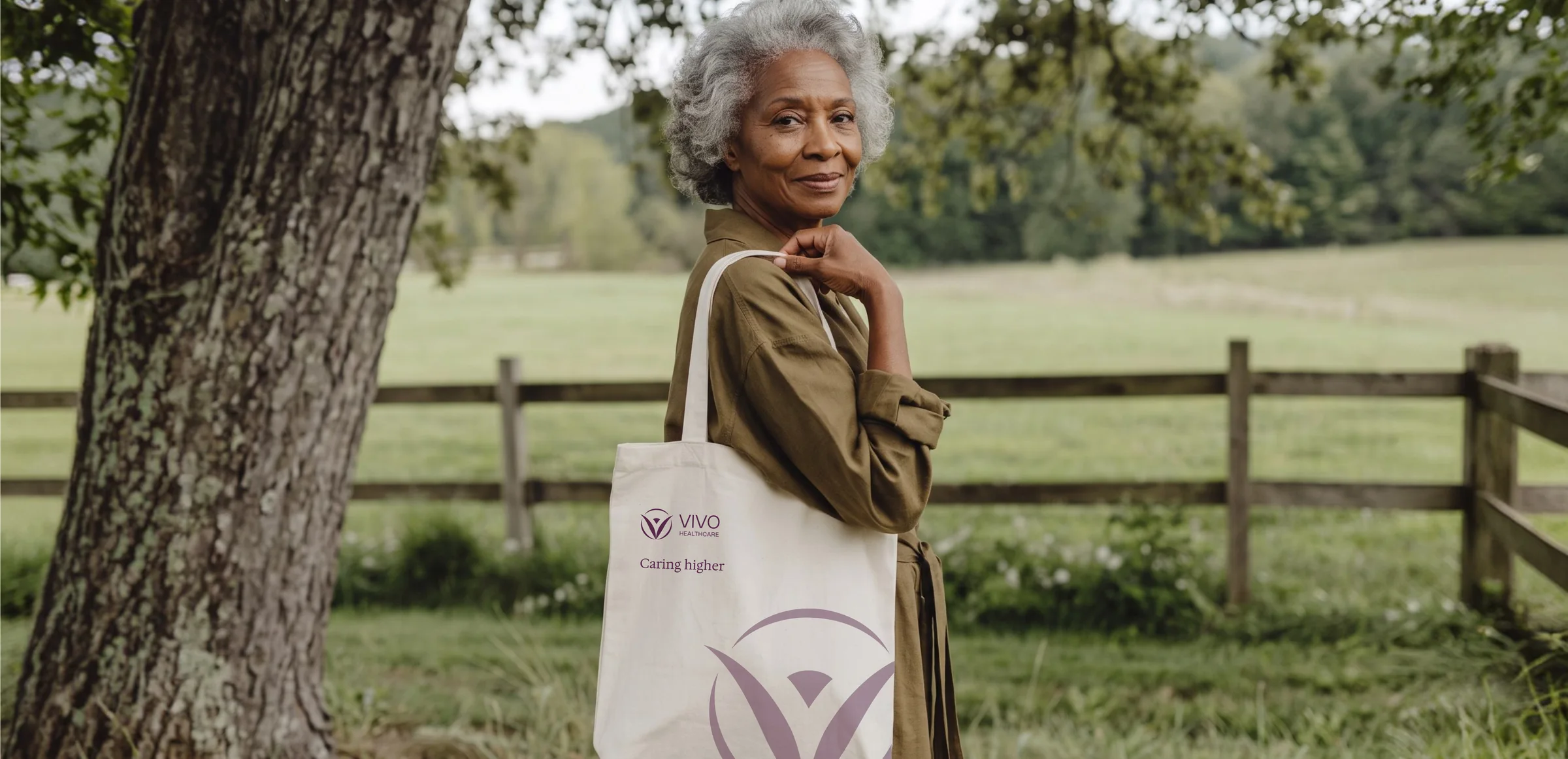
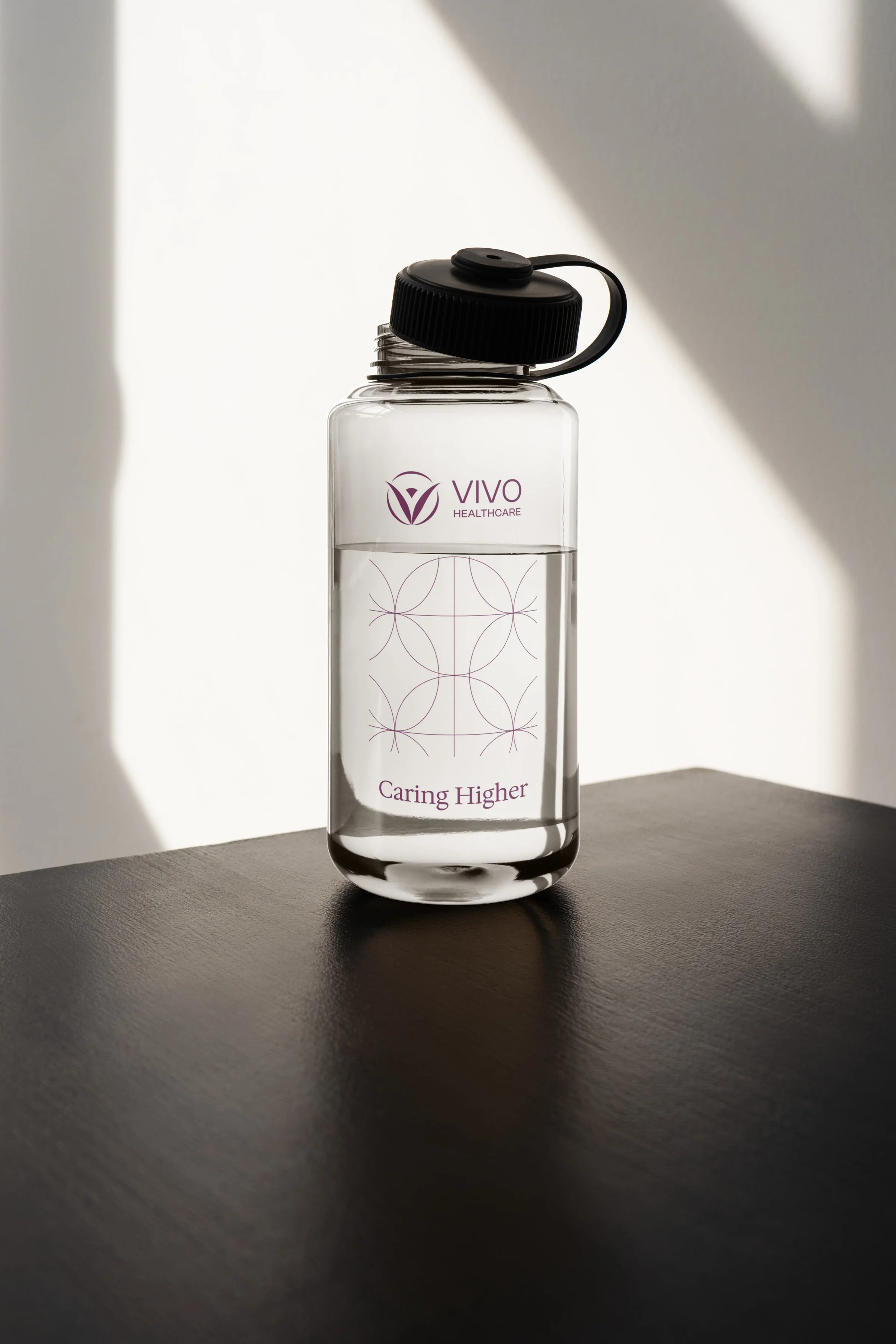
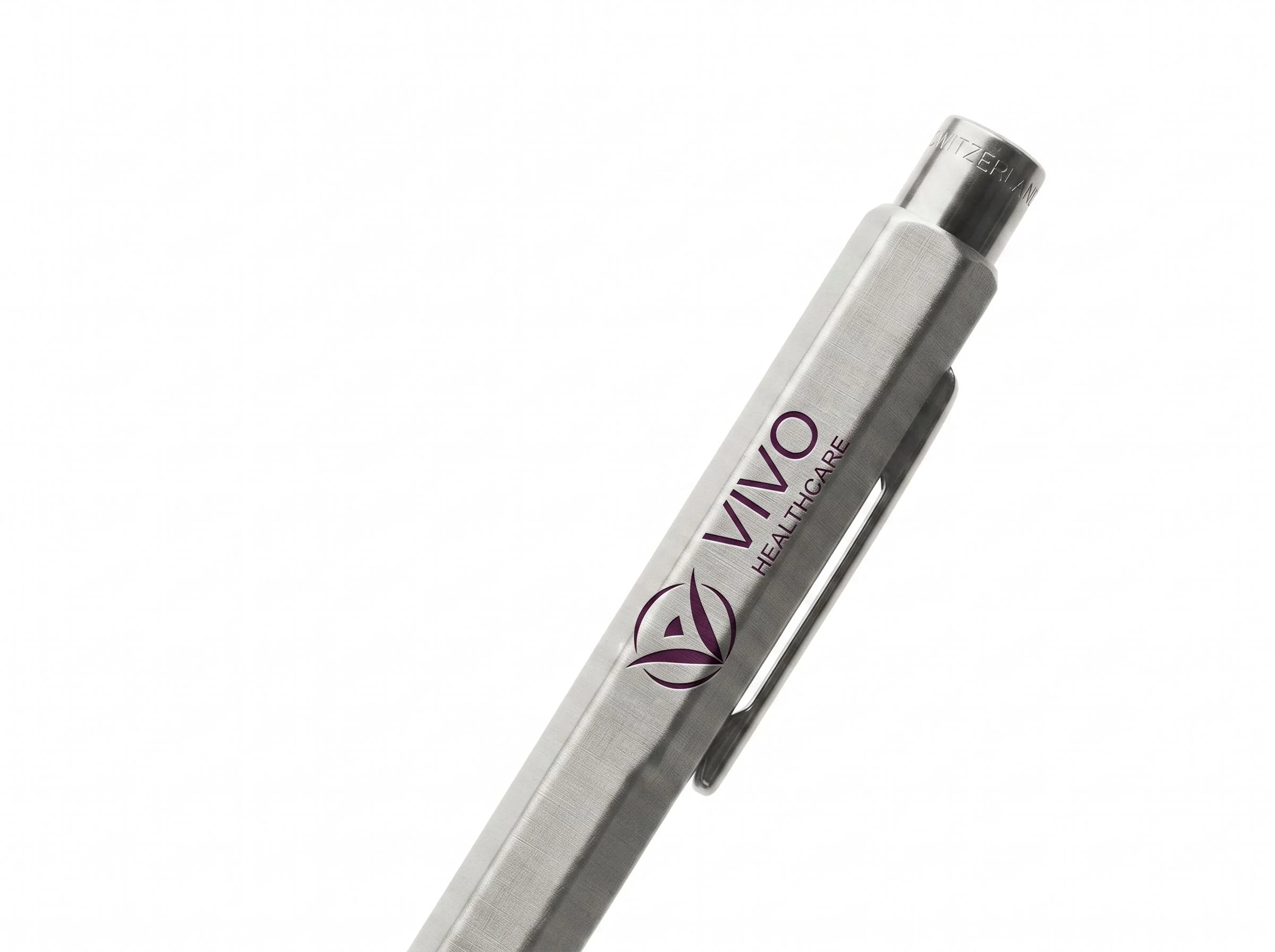
A tote, a bottle, a pen. Small, but a family member walks a Vivo tote through a grocery store for years. The pattern and the tagline do the talking, the logo stays small.
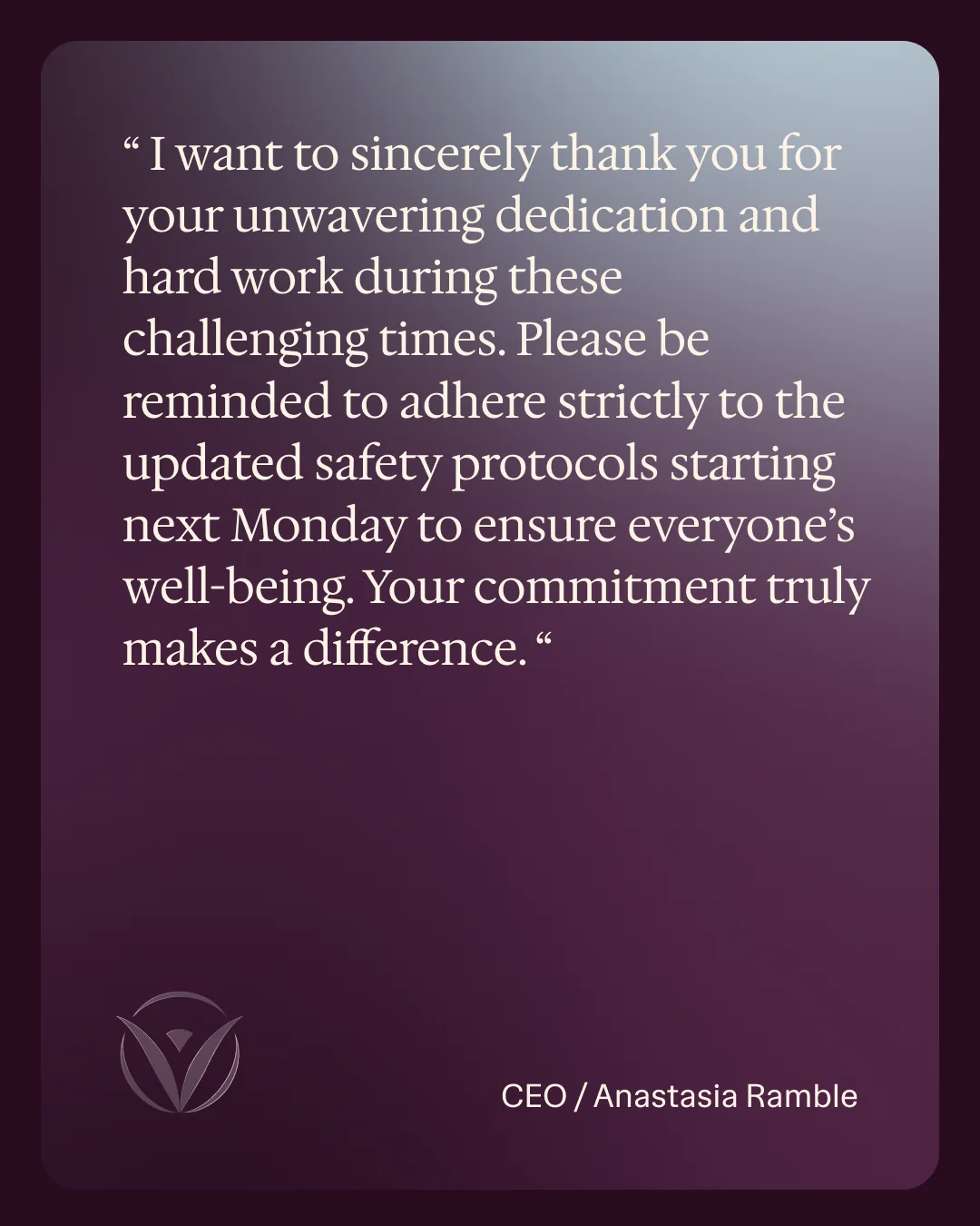
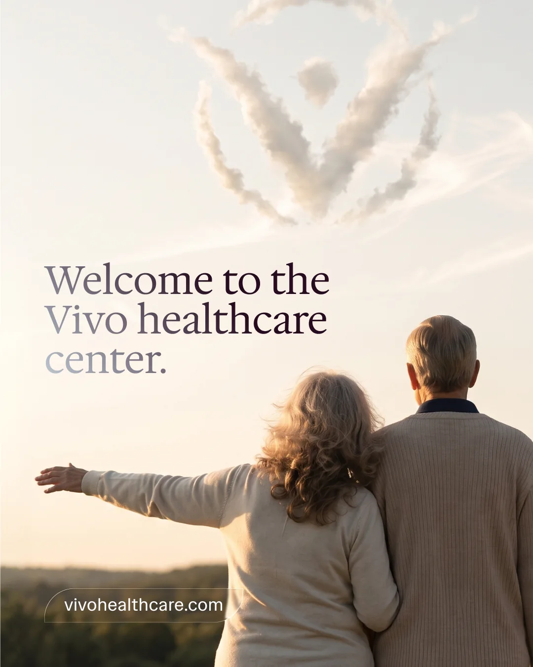
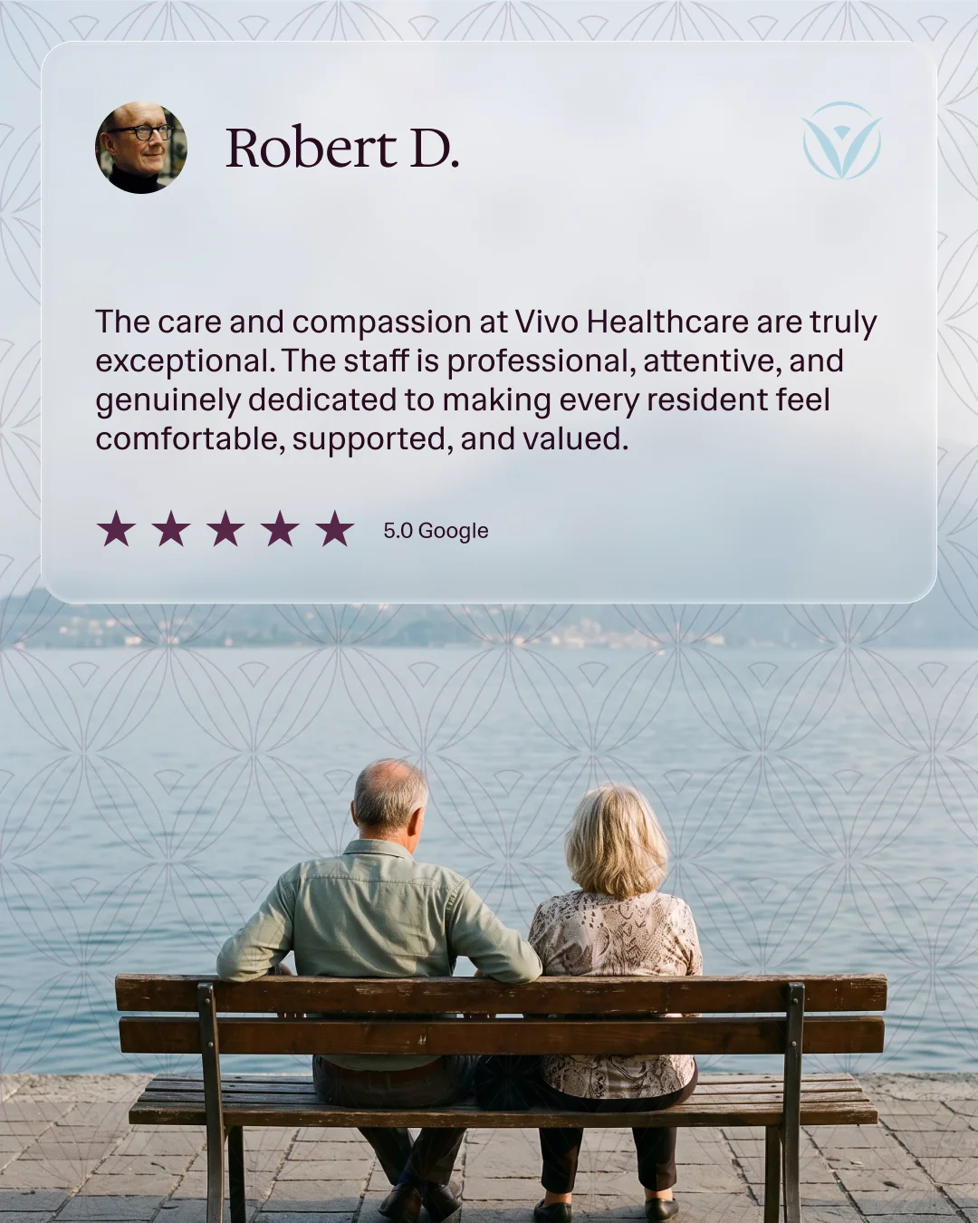

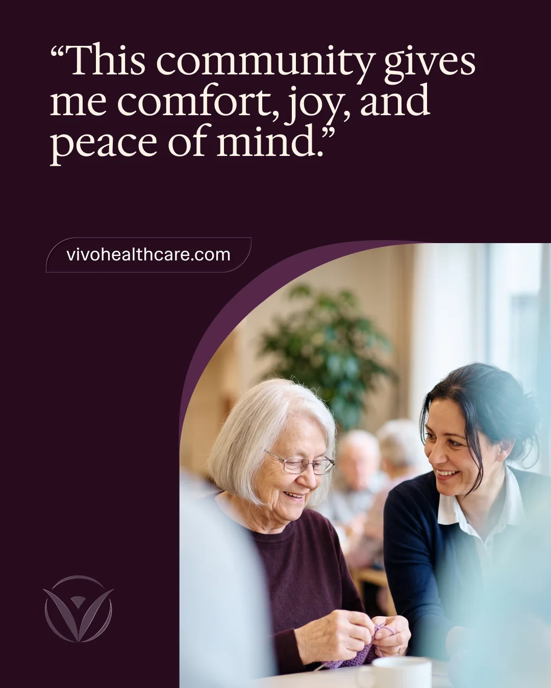
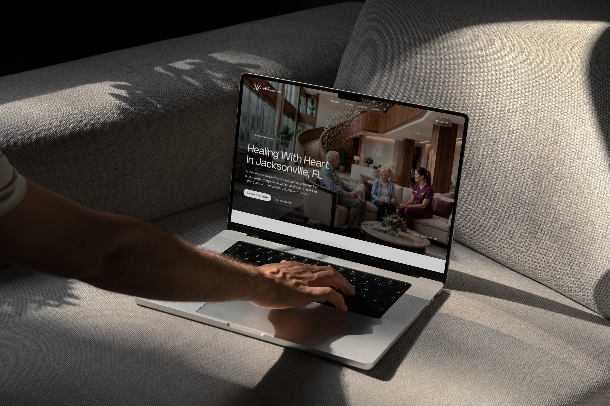
Most families meet a center online first, usually late, usually on a phone. The website carries the same mark, palette, type, and photography as the front door, so the first impression and the tenth agree.
The figure-in-a-ring symbol, the wordmark, and every color variant, from dark purple to reversed white.
One lockup system that gives each center its own name and keeps the Vivo signature beside it.
Six colors and two typefaces, written into guidelines the network can hand to any vendor.
A lattice drawn from the ring of the mark. It runs across stationery, brochures, bottles, and glass.
Business cards, letterhead, envelopes, folders, a trifold brochure per center, flyers, and the brand book.
Building letters, monument and entry signs, window graphics, lobby walls, and door tags.
Totes, bottles, and pens for the team. Social media design and copy for the feed.
A 75-second brand film to introduce the new Vivo, and the website that carries the system online.
The Vivo team, posting on LinkedIn the day the new identity went out.
A new logo can change how a company looks. A new standard can change how a company operates. Caring Higher. Those two words represent exactly where Vivo Healthcare is headed. New identity. Same mission. Higher expectations. Bigger vision.
Love our new vision and logo! In business, staying successful means being willing to evolve, embrace new opportunities, and make adjustments that move the organization forward.
Proud to be part of this amazing new chapter with Vivo!
Caring Higher used to be something you'd only know after a week inside a Vivo center. Now it's on the building, the brochure, the bottle, and the door to room 23.