Beyond Care,
Pioneering New Paths
in Healthcare.
A complete identity for Millennial Healthcare Services, a consulting group that brings teams together. Built around collaboration, expressed in every surface the network touches.
A consulting brand that earns the room.
Millennial needed positioning that earned respect from facilities for the strategic vision they bring to the table. The brand had to read as the people who walk in and convene the room. The ones operators call before the operators decide.
Working with the Millennial leadership team, we built a healthcare brand identity that mirrors how the firm actually operates: collaborative, modern, and unmistakably its own. The mark, the wordmark, the wave, the system that surrounds them. Every piece points to the same idea. Healthcare moves forward when teams work as one.
Four figures.
One M.
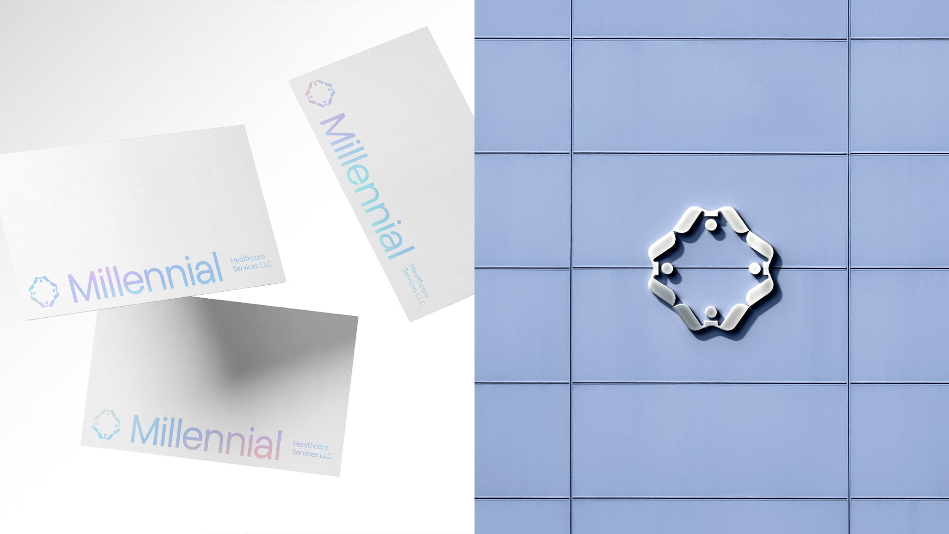
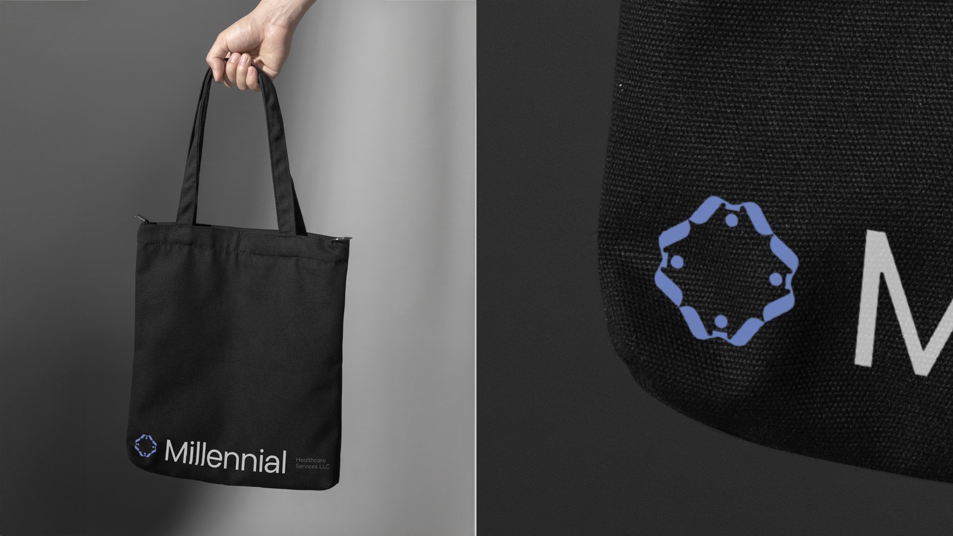
The Millennial mark is built from four figures holding hands, arranged around a central point. Read together they form a stylized "M." Read individually they form the spine of the brand: collaboration as the structure of the firm, expressed before any words are read.
The figures
Four people, hands joined, facing inward. The structure speaks before the wordmark does. Millennial is a firm that brings people together.
The "M"
Read at distance, the four-figure formation resolves into an "M." A monogram that lives quietly inside the symbol itself, structural rather than stamped on.
The geometry
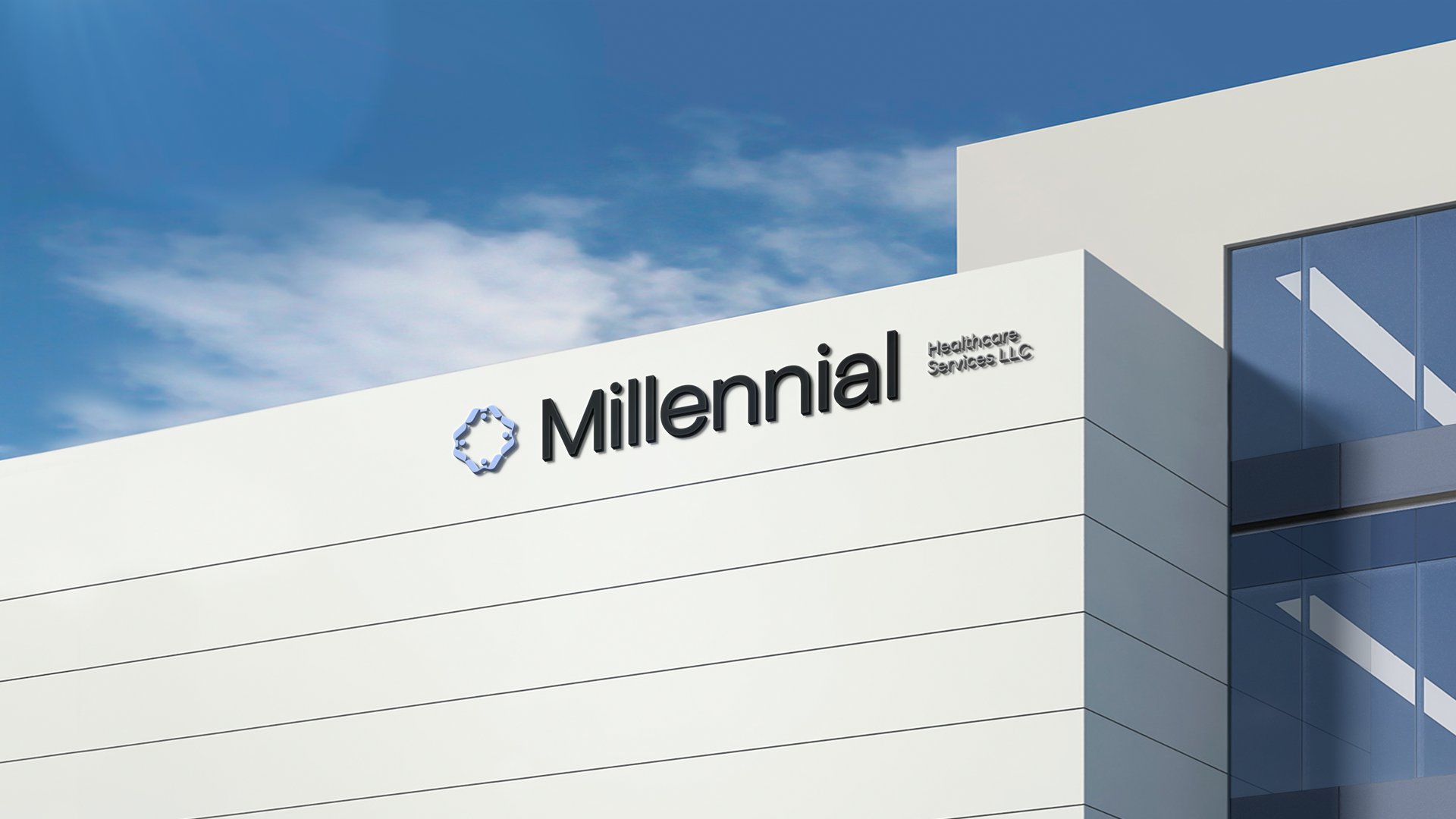
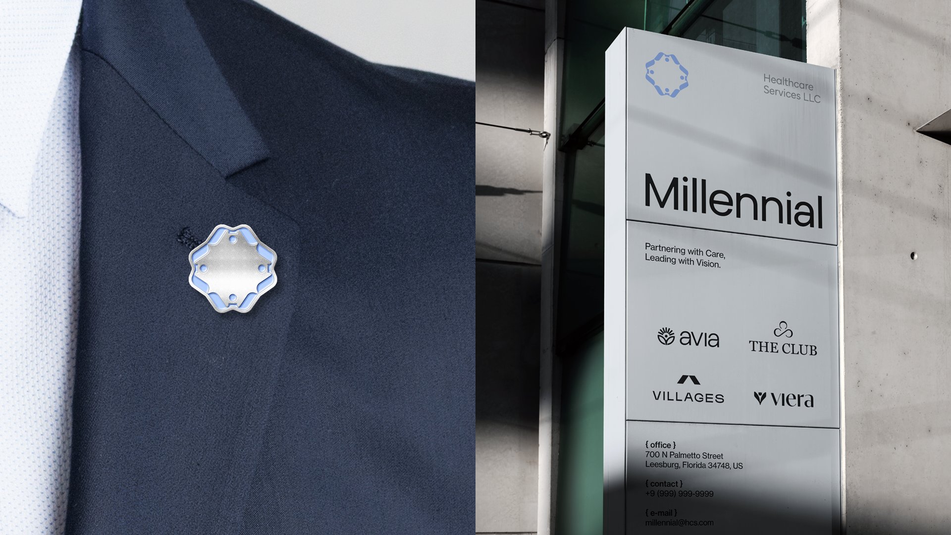
An eight-sided silhouette, strong, balanced, easy to recognize at any size. The mark holds equally well as a lapel pin, a monument sign, or a single embroidered hat.
Motion as
a brand asset.
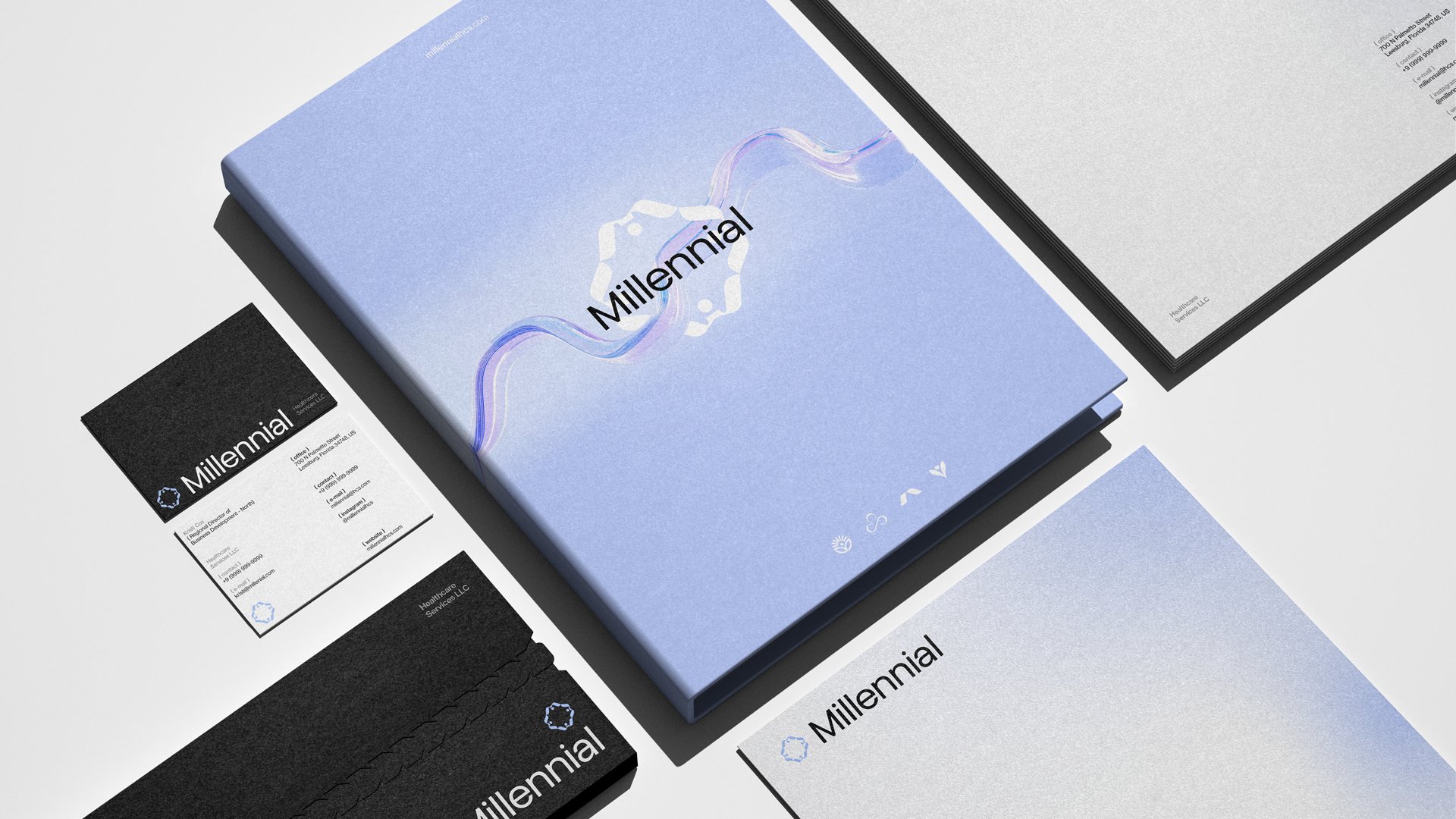
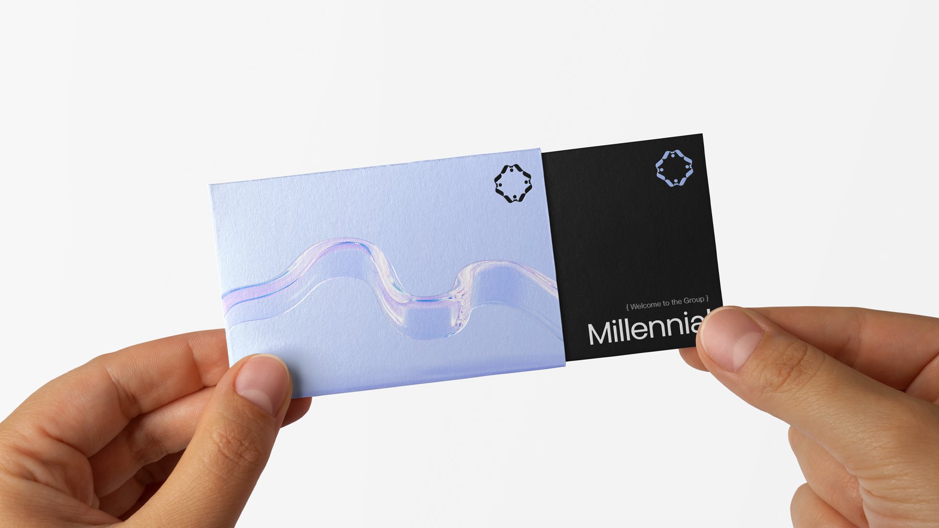
The iridescent ribbon that runs through the system carries a literal idea: healthcare moving forward. Flow, progress, the path Millennial helps facilities take. It threads stationery, packaging, and environmental design with one continuous gesture.
Modern, clear,
quietly confident.
The "Millennial" wordmark is set in a contemporary geometric sans. Open counters, generous spacing, no flourishes. It carries equally well in white on a dark suite, in soft iridescent on lavender, or pressed into letterhead in matte black. Confidence without performance.
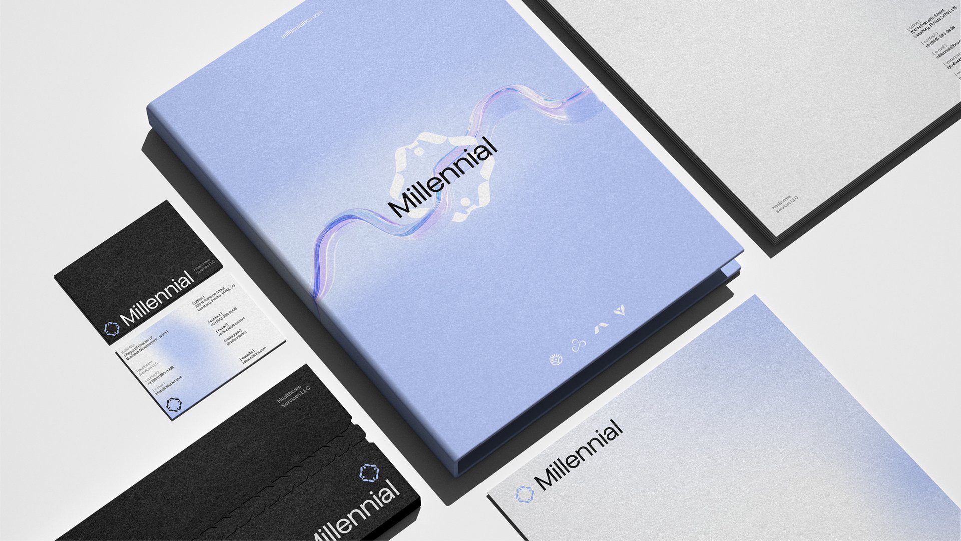
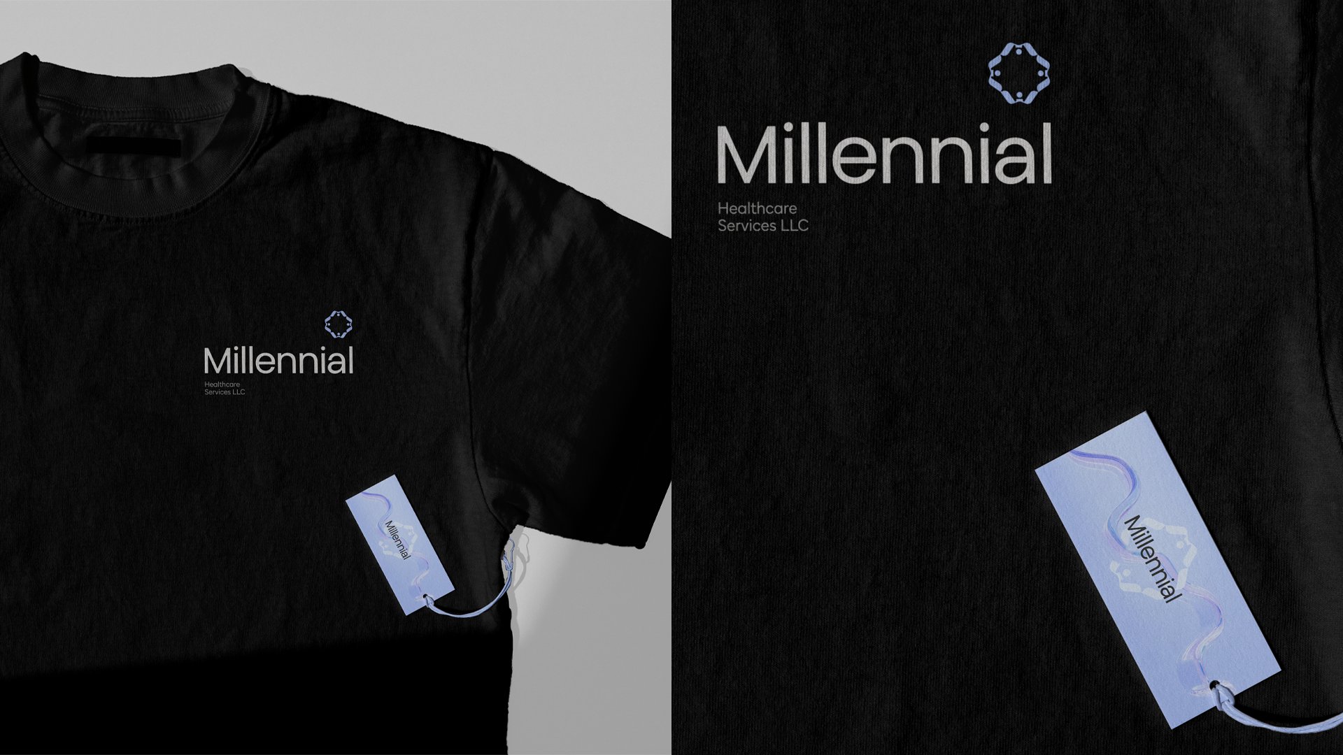
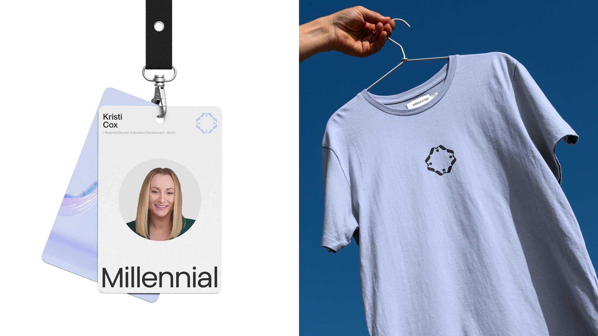
A system on paper.
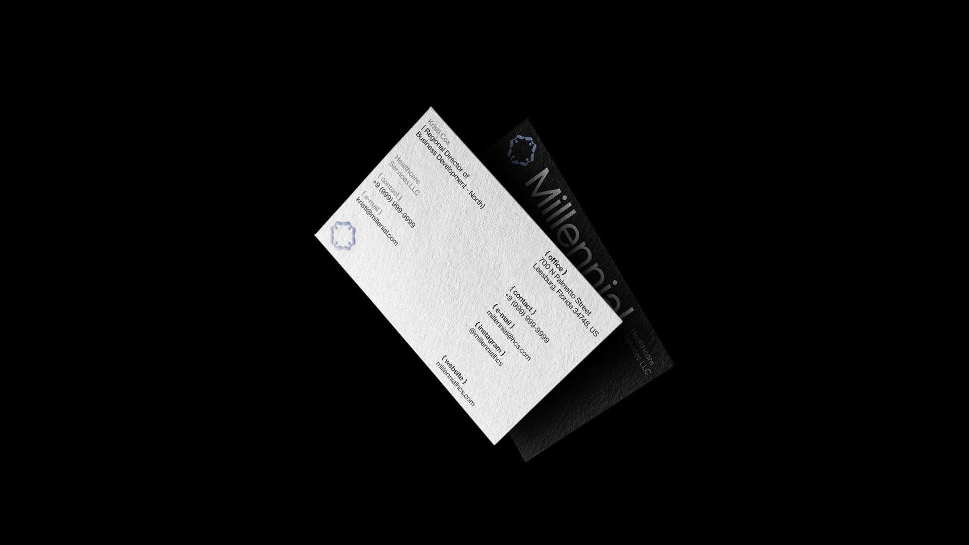
Business cards, letterhead, presentation folders, welcome packets. The full print suite carries the same logic in two registers. Iridescent and lavender for warmth, deep black for gravity. Both true to the brand.
Where teams meet
the brand first.
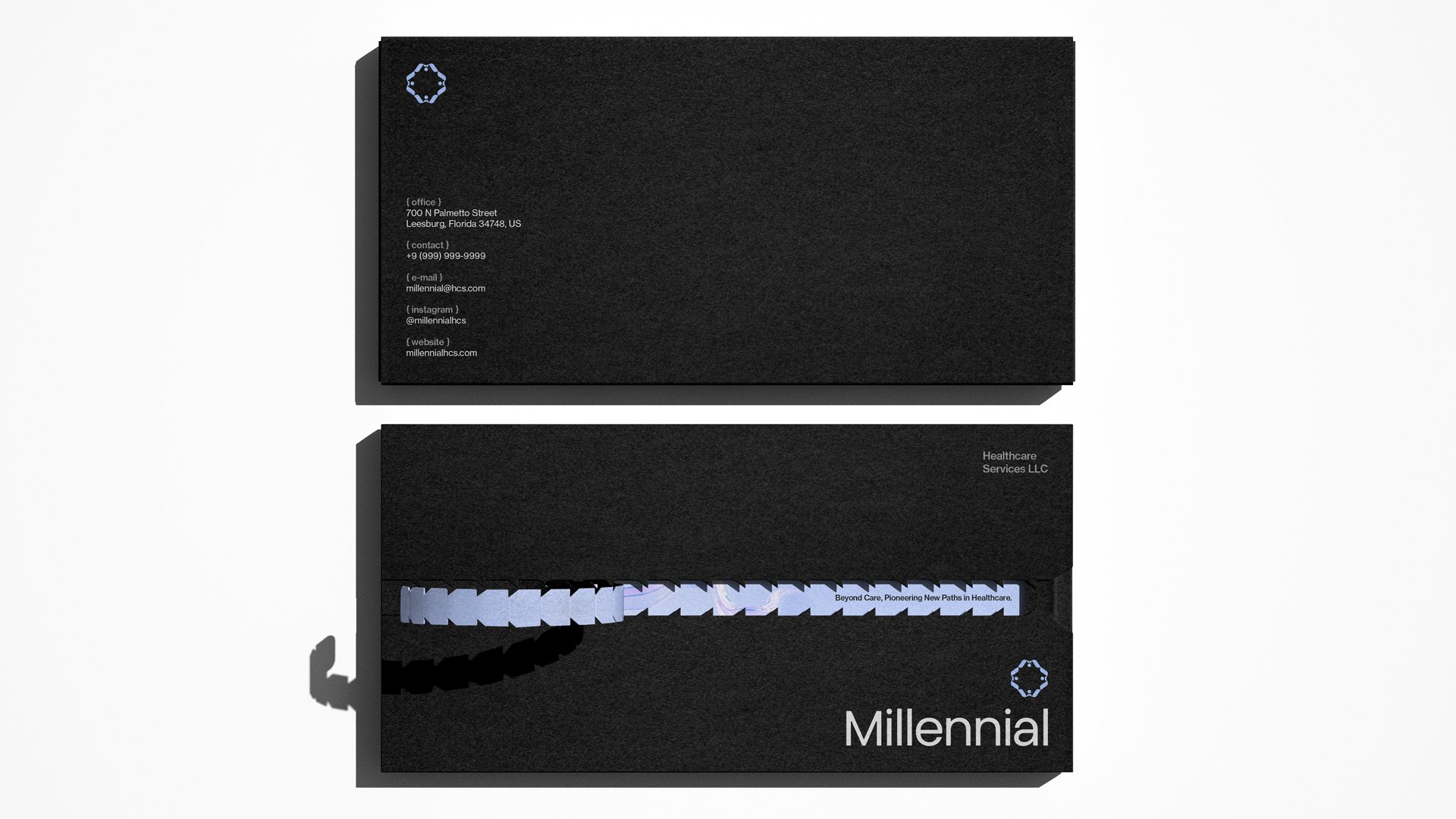
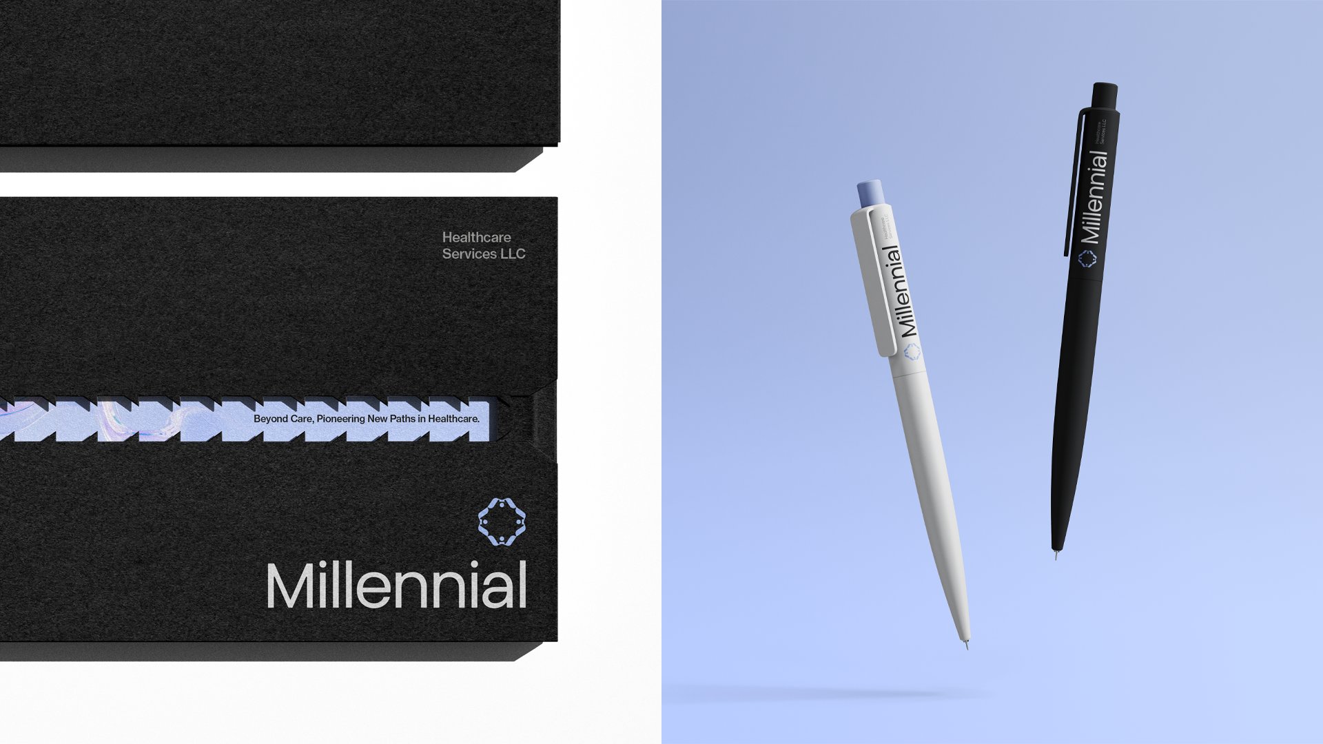
The black welcome box is the first physical handshake between Millennial and a new facility partner. The wave threads the slipcase, the tagline rests inside, and the wordmark closes the cover. A small ceremony, before the work begins.
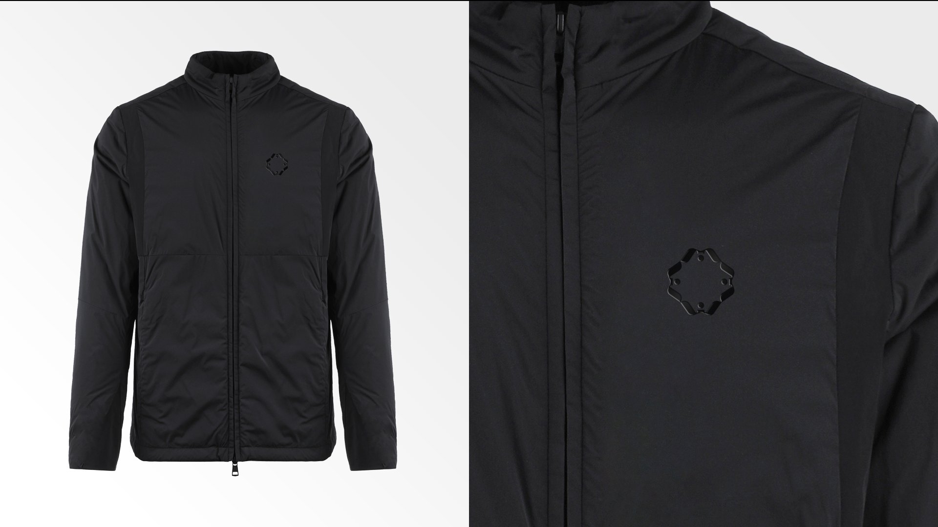
The brand,
worn into the room.
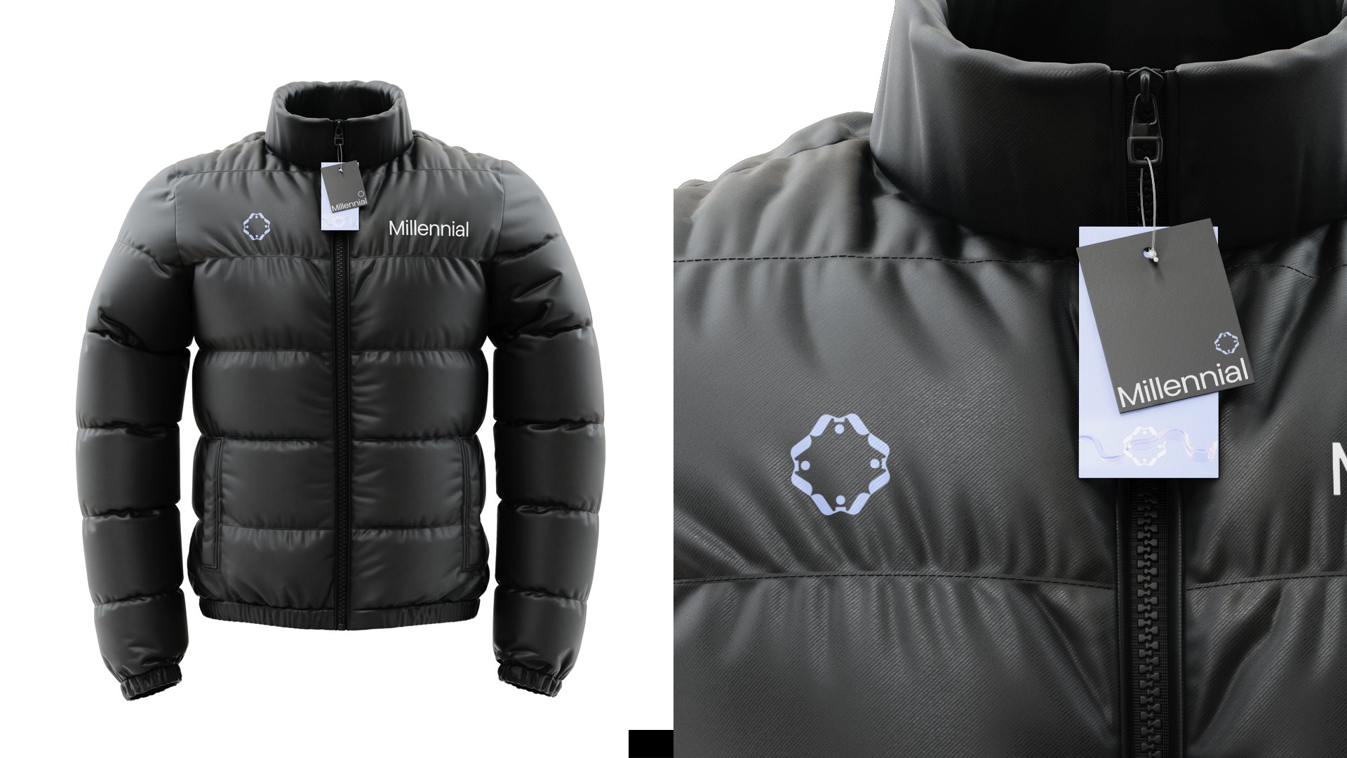
Soft jackets, puffers, tees, totes, hats, lanyards, badges. The apparel program lets the Millennial team show up consistent at every facility, every event, every site visit. Restrained where it should be, recognizable from across the floor.
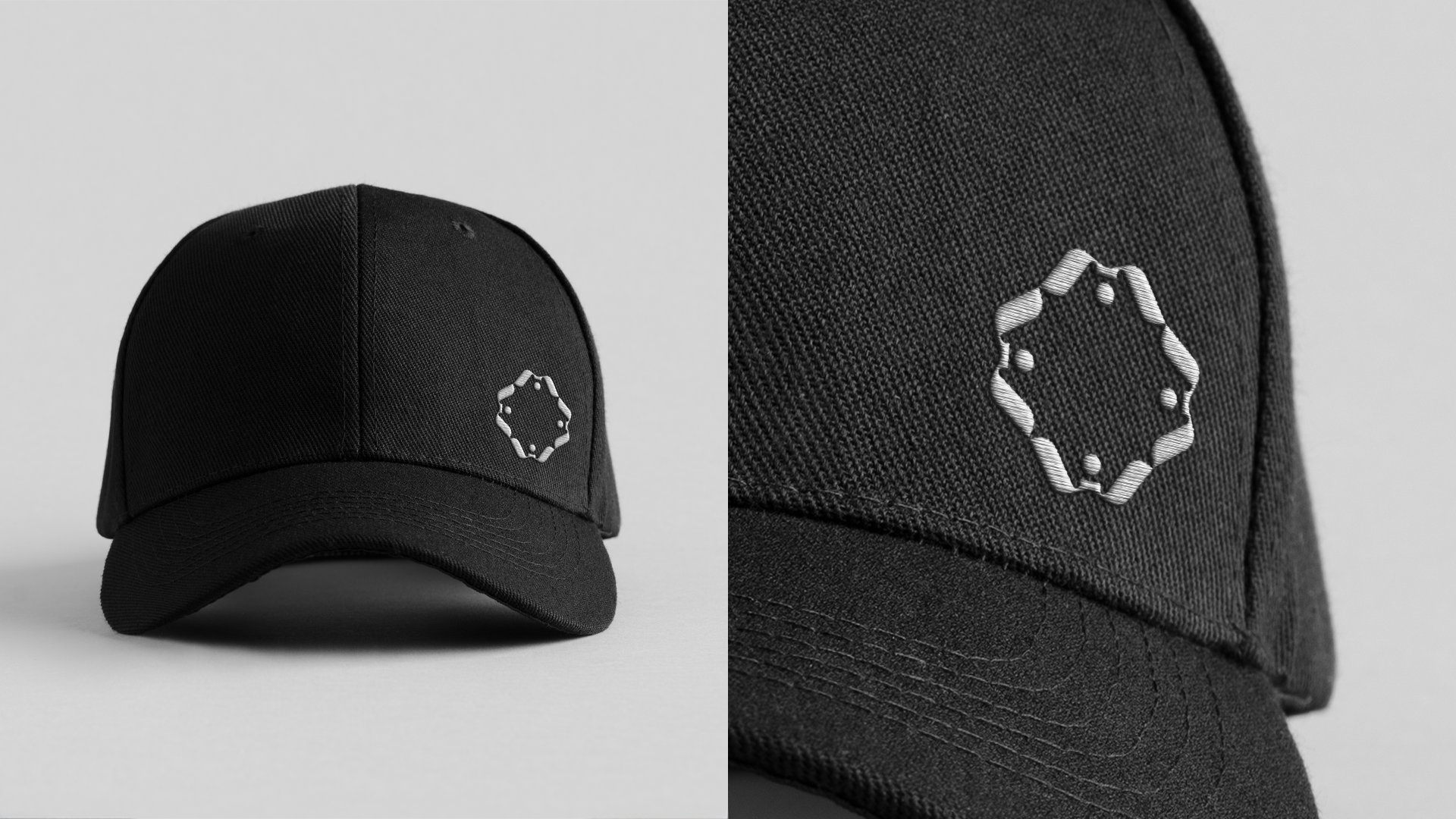
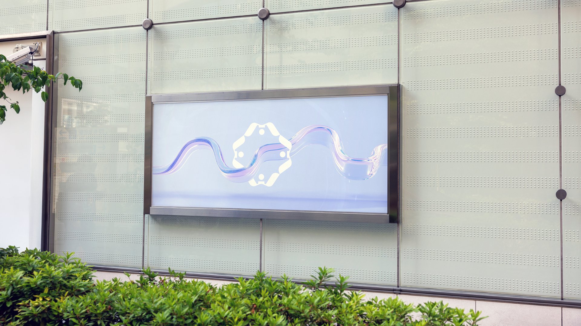
From lapel pin
to monument sign.
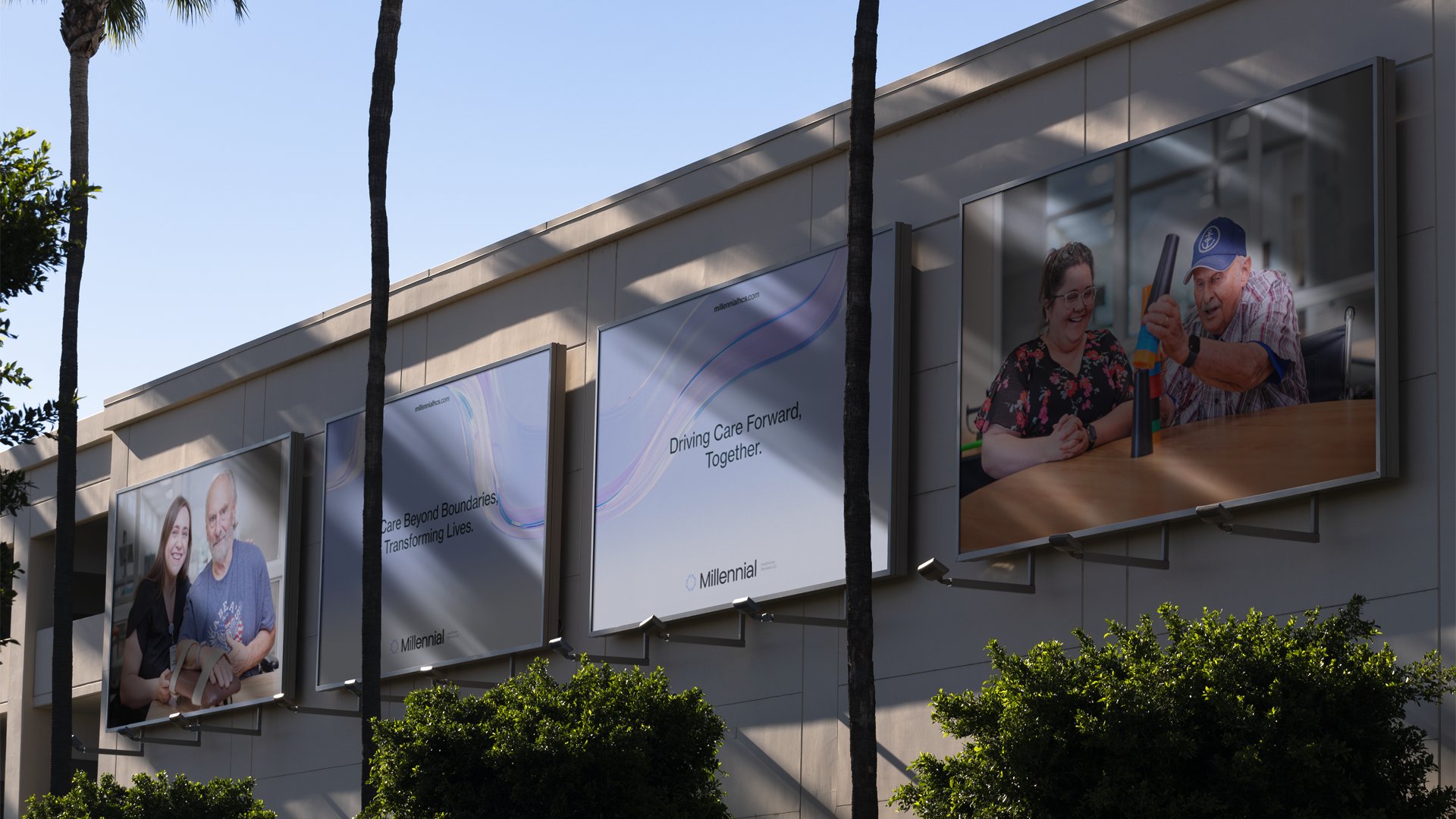
The system holds at every scale: pinned to a jacket, etched into a glass facade, lit on a billboard, projected forty feet wide on a stage. One brand, every elevation.
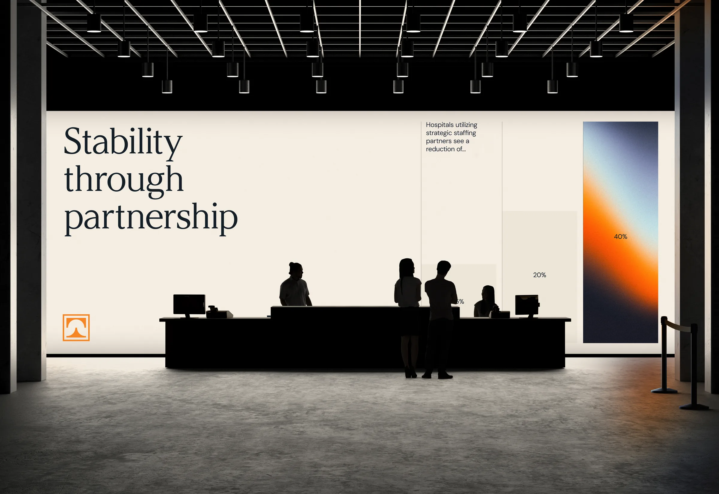
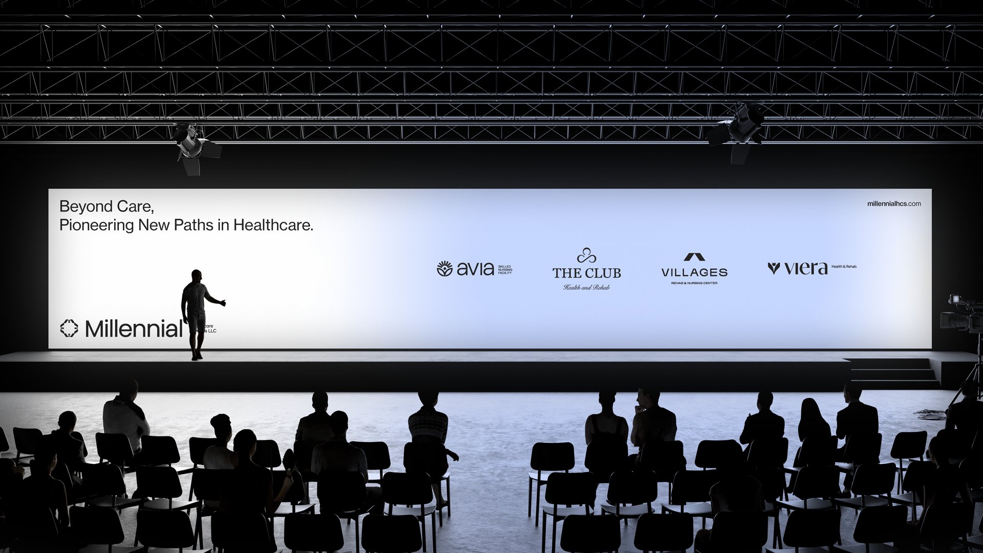
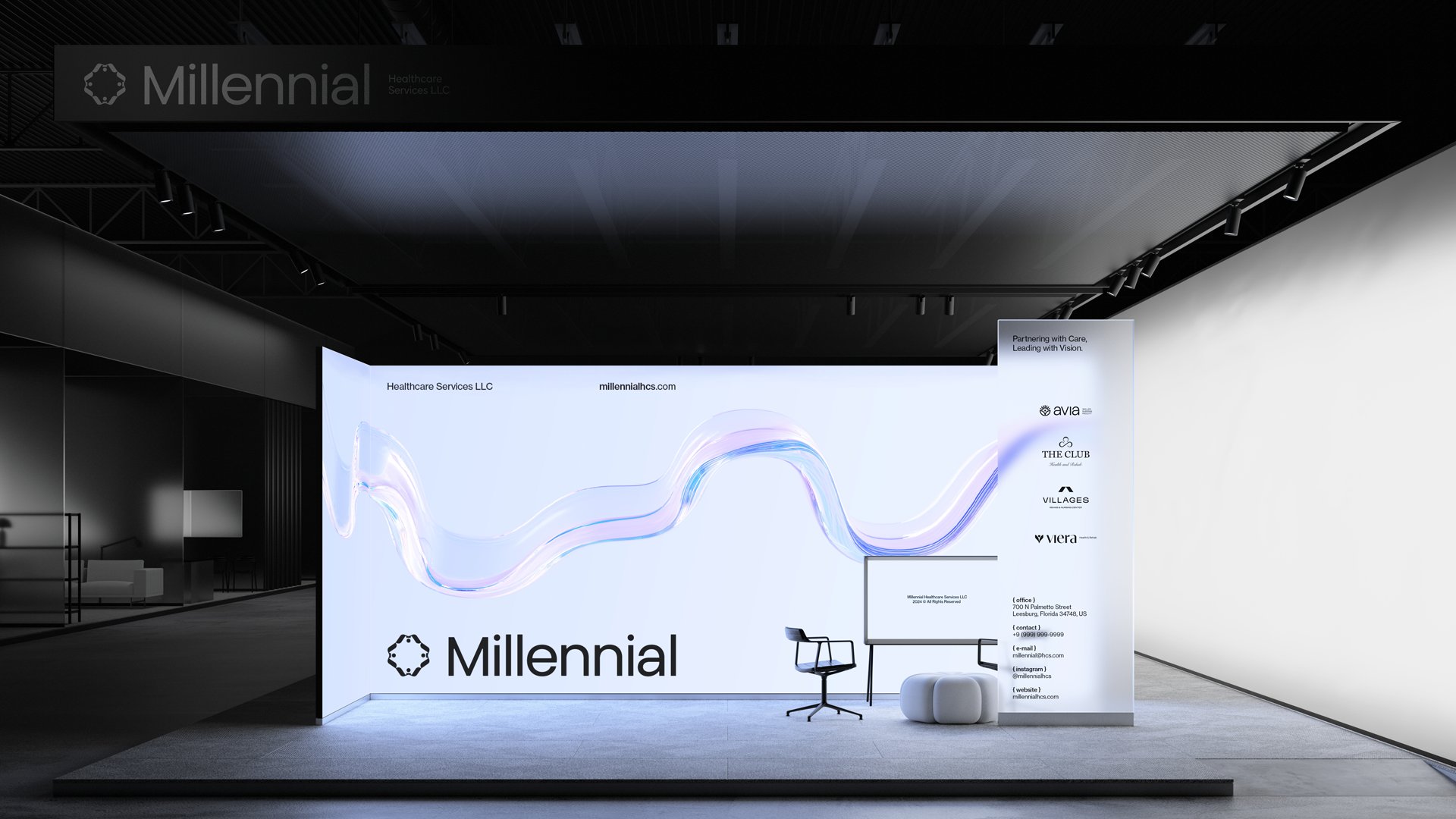
When the brand
walks on stage.
Conference stage, trade-show booth, partner reveal. The brand was built to scale up at full architectural size. The wave runs the full width of the stage. The mark anchors every elevation. The tagline sits where executives can see it before they sit down.
Millennial doesn't lecture, and it doesn't sell. It convenes. The mark, four people holding hands forming the M, is the brand telling the truth before anyone has to.