Modern luxury,
engineered to endure.
A modern luxury community on a pine-shaded plot. We named the project, the streets, the four model homes, and built every brand surface a buyer touches before signing.
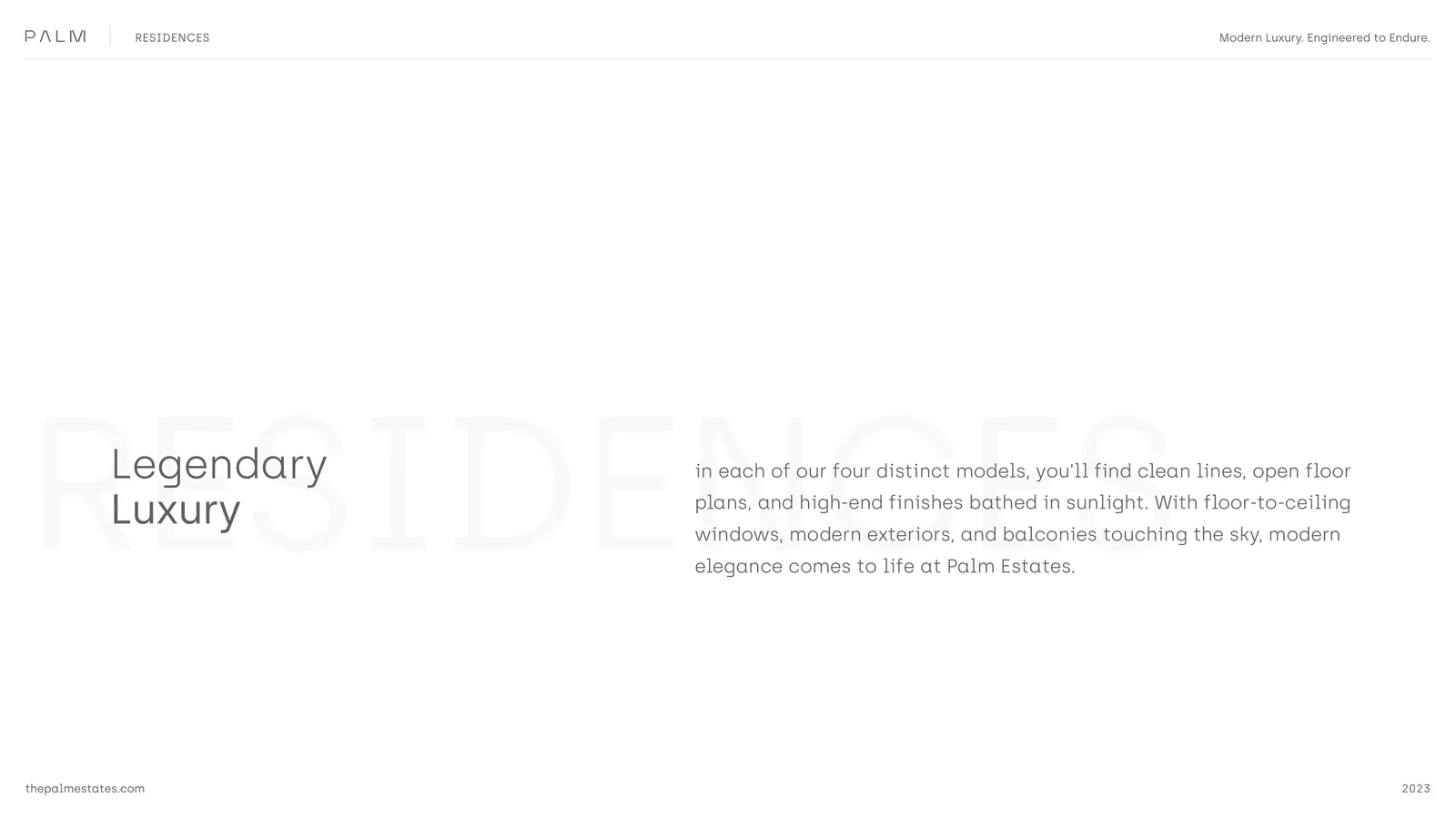
A new kind of
luxury community.
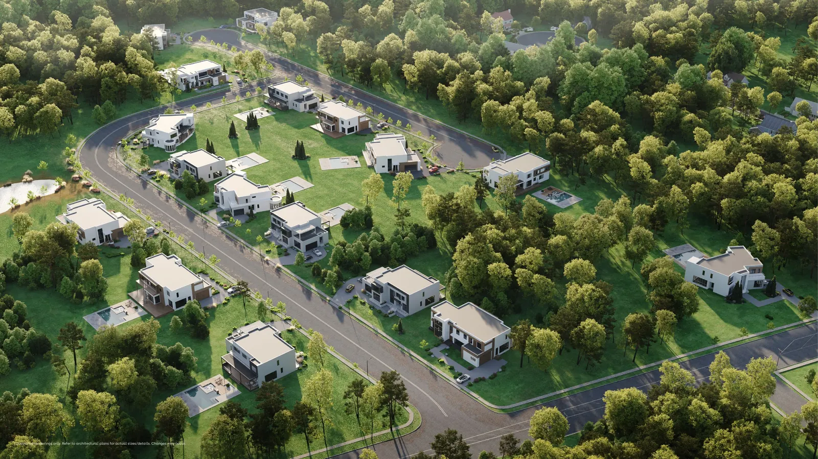
The brief was to build a community that brings Floridian-style modern luxury to a Northeast lot, without the costume. Clean architecture. Quiet streets. Materials that age well. A brand that signals confidence without shouting.
The architectural team handled the homes and the renderings. We wrote the development brand. The name, the tagline, the four model homes, the four streets, the brochure that buyers leave with, and the social presence that runs ahead of the first open house.
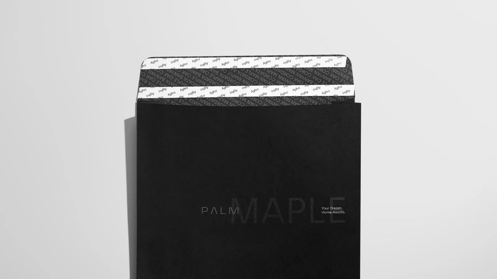
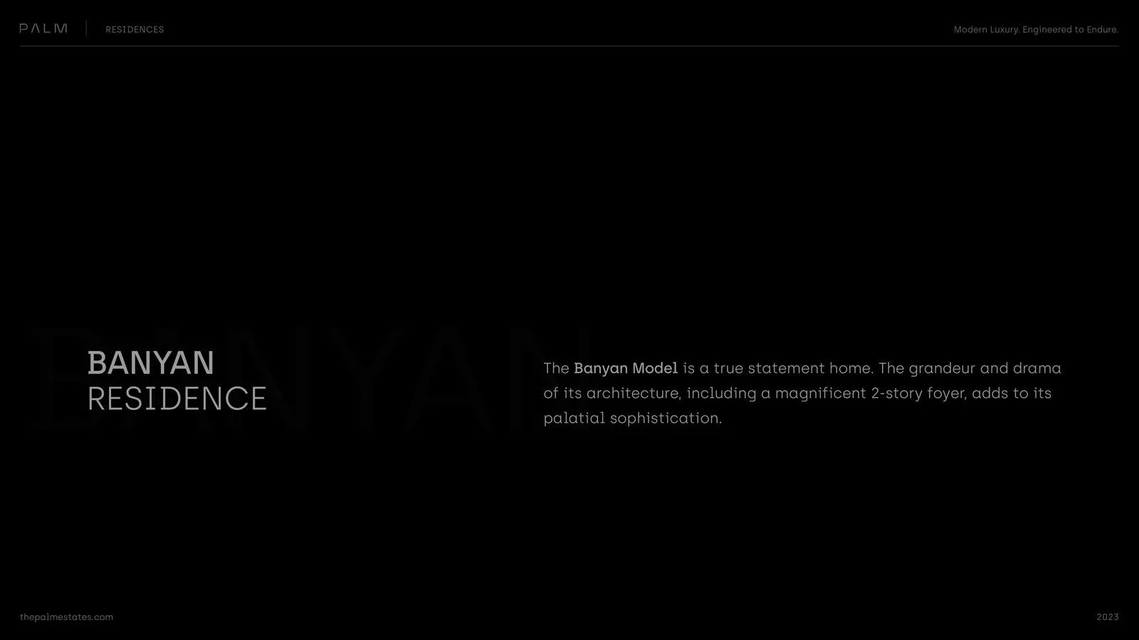
Four letters.
Built to be remembered.
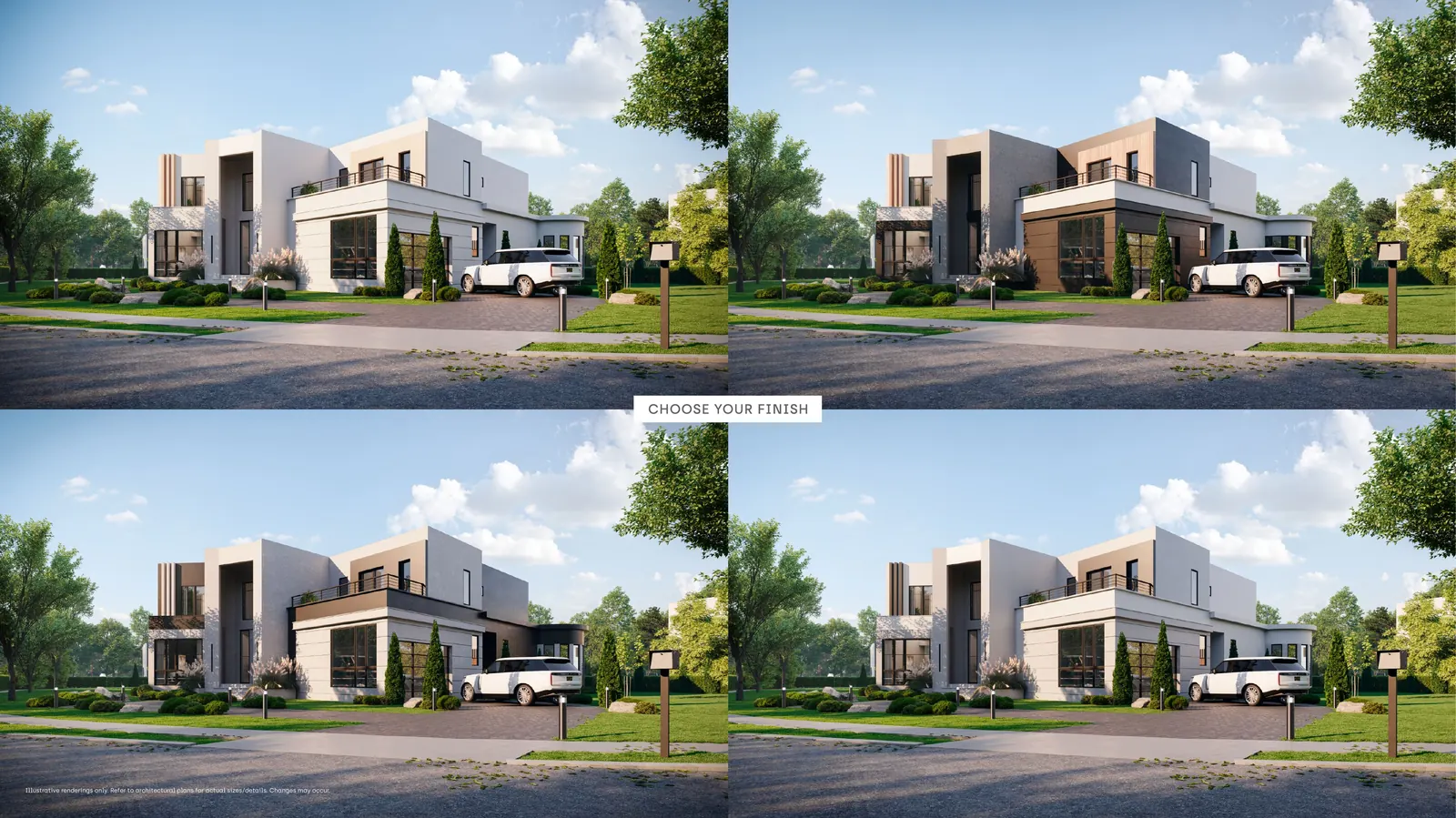
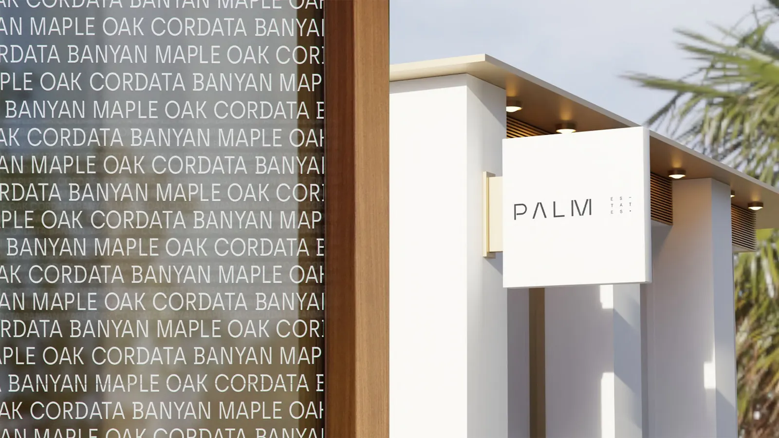
Palm. A short, weighted name that signals warmth without spelling it out. It works on a billboard at sixty miles an hour. It works as a hashtag. It carries a Floridian posture into a New Jersey market without leaning on costume. Four letters that say everything the project needs to say.
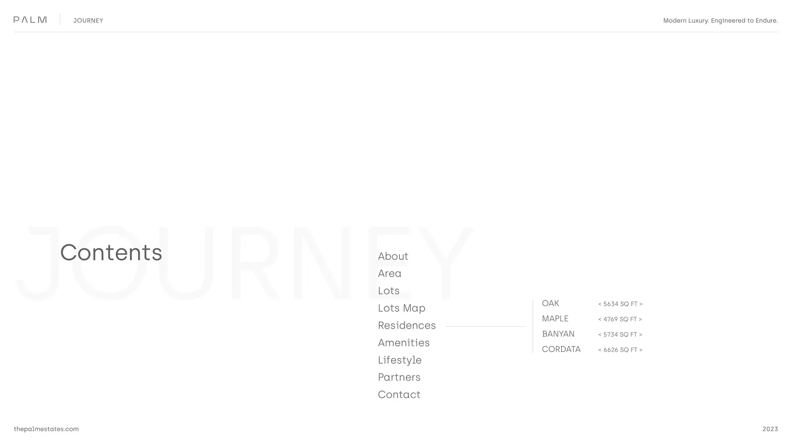
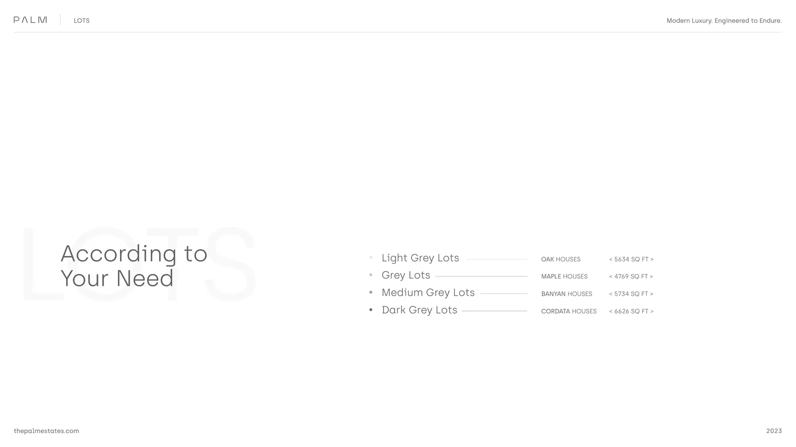
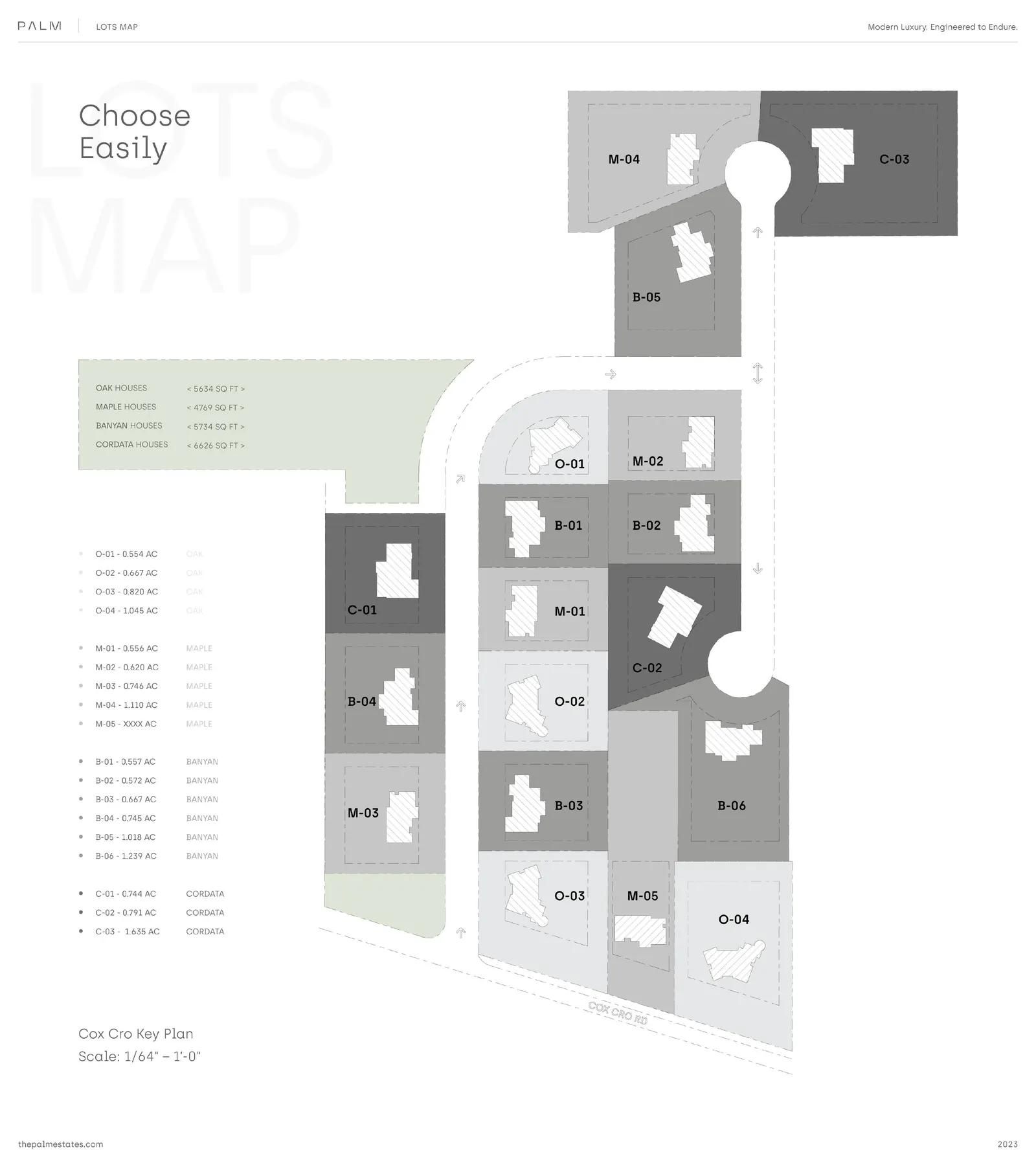
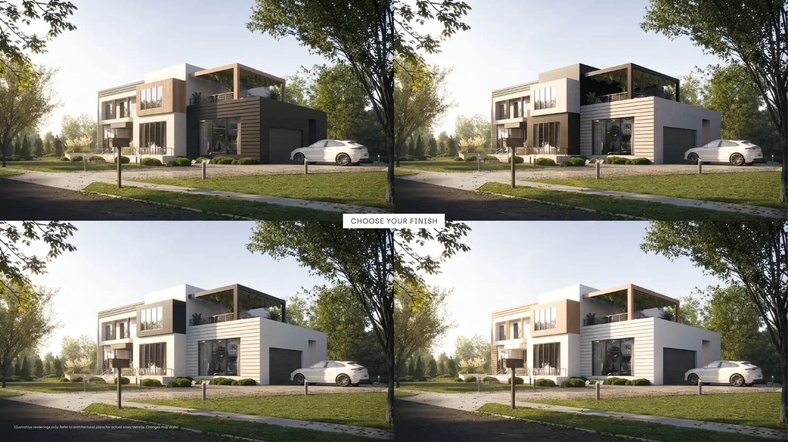
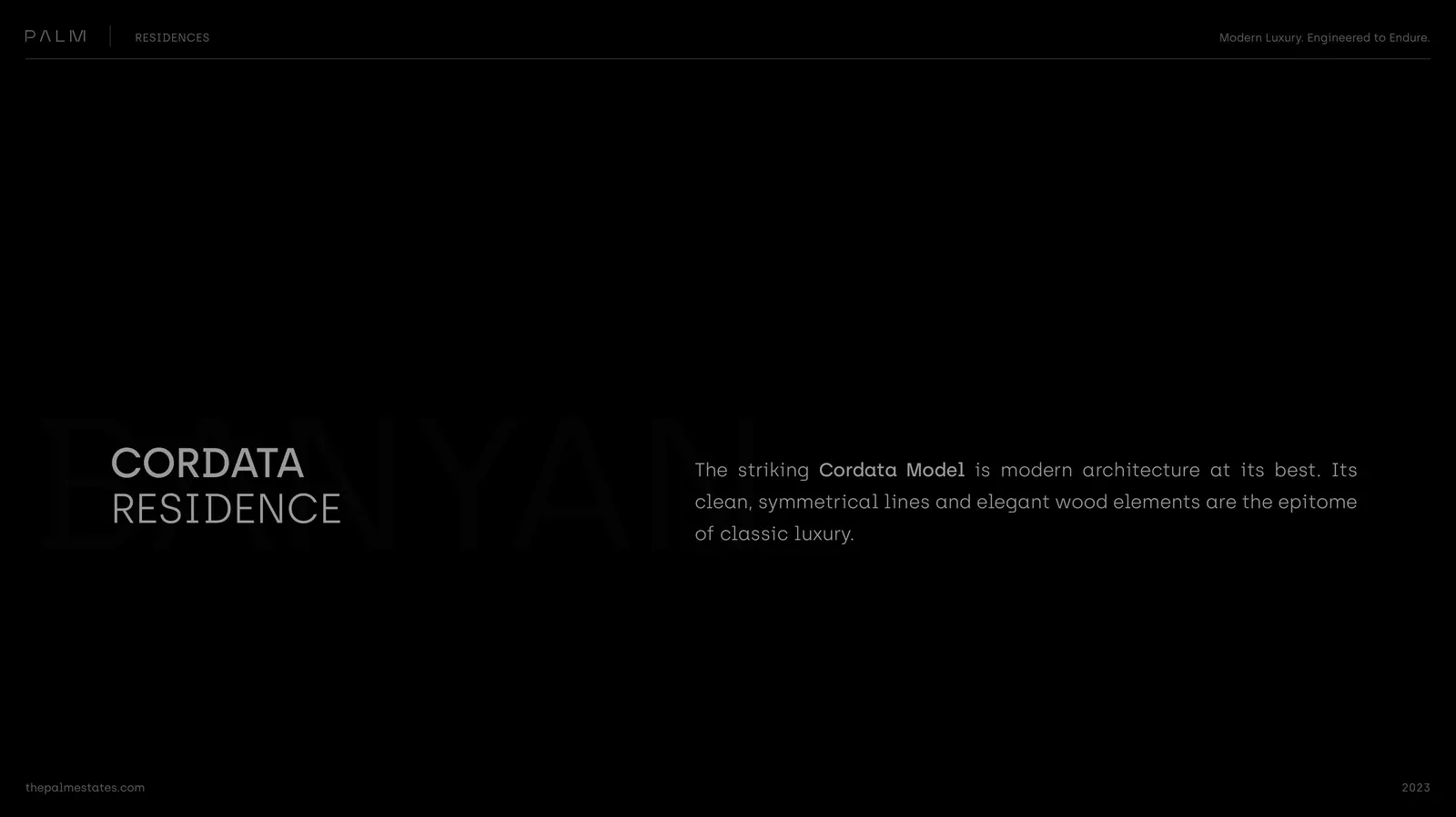
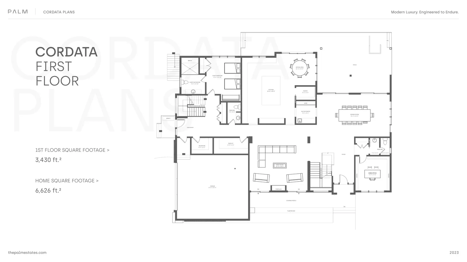
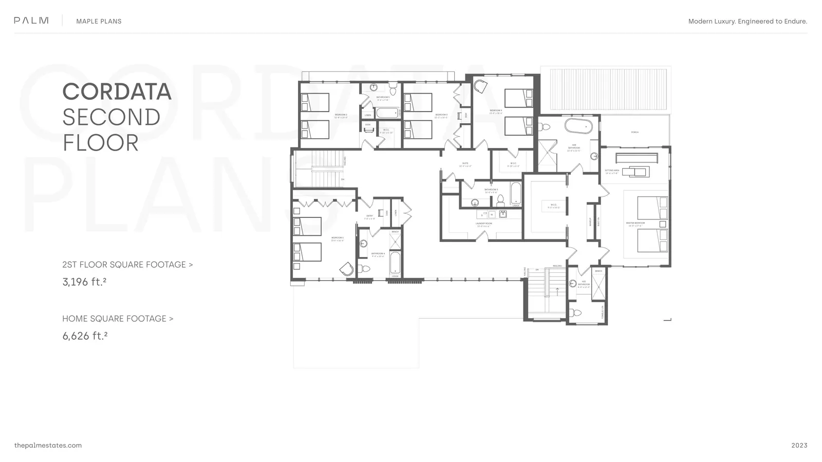
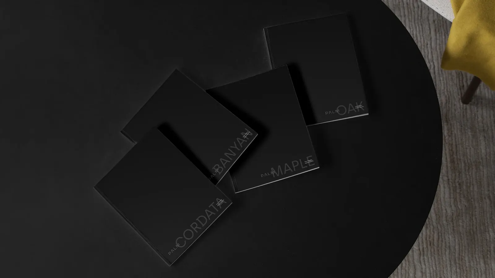
- Cordata
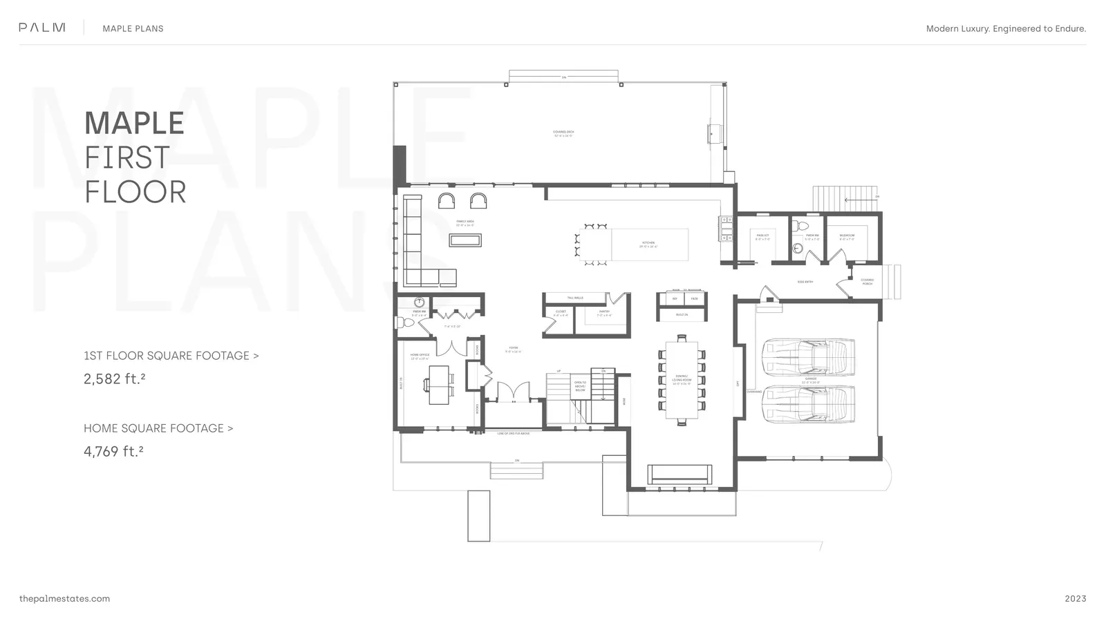
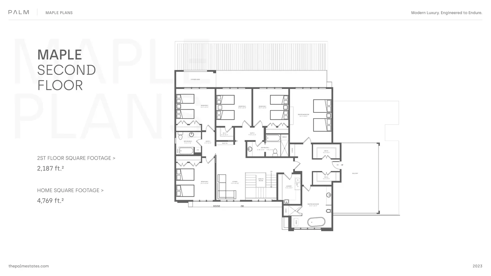
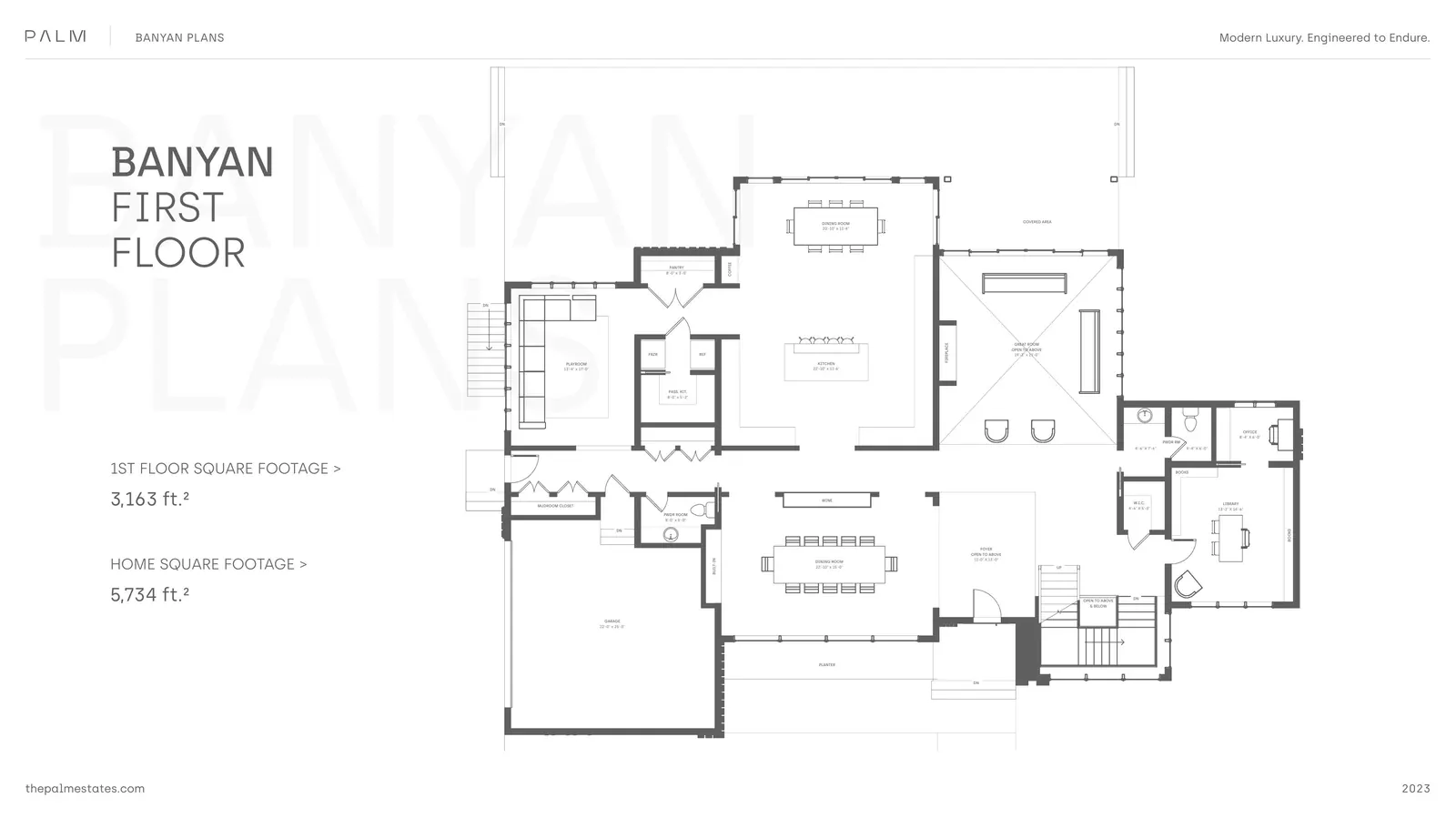
- Banyan
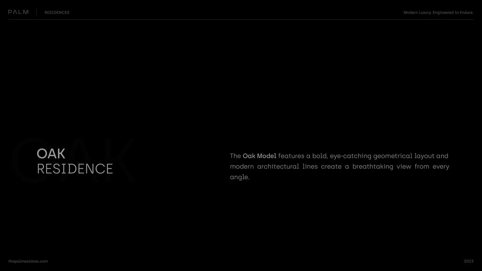
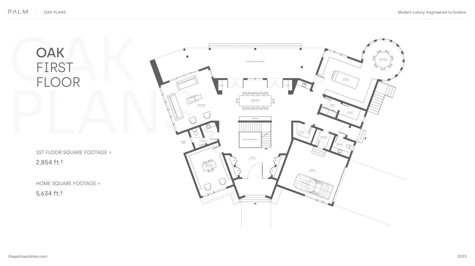
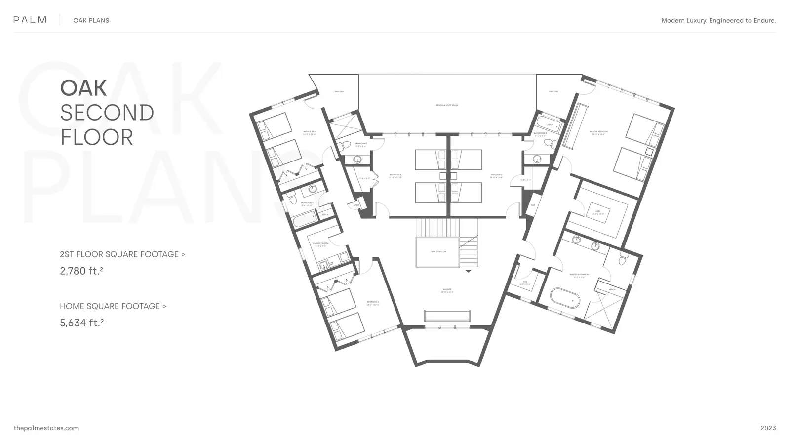
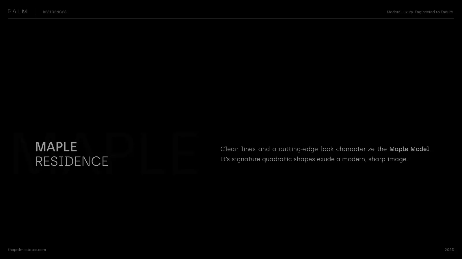
- Maple
- Oak
Tree species, native to both Florida and New Jersey. Each name carries a different posture — Cordata is precise, Banyan is grand, Maple is familiar, Oak is solid. Four homes that read as a family without reading as a series.
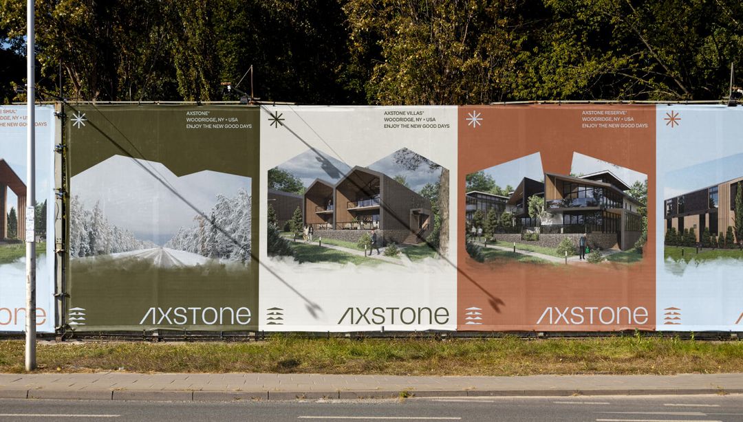
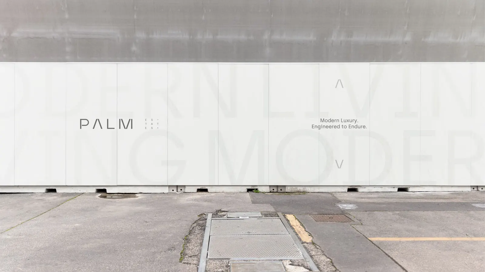
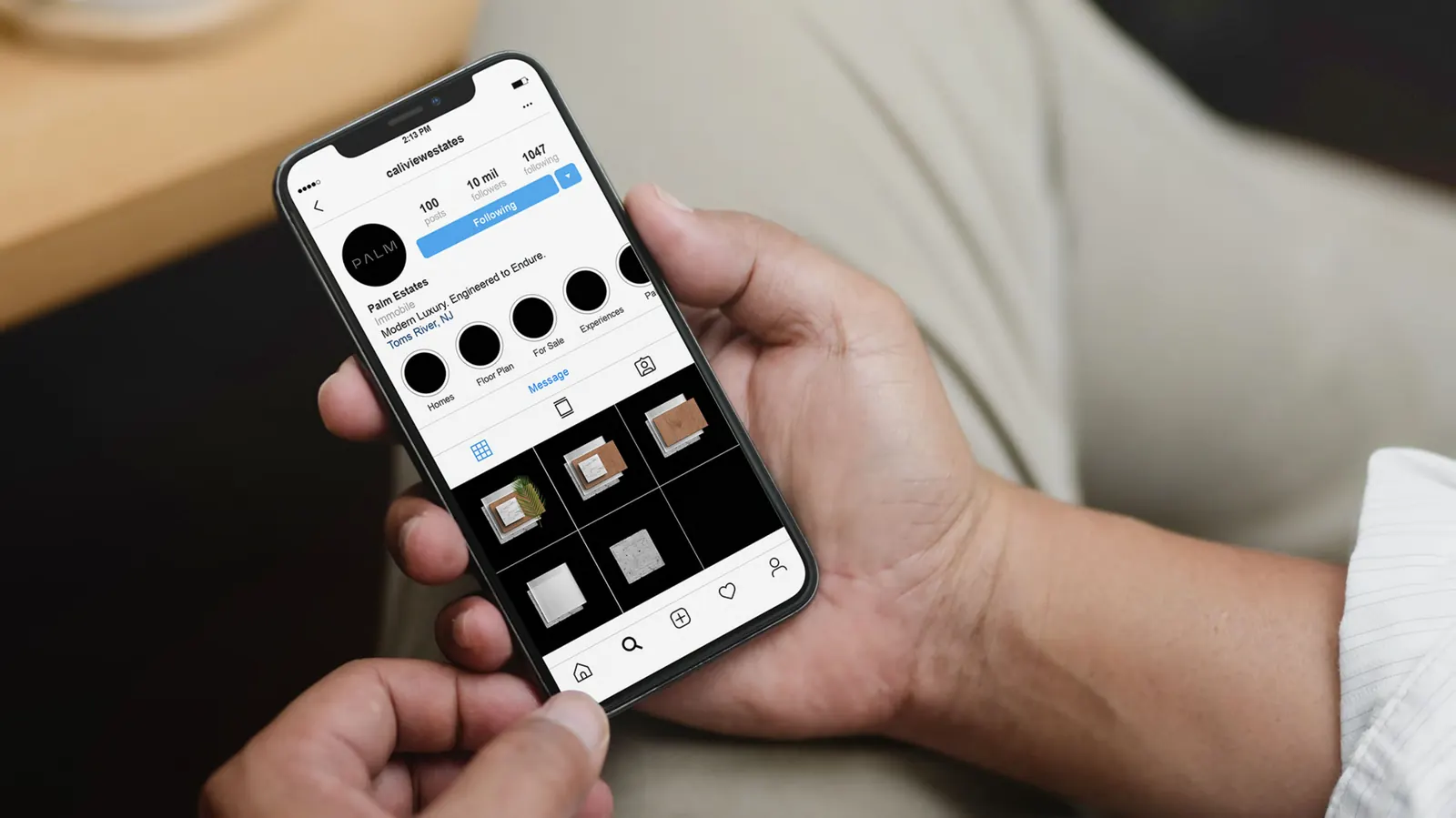
Streets named in keeping with the same botanical system, so the community reads as a single thought from the entrance sign to the last cul-de-sac. A buyer driving through the development encounters the brand without ever seeing a logo.
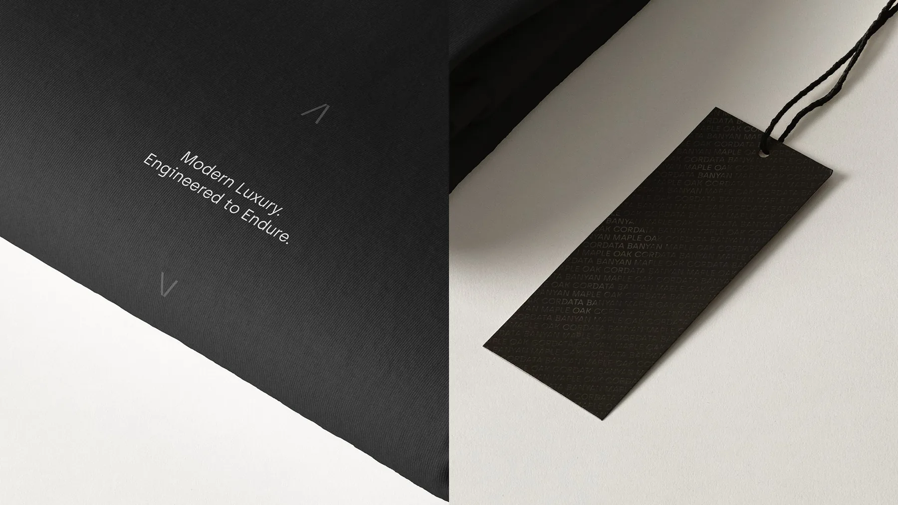
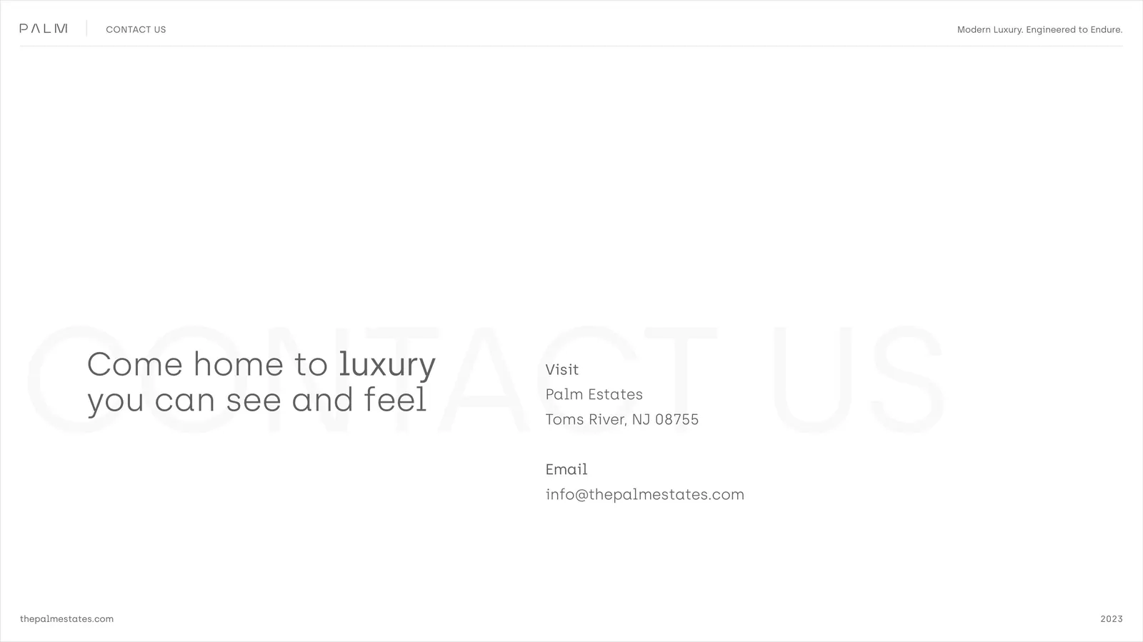
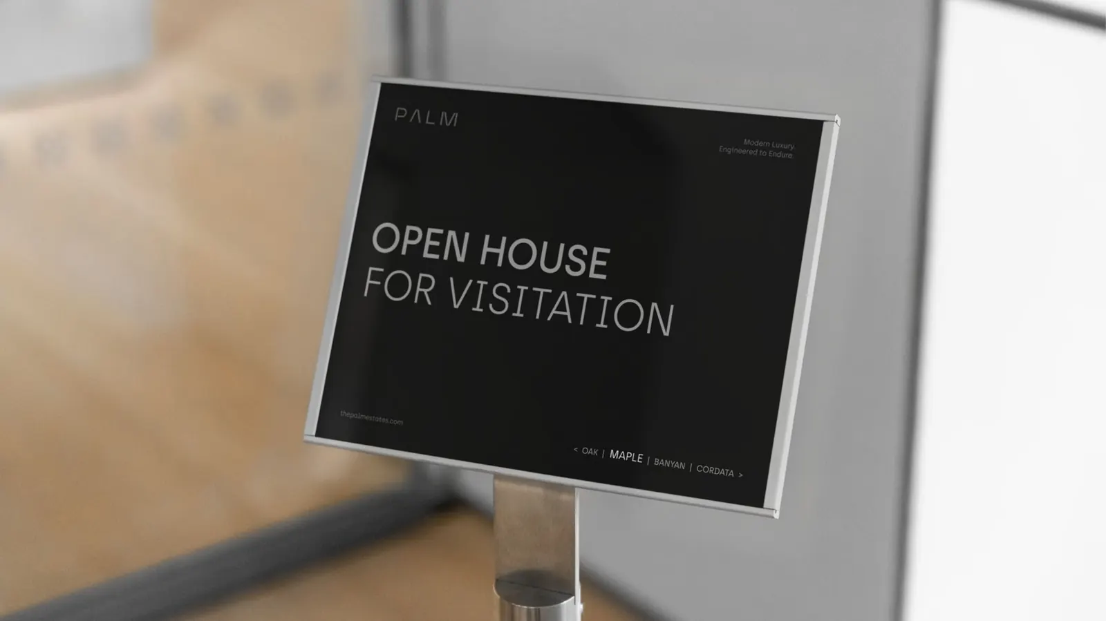
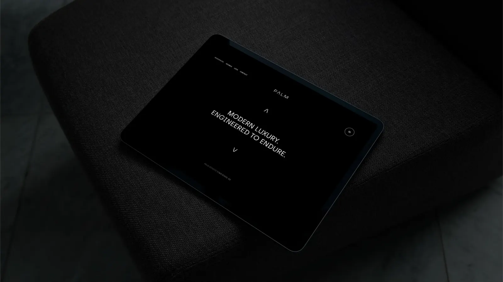
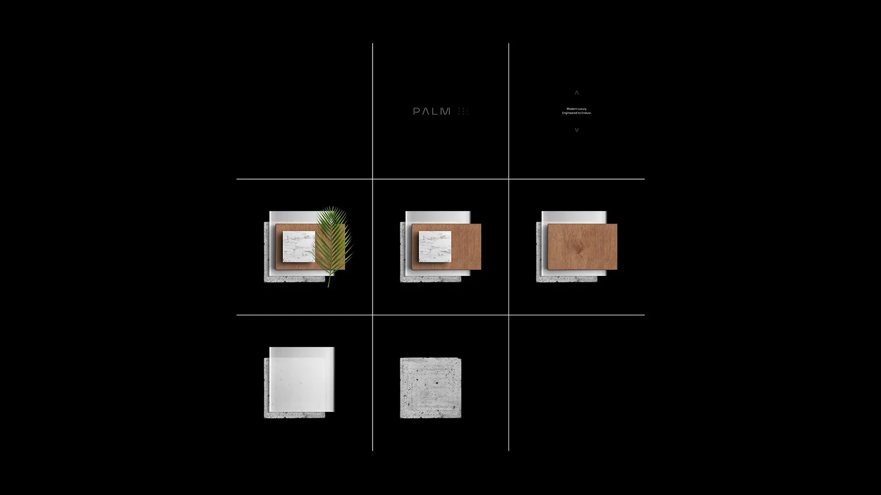
Modern Luxury.
Engineered to Endure.
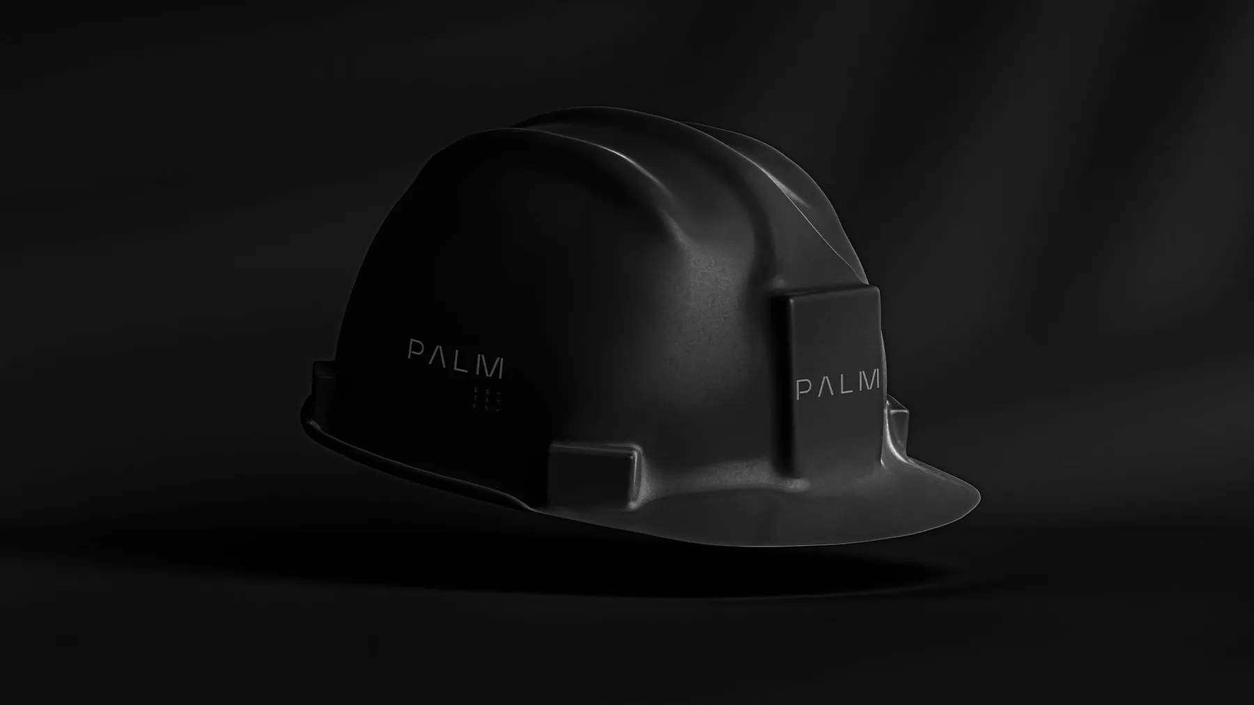
Six words that do the work of a paragraph. “Modern Luxury” signals the category and the price point. “Engineered to Endure” signals the build quality and the long-term thinking that separates Palm from a flip. The line works on a billboard, in a brochure footer, at the bottom of an Instagram post, and on a hardhat. Same line, every surface.
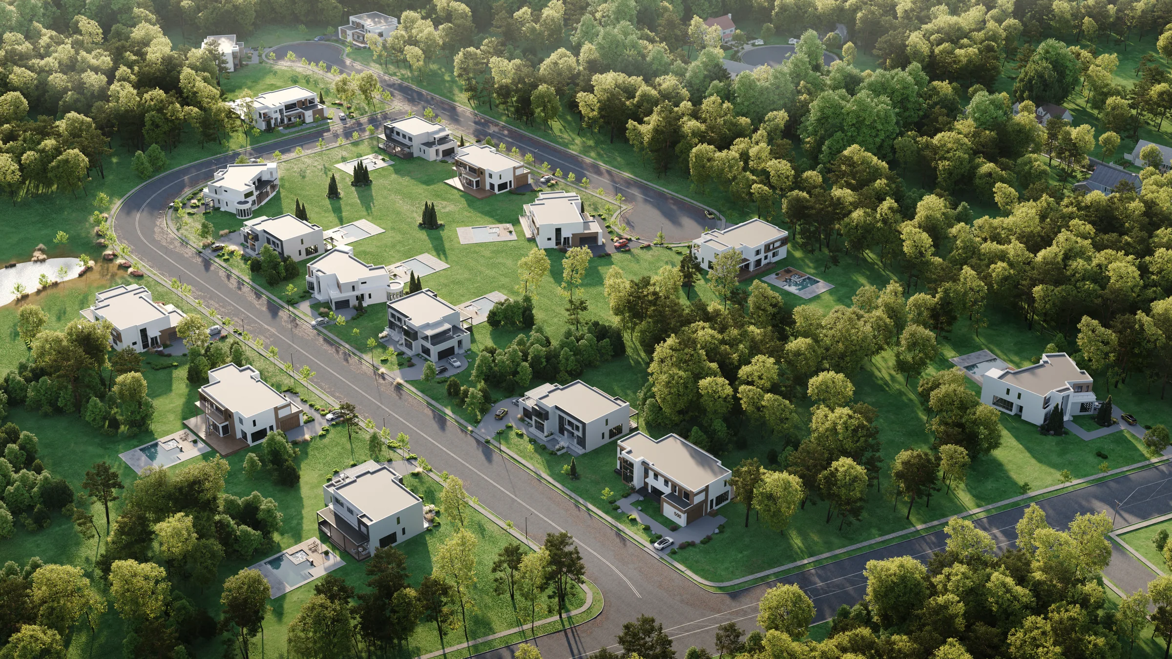
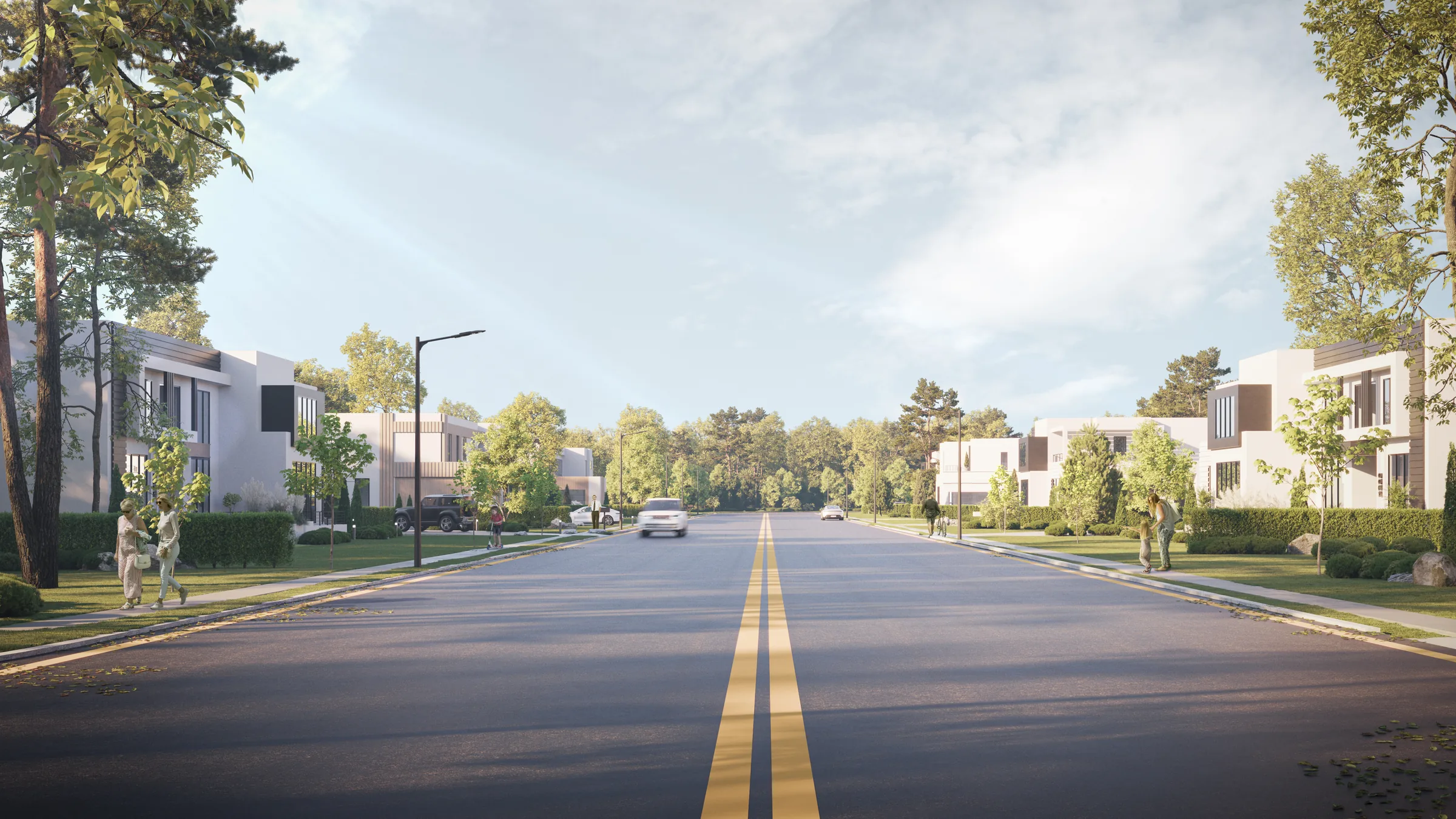
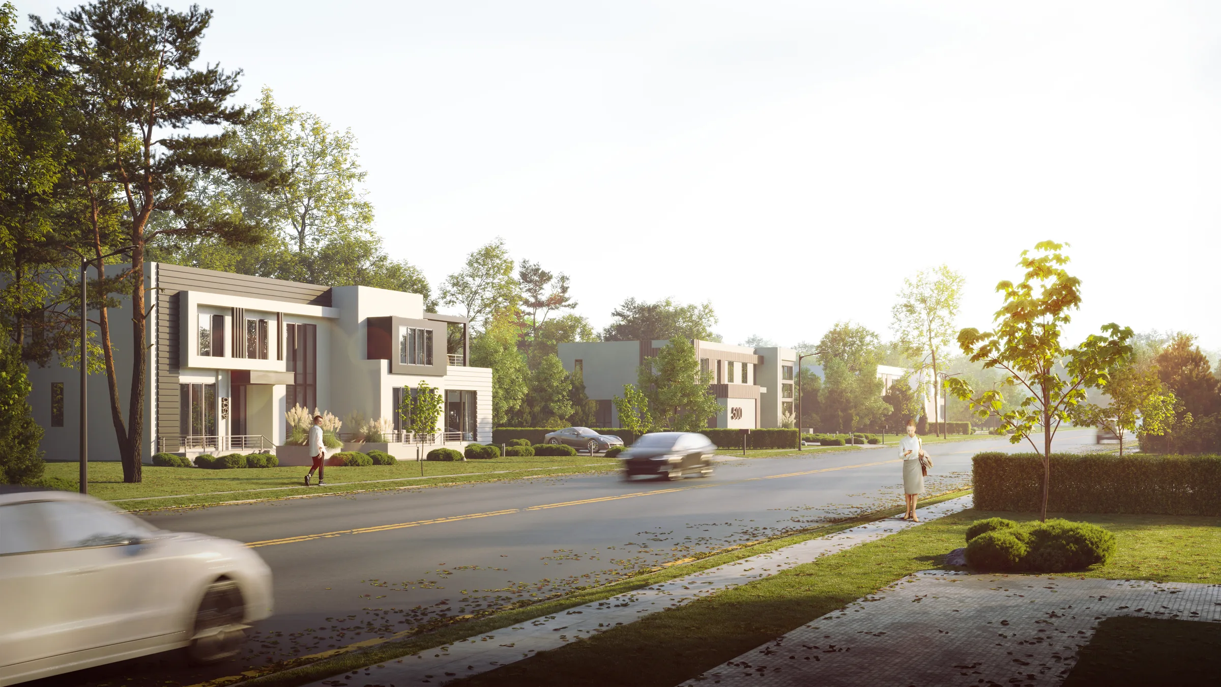
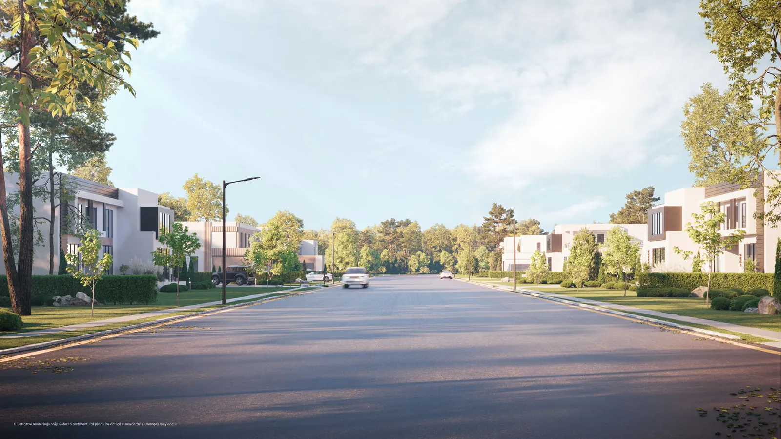
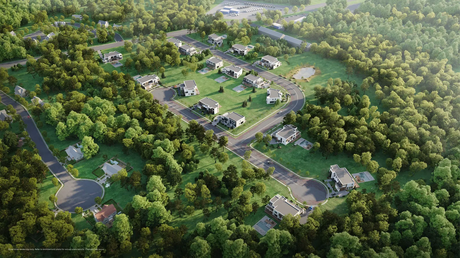
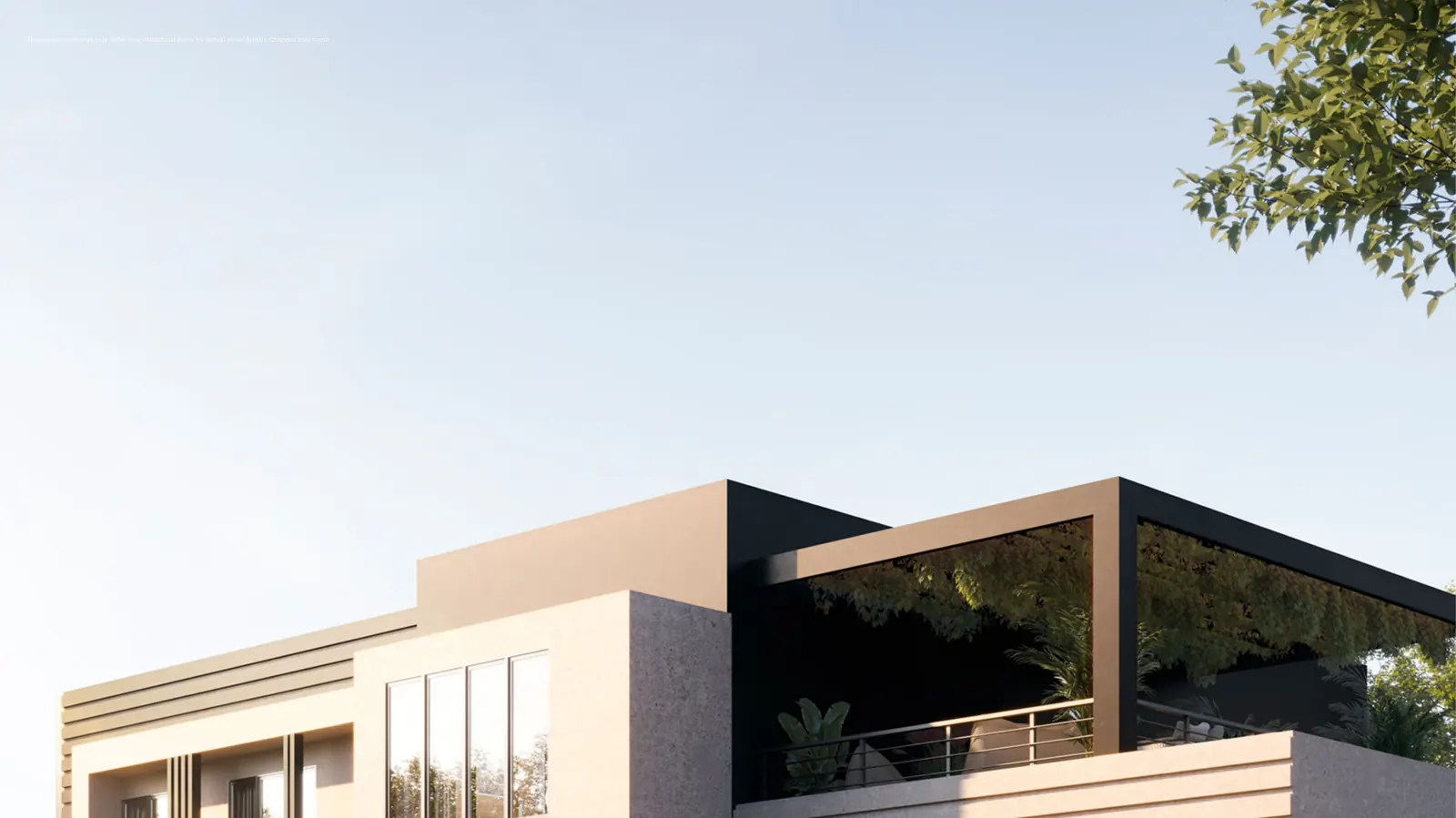
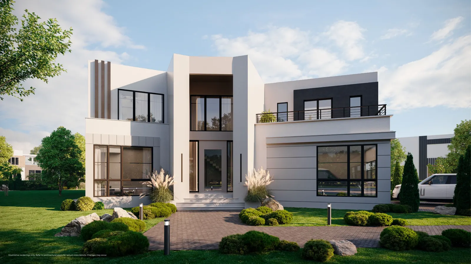
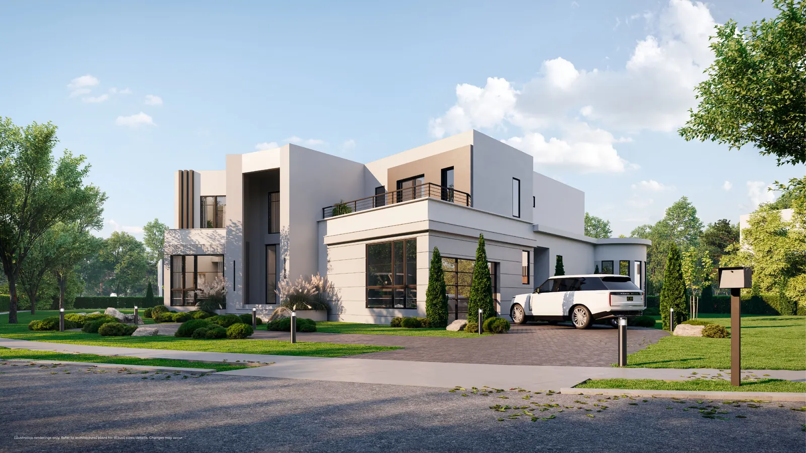
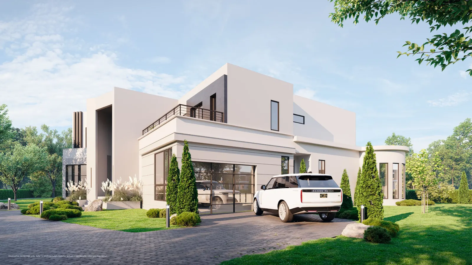
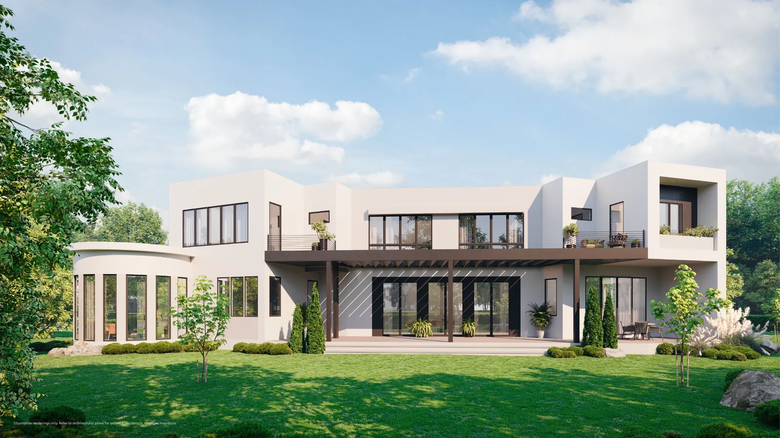
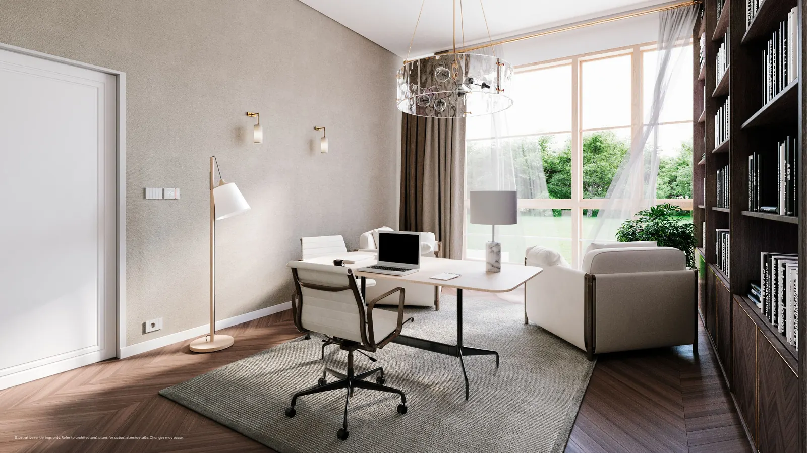
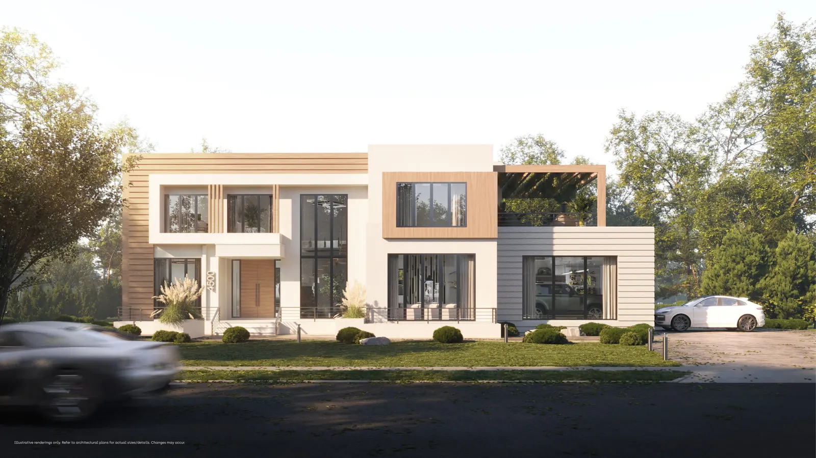
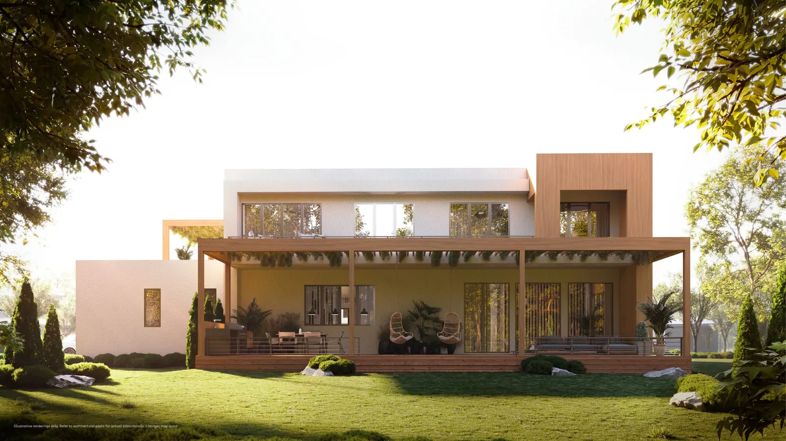
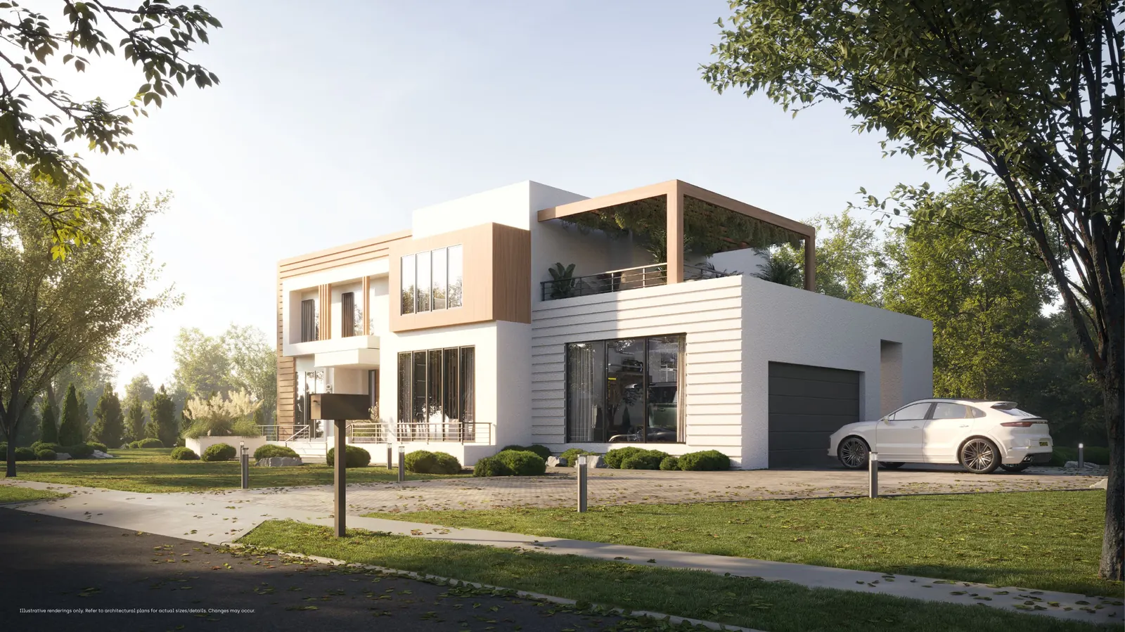
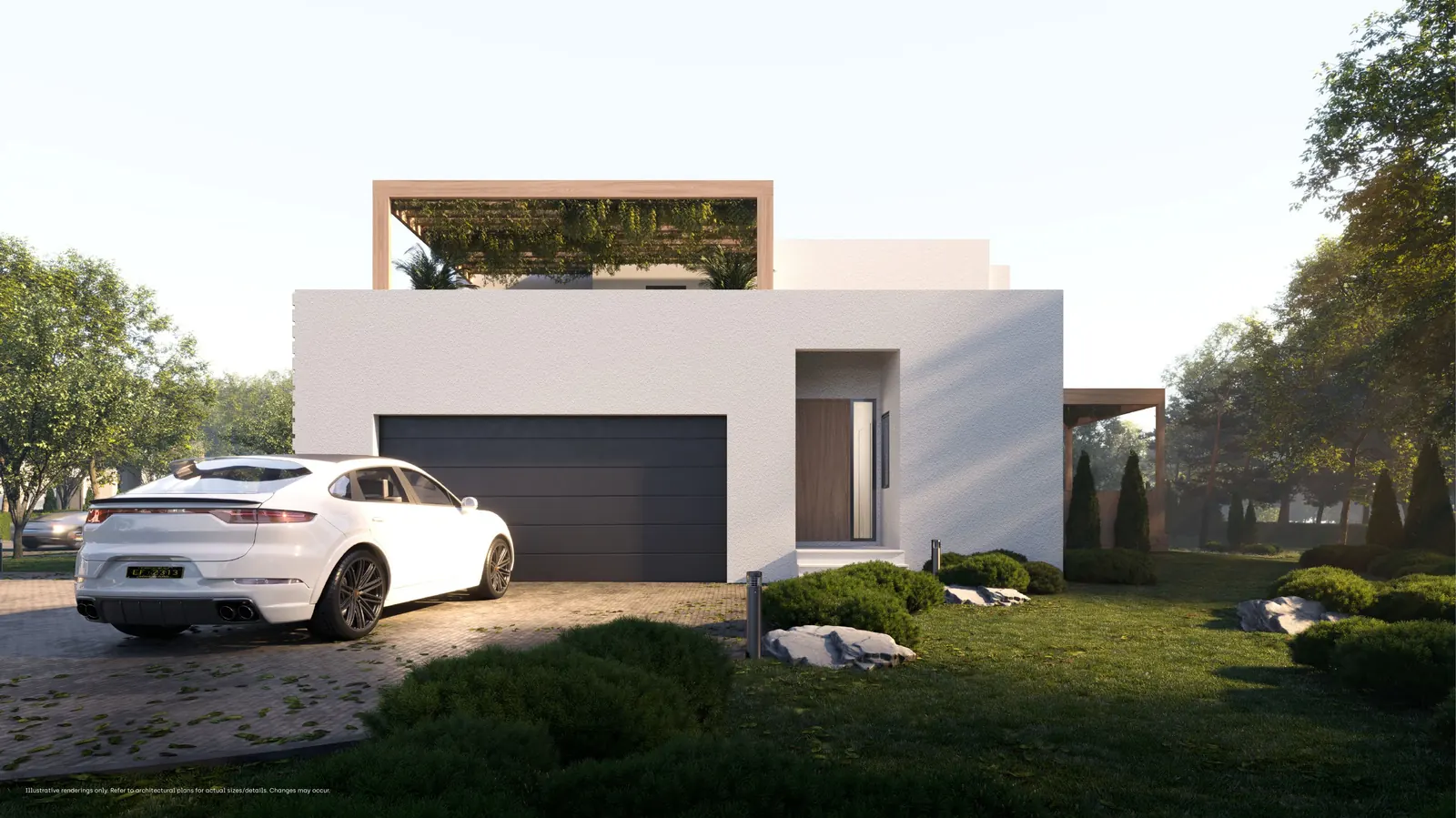
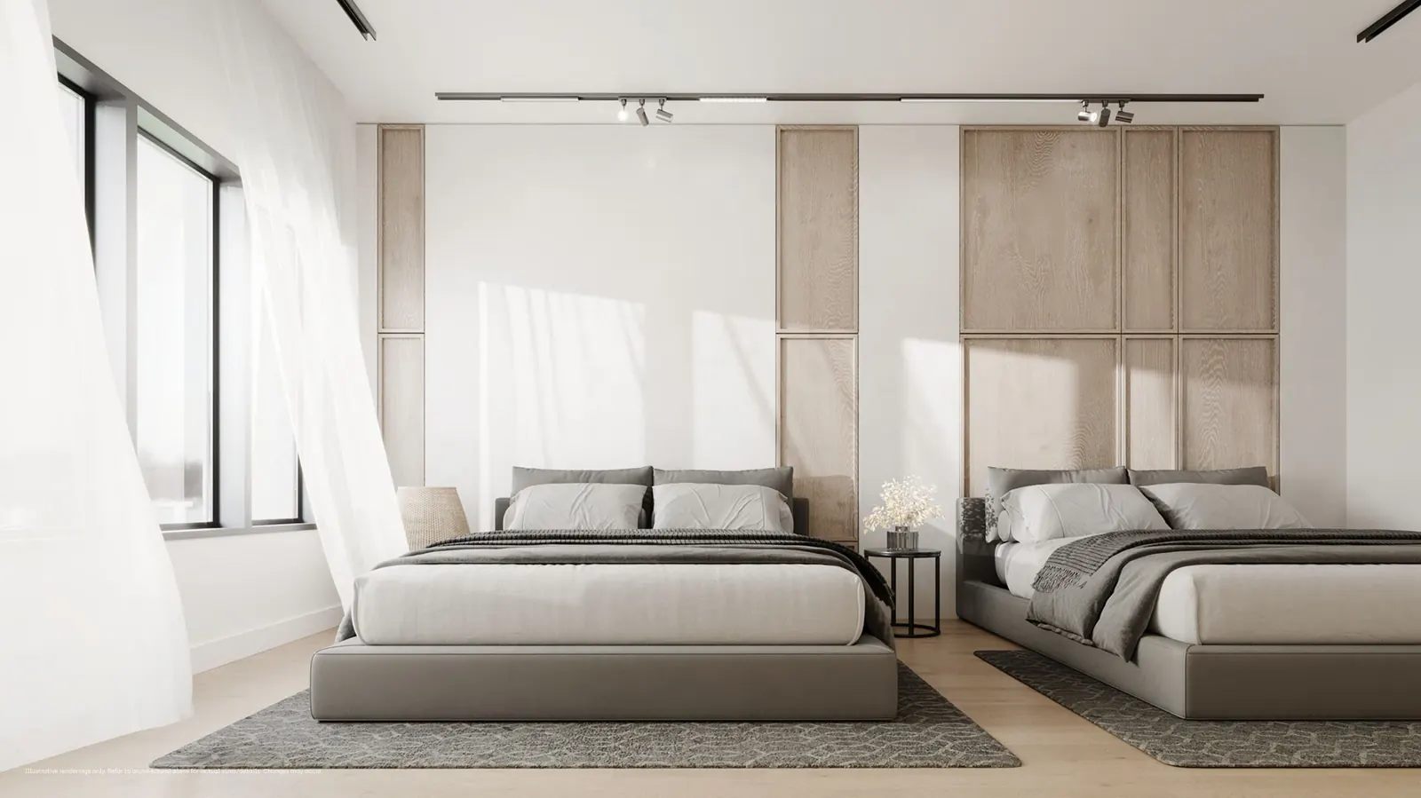
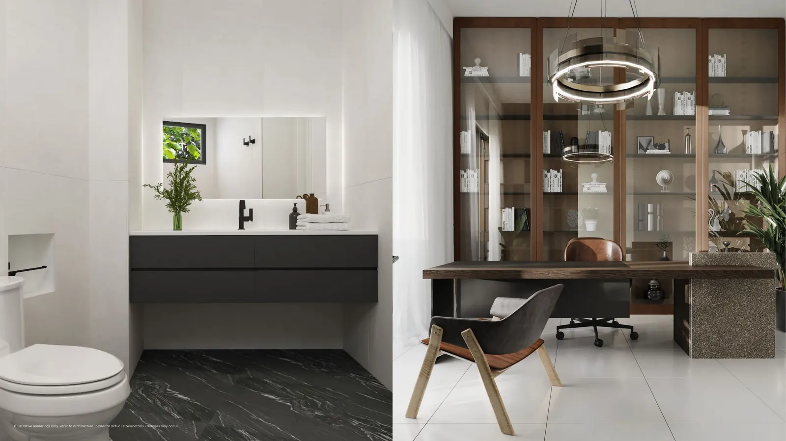
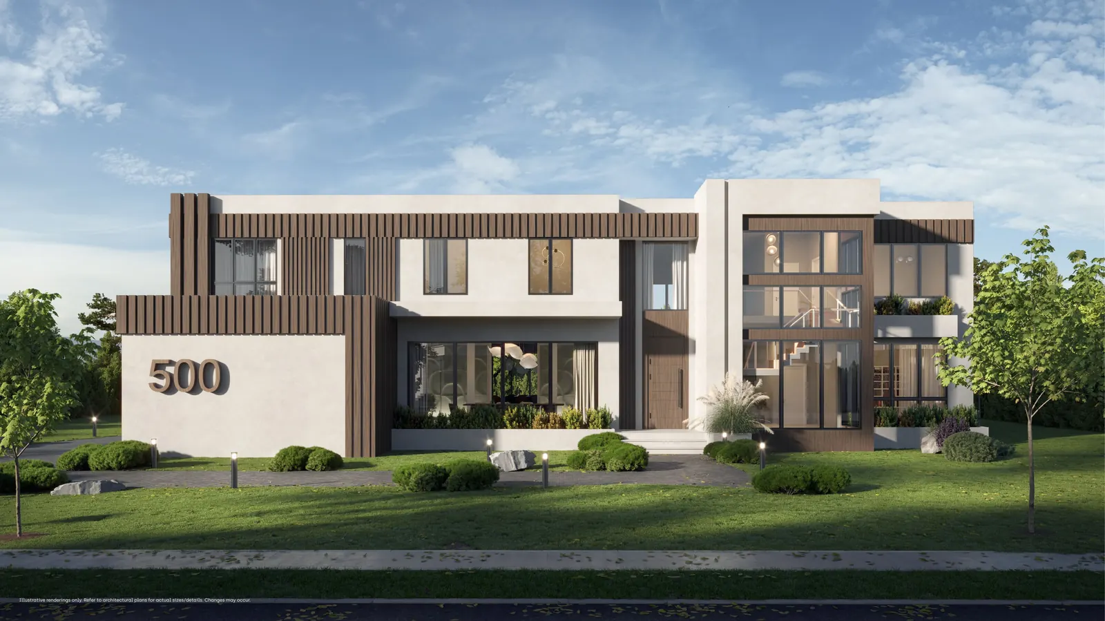
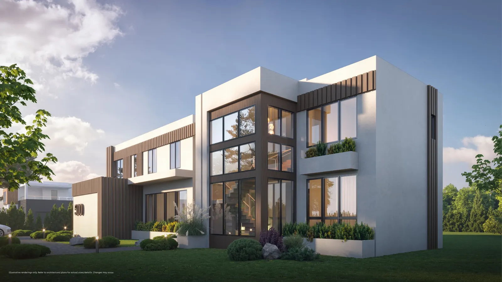
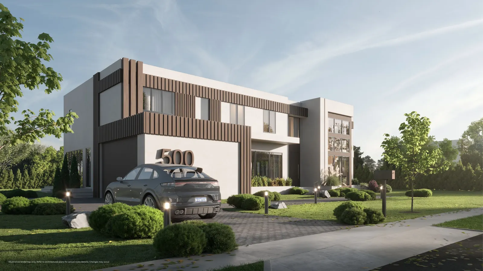
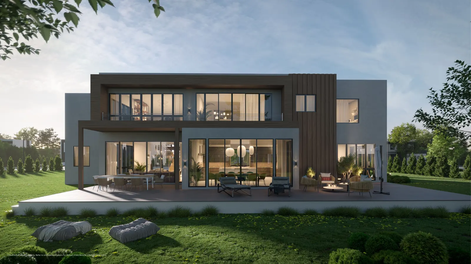
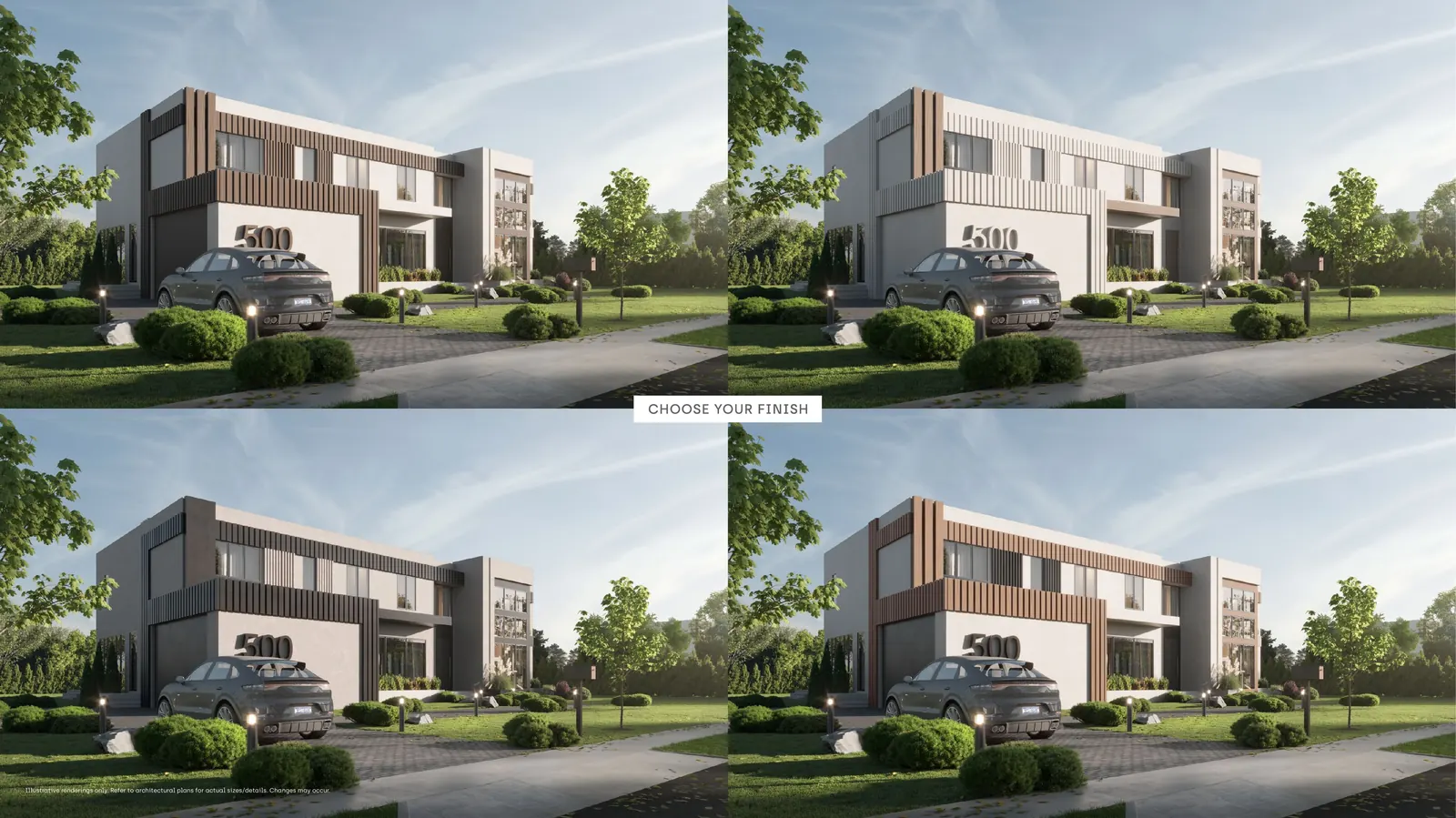
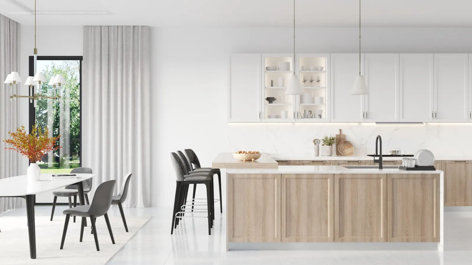
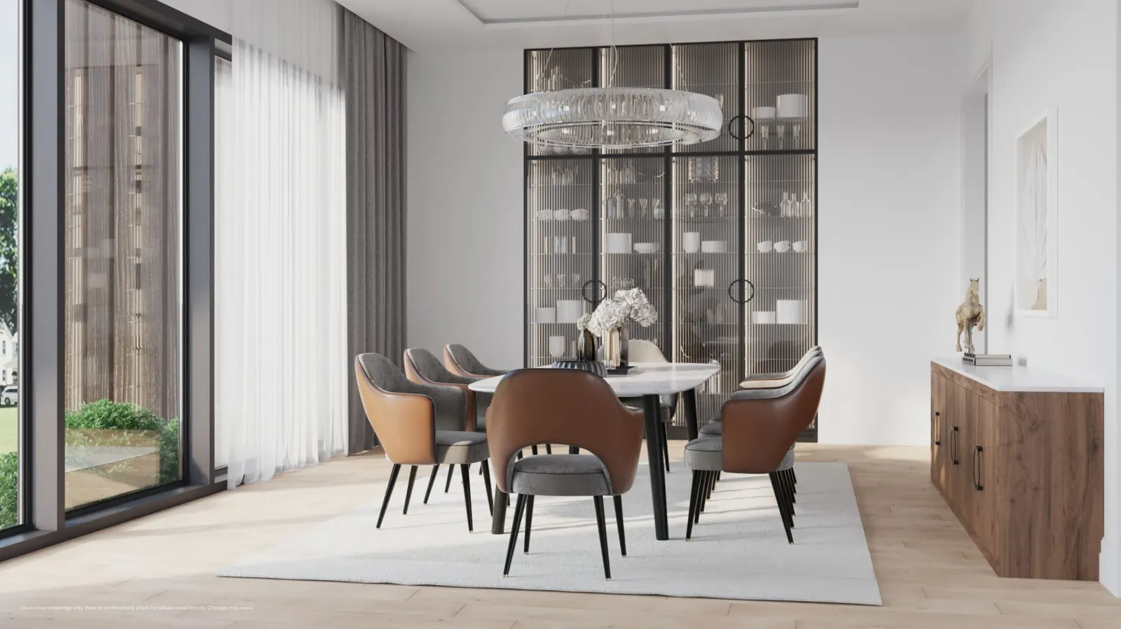
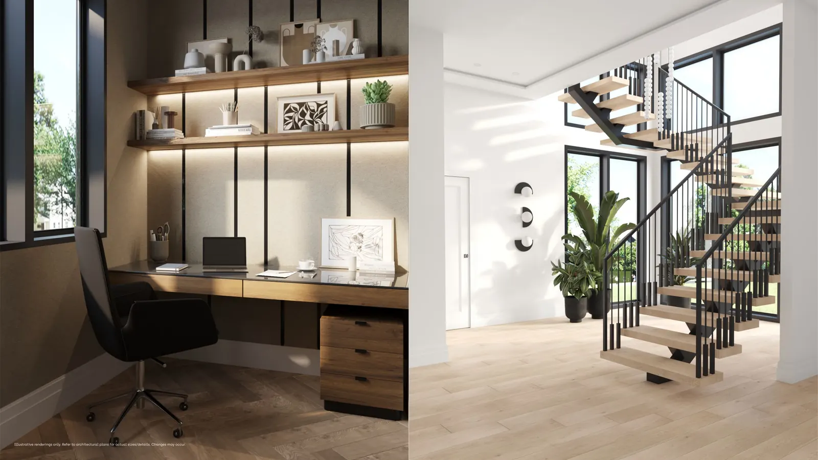
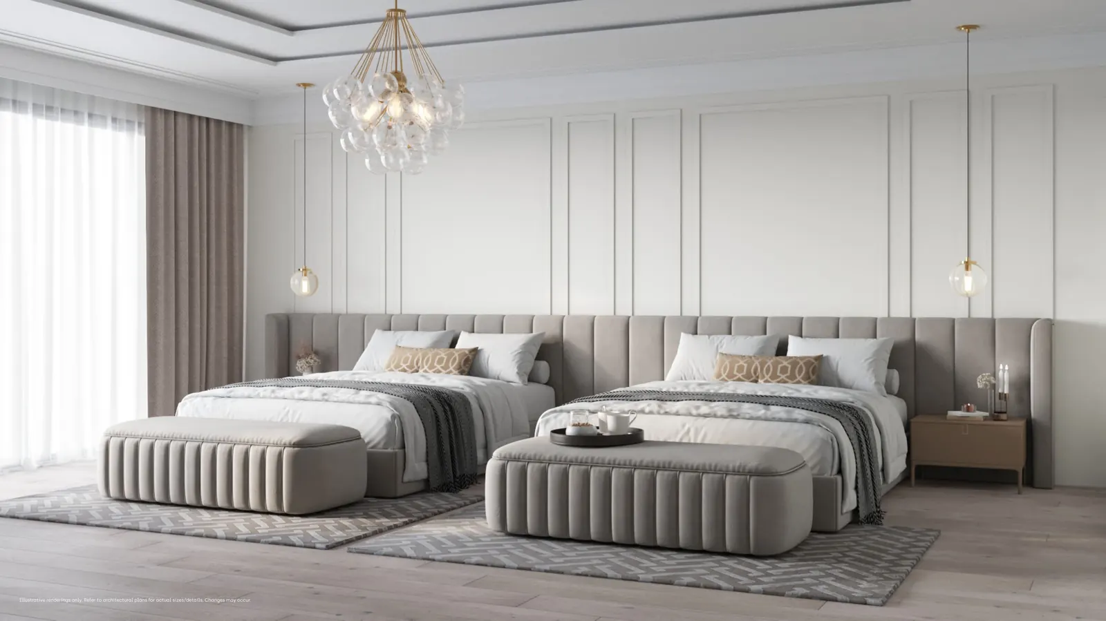
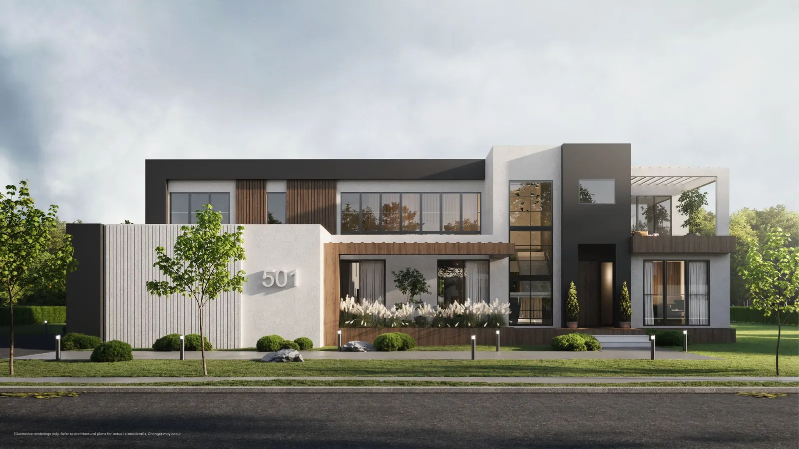
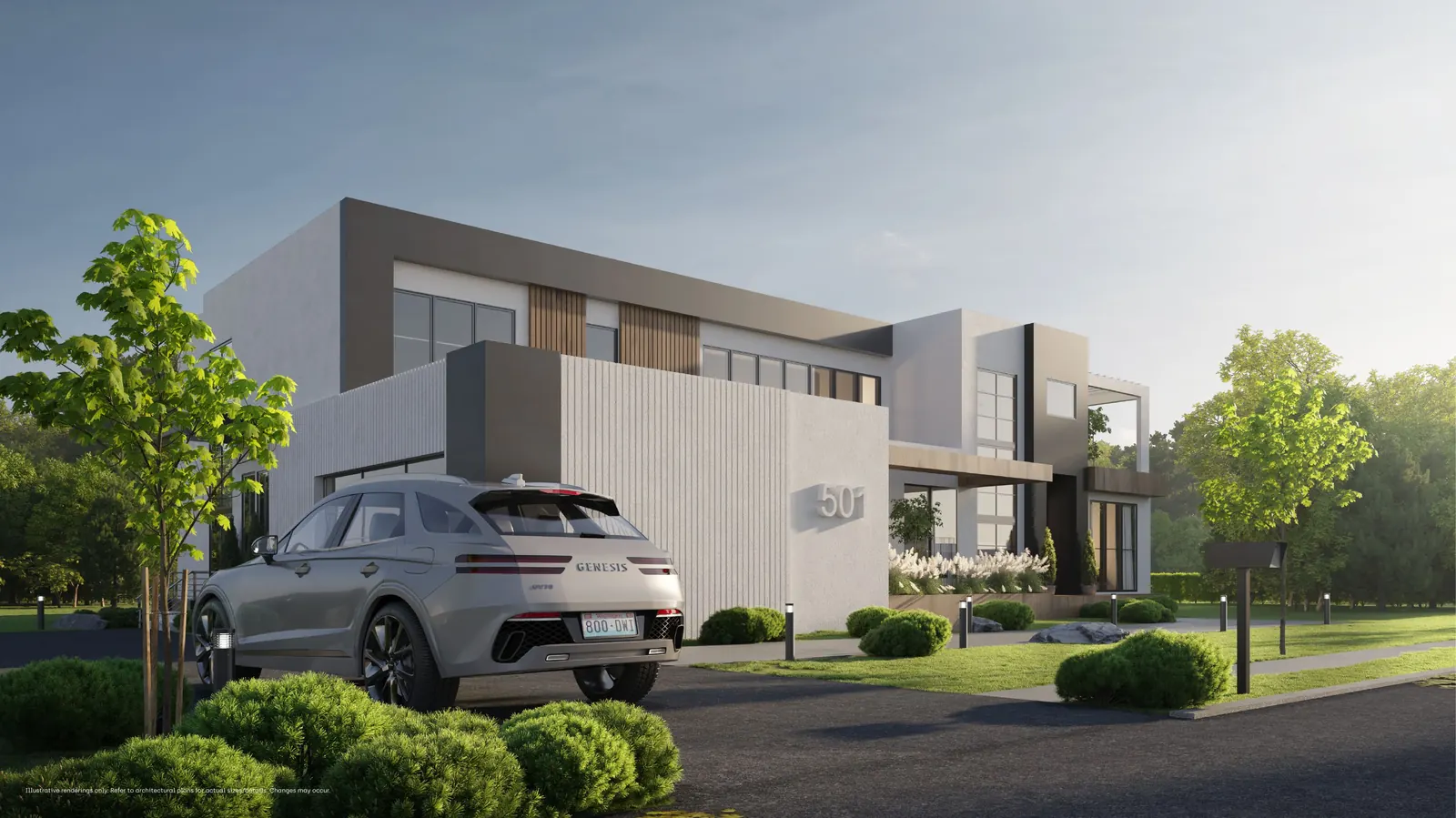
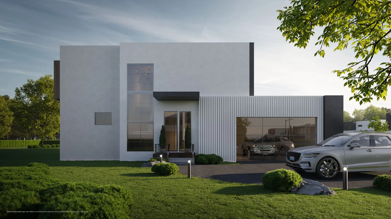
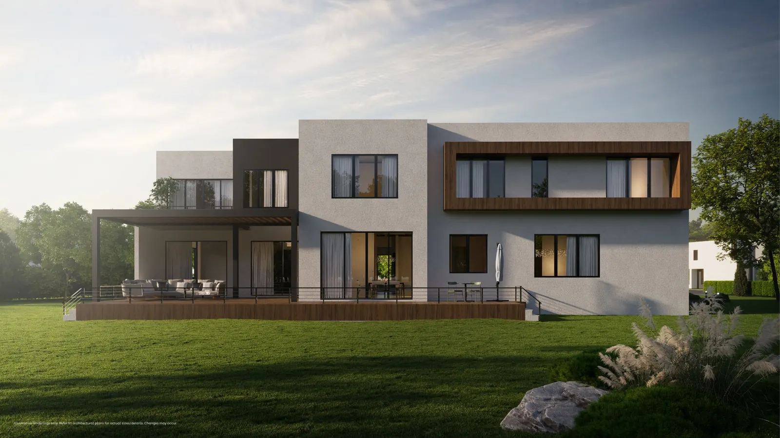
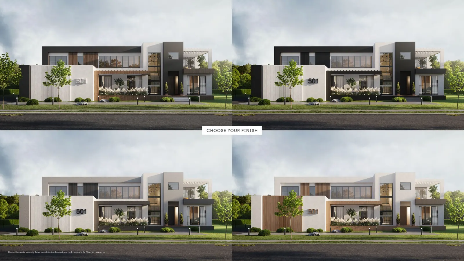
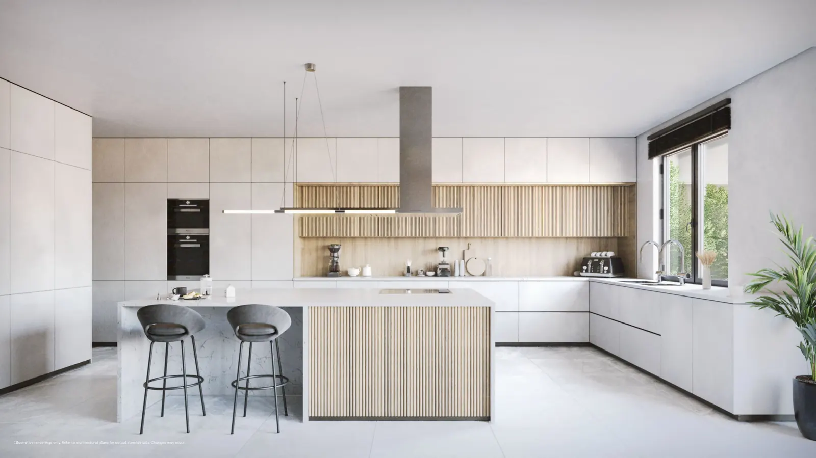
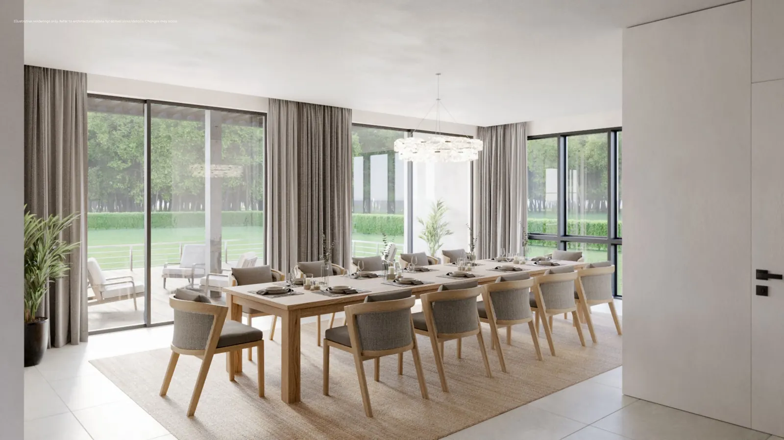
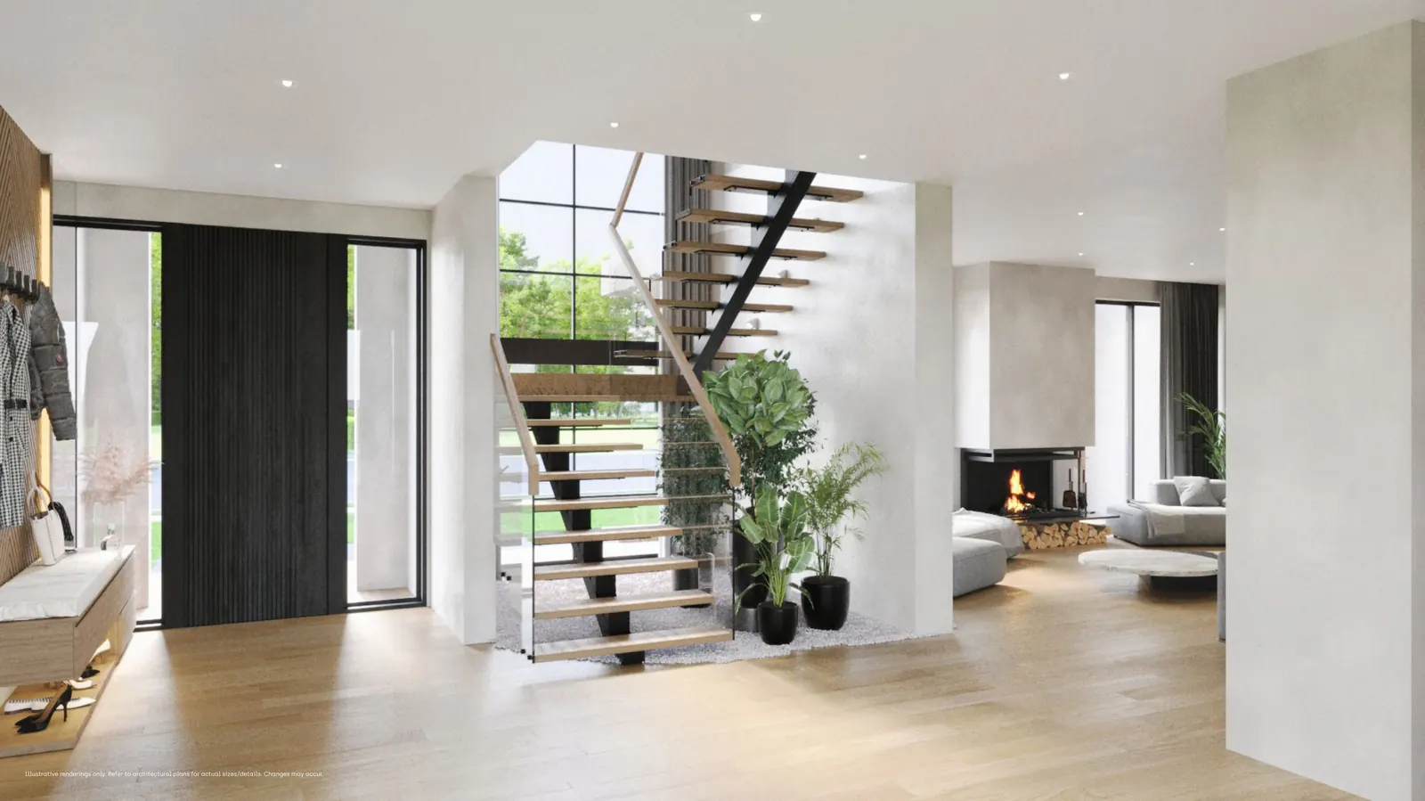
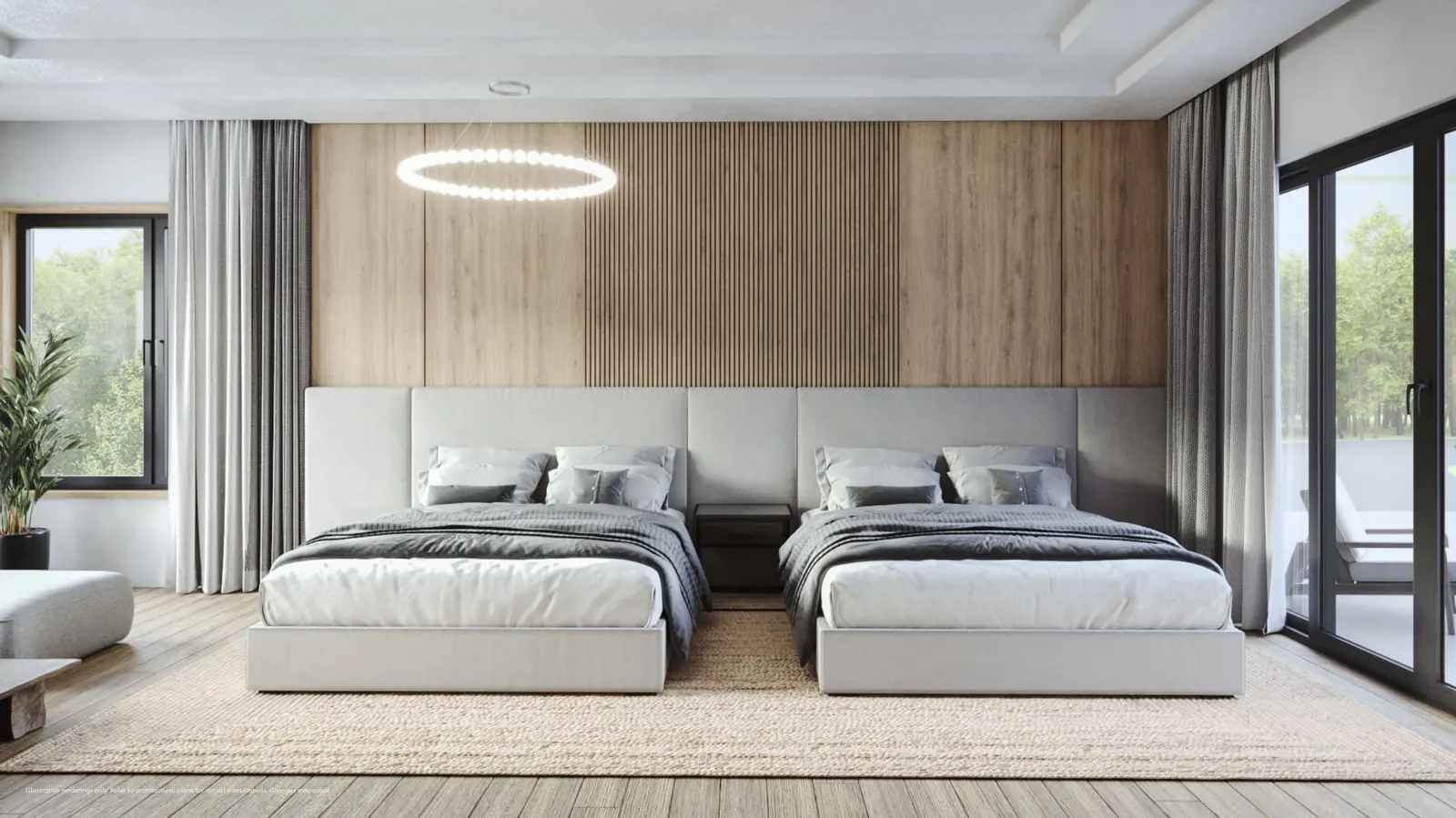
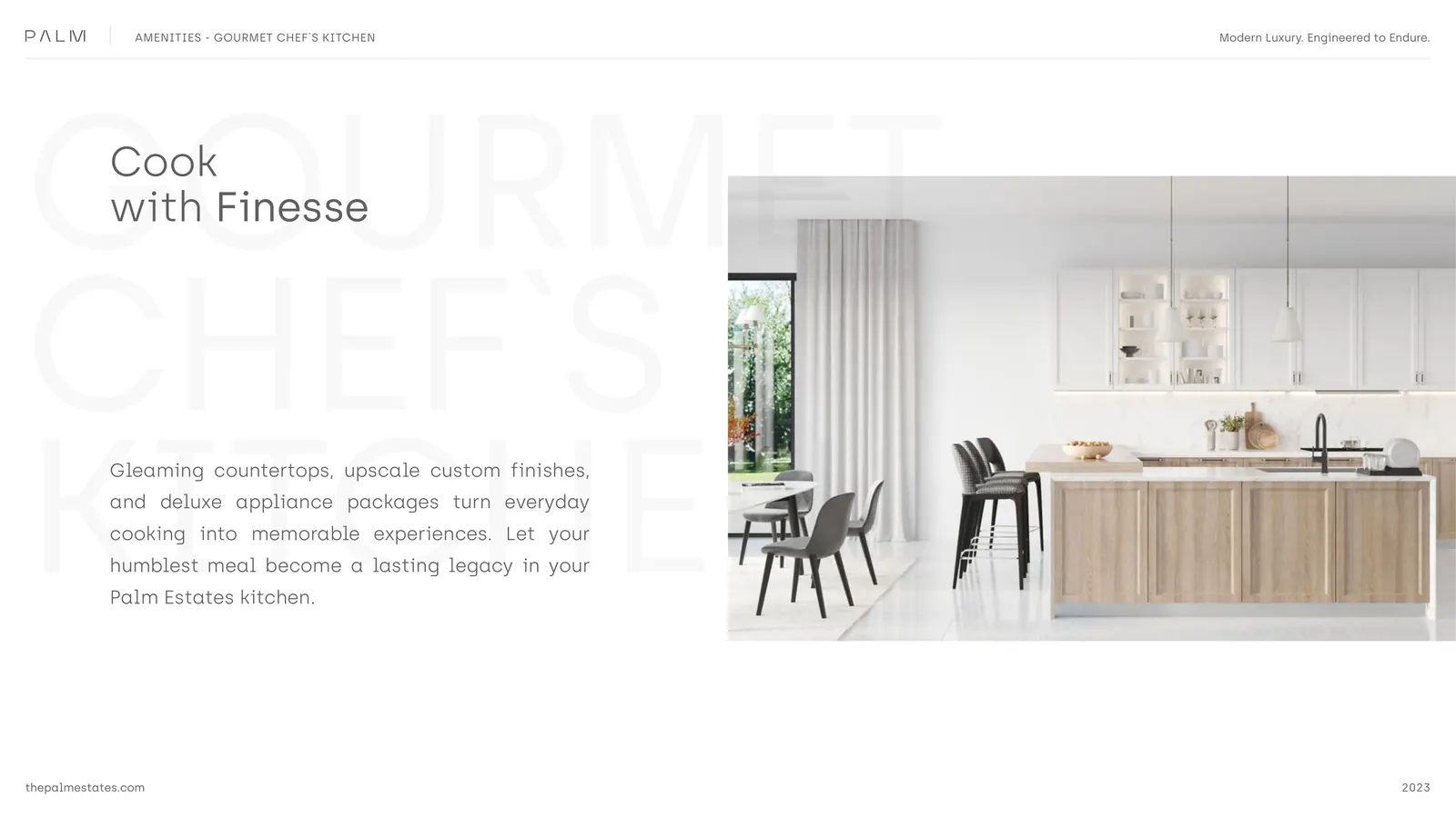
5K renderings
that sell from a screen.
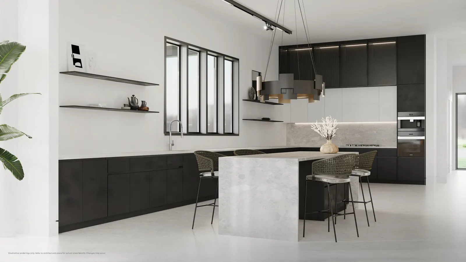
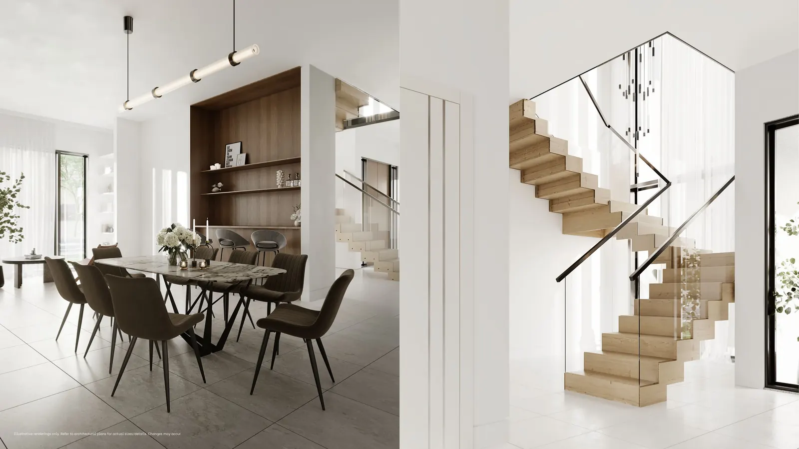
Every home and every street view was rendered at 5K. The renderings carry the project months before the first foundation pour, so buyers can stand on a virtual sidewalk, walk past their model home, and decide if it’s the one — without a hardhat, without a flashlight, without a single mosquito.
Cordata. Banyan.
Maple. Oak.
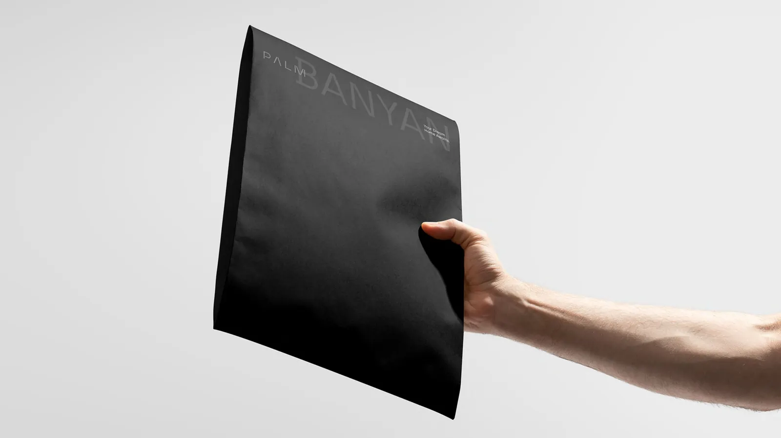
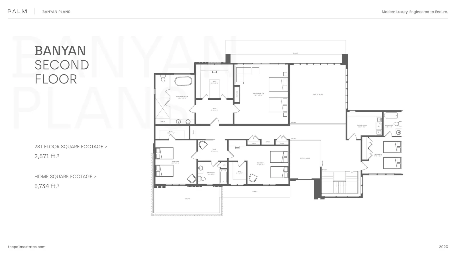
Eighty-nine pages,
one in your hand.
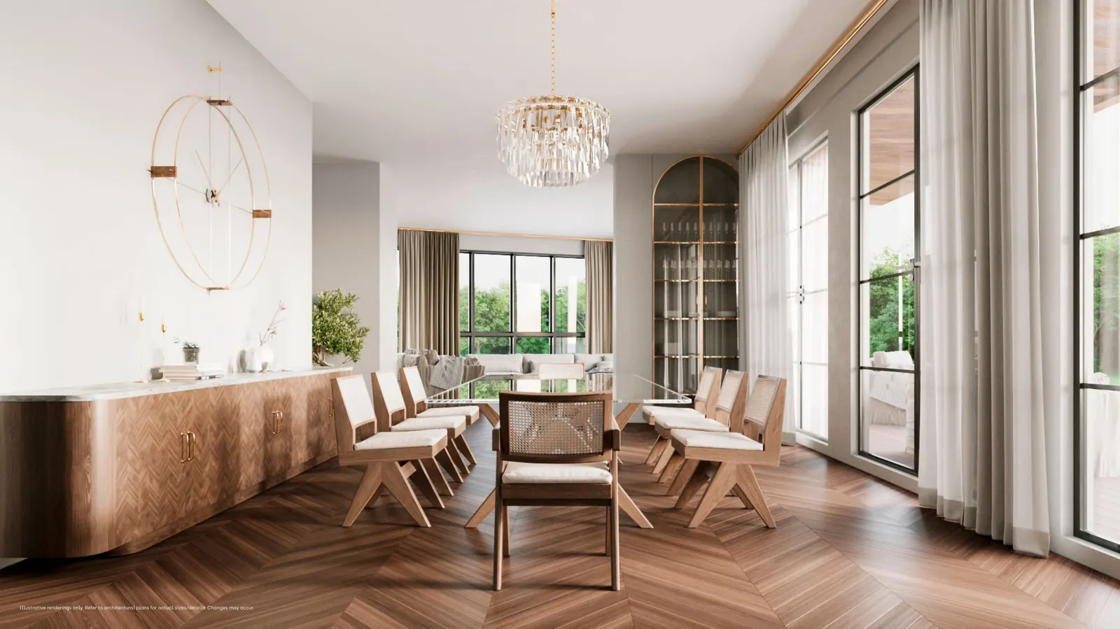
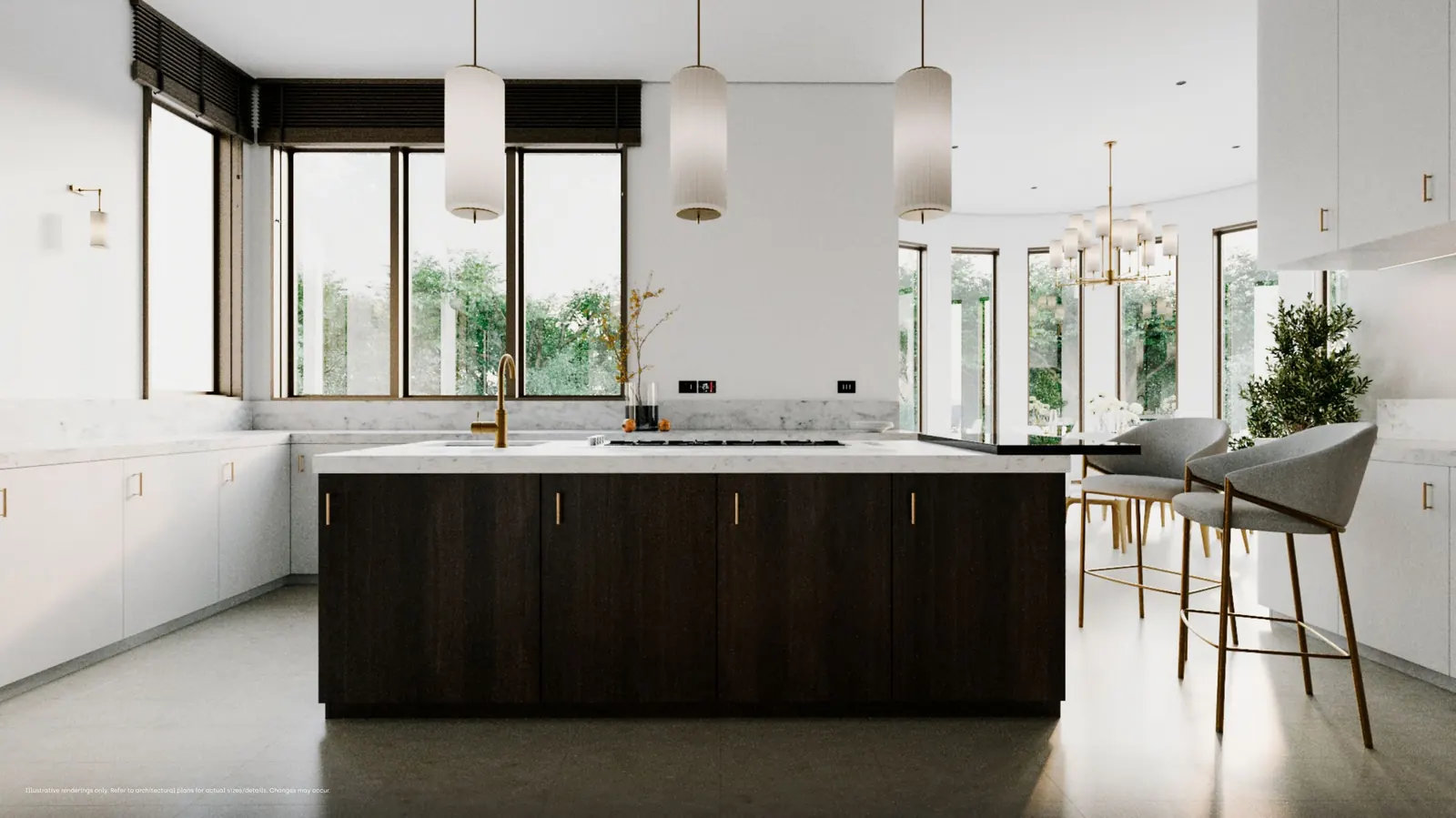
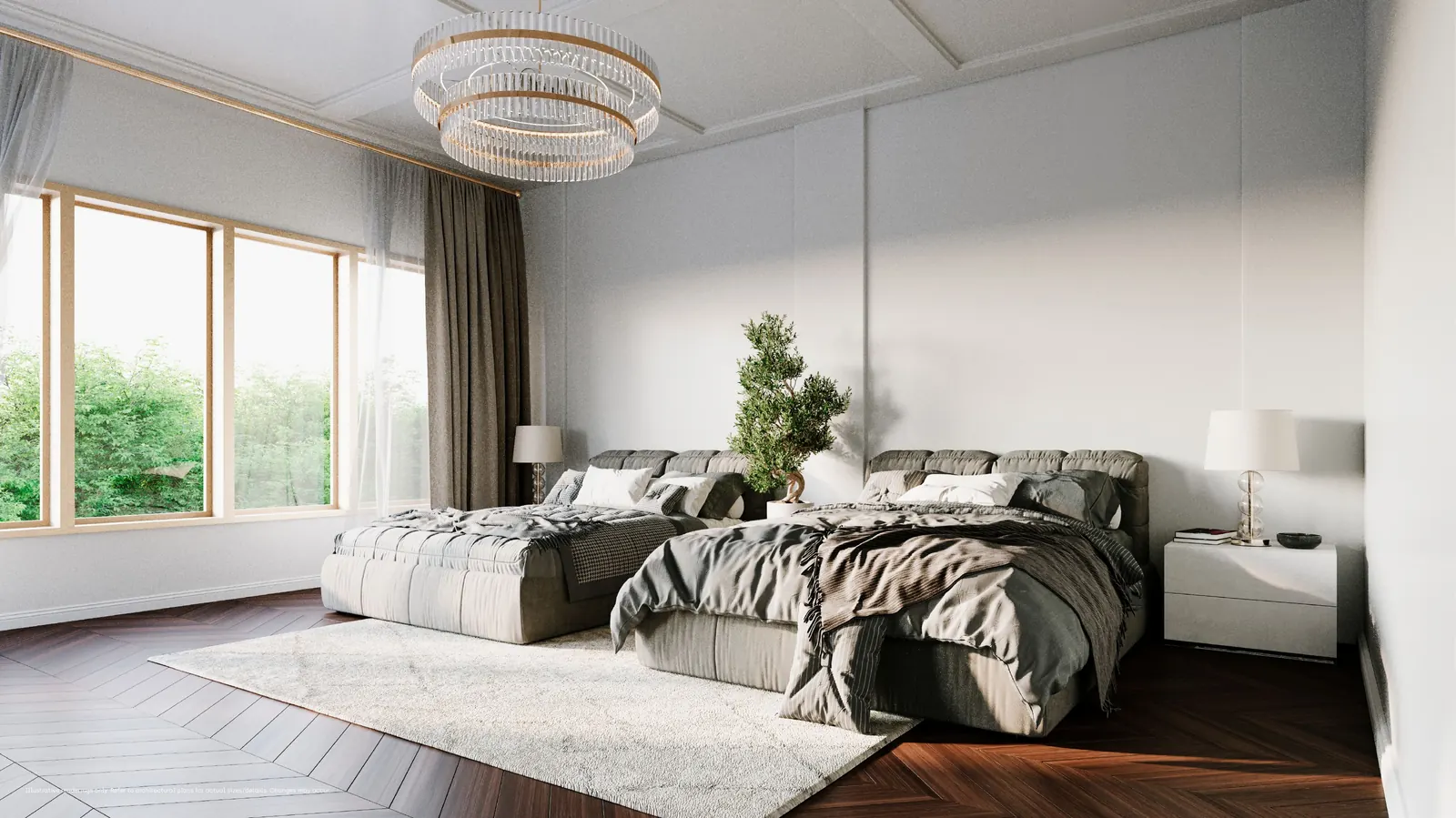
A printed brochure designed to be left with a buyer and reopened a week later. The masterplan, the four models, the floor plans, the renderings, and the materials palette — paced so the reader meets the community in the same order a salesperson would walk them through it. Flip through the full book below.

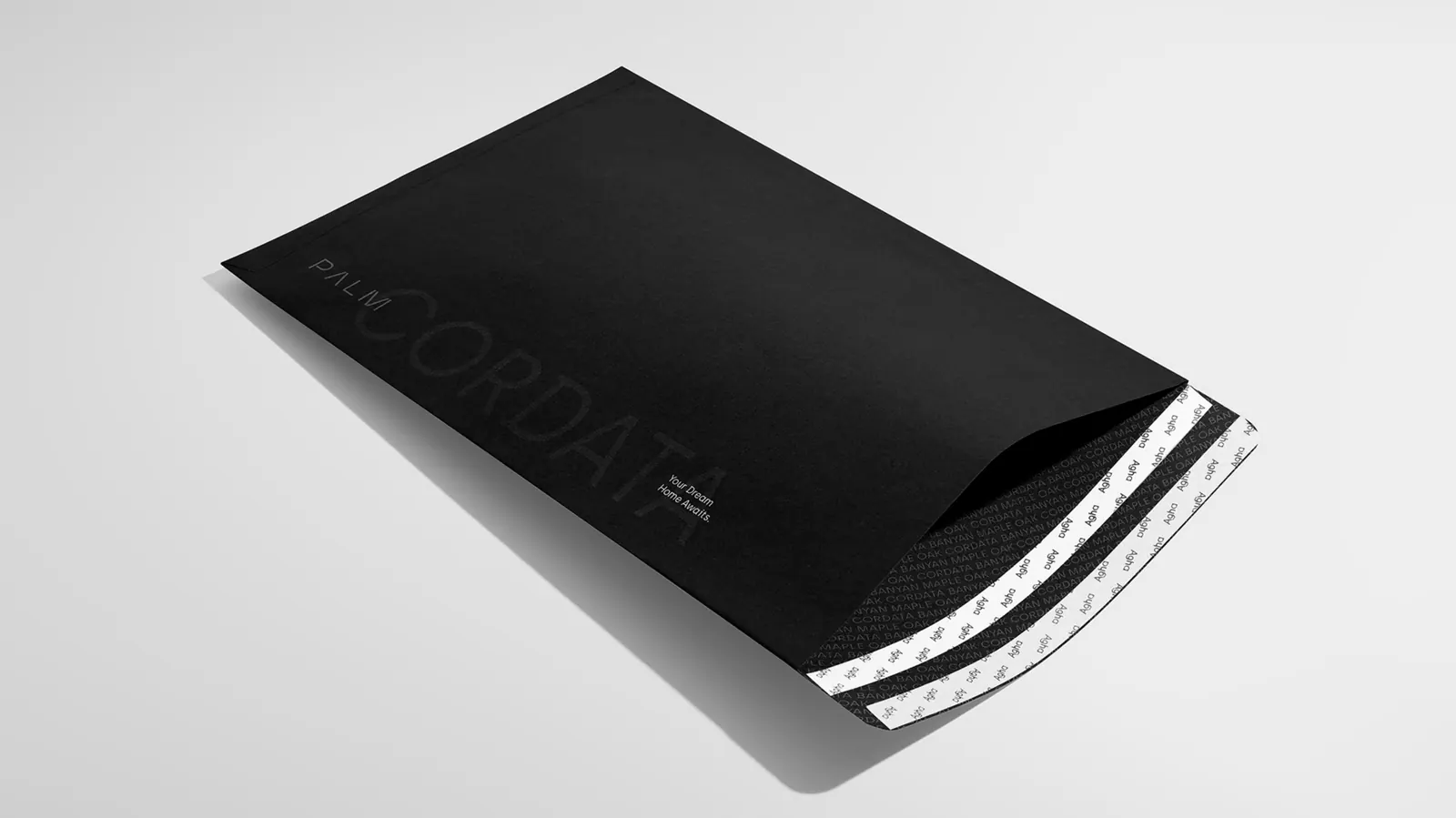
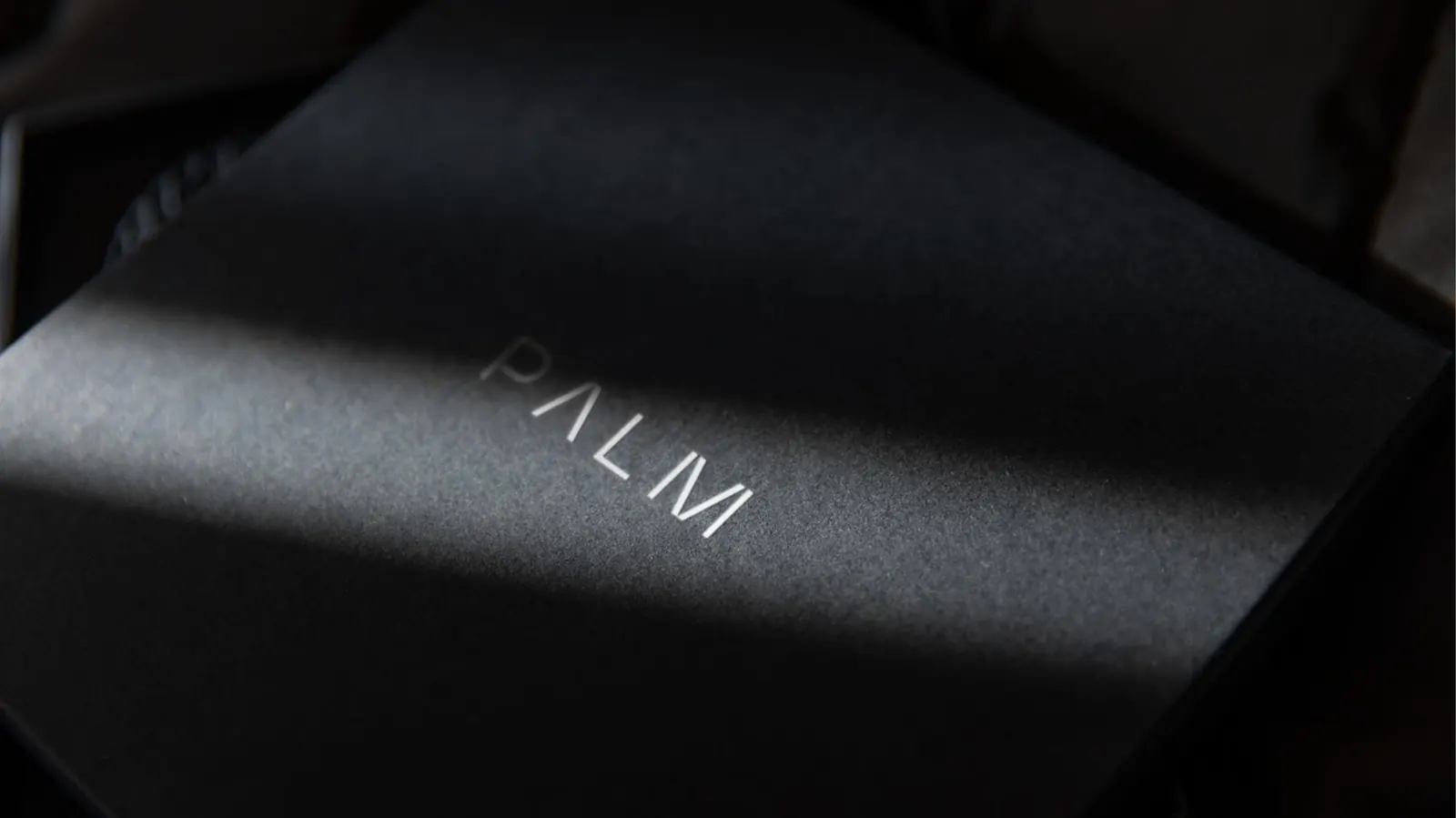


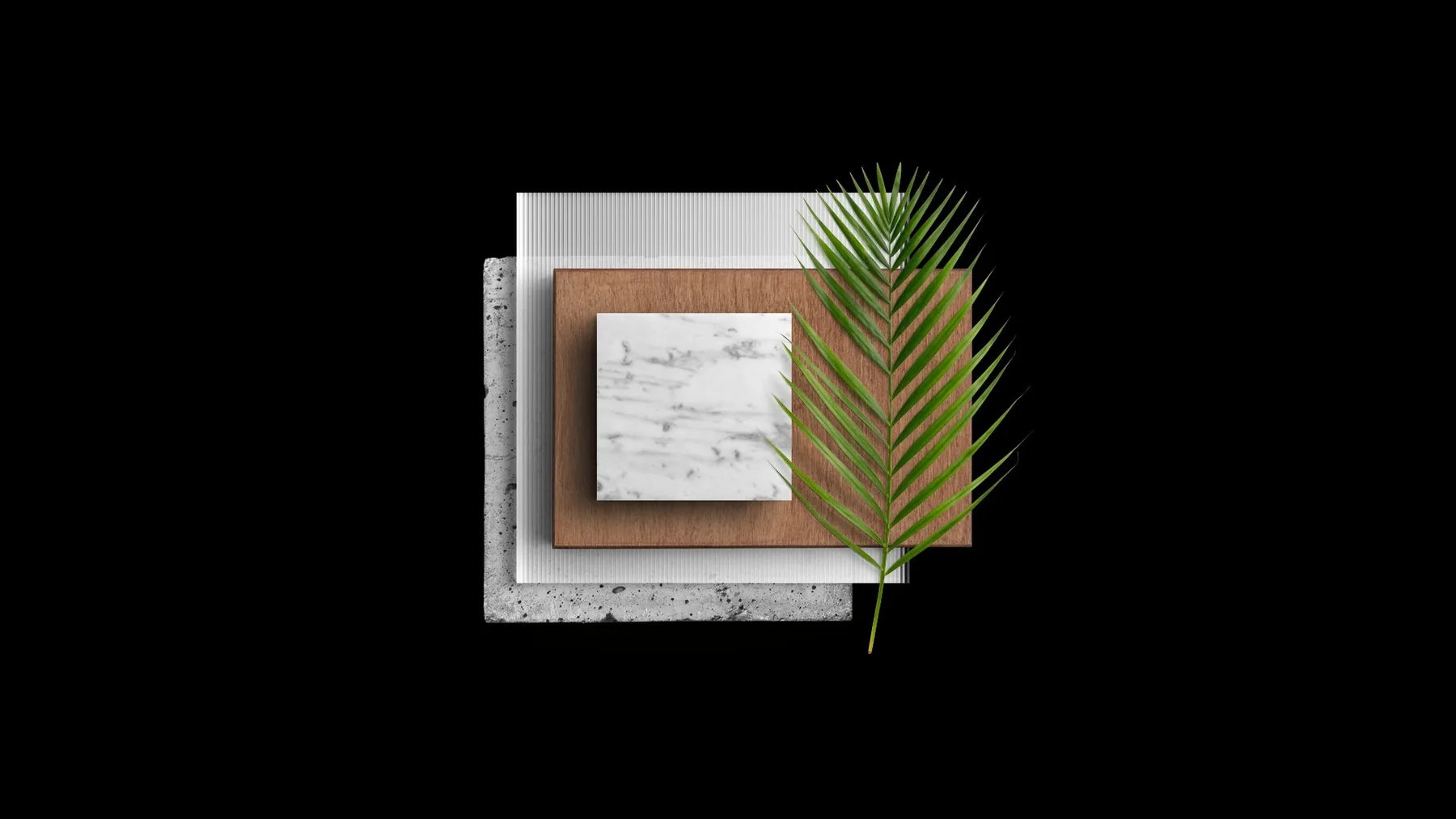
A wordmark,
and the materials behind it.
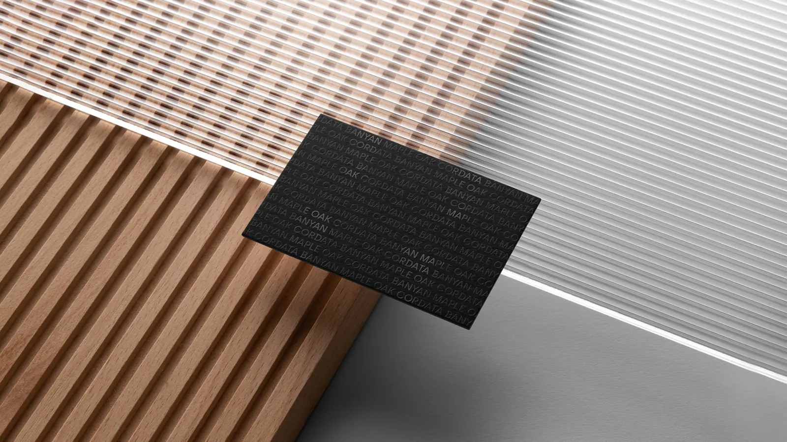
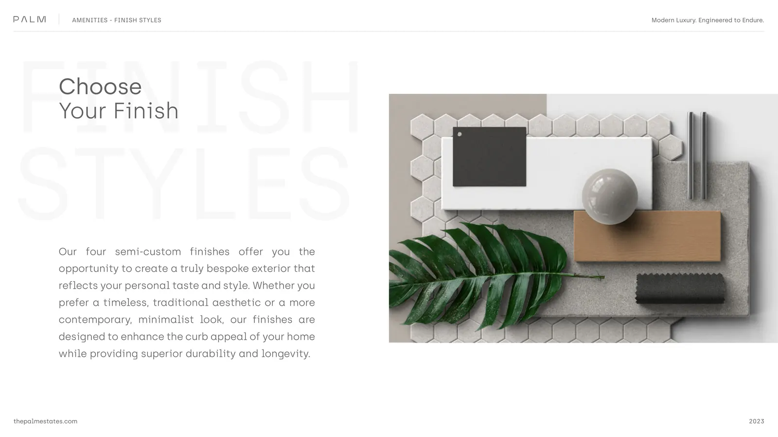
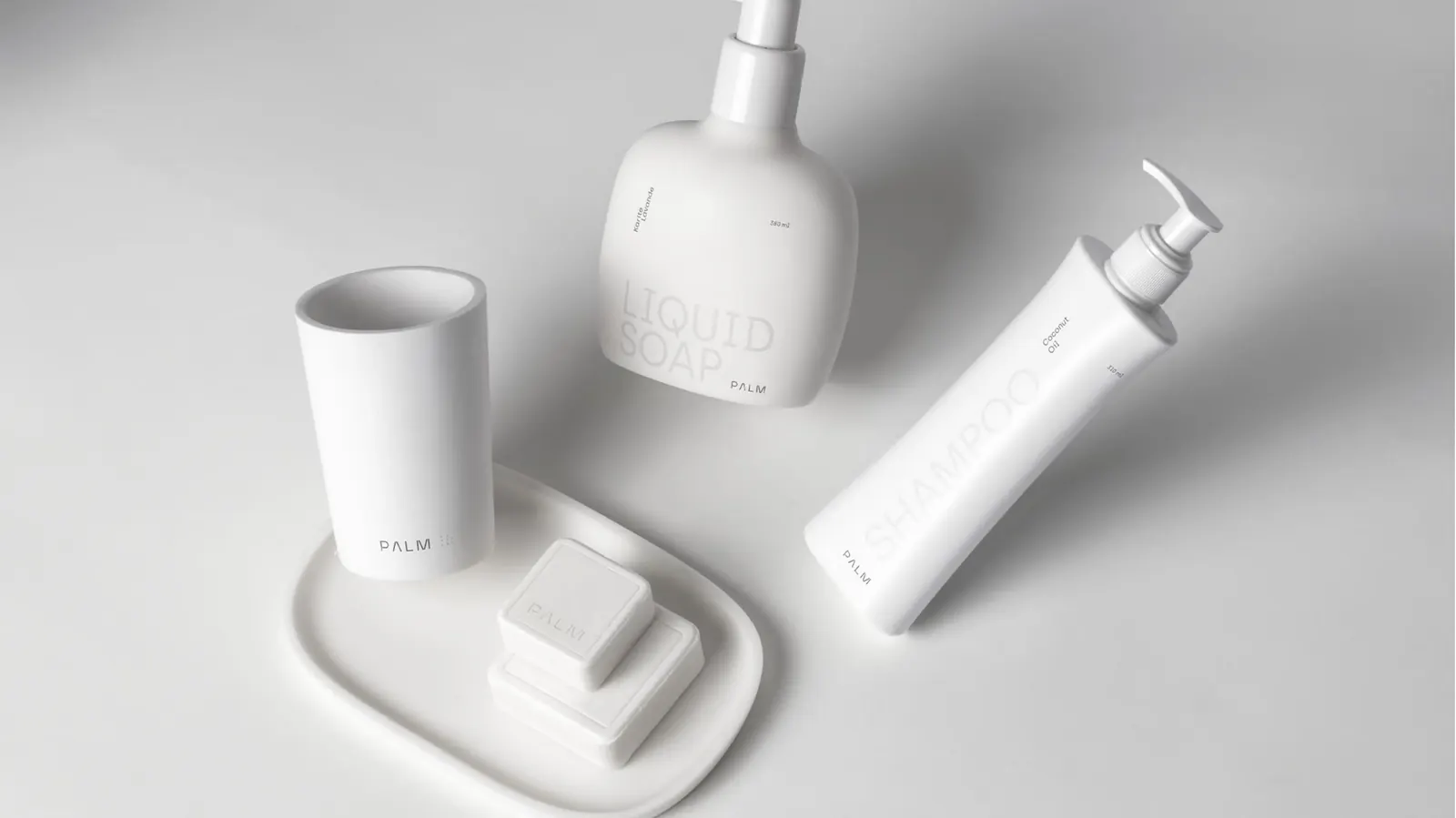
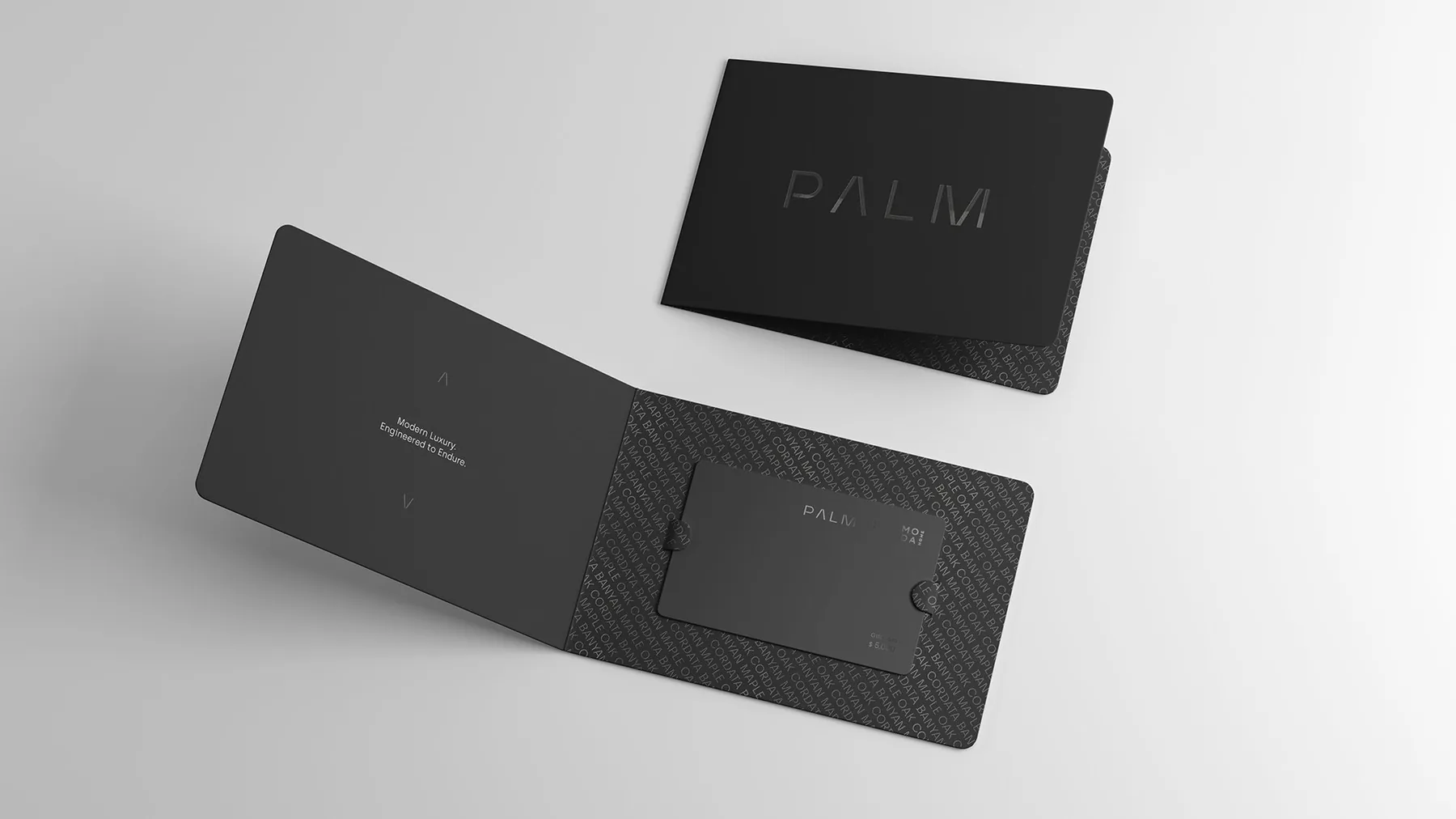
A spaced wordmark in a thin geometric face. Black on black for the premium pieces, white on black for the bold ones. The brand is built on the same three materials the homes are built on — wood, marble, and concrete — with a palm leaf as the only sign of warmth. The system reads as restrained on its own and confident in context.
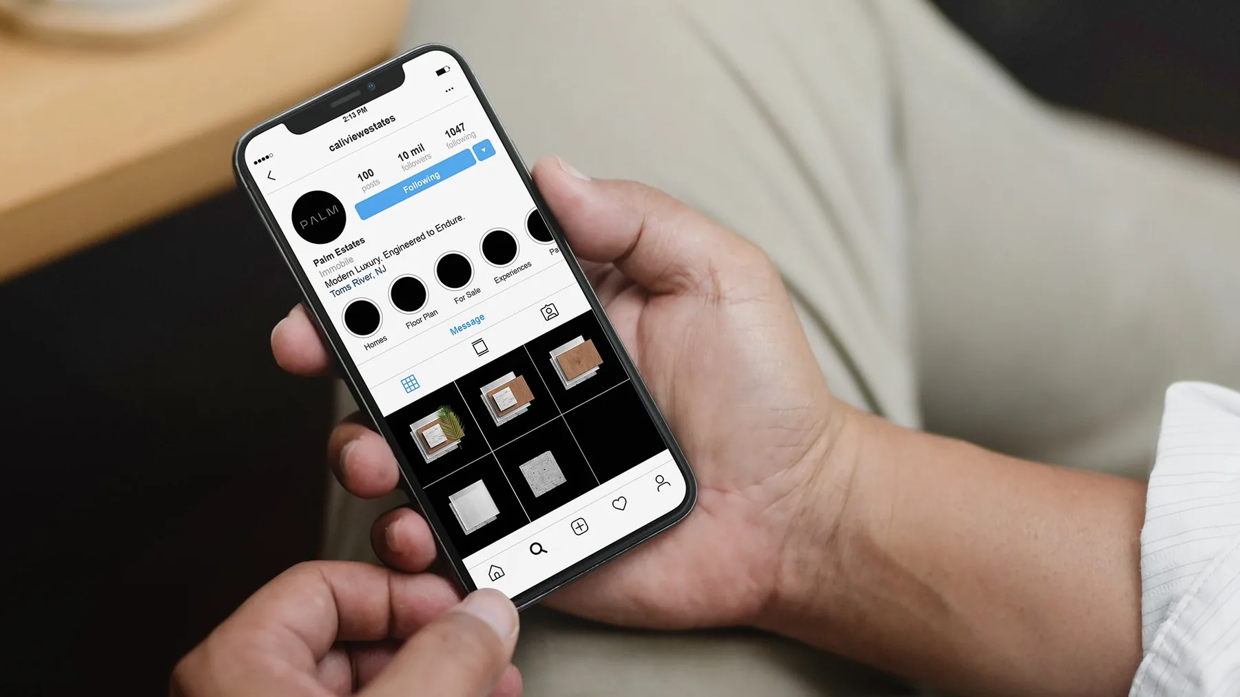
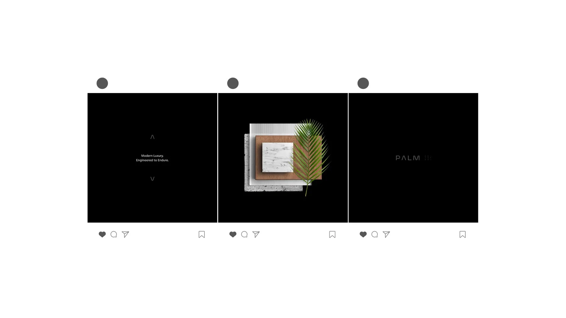
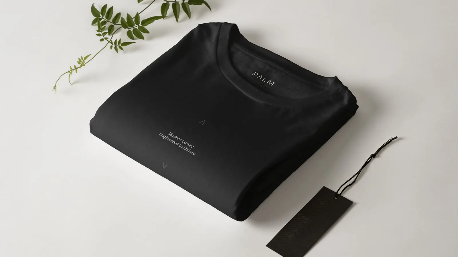
The brand,
off the page.
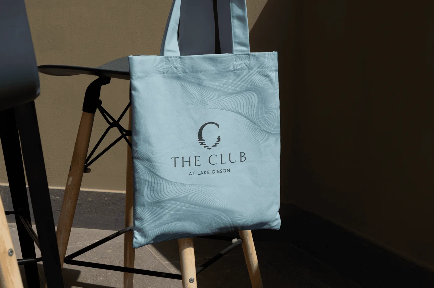
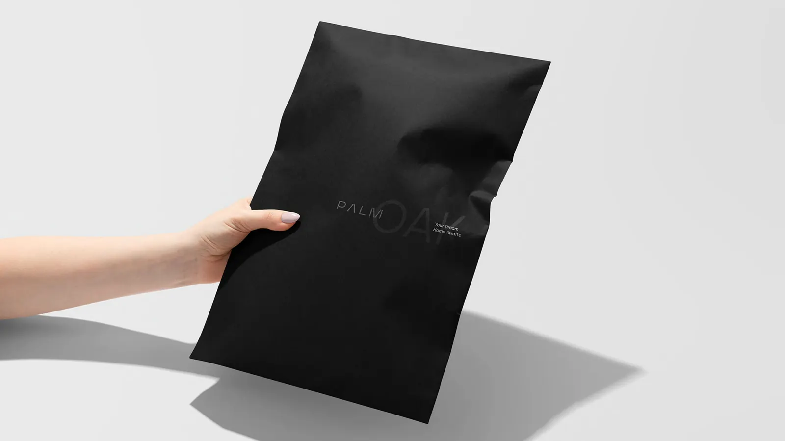
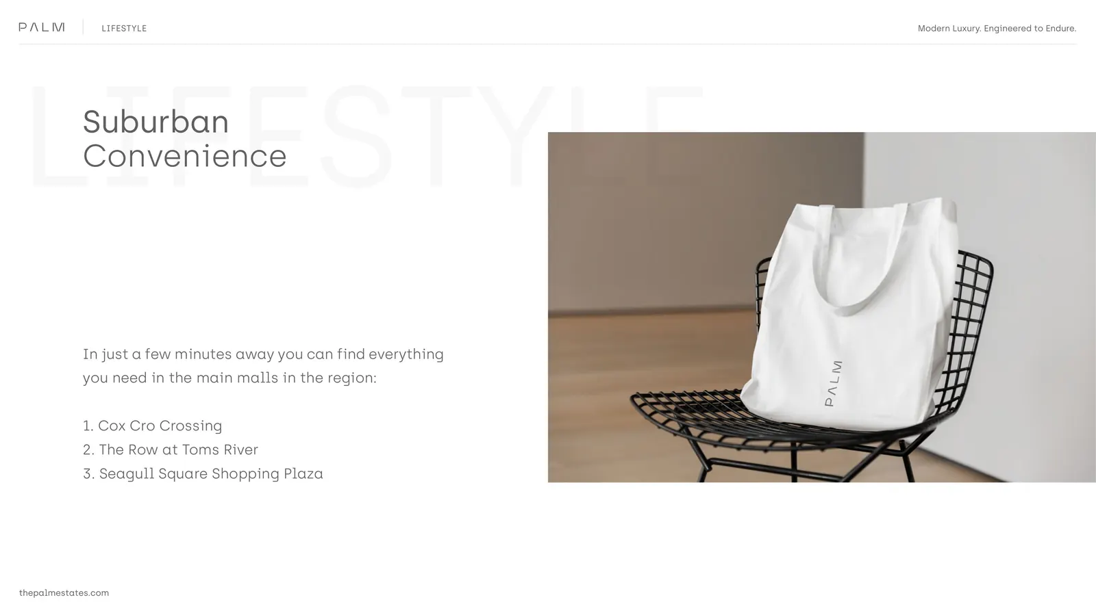
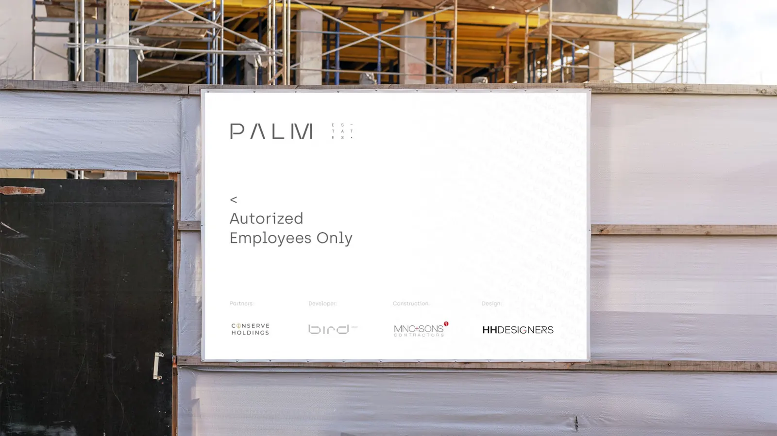
A gift card pack for partners. A hangtag for the merchandise line. A hardhat for the construction site. Each piece designed to feel like part of the same community a buyer is moving into — even before the first model goes vertical.
A team effort,
start to finish.
The architecture and the 5K renderings were drawn and produced by our architectural partner. The brand, the naming, the brochure, the social, and every piece of collateral were ours. The result is a community that feels considered before a single home is finished.
We needed a brand that could carry a community for a decade, not a launch. Mozart wrote a name and a tagline that still hold up every time we hand a brochure to a buyer. The work reads as confident without trying, which is the hardest thing to do.