The river,
in the mark.
A senior care campus on the Susquehanna. The river runs through the logo. The sky runs through the rest.
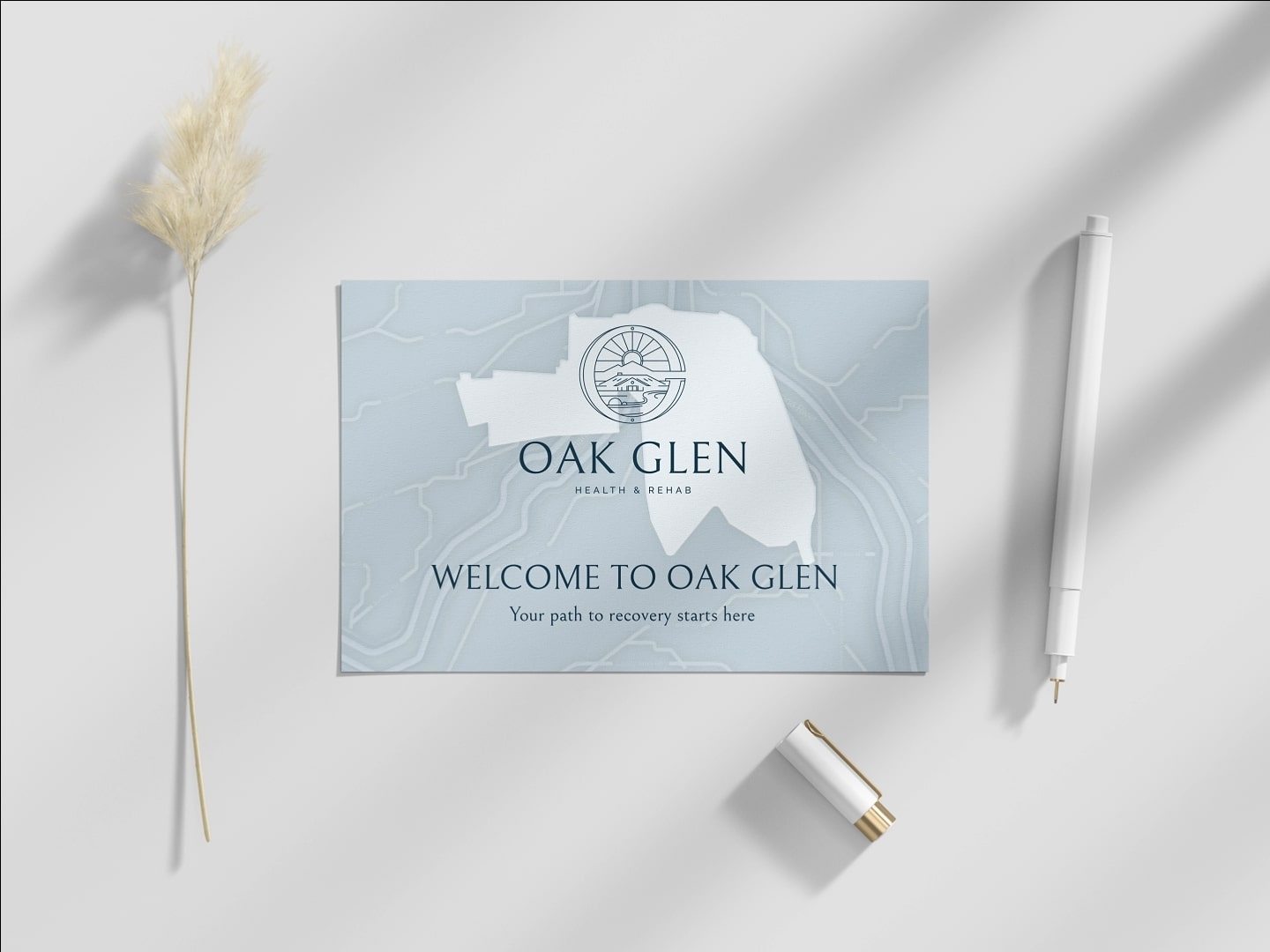
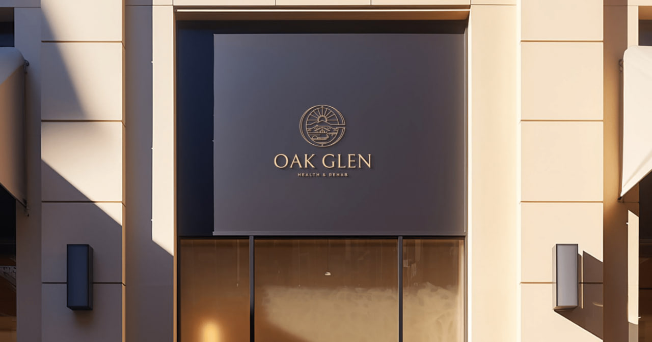
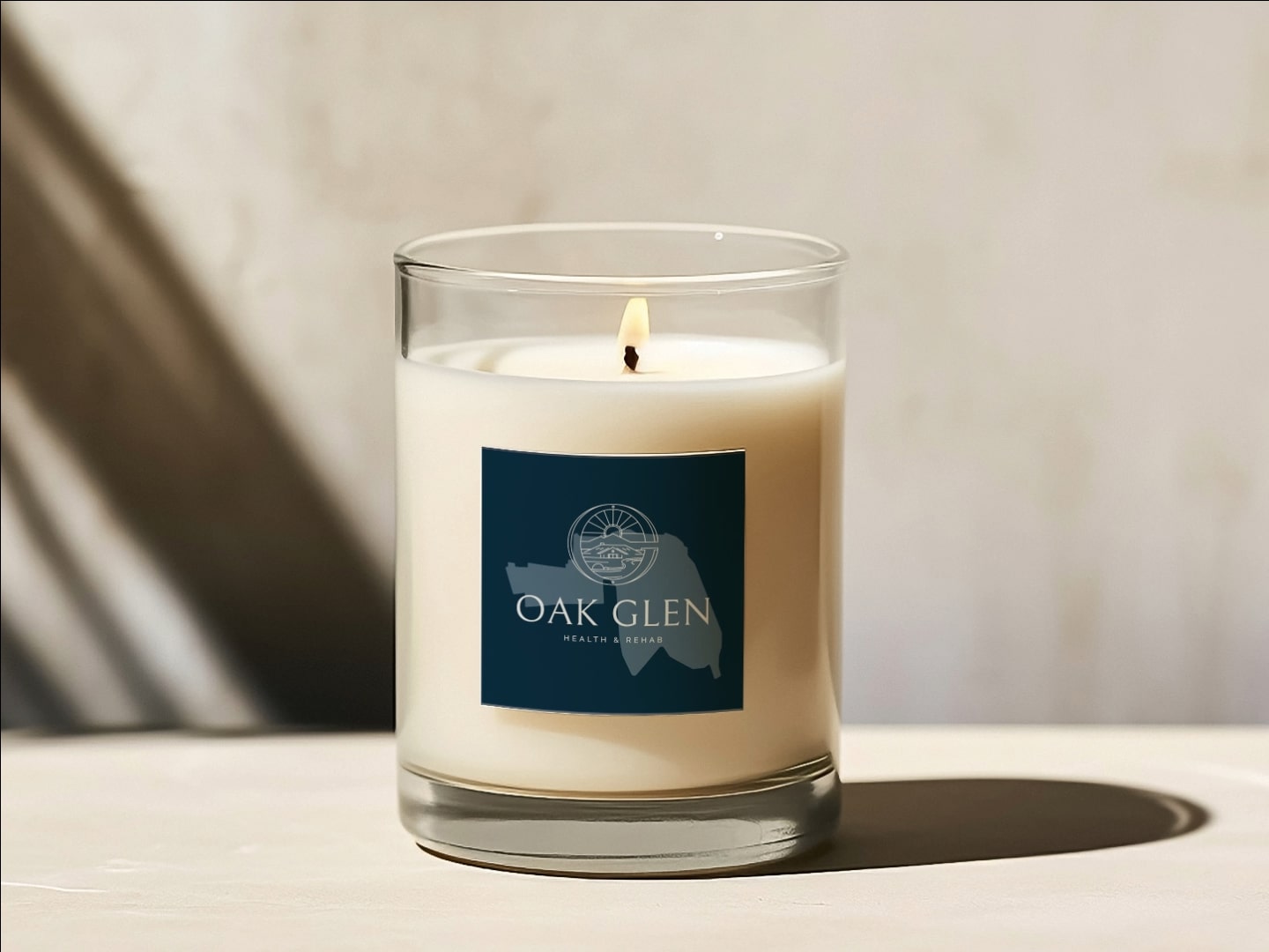
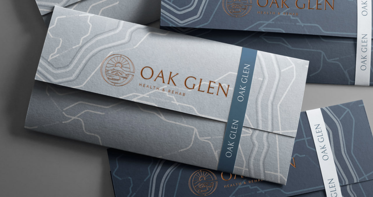
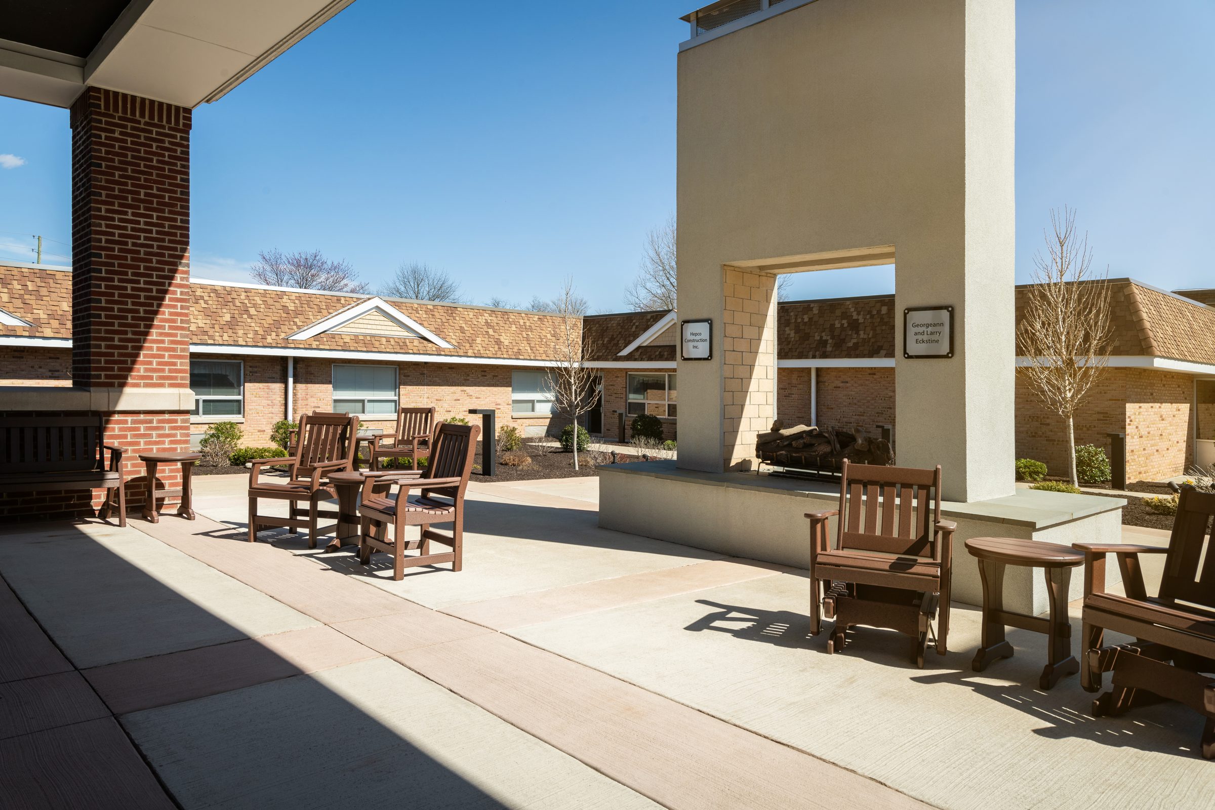
Oak Glen sits on a quiet bend of the Susquehanna in Lewisburg, Pennsylvania, with the Buffalo Valley behind it and clear blue Pennsylvania sky above. We rebuilt every surface of the senior living brand around that geography. The river slips into the logomark. The palette is drawn from the water, the fields, and the season Oak Glen feels most itself in. The new website carries the same patience the campus does. And the photo direction, shot on-site over a single visit, sets the place in the light it was meant to be seen in.
A logo
shaped by water.
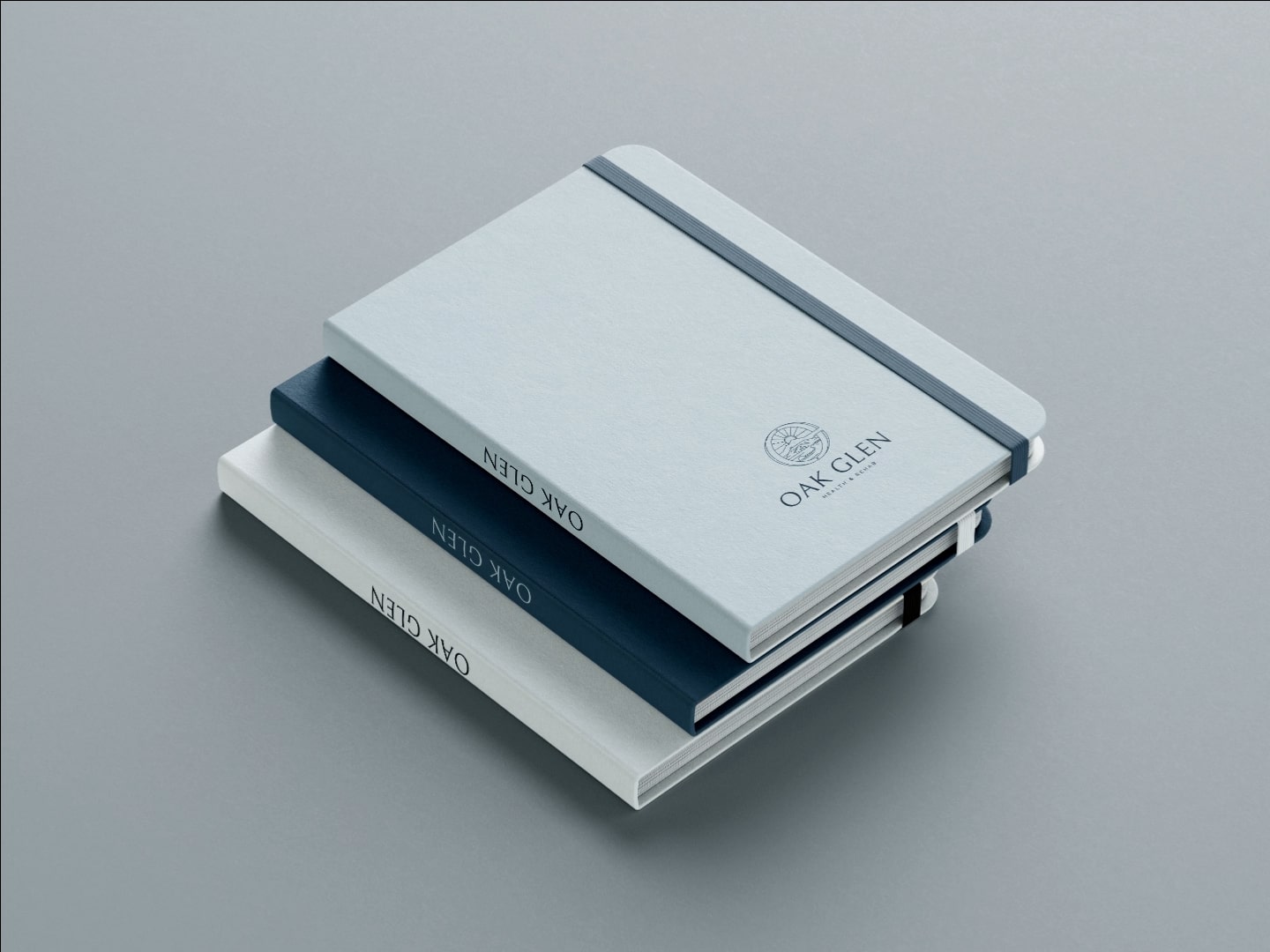
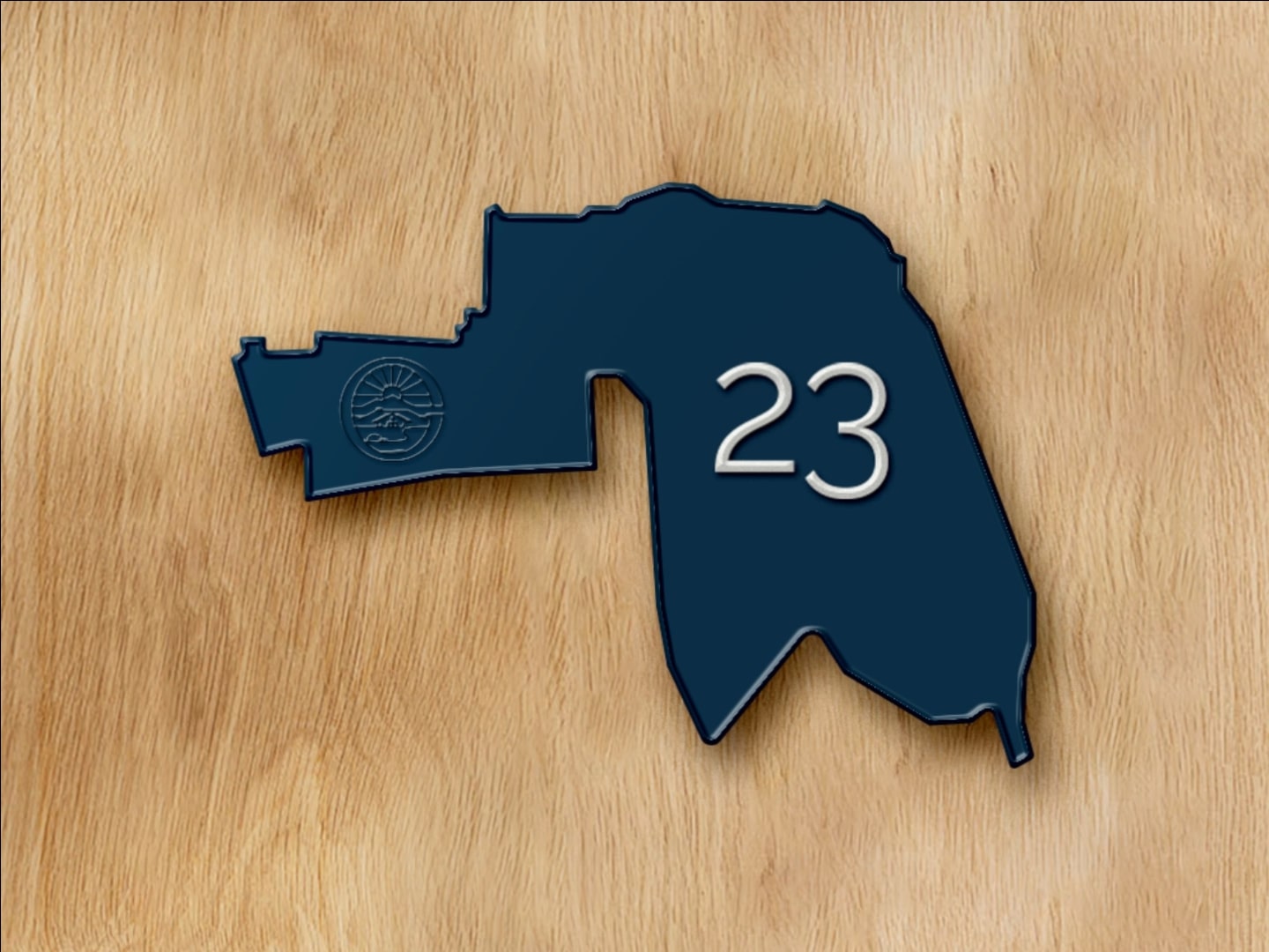
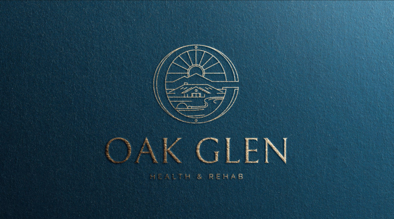
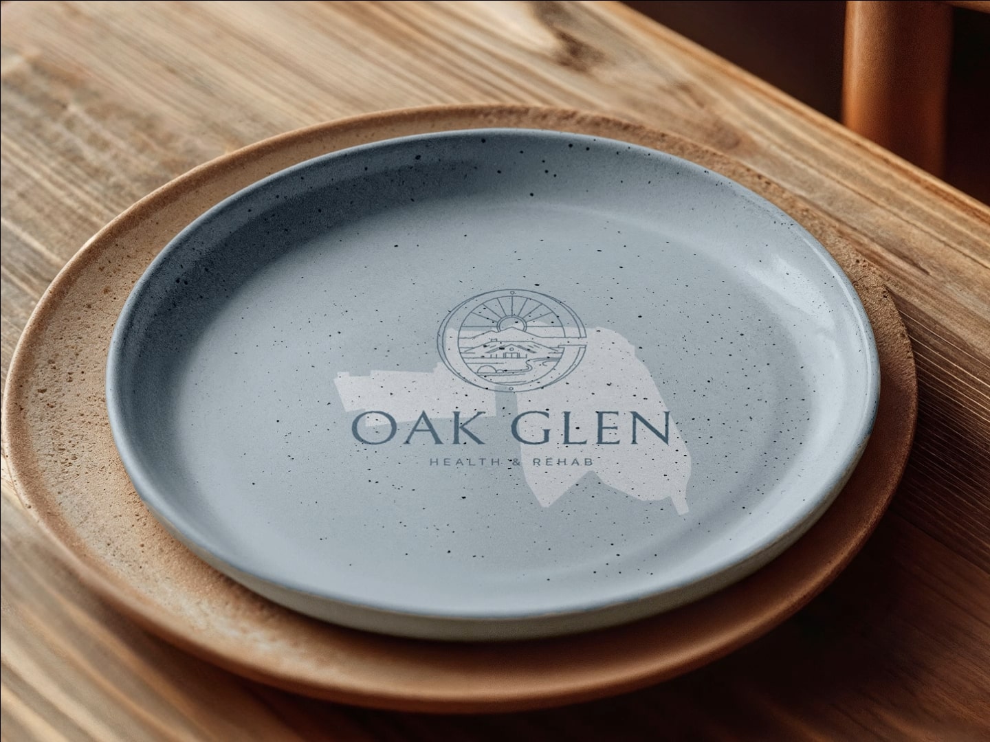
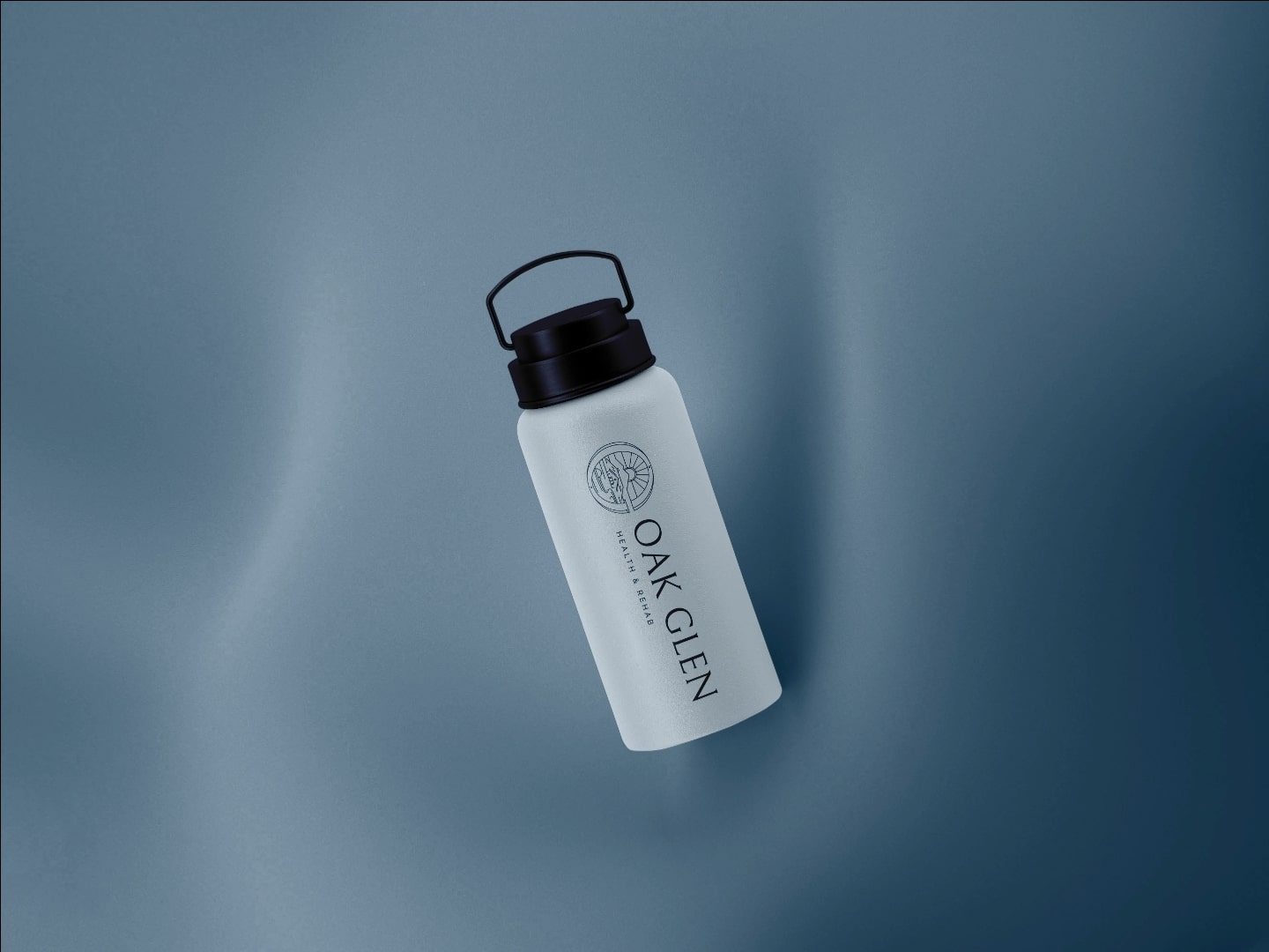
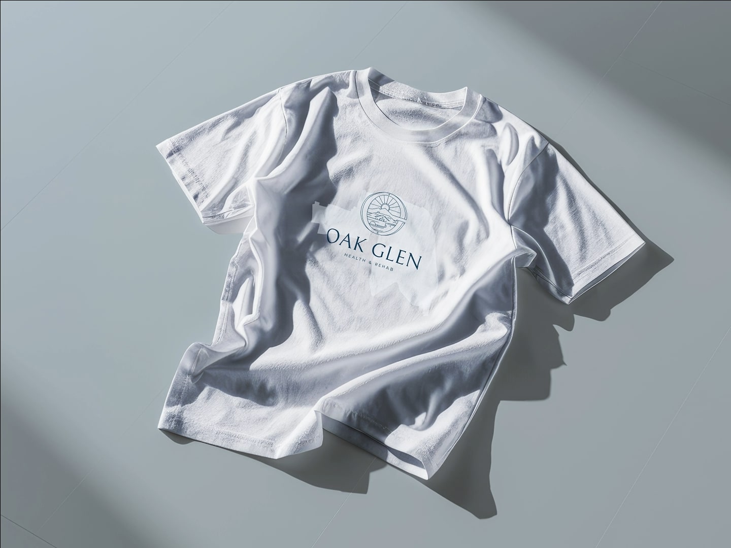
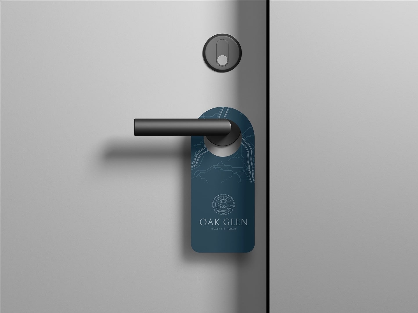
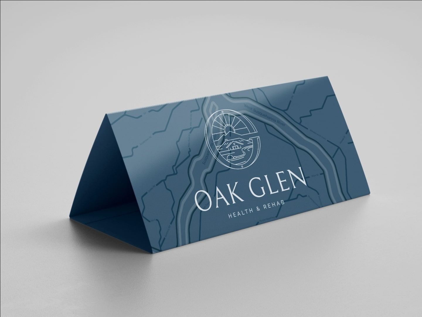
The Susquehanna bends into the mark itself. The colors take after the river and the sky above it. From the wordmark down to the smallest piece of stationery, the system is anchored to a single place.

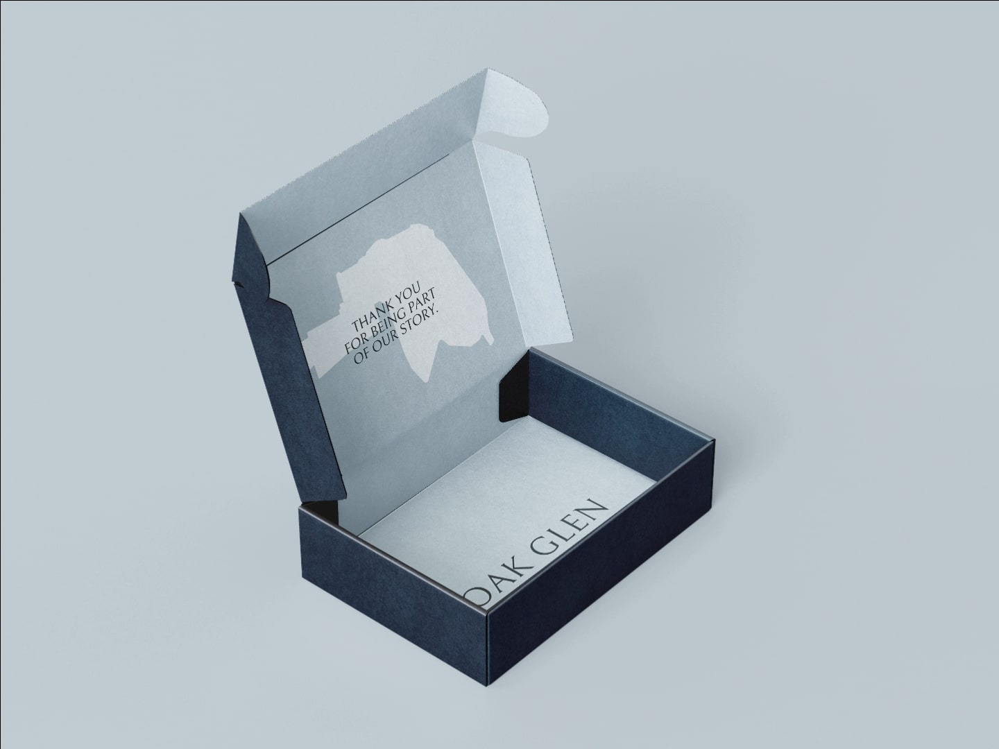
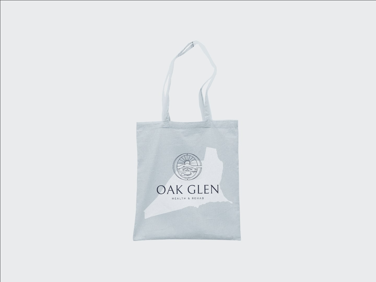
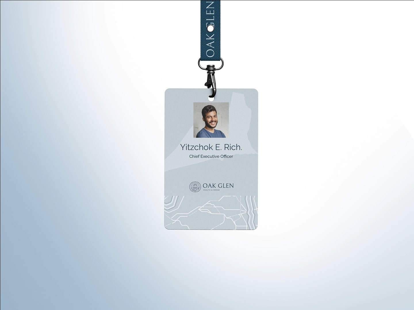
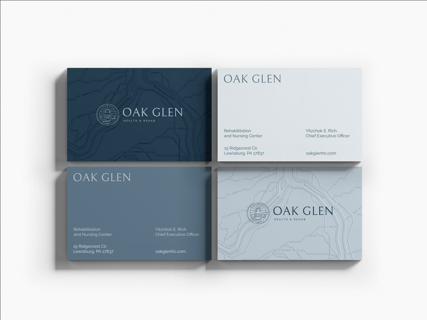
A website
that lets the place breathe.
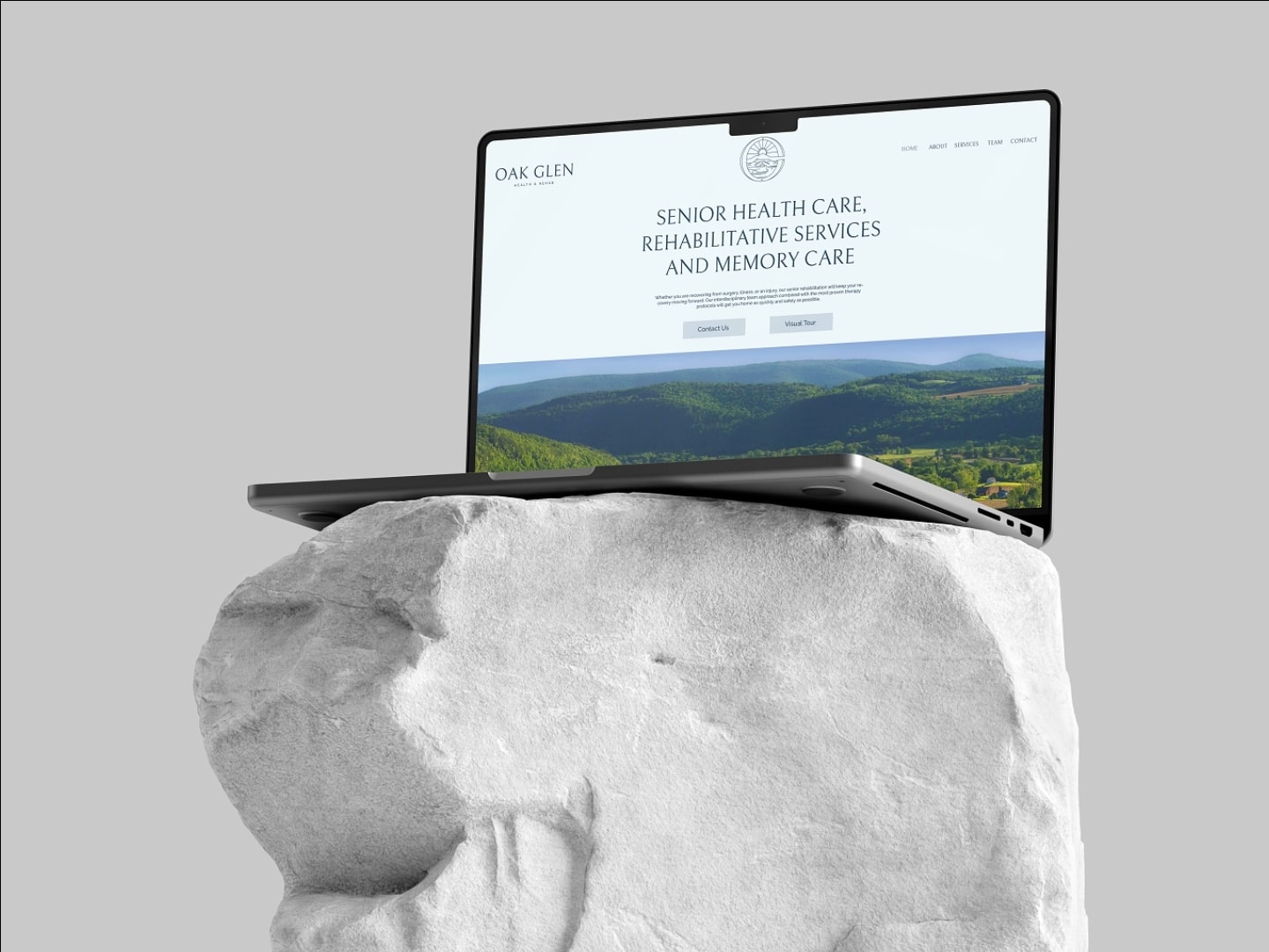
The new oakglenhc.com is paced like the campus itself. Open compositions, slow scroll, real photography. Built so families can move through it the way they'd move through a tour, at their own speed.
Visit oakglenhc.comShot on-site,
across one campus day.
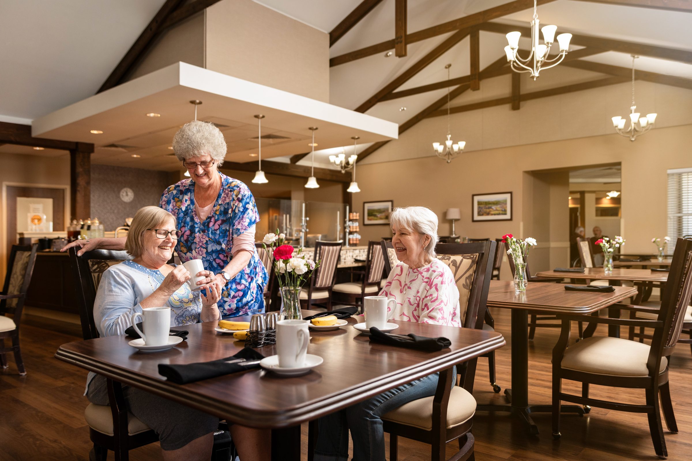
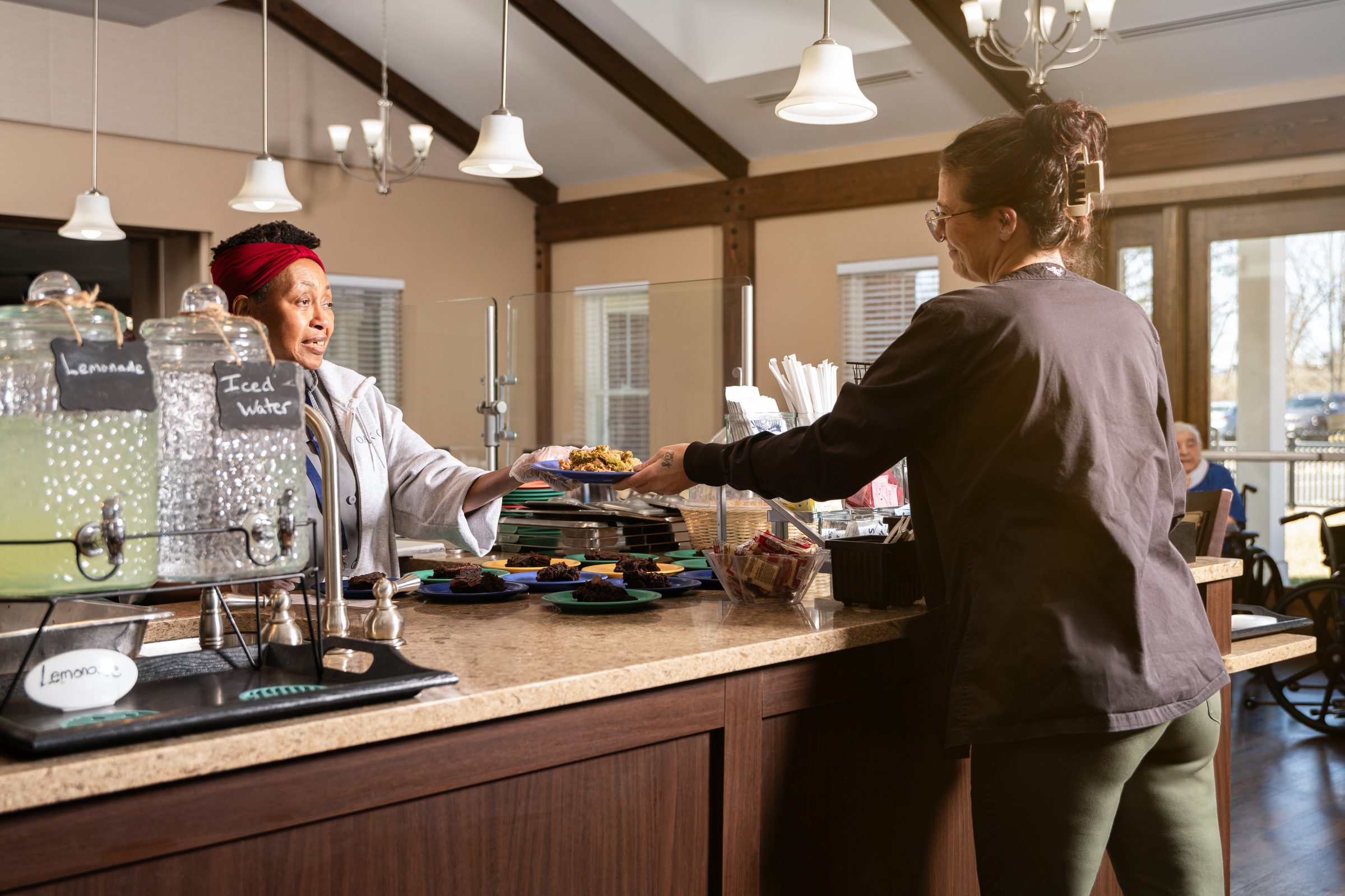
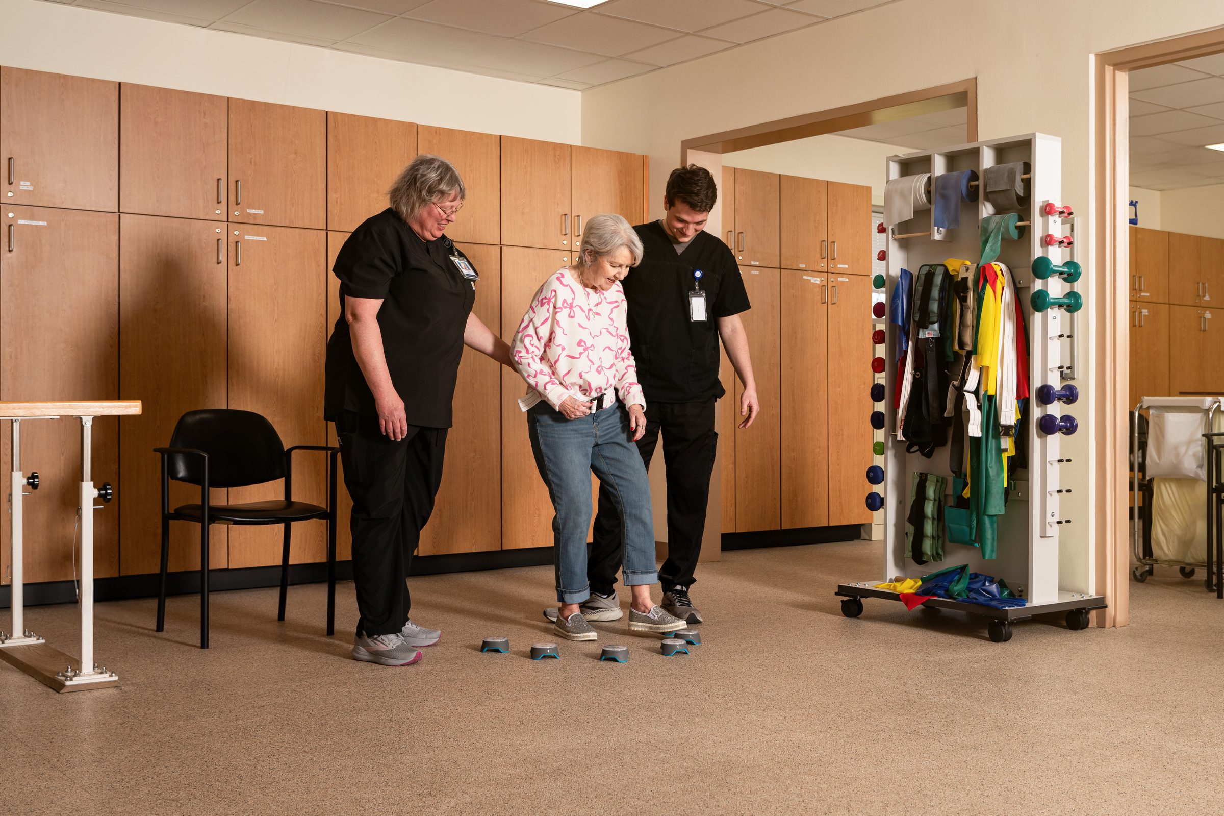
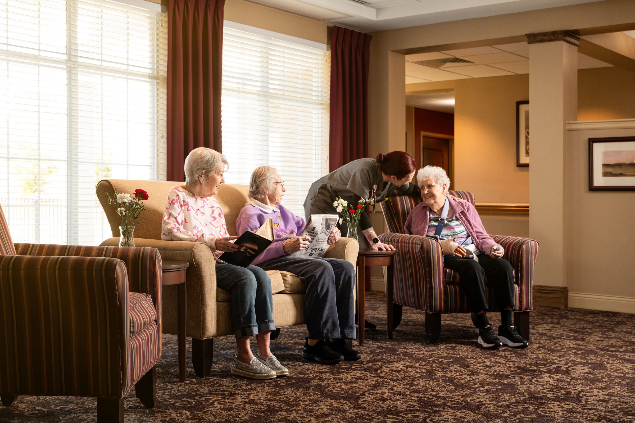
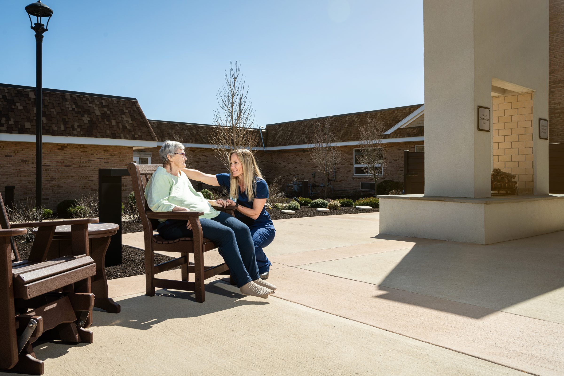
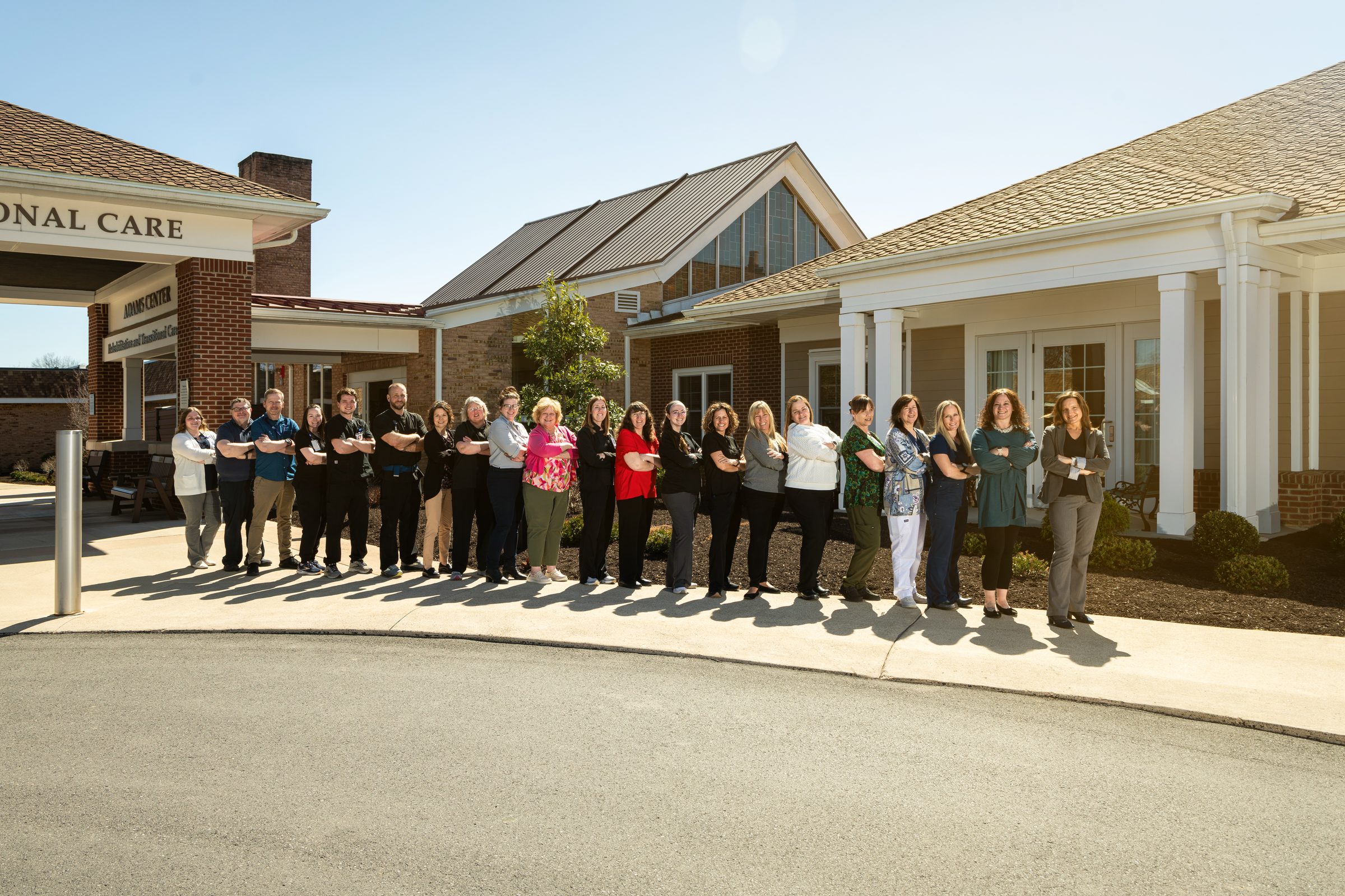
We coordinated and directed the full photo shoot, working through dining rooms, lounges, the rehab wing, and the team outside the Adams Center. Real residents, real staff, the light Lewisburg has when the trees are still bare and the sky is fully blue.
The campus was already the place. The brand finally tells you so before you've stepped onto it.