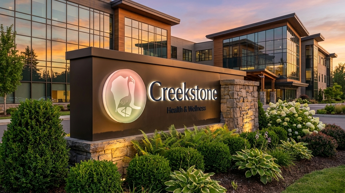
The brand that grew
from the land itself.
Rename it.
Make it belong here.
Formerly Good Sam. New ownership took over the campus and wanted a clean reset, so we renamed it Creekstone Health & Wellness and built the whole brand from the ground up.
Identity, signage, print, the welcome experience, apparel, a fleet wrap system, and the digital presence. All of it grew from the property itself, starting with a logo that comes straight off the land.
The logo was already
written in the water.
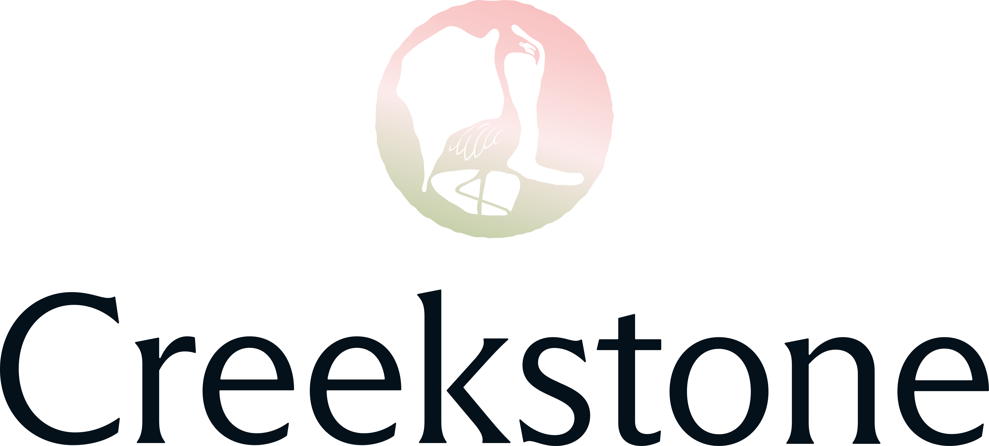
Fly over the property and you see three lakes. Their silhouettes, rearranged, form a flamingo. That's the mark. Gestalt in geography.

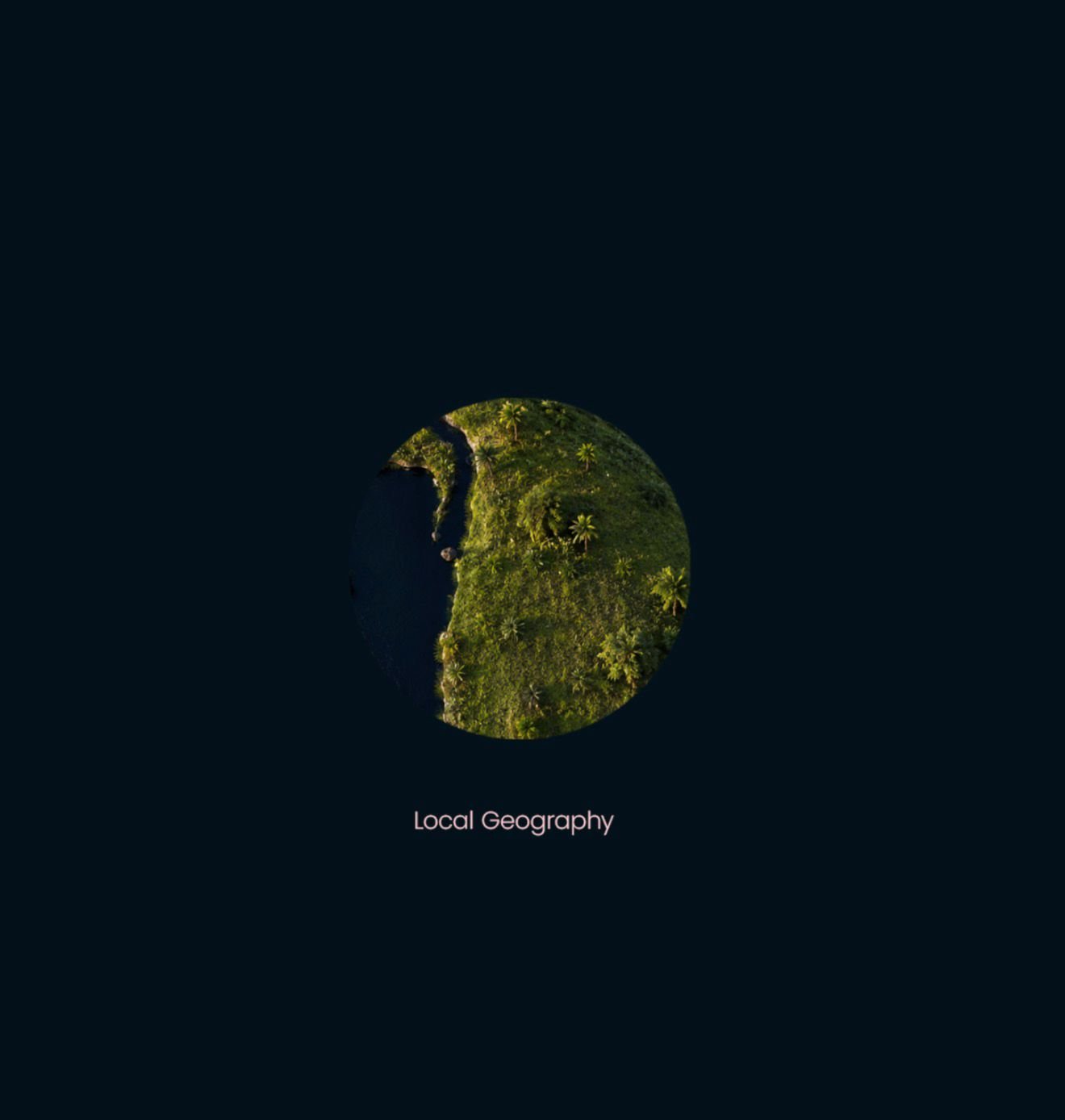
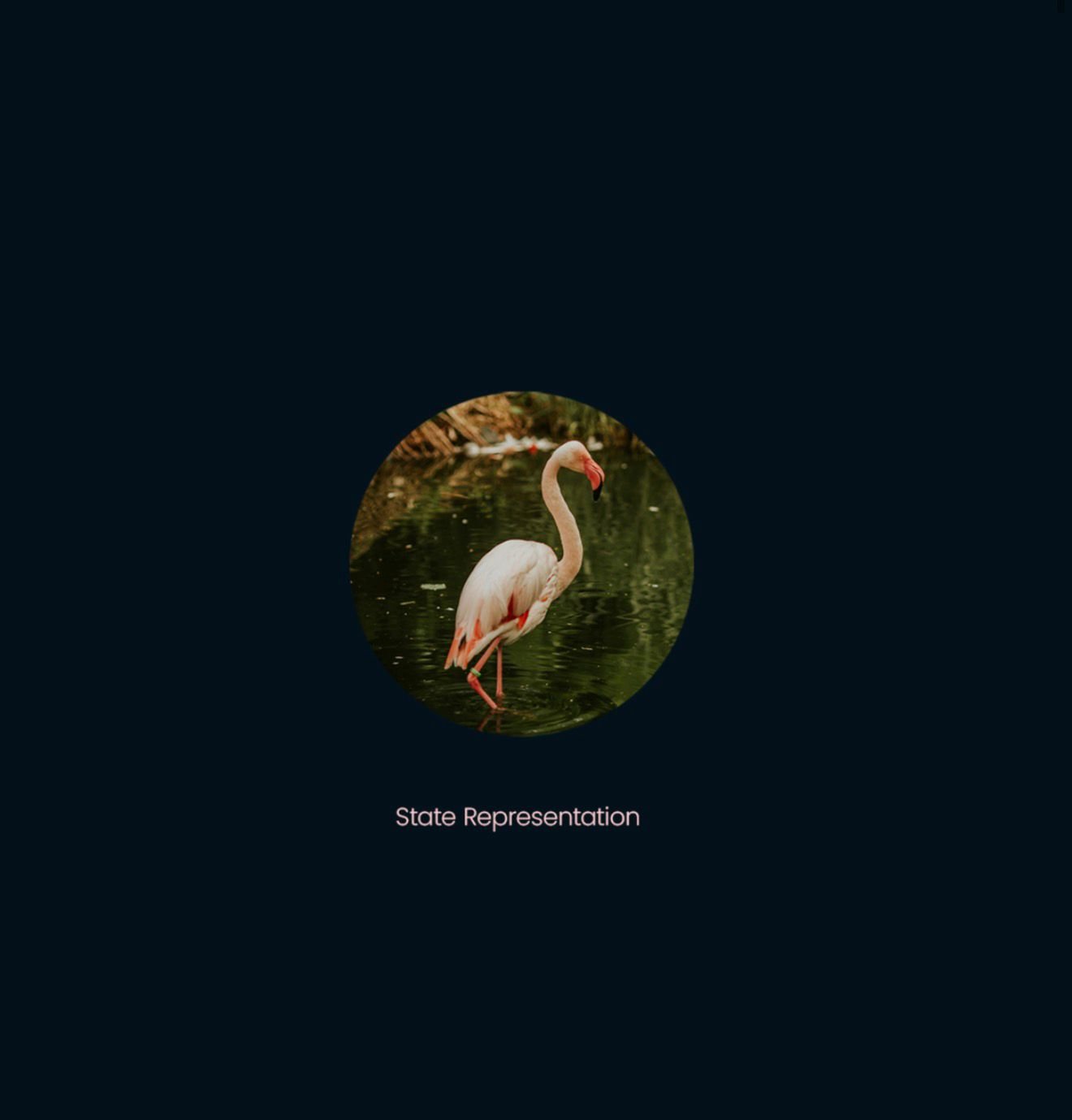
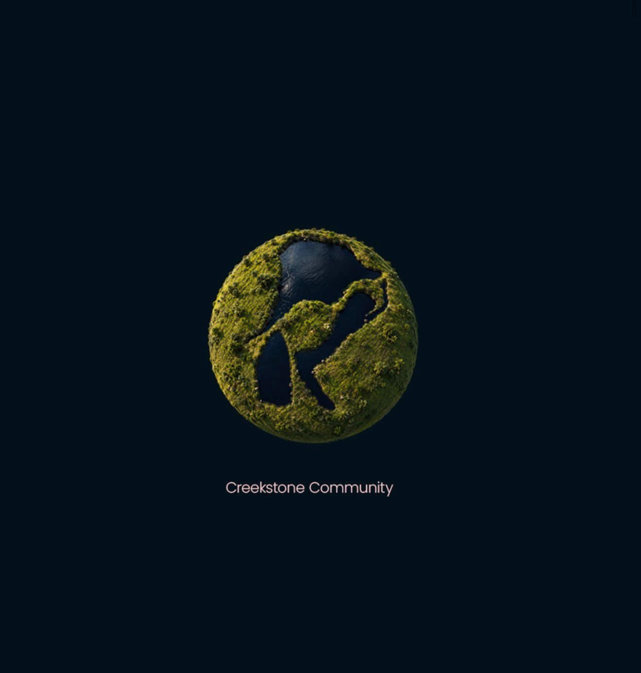
We took the silhouettes of those three lakes from the aerial. Kept the proportions, rearranged them. In the negative space: a flamingo standing in water. The shape of the creeks and stones made it into the mark too, in the forms inside the circle.
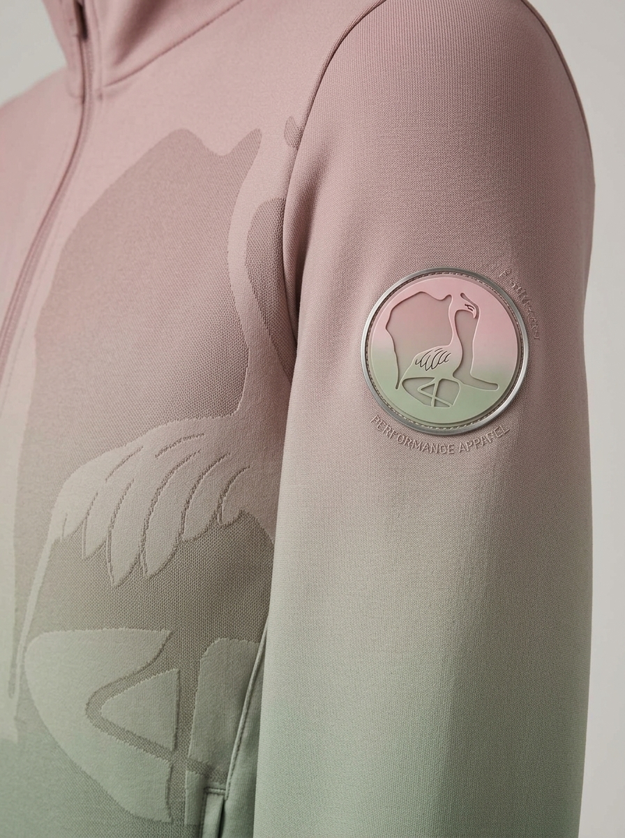
The gradient runs pink-to-sage: flamingo pink meets the waterline green. A texture over the mark gives it weight, matches the name. Nothing in here was arbitrary.
Florida's most iconic bird
finally got its story back.
The flamingo has decorated Florida for decades, but for years it was considered non-native. Recent research changed that. The flamingo was always from here. Artist Matthew Mazzotta put that story at the center of Tampa International Airport with an installation called "HOME", with towering flamingos in the Central Terminal, built to make you look twice at what actually belongs.
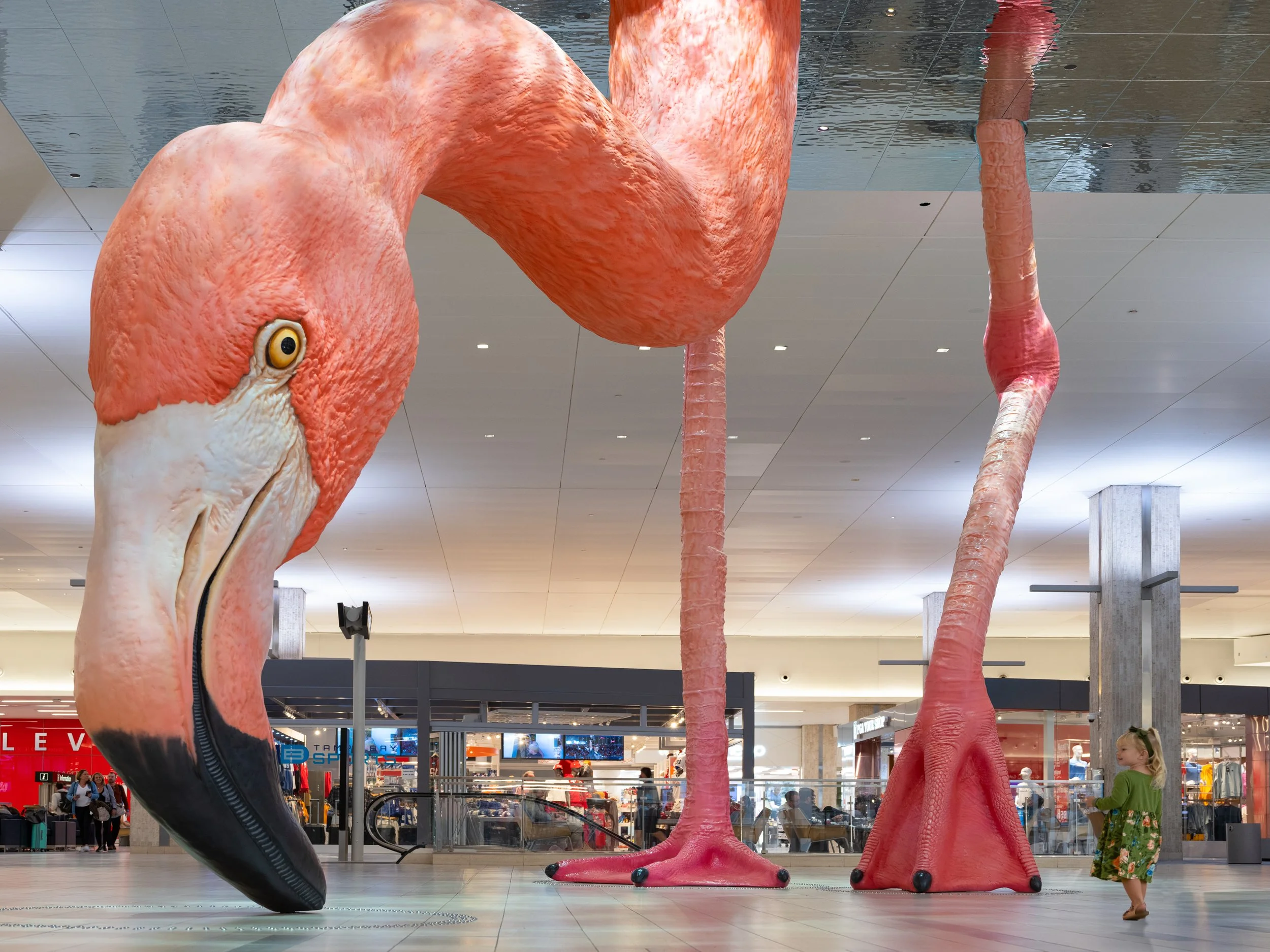
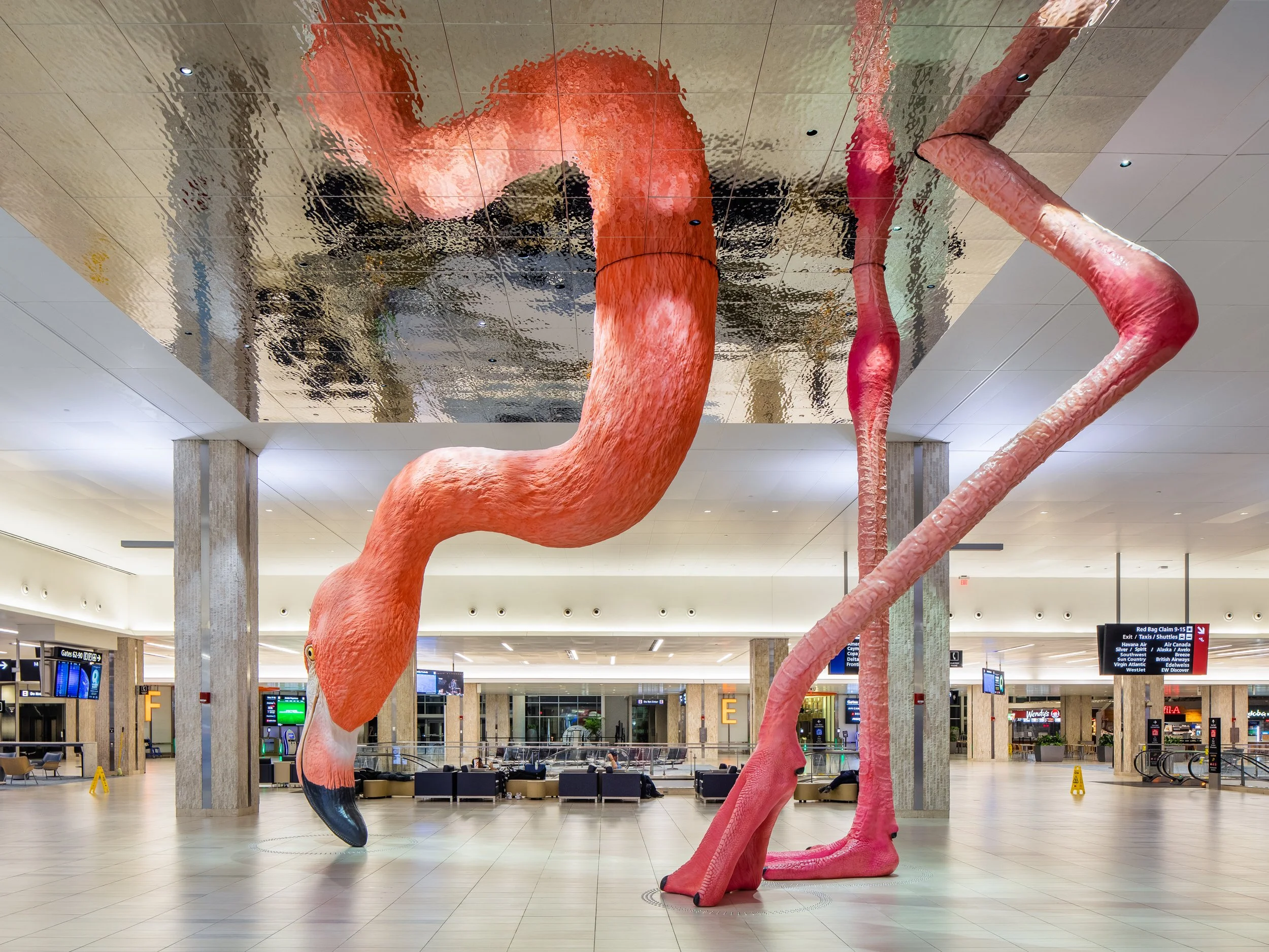
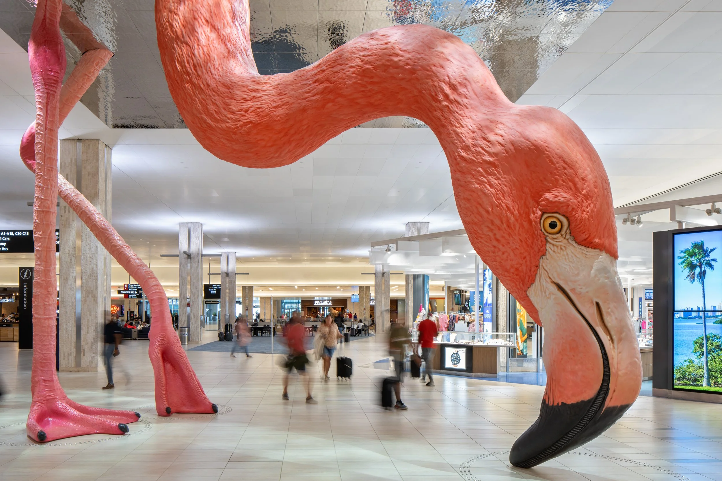
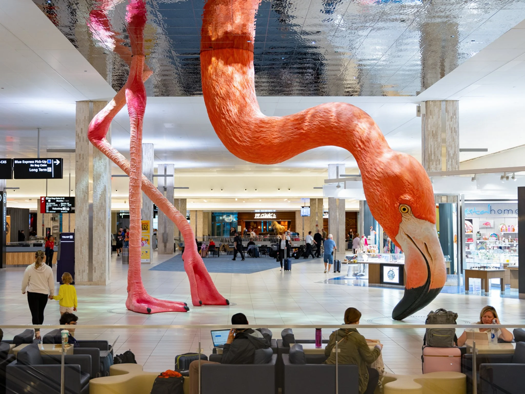
Photography: Matthew Mazzotta. "HOME" (2021), Tampa International Airport. matthewmazzotta.com
That's the same animal in the Creekstone mark. The same water. The same Florida. It's not a coincidence that a brand built on the actual lakes of this property lands in the same territory as the state's most recognized art installation. The flamingo has always been the right answer here.
One mark.
Drawn from the water.
The full lockup and the symbol on its own. Both hold from badge size up to billboard scale.

The colors came
from the gradient.
The flamingo carries the palette. Pink from the bird, sage from the waterline, cream from the stone.
The first thing
families drive past.
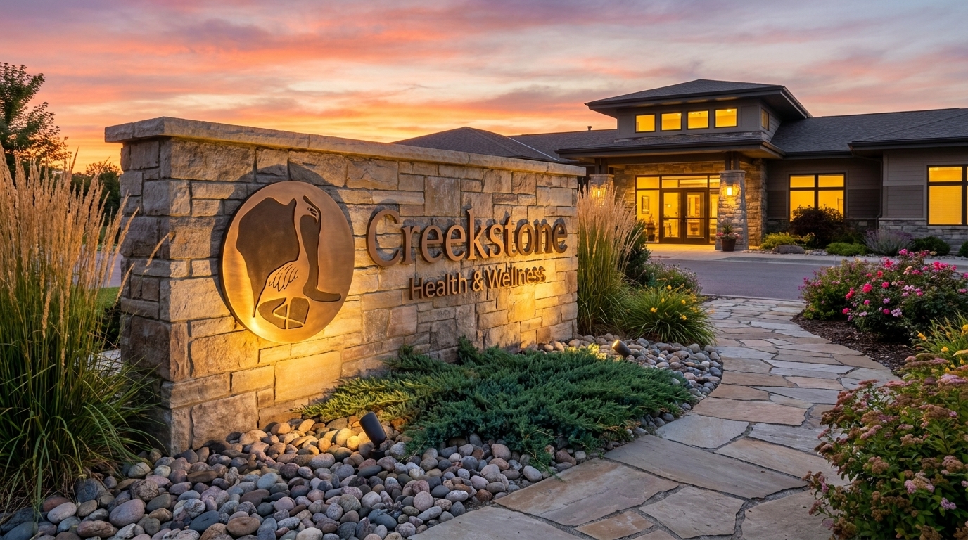
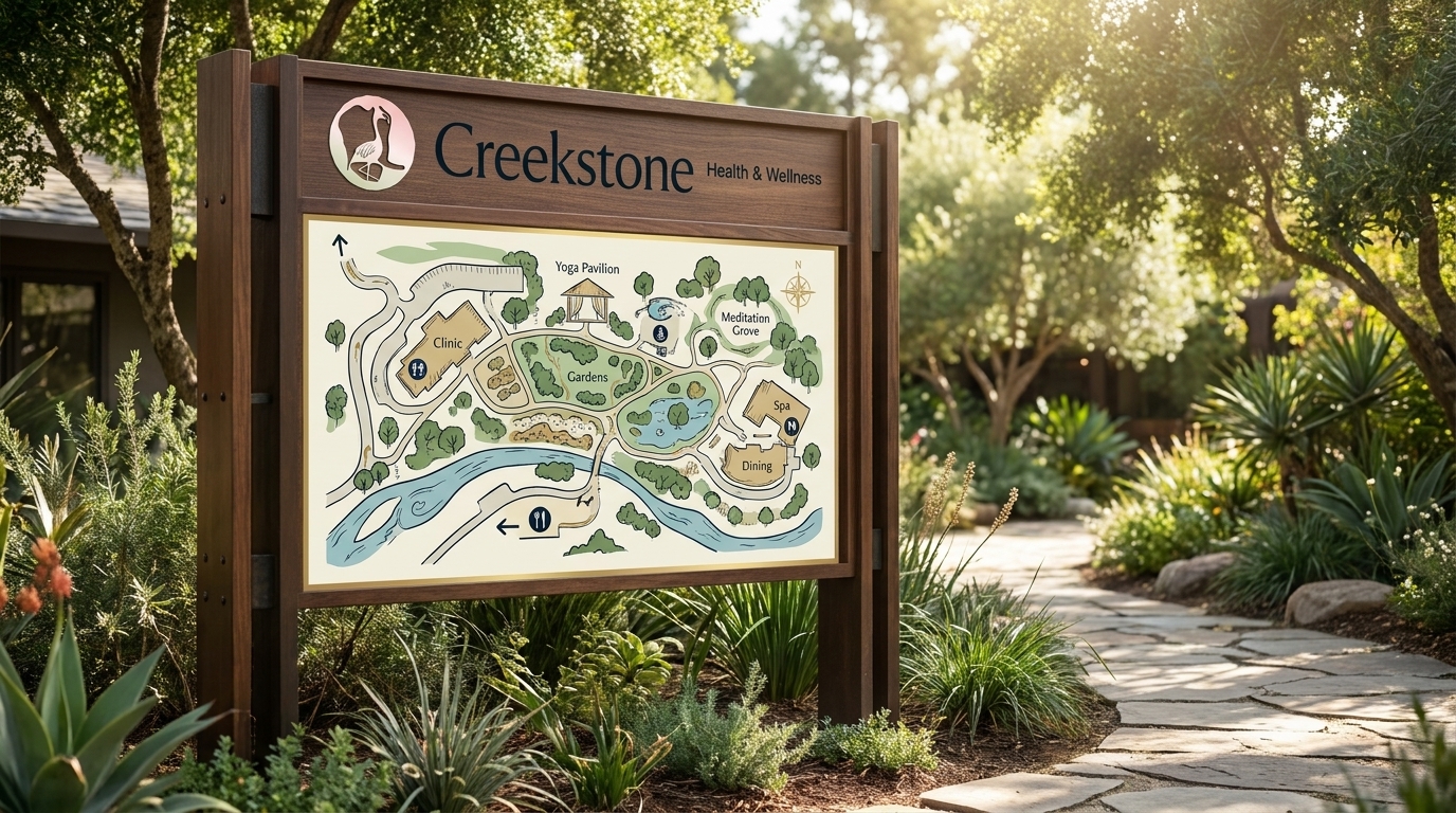
Two monument treatments: the backlit version for the campus entrance, the stone version for the grounds. Both carry the full gradient mark at a scale you can see from the road.
The mark in the hallway,
at the door, in the lobby.
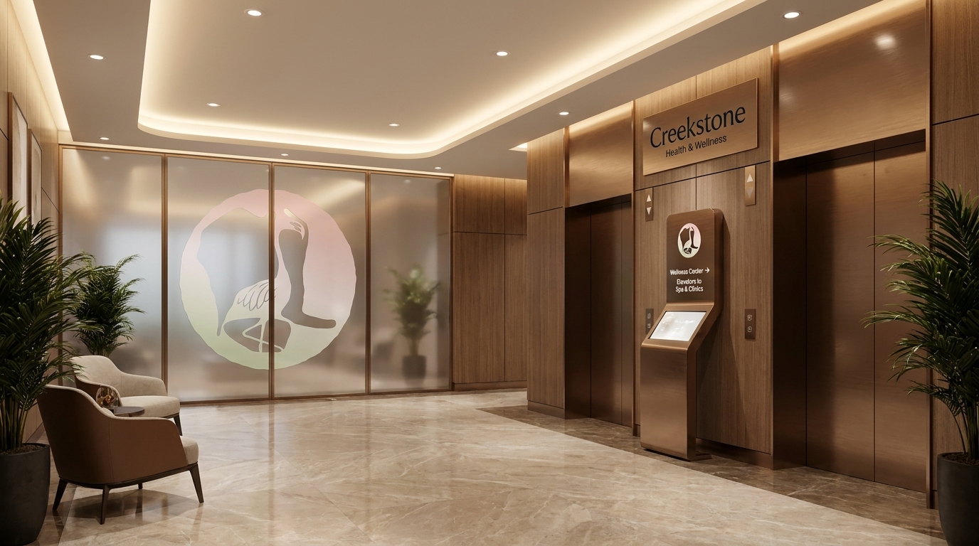
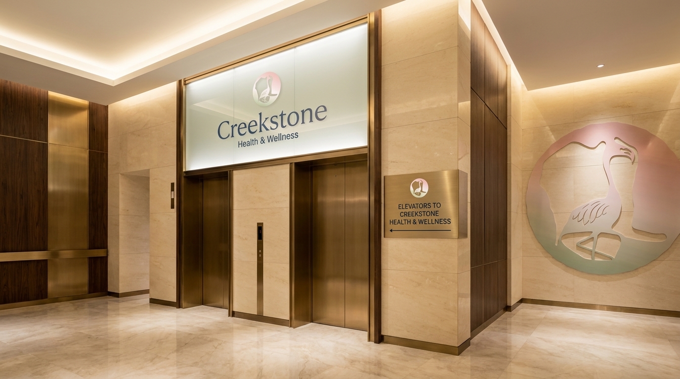
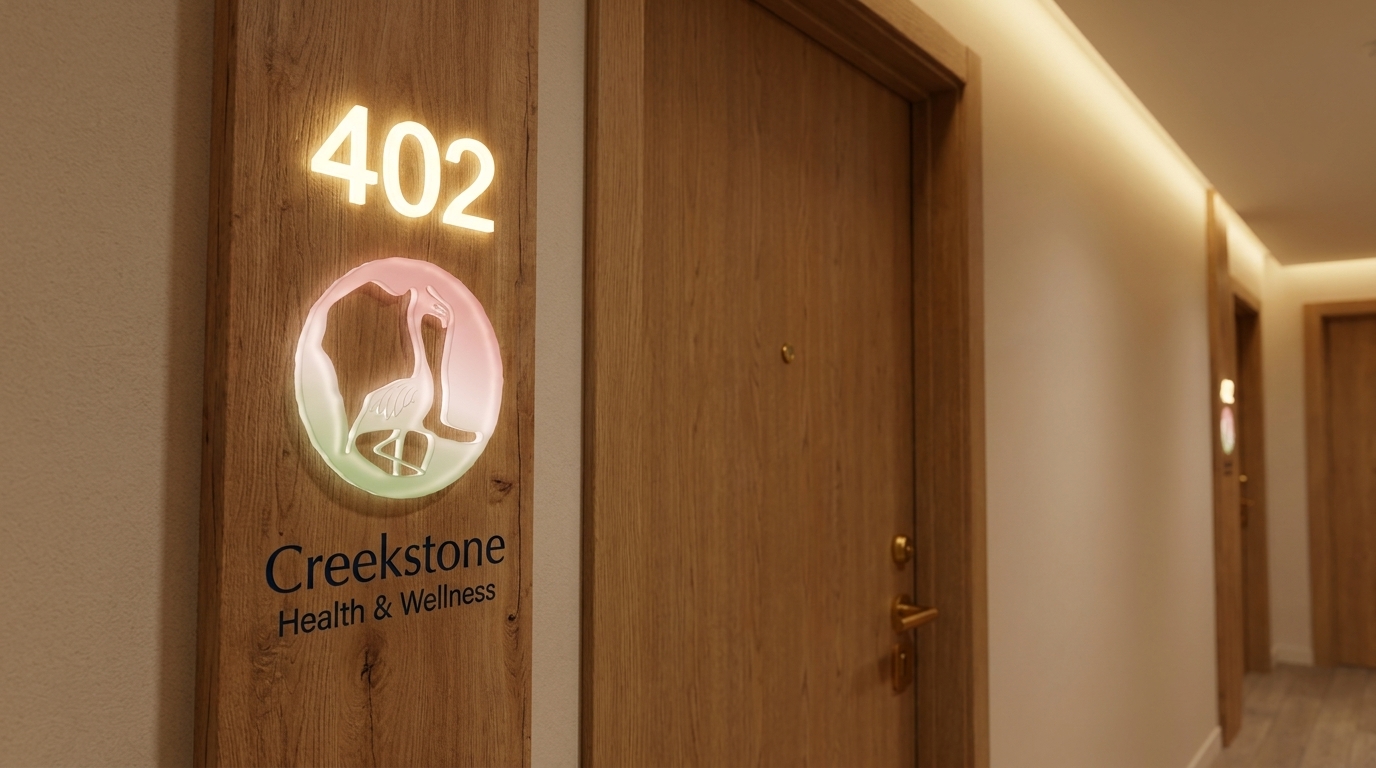
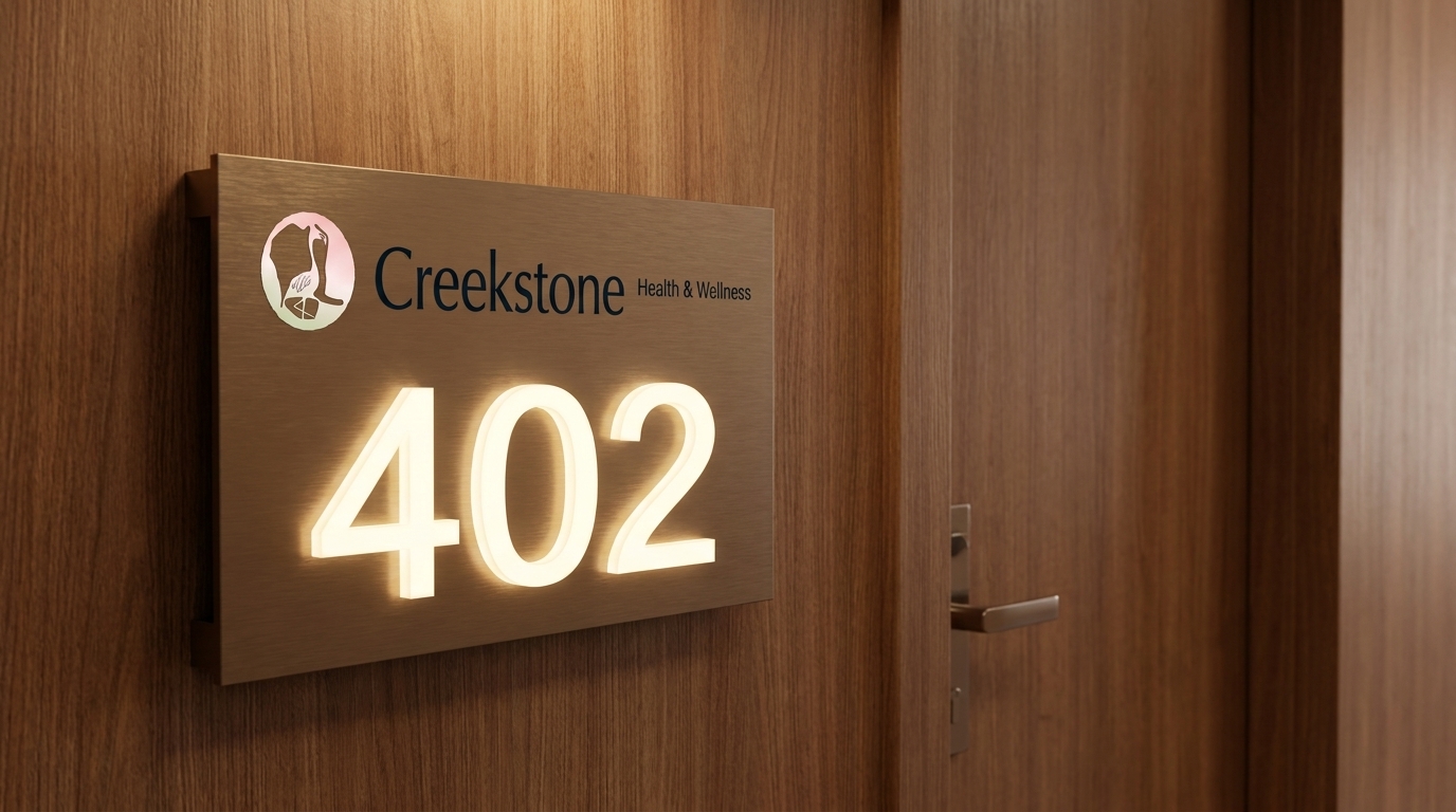
Every resident touches these surfaces. Room numbering, elevator surrounds, lobby graphics. The identity runs from the front of the building to the end of the corridor.
The materials a family
holds while they decide.
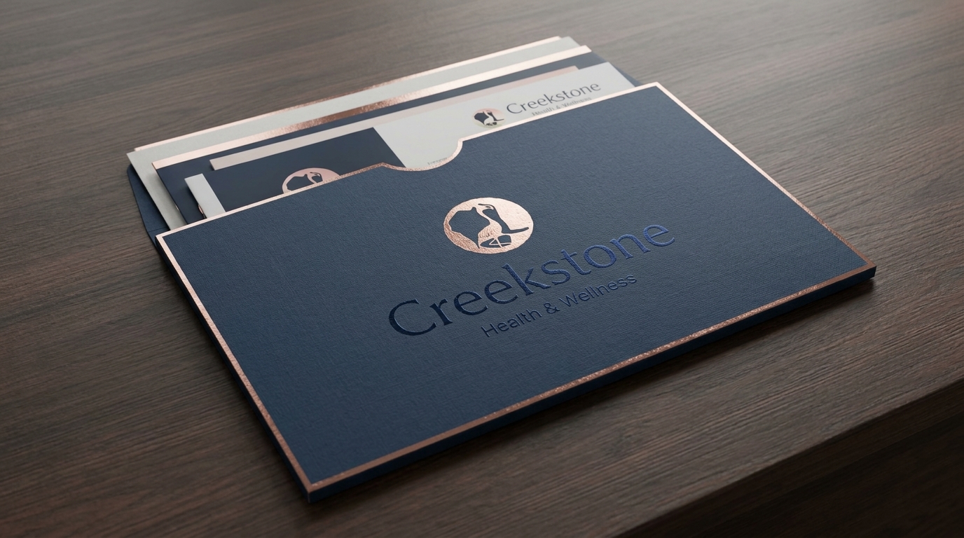
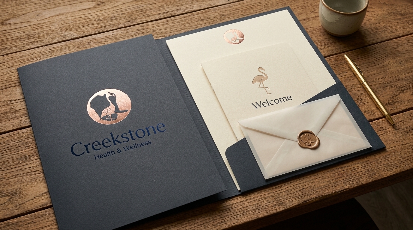
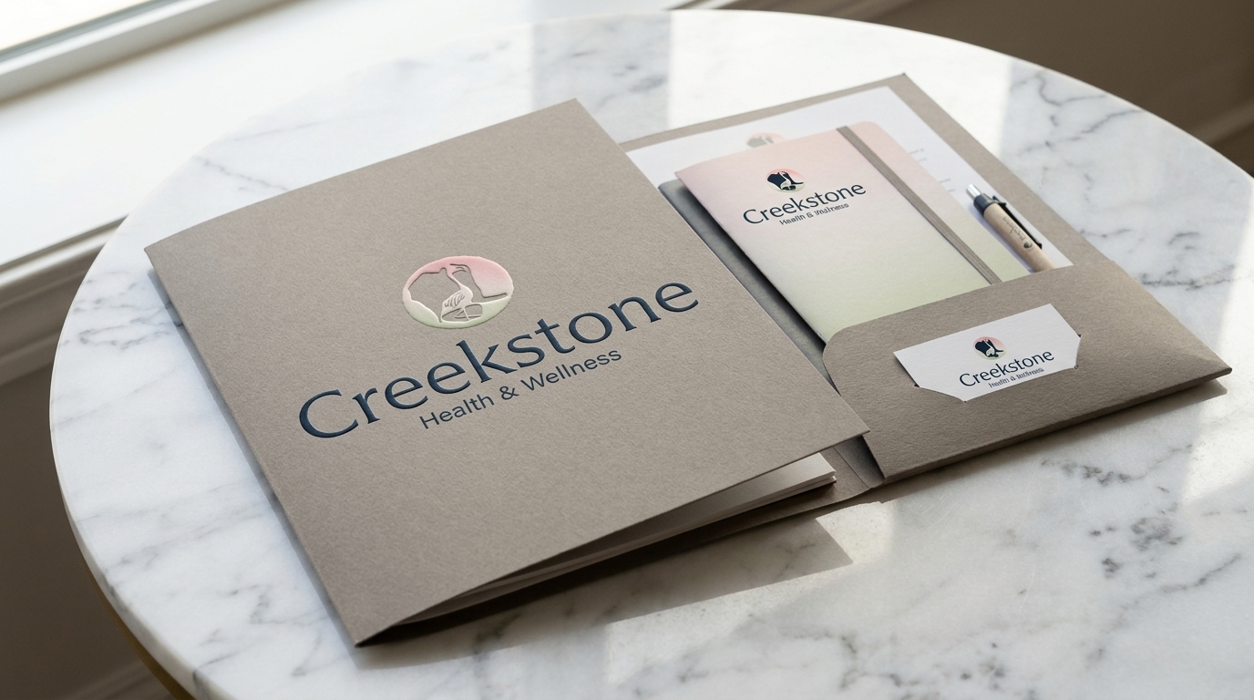
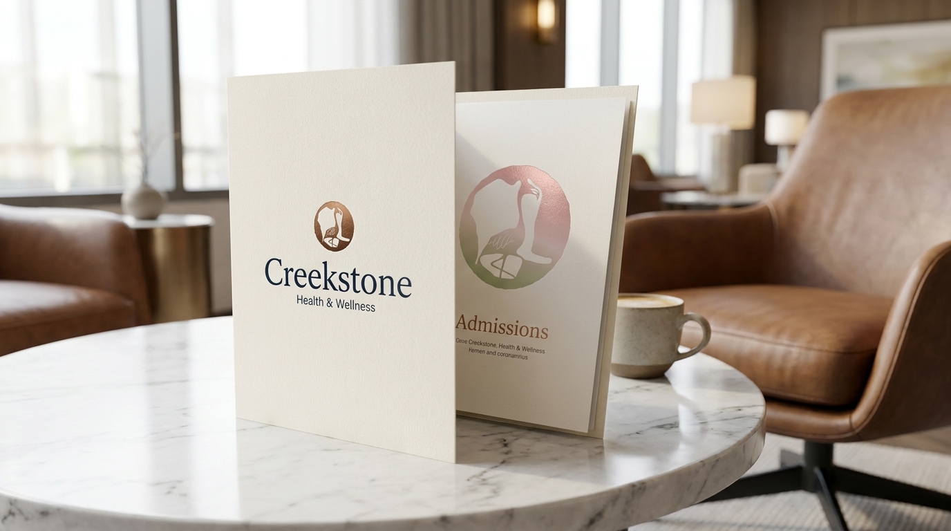
Copper foil. Navy linen. Ribbon-tied packets. Wax seal. These aren't cost-cutter materials. They're the physical argument for why Creekstone is worth choosing.
The moment they walk in
for the first time.
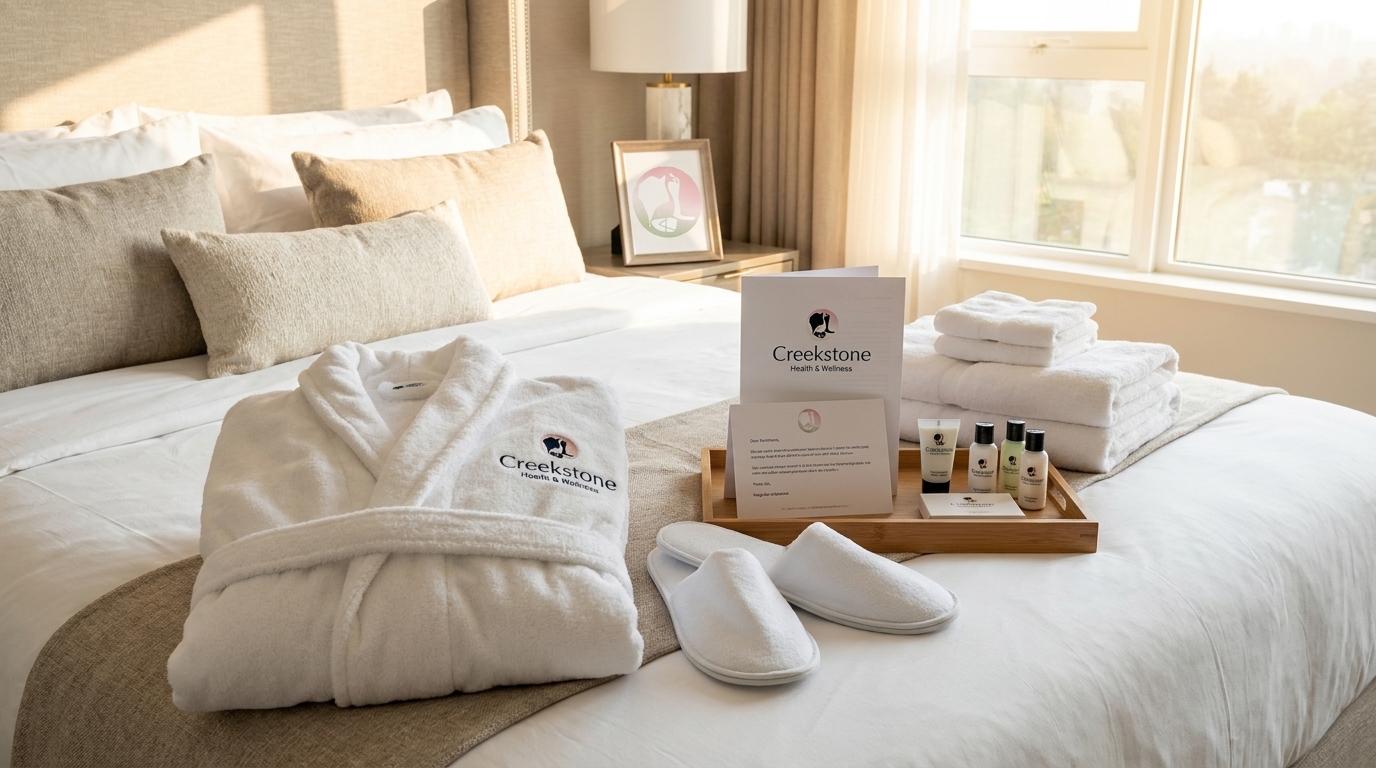
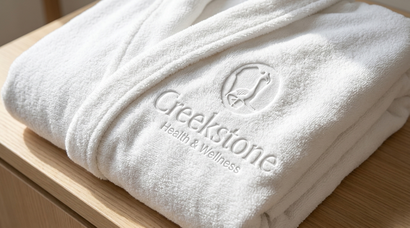
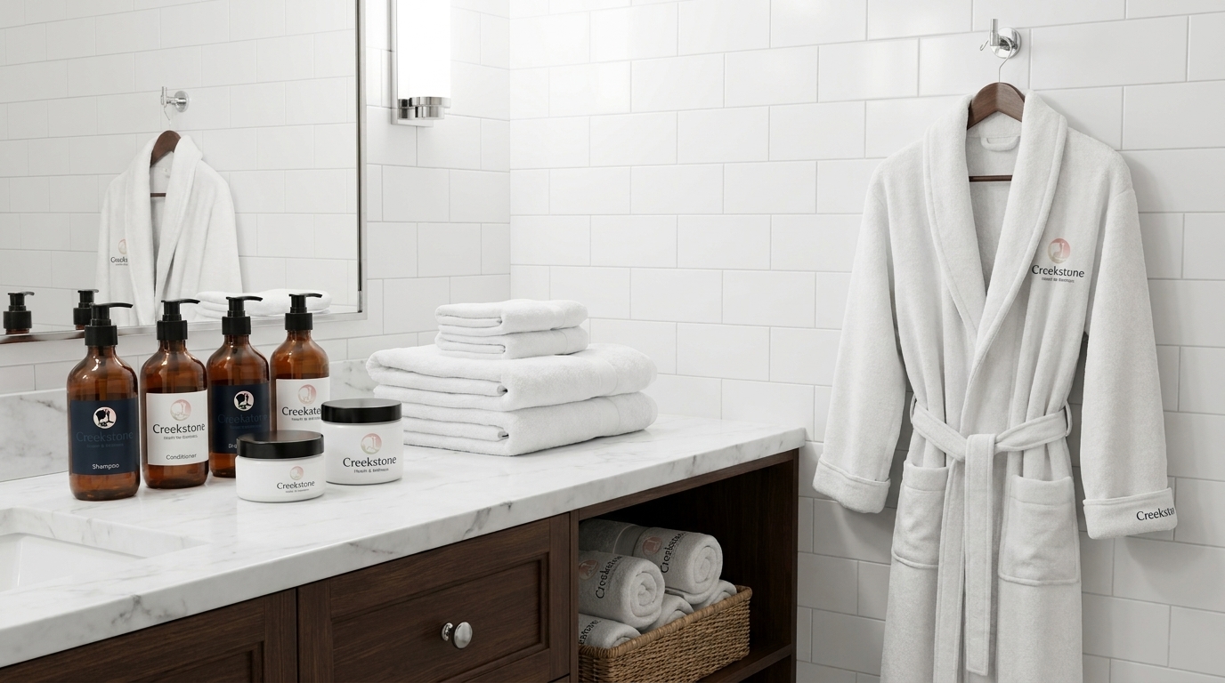
The welcome folder is at the front desk. The suite is ready with the robe, the amenities tray, and the branded linen. Everything there before the family arrives.
The brand lives on
the people wearing it.
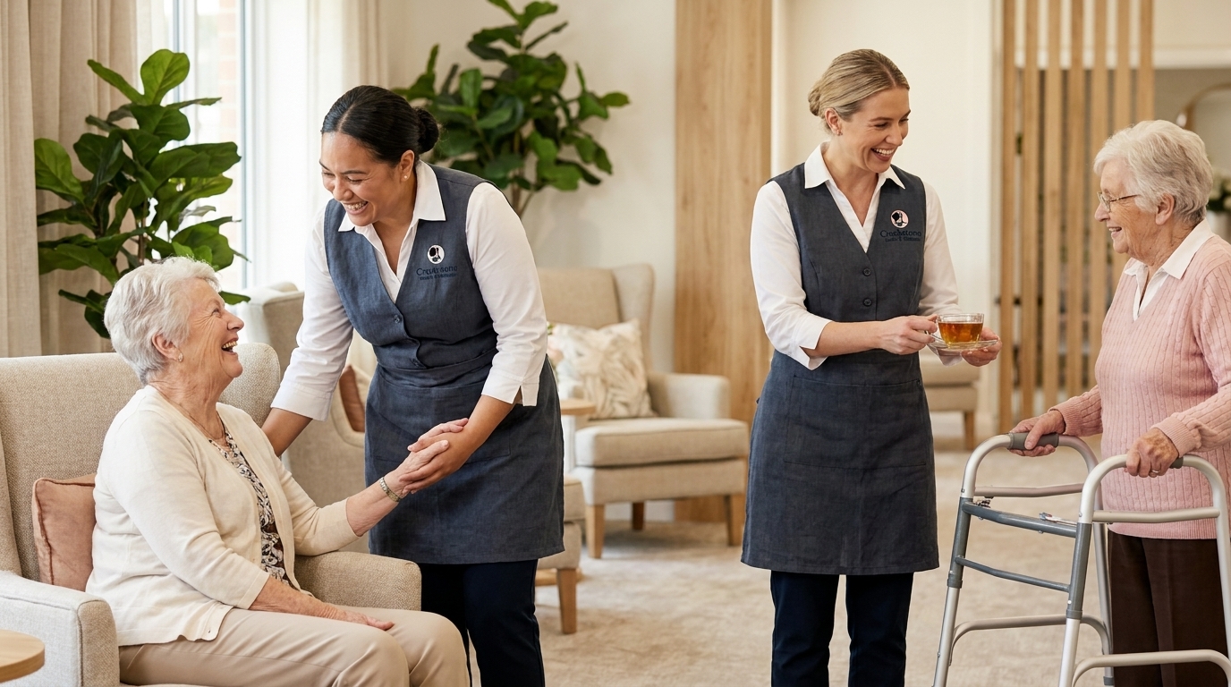
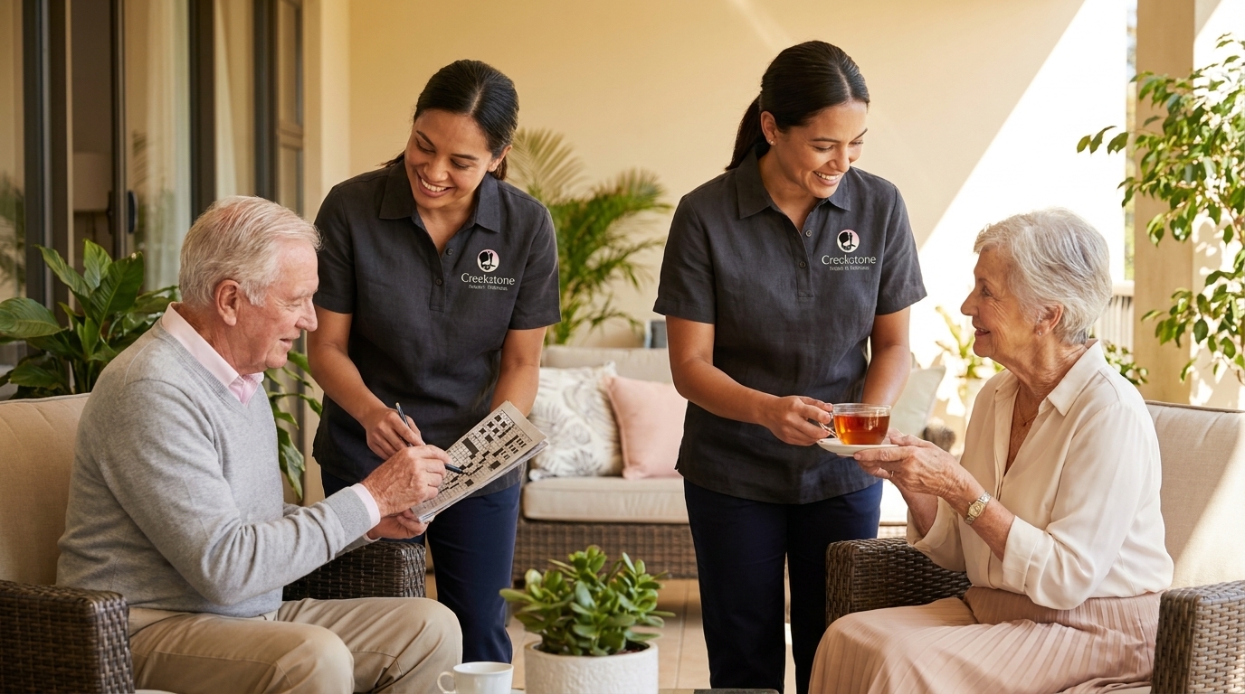
Staff apparel in slate linen aprons and branded polo shirts. The Creekstone mark on every uniform. It reads consistent whether someone's serving tea on the patio or assisting in the lounge.
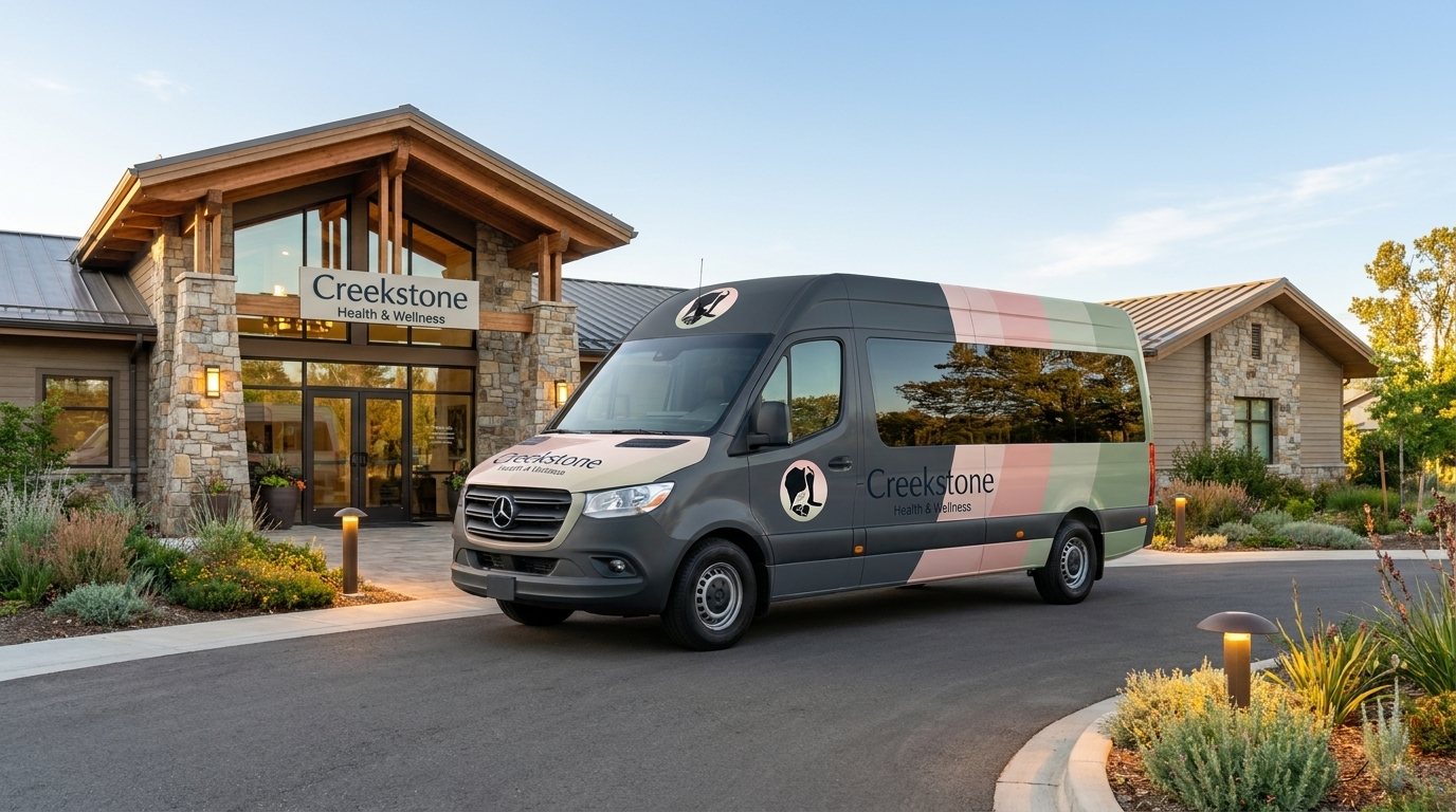
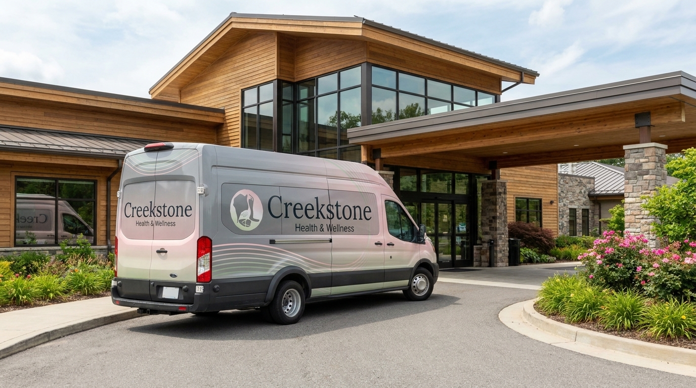
Three vehicles.
Three treatments.
Each shuttle carries the mark differently. The gradient colorblock, the navy botanical, the pink-grey flow. All three read Creekstone from the road.
The brand at the gym,
on the calendar.
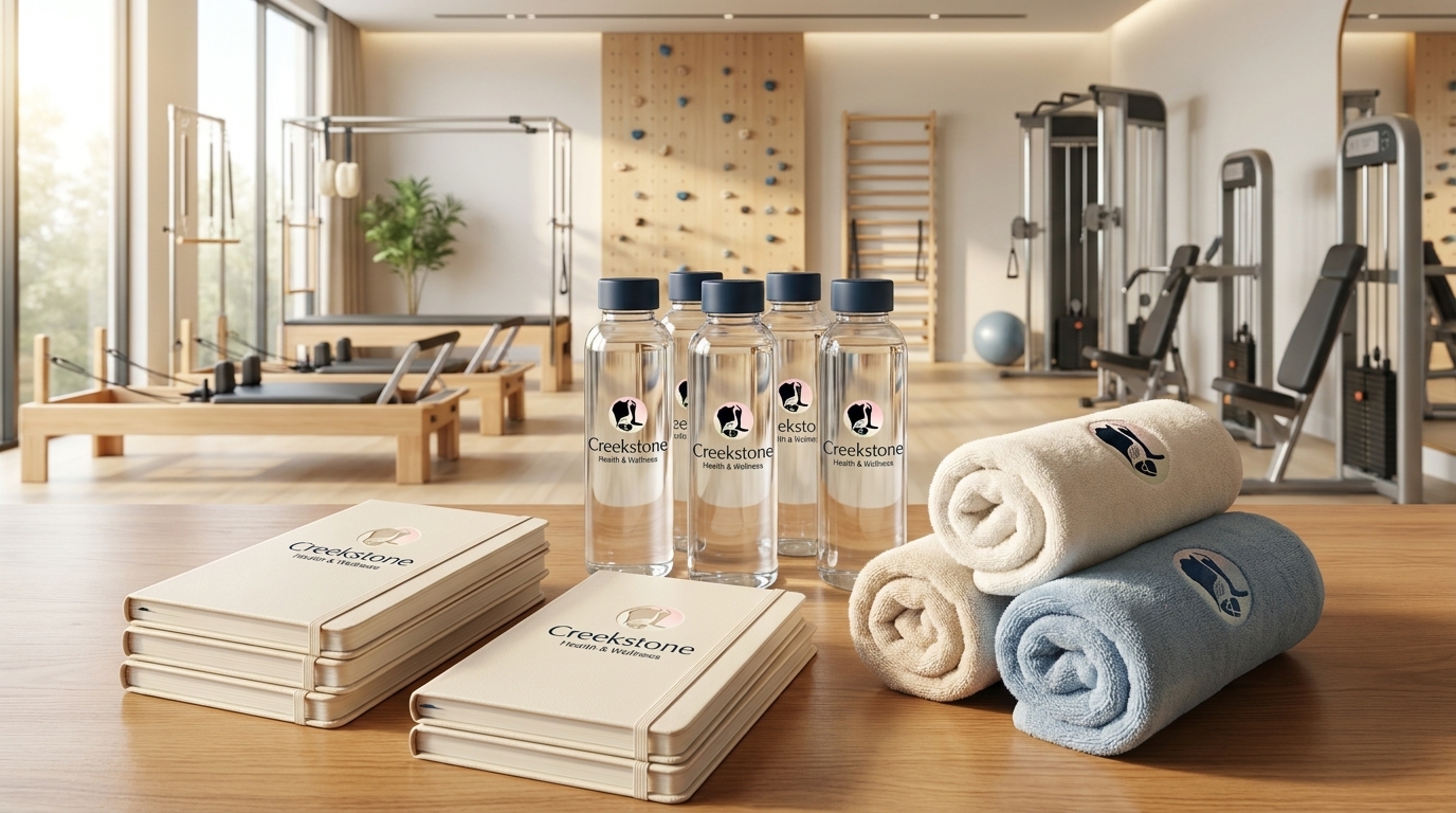
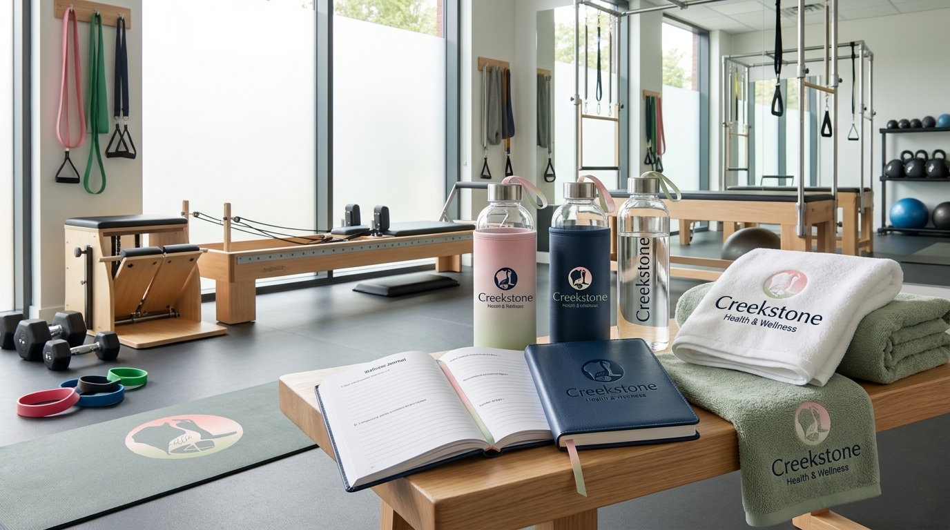
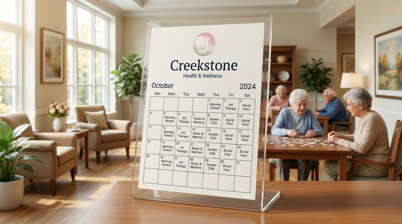
Performance apparel for the fitness team. Glass water bottles, journals, and towels for the center. A monthly activity calendar in acrylic on the common room console. Every touchpoint carries the mark.
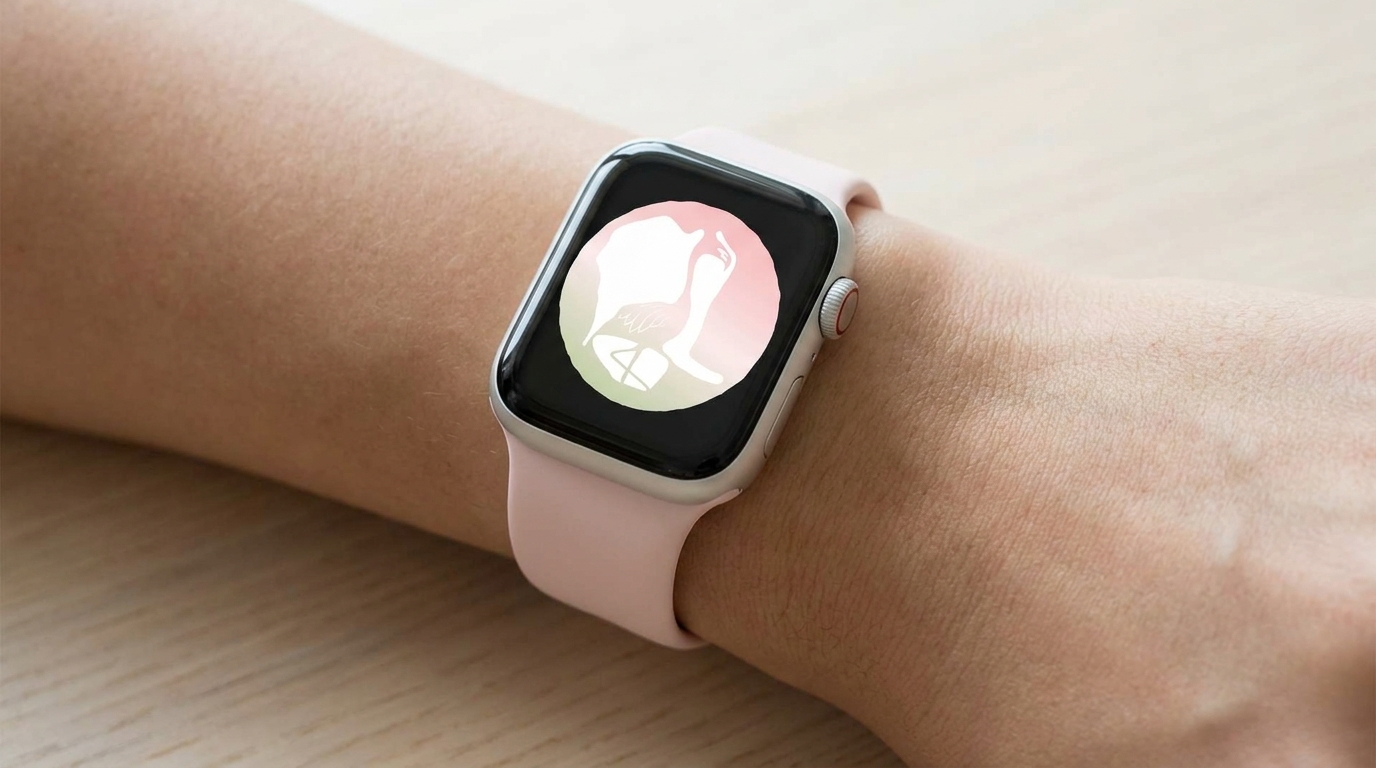
The brand on every screen.
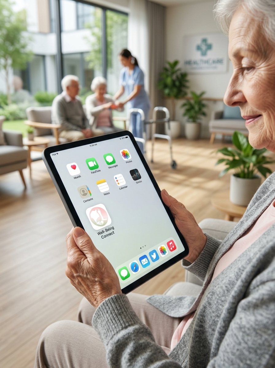
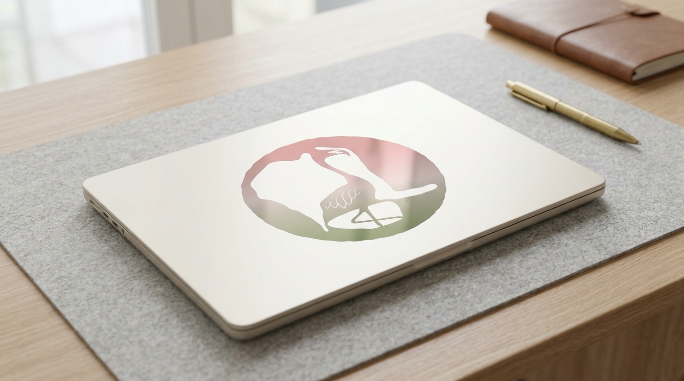
From the resident's tablet app down to the smartwatch face. The mark holds at every size, on every device.
The full system.
- 01
Name & identity
Full rename from Good Sam to Creekstone. Logo, mark, wordmark, and guidelines built around the campus geography.
- 02
Color & palette
Flamingo pink, waterline sage, creek navy, and stone cream. Pulled directly from the gradient mark.
- 03
Exterior signage
Backlit campus monument, stone monument, and a full campus wayfinding map system.
- 04
Interior signage
Elevator lobby graphics, frosted glass panels, corridor room signage, and backlit brass room numbers.
- 05
Admissions & print
Three folder editions (navy foil, cream, kraft), ribbon-tied admissions packets, letterhead, and business cards.
- 06
Welcome experience
Arrival suite setup, branded robe and towels, spa amenity bottles, and reception welcome folders.
- 07
Apparel
Staff linen aprons and polo shirts, each carrying the Creekstone mark.
- 08
Fleet wraps
Three shuttle treatments: colorblock Sprinter, botanical navy Transit, and gradient pink Transit.
- 09
Merch & amenities
Branded water bottles, journals, and towels for the fitness center and Pilates studio.
- 10
Programming
Monthly activity calendar template, formatted for acrylic display in resident common areas.
- 11
Social media
Instagram and Facebook post and story templates, plus paid social creative.
- 12
Brand guidelines
Full usage documentation: mark, color, typography, voice, and application standards.
Who did
what.
Built from the ground.
Literally.
The lakes were always there. We just made everyone look.